If the idea is at the heart of everything, then I would like you to think of a movie that you love. Then look at its current title sequence and come up with a new one.
Sketch up the rough idea in the form of a storyboard. Your storyboard needs to be at 30 frames and should be for at least 1 minute of motion design.
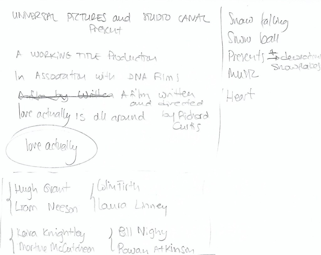
I chose Love Actually, one of my favourite movies. After watching its current title, I wrote down some ideas and titles, as well as the names of the main cast.
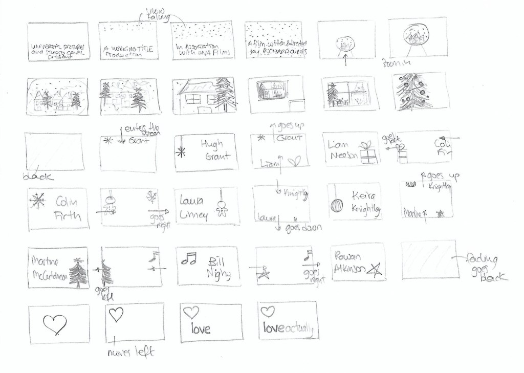
After that, I sketched up the storyboard in what ended up being 34 frames.
Question 1 – Written assignment (observation and analysis)
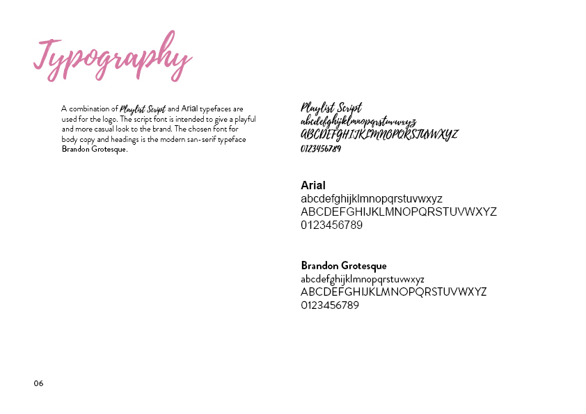
Define the term “typography” in your own words
Write a few sentences explaining what typography is not
Typography is the study of how letterforms interact on a surface directly relating to how the type will be set when it eventually goes to press. As Gerrit Noordzij put it, typography is writing with prefabricated characters. The arrangement of letters, words and other visual material can be collected and duplicated as many times as needed.
Typography does not involve producing letters uniquely by hand or tool. It is not handwritting, lettering, carving letters, sign writing or graffiti. However, letters produced in these ways can inspire a designer to create a new typeface.
Find a case study on typeface development on the Internet (similar to the ones in Addendum A). Explain which medium (small format printing, large format printing, mobile devices, etc.) the font developed is best suited for and why. Keep legibility, size and style in mind.
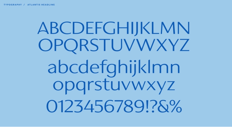
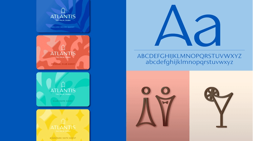
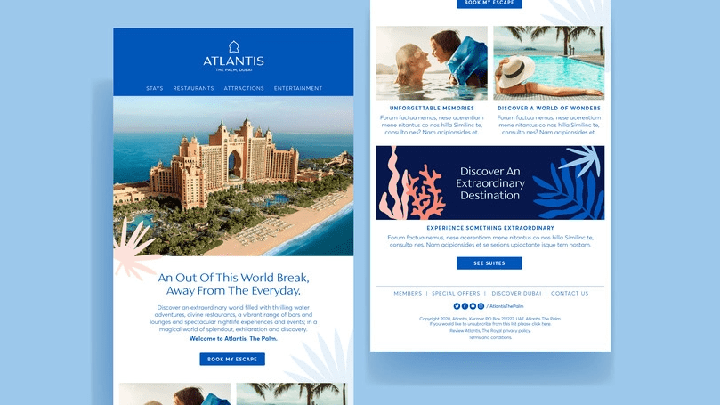
I found a case study on A new brand identity for Atlantis Resorts by Monotype.
The Resort wanted to unify their visual brand across all their properties, modernised their original typography and logo and give the brand a fresh look, but that also captured their mission to be extraordinary in everything that they do. The brand is fun, creative and experiential, which they wanted to be reflected in their trademark and branding.
The new custom typeface has distinctive letters inspired by middle eastern cultures and Arabic calligraphy. The designers were asked to create a caps only headline font. They had to be mindful of how the fonts were going to be used in signage and in-turn signage manufacturing limitations. The letterforms would be cut form steel in a range of sizes so they balanced the weights and ran tests to avoid letter strokes that were too thin. As the brand identity grew, the typeface was expanded into a full Latin character set of upper and lowercase with a view to creating continuity across the Atlantis brand.
The typeface was initially designed to be used in the logo and the resort signage. Its open proportions make it suitable for such use. A tall x-height enhances clarity and legibility, so it also works in body text used in both printing and web.
Question 2 – Research and written assignment (observation and analysis)
Document one day of your life acting as an observer of typographic design. Produce a comprehensive diary of the typographic experience of your day from first thing in the morning to last thing at night.
Keep this diary within a research folder or sketchbook. You should be prepared to use photography, photocopying and other means where necessary to evidence what you find, as well as collecting first-hand examples of typographic design.
Make notes or comments to reflect on what you have collected and documented. Your notes should help you to consider what kind of design it is that you are recording. For example, a cereal packet may have some large obvious lettering / typographic device on the front of the box, but there will also be typography in the form of information design within a “nutritional information” table on the packaging. So are you looking at promotional design/branding or information design? Or are you looking at typography? Is it lettering?
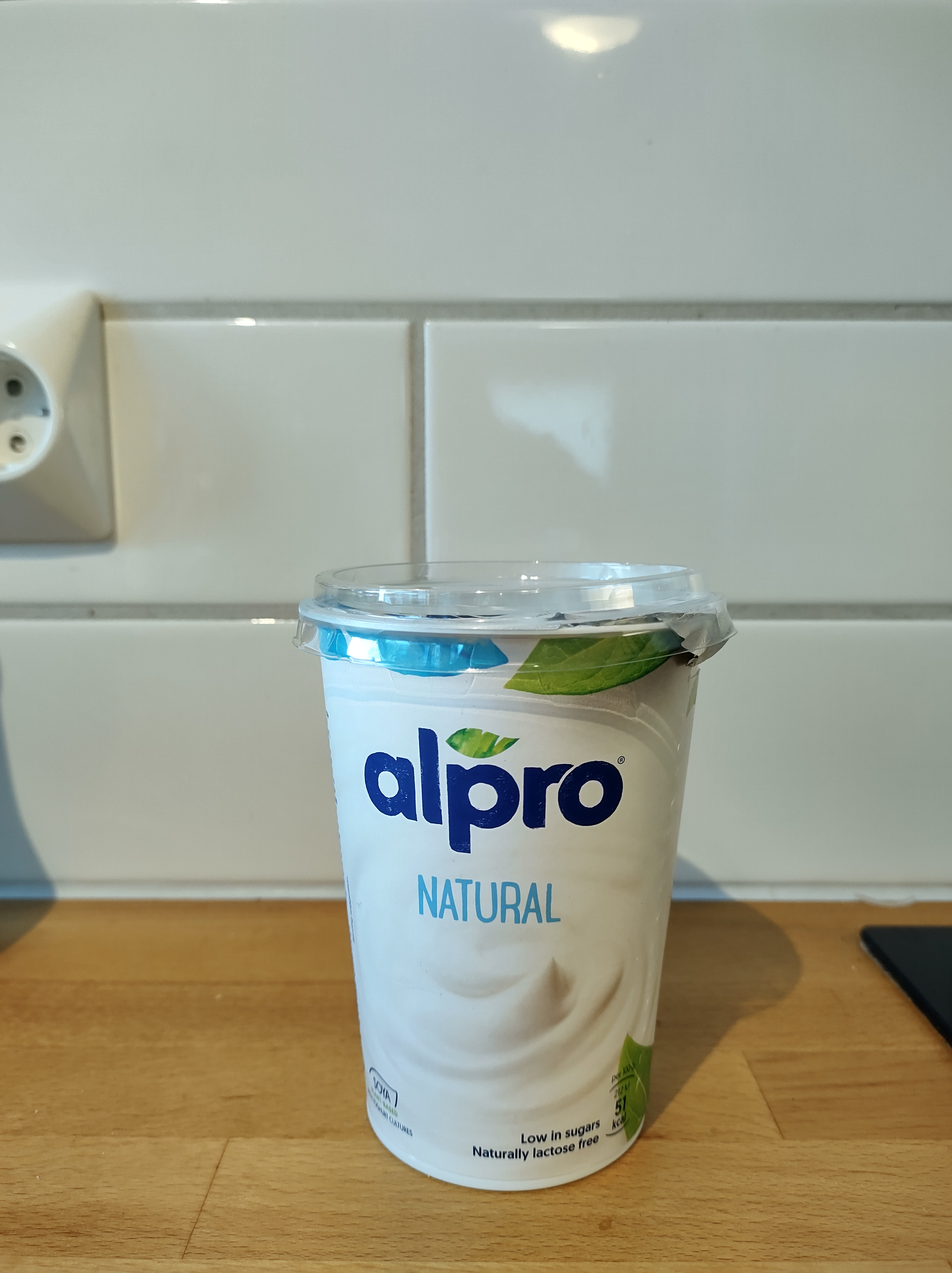
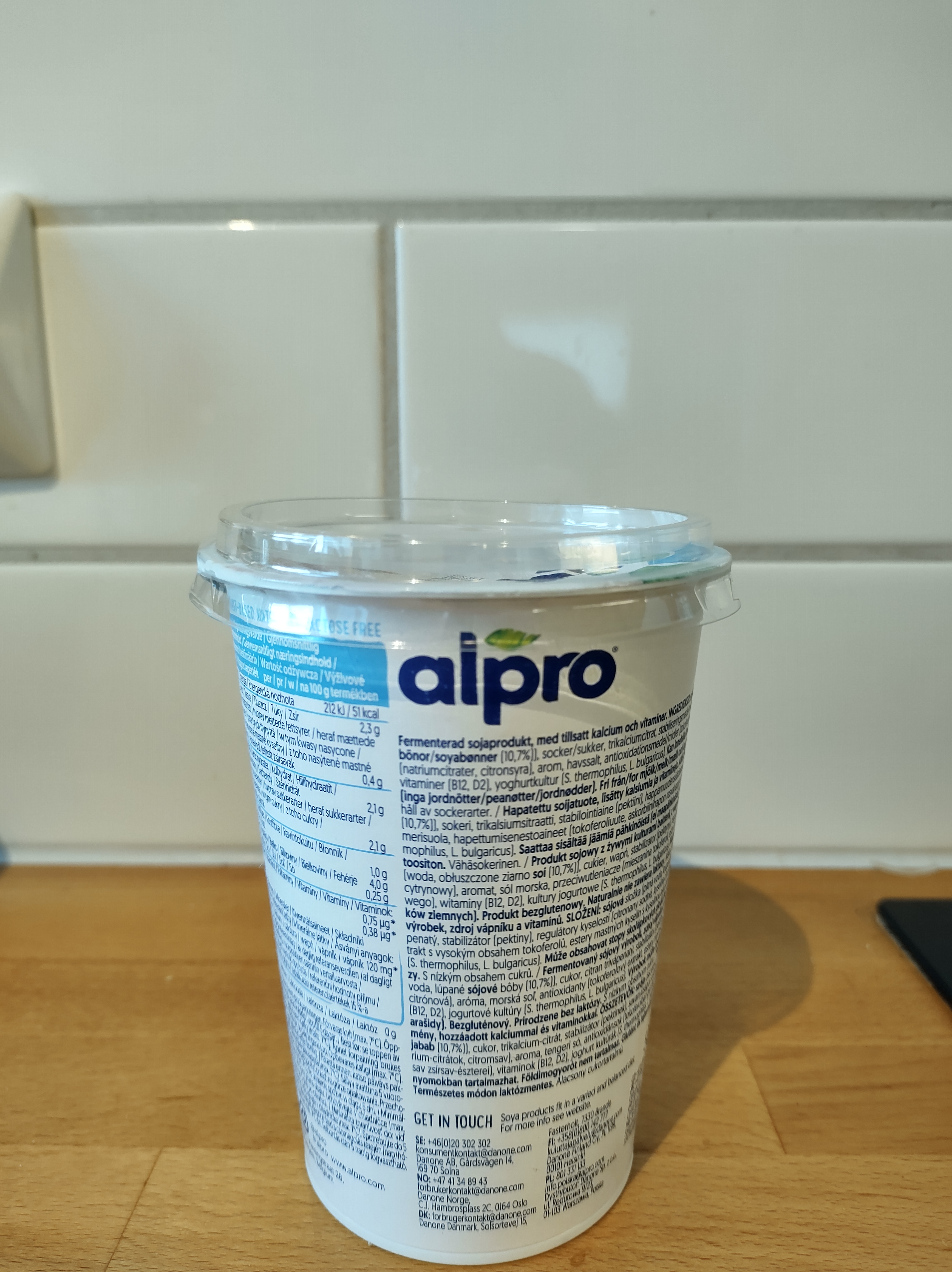
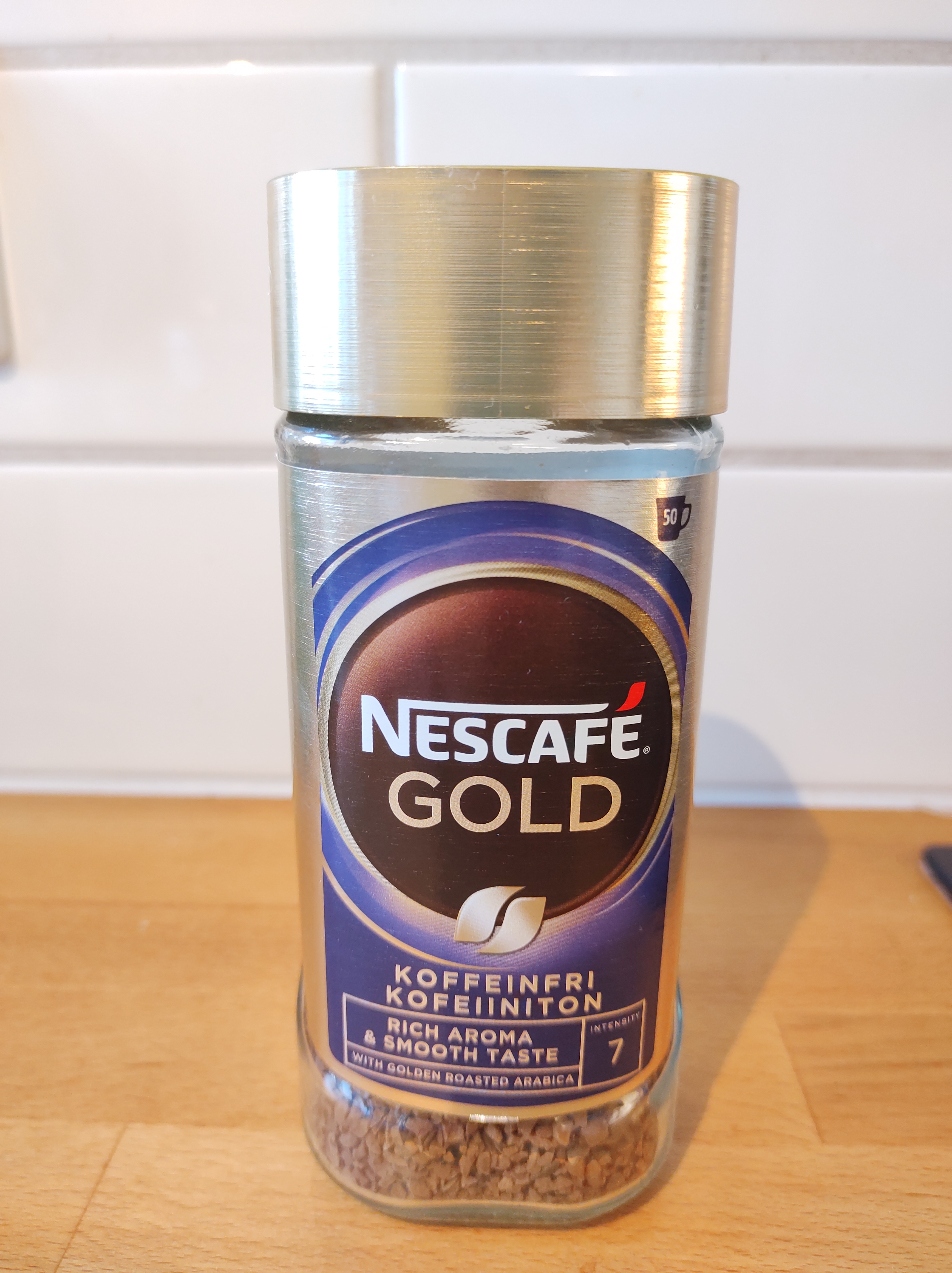
In our daily life, we are surrounded by typography that we often overlook. Thanks to this week’s lesson and learning assignment, I have paid closer attention to my surroundings and the typography of products, banners and signage in my home and around town. Here is a compilation of some of the pictures I took.
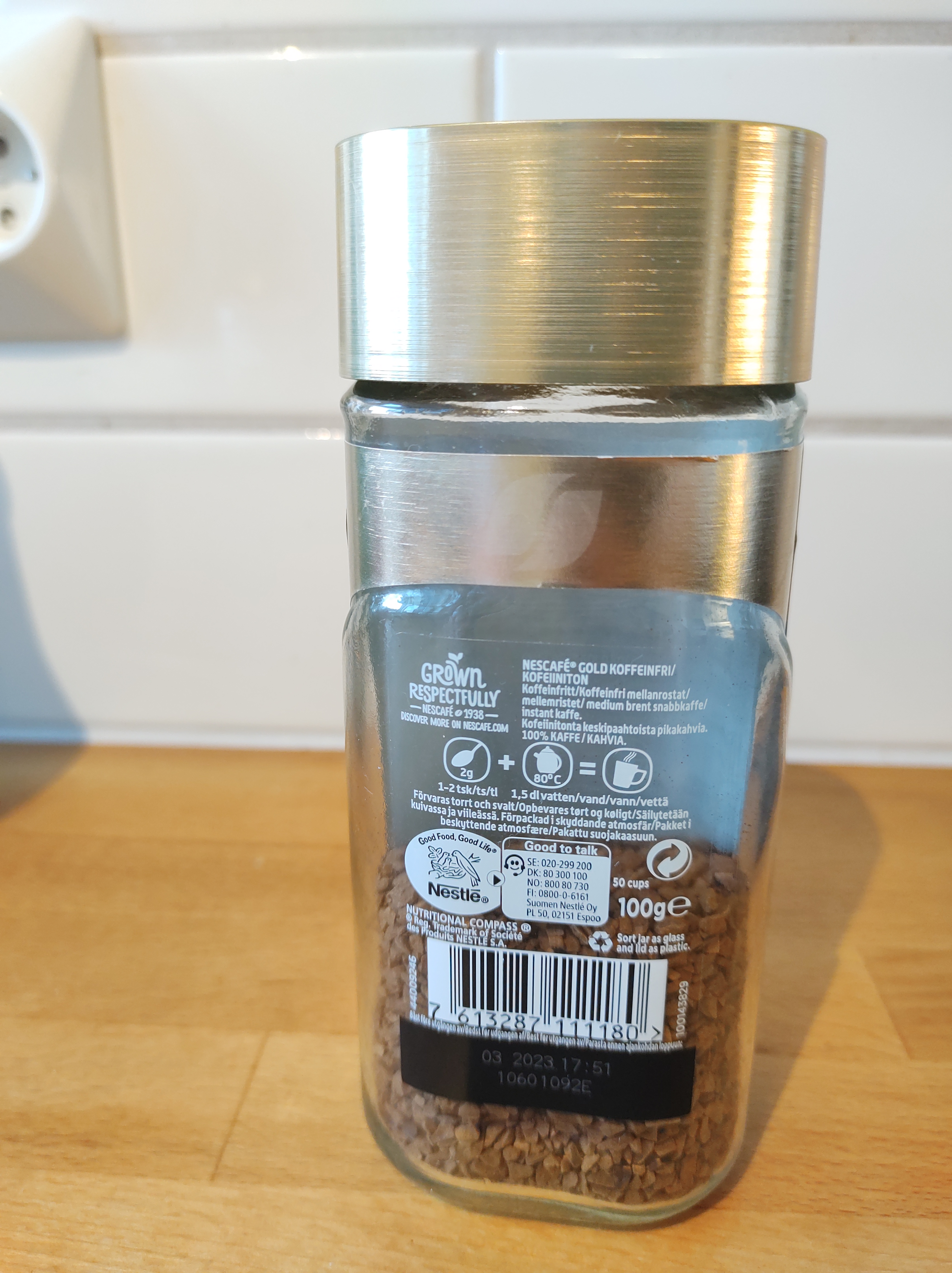
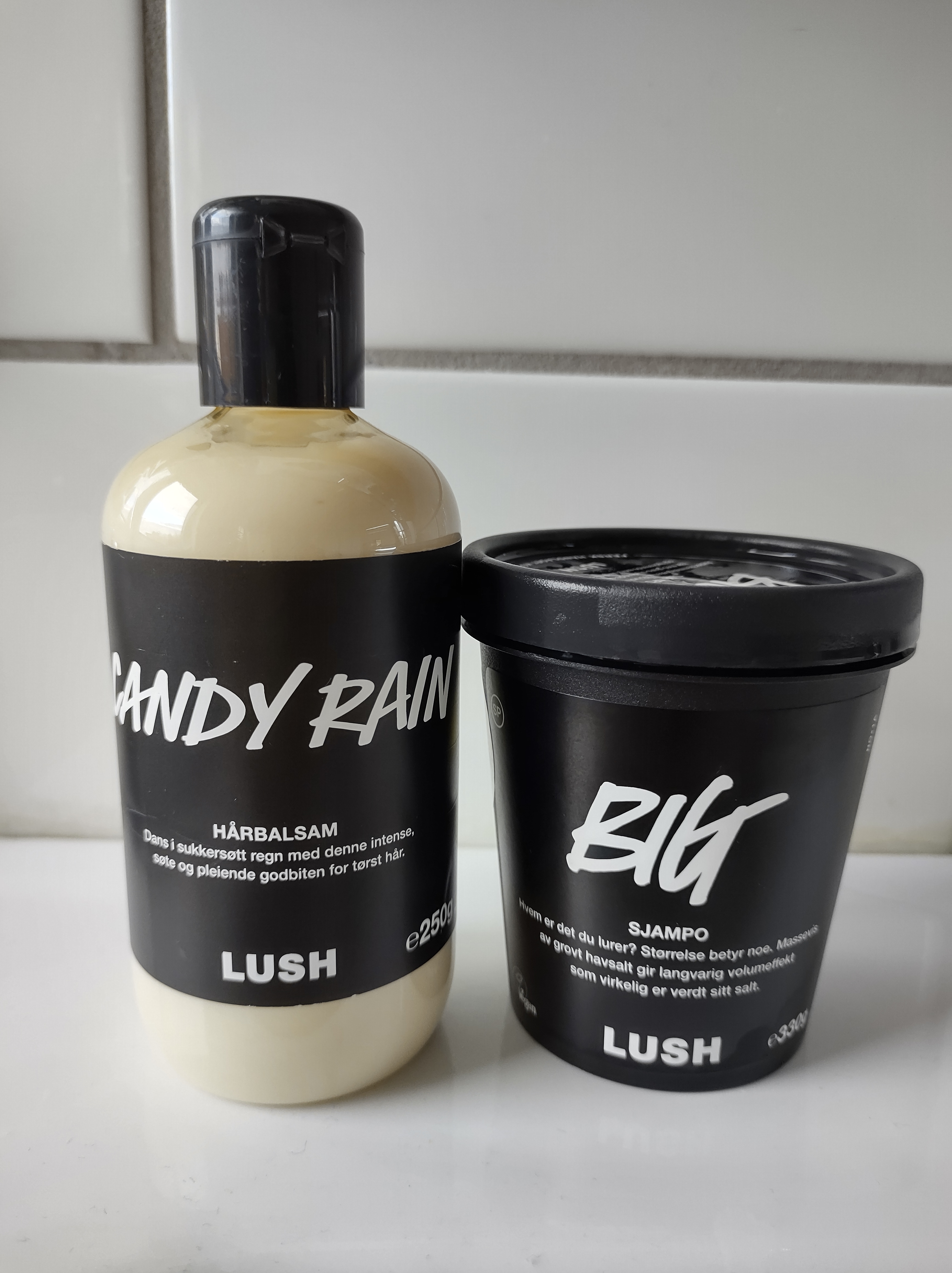
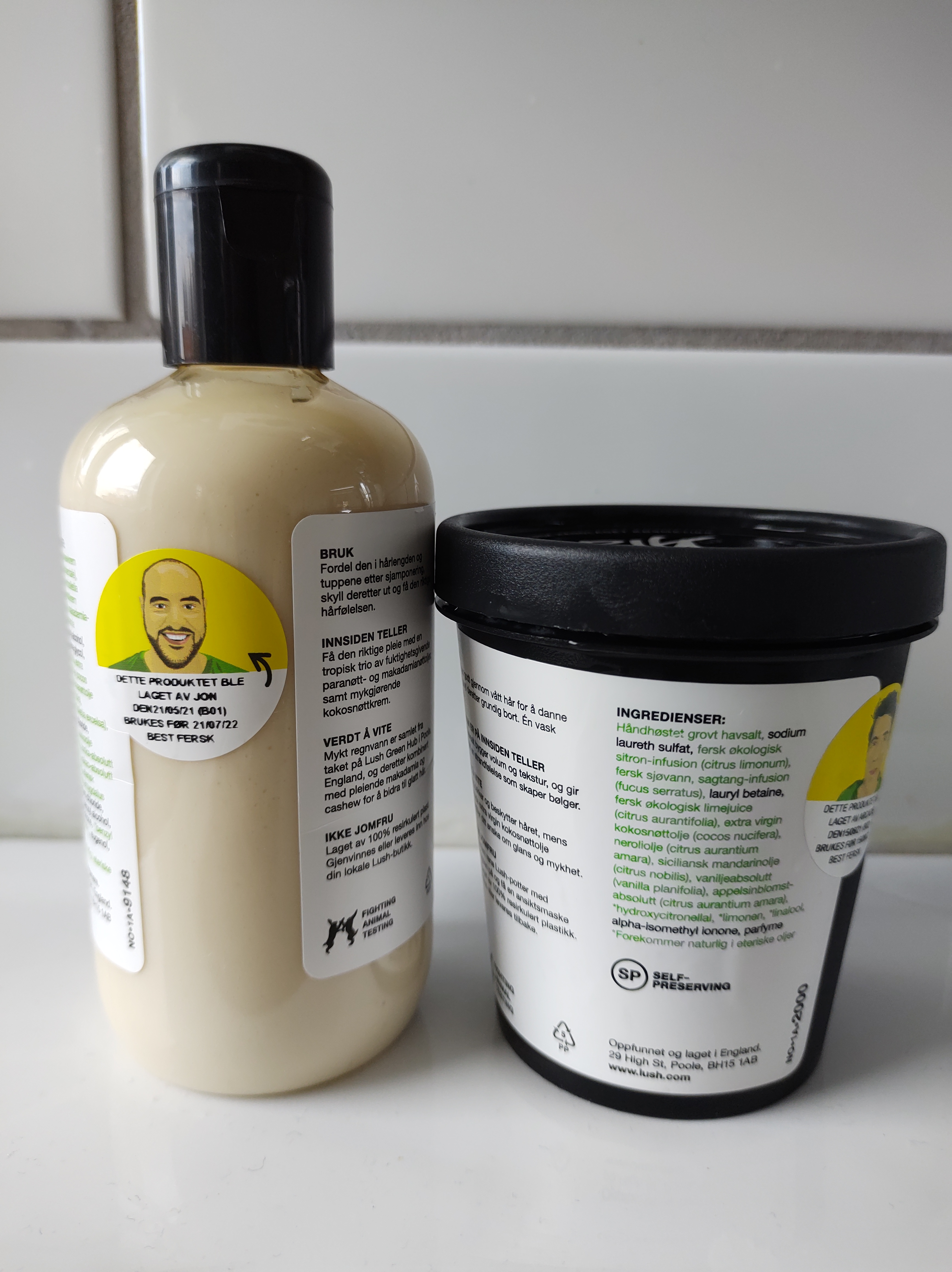
In the case of product packaging such as yoghurt, coffee, toothpaste and cosmetics, they often have a large typographic or lettering design on the front to catch the consumer’s attention and make the product more attractive. Secondary typeface adds a bit more information to it. There is a larger amount of text in a much smaller size on the back, which shows nutritional and/or ingredients information.
The information signs use symbols (pram, bicycle and arrows) and white, large and sans serif fonts on a dark background to transmit the message effectively.
Ads and commercial banners are meant to be seen, so they are huge, use mostly only very big fonts and have a lot of breathing room.
Choose two examples of design that you have collected that you consider to have either good or bad qualities. Try to analyse these further in terms of their typography. Can you identify the typefaces being used? Does the typography communicate successfully? If so, why? If not, why not?
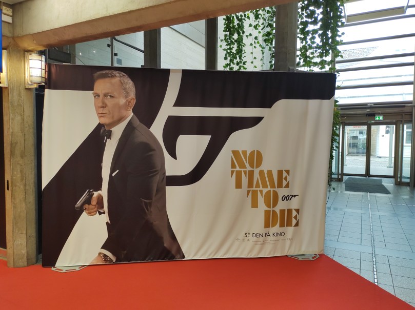
Movie advertising banner
At the cinema I found this advertising banner for the new James Bond movie. The font used for the logo is Futura ND Black, according to this article. The entire banner is black and white with the expection of the logo, which is golden. The picture of James Bond mimics the shape of the logo. The retro font works well with the theme of the film, as well as the colours and the dynamic text alignment.
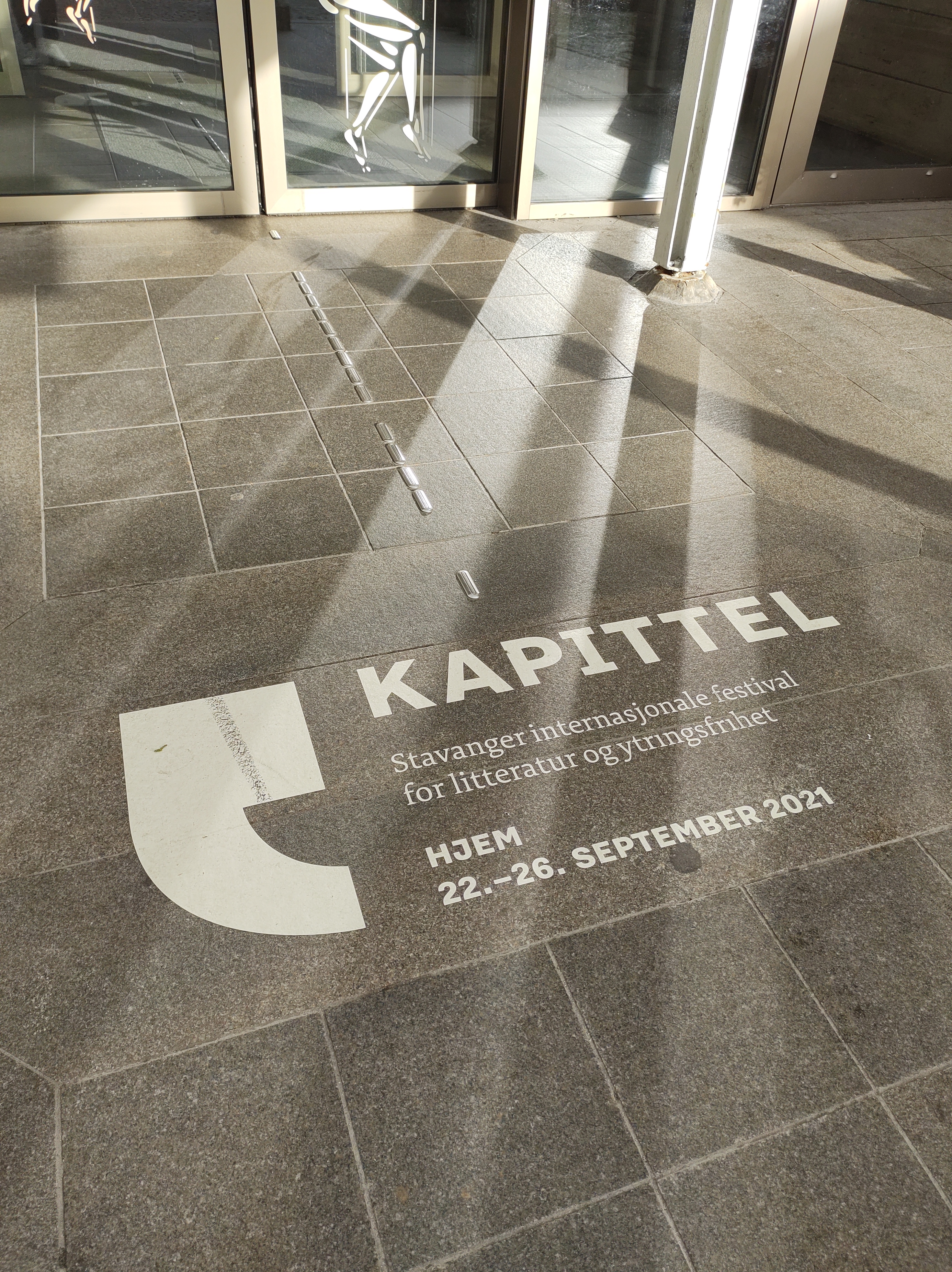
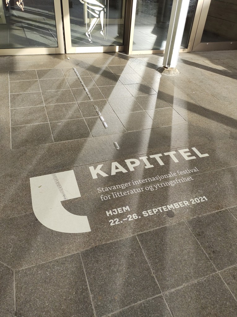
In order to promote Kapittel, Stavanger International Festival of Literature and Freedom of Speech, the local library and cultural centre drew the sign on the street floor at the entrance. This way, everyone who enters the building sees it. I think the typography is effective and communicates well. The sans serif font used for the name of the festival -Kapittel- is big and bold and catches the eye. I believe the same font, but in a smaller size is used at the bottom to indicate the dates. The text in the middle is secondary as it is a description of the event, for that the designers chose a serif which adds contrast to the design. Finally, a extra large quotation mark -which is also the festival’s logo- frames the text.
Question 3 – Practical assignment
Complete the exercise files that came with the LinkedIn video Indesign Typography. Upload them to WordPress.
I completed this course earlier in the program. I have rewatched some parts that I felt needed refreshing.
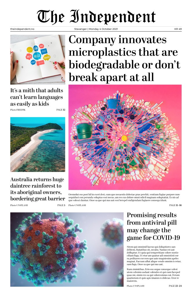
Use your design software to design a newspaper front page. Pay special attention to typography (size, leading, column width, etc.).
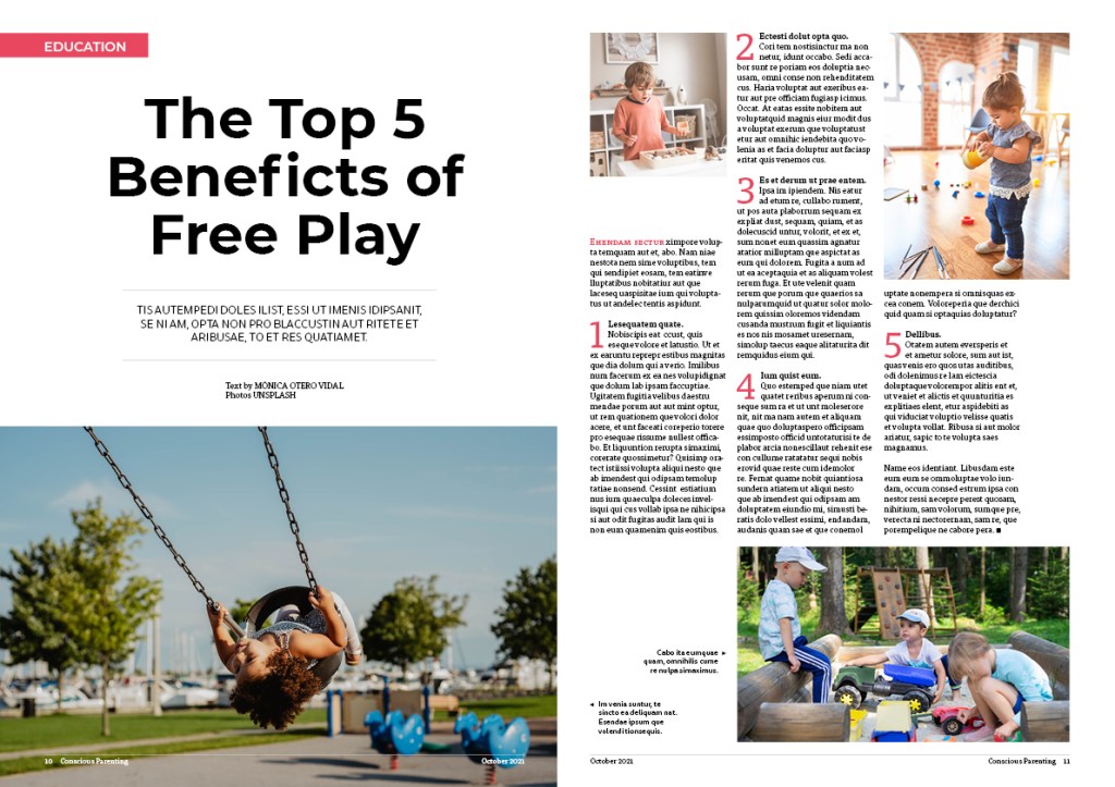
Use your design software to design a double-page spread (DPS) for your favourite magazine (look at an example of a DPS here)
Describe the steps that you will take to ensure that you take a high quality photograph in low light conditions. Refer to exposure, lenses, tripods, colour temperature, flash and ISO. Your answer should be a minimum of 350 words.
Question 2 – Practical assignment
Watch the LinkedIn course Photography 101: Shooting in Low Light by Joseph Linaschke
Take four low-light photographs: – One should be a sharp photograph that focuses on a static object, like a building or statue. – The second photograph should showcase moving objects, like cars or running water. – For the third photograph, take a moody portrait of a friend and use high ISO settings to your advantage. – The fourth photograph should explore using external light sources, like a Speedlite flash (please note, if you don’t have the equipment to take this last photograph, you may leave it out).
ISO 640 32 mm f/13 1.3 sec
ISO 100 32 mm f/20 10 sec
ISO 2000 55 mm f/5.6 1/50 sec
ISO 100 42 mm f/5.0 1/200 sec – Nikon Speedlight SB-300
“Frank Shepard Fairey is an American contemporary graphic designer and illustrator who emerged from the skateboarding scene. He first became known for his ‘Andre the Giant Has a Posse’” (…OBEY…) (www.obeygiant.com) sticker campaign, in which he appropriated images from the comedic supermarket tabloid Weekly World News.
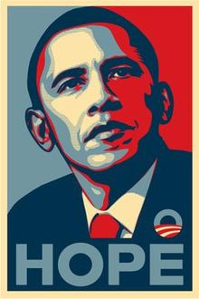
His work became more widely known in the 2008 U.S. presidential election, specifically his Barack Obama “Hope” poster.
Source: Wikipedia
Analyse his poster for the 2008 U.S. Presidential Election and give your opinion on the use of style and its efficacy. Also critique the use of pastiche and typography. Write one page (about 350 words) on your opinion of this design and substantiate your answers with examples.
The Barack Obama “Hope” poster designed by artist Shepard Fairey for the 2008 US Presidential Campaign is described as iconic. Although not originally part of the official campaign branding, the design proved so popular that the poster became something of a viral phenomenon, seamlessly playing into the Obama campaign’s overall ambience.
The poster shows a portrait of Obama where he is gazing slightly upward and to the side, and his expression communicates confidence and focus. Its style depicts the presidential candidate as an almost heroic figure. The word “HOPE” that accompanies the picture helps convey the message of Obama being the change to come for the people of America.
We can see how Fairey took inspiration from images of previous American presidents, such as the well-known JFK portrait or the image of Abraham Lincoln on the five-dollar bill. Choosing the same recognizable pose of previous presidents elevates Obama to the same level and depicts him as the next president of the United States, even before the election.
Source: Wikipedia
Source: Wikipedia
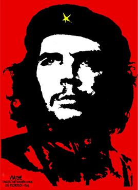
The “Hope” poster style imitates other propaganda posters such as Jim Fitzpatrick’s Che Guevara, where he is represented with a straight look into the distance, similar to Obama’s pose. The focus is on Che Guevara’s black and white face on a red background.
Source: Wikipedia
In his work, Sheppard Fairey often uses red and cream colours, which he also did in the “Hope” poster. In this case, he also added blue, which symbolizes trust and loyalty, strengthening Obama’s figure. Red, white and blue are the traditional American patriotic colours, but he uses a muted, desaturated palette, differentiating his work from almost all mainstream political campaign images.
Source: CareerAdict
The all-capital slogan printed under Obama’s image says “Hope” in a bold, modern, sans-serif typeface. Through this slogan, the viewer forms a correlation between the three-quarter pose and the concept of hope and generate the meaning: Barack Obama provide us hope.
In conclusion, the limited palette, the simplicity of the layout, a short slogan in bold typography and the flat-colour illustration makes the design effective and easy to recognize and remember. It also allows for the image to be widely reproduced, which was Fairey’s intention. It certainly helped to make this iconic work go viral.
Create your own WordPress theme and then customise it. Add the hacks mentioned in the lesson CMS and WordPress part 3. Do some research on the Internet and find two more hacks and implement it on your site.
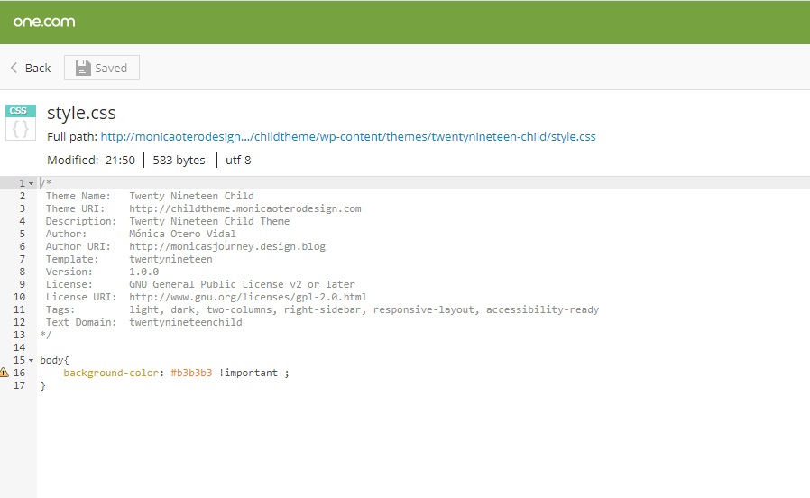
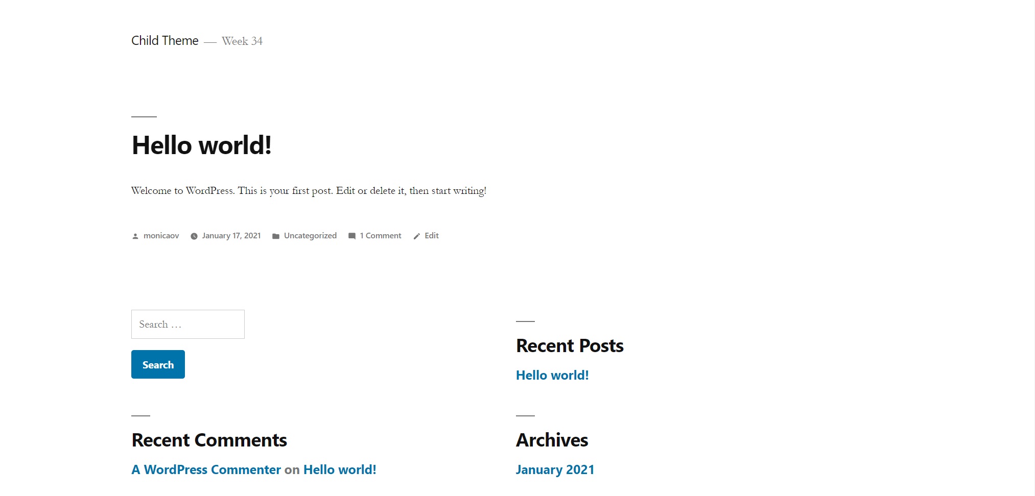
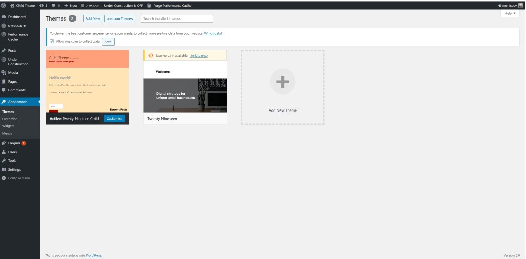
For this week’s learning activity I decided to create a child theme from an already existing WordPress theme. I created a WordPress site in one.com through 1-clic installation and chose the Twenty Nineteen theme. Since I was going to make only a few changes, I decided to work directly in one.com. I followed the LinkedIn tutorial WordPress: Building Child Themes by Patrick Rauland.
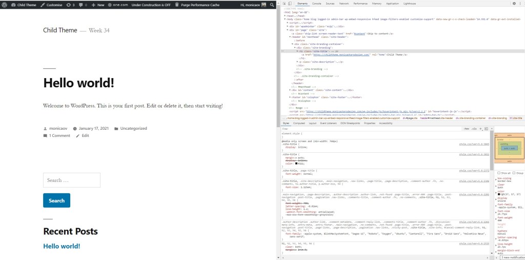
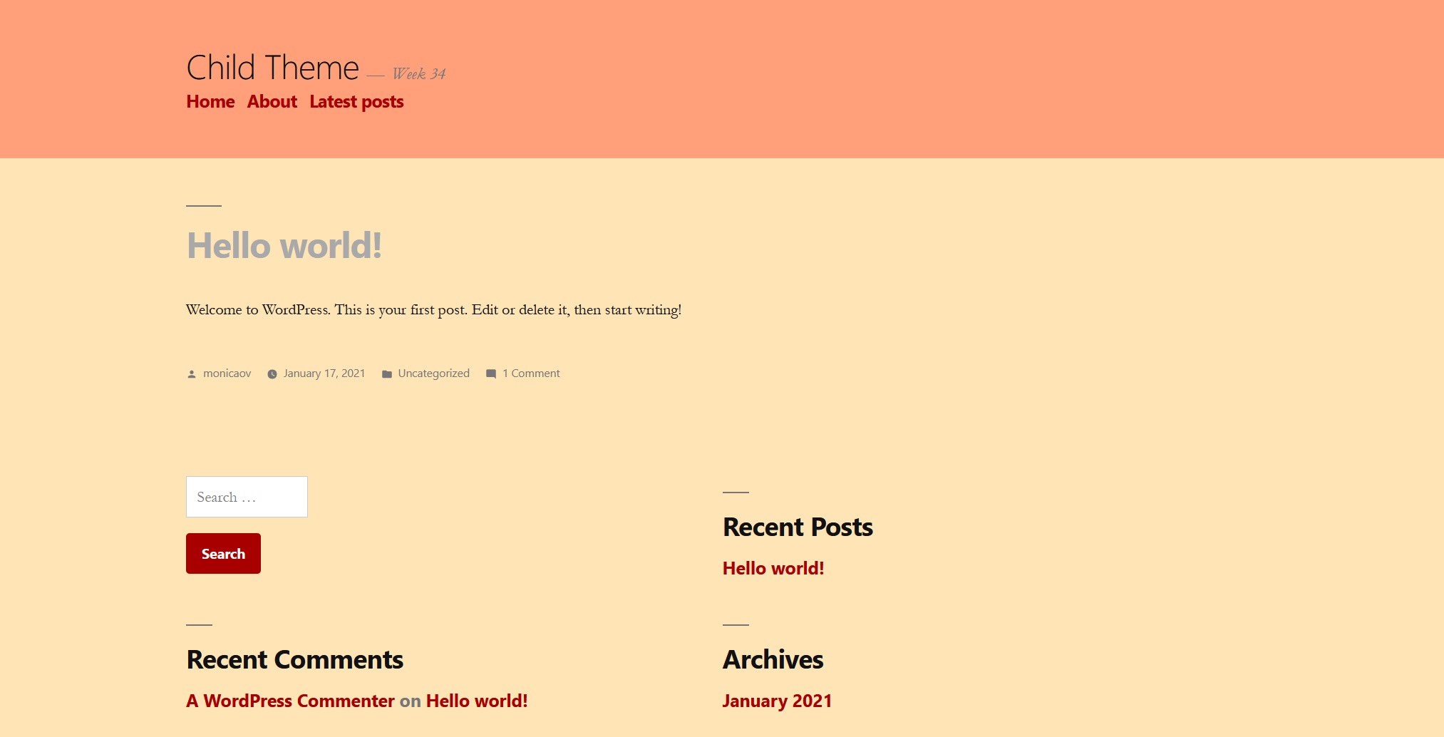
First, I edited the child’s style.css and changed the background colour as suggested in the tutorial.
css file in child theme
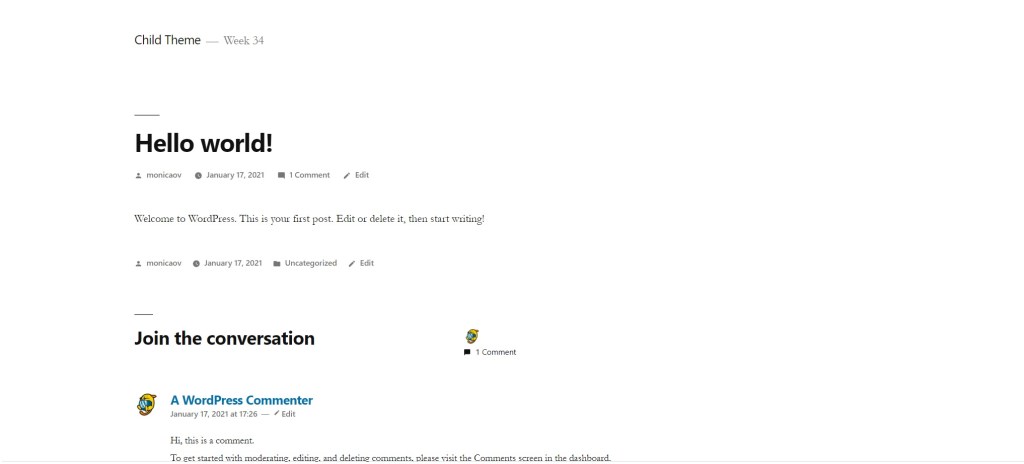
Parent
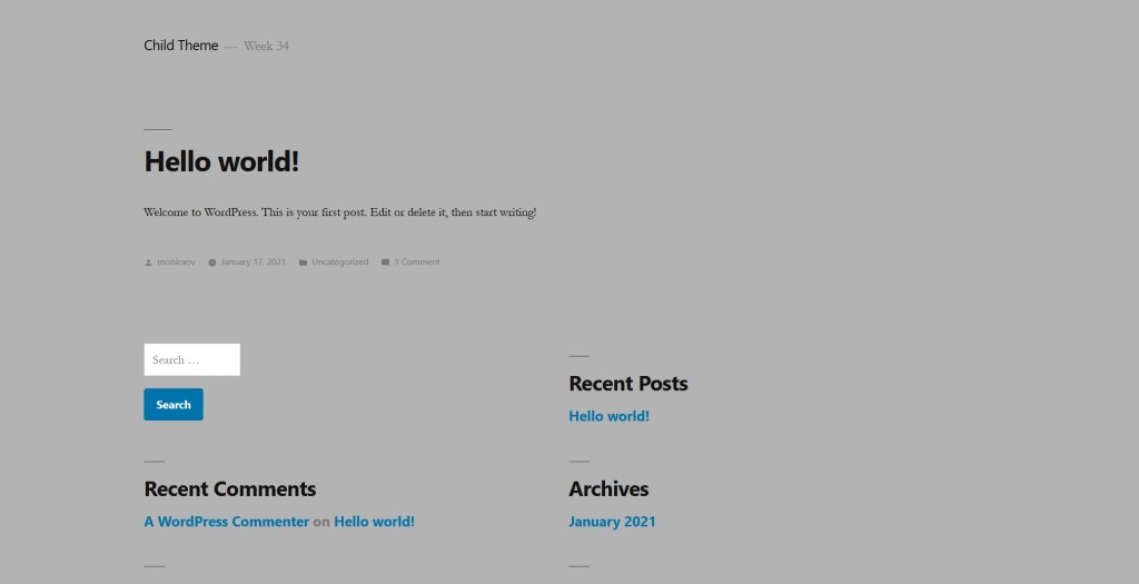
Child
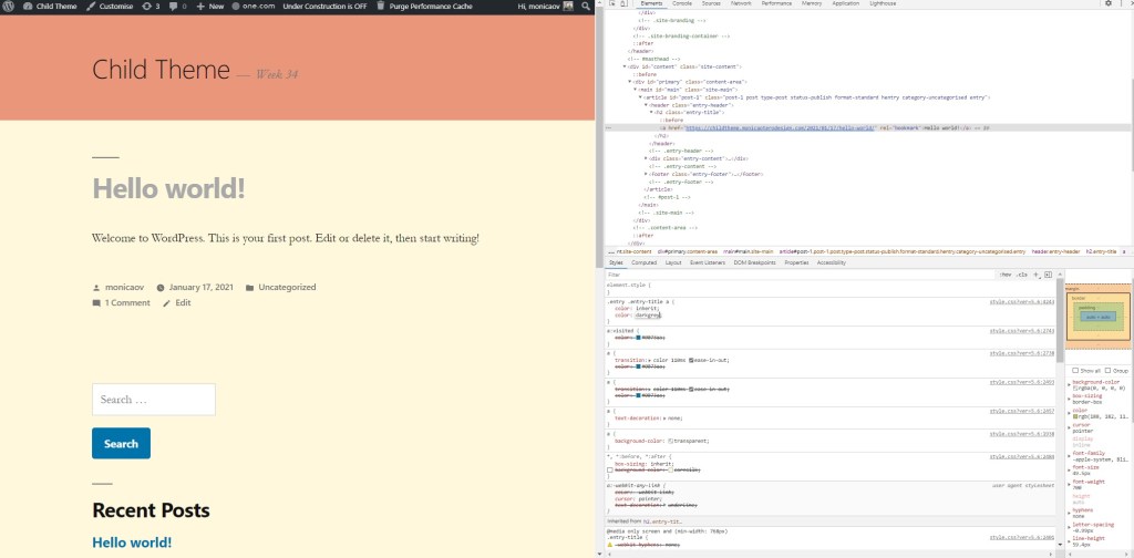
After that I played around editing in the browser and changed background colours, text size and style…
Parent
Child
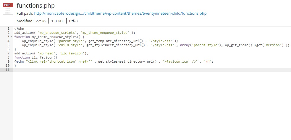
Then I added a favicon to my site following the instructions on this weeks lesson. Although the parent theme I chose allows to add a favicon, I decided to try and do it by adding it to the functions.php file to see if it worked. It did. Now I know I can change the WordPress icon to the one I choose even when the selected theme doesn’t give me the option.
I changed a few more details in the Customise section. The theme I picked doesn’t allow too many changes, so I only added a menu, two extra pages and changed the colour of the links to deep red.
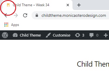
Finally, I added a screenshot for the preview of the child theme.
Take your theme that you have installed on your hosting account and customise it as per this module. Then I want you to find some WordPress hacks that you can use to customise your website even further. The main thing with this project is to not just do things for the sake of doing them. I would like you to explain the tweaks that you have made and your reasoning for adding certain features.
When creating my portfolio in week 32, I also added 4 posts, an about page and played around with the options to customize it. Below I list those changes and the new ones I made this week.
I changed some general settings such as title and tagline, site language, timezone, date format (d/m/Y) and time format (H:i).
I changed comment settings so no one can comment. Since it is a portfolio and there is a contact form available, I preferred to disable this option.
I changed the permalinks to use post name instead of the default one. It is more search engine friendly and gives the reader an idea of what the post is about.
I installed the WPS Hide Login plugin to protect my website by changing the login URL and preventing access to the wp-login.php page and the wp-admin directory to non-connected people.
Added a gravatar.
I uploaded a logo and a site icon.
I changed the number of columns in the post grid on desktop to three.
I added a contact form to my About page. For that, I installed the Ninja Forms plugins.
I added additional CSS in order to change the look of the navigation menu. The menu items were underlined and I changed it so they appear without decoration except on hover. This is the CSS code I added: .alt-nav a {text-decoration: none;} .alt-nav a:hover {text-decoration: underline ;}
Also adding additional CSS, I removed the left padding in the about page, so the photo and text are centered. .resume-template .entry-content {max-width: 500px;padding-left: 0;}
Finally, I edited the file footer.php to change the hypelink text from the blog name to my name.
In week 32 we began to learn about WordPress and how we can use it to create websites. For this Learning Activity I have set up a web for my portfolio using this content management system.
So far, I have added the semester’s completed mandatory assignments and some learning activities that I liked to my portfolio. I know the look of it can be improved a lot, and I will continue doing so, as this semester the portfolio is interactive.
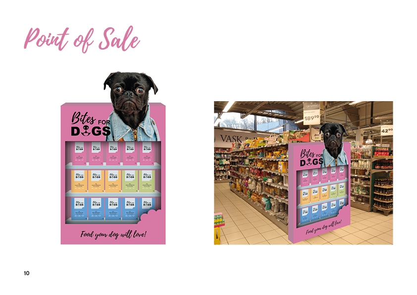
PART A Consider the touchpoints of your brand in general (to ensure that all the elements work together) and then focus on your packaging. Design a set of Point of Sale elements that will promote your product in-store. The set can consist of however many elements you choose. It can be in any format that you would like it to be. Please consider the following:
1. Can customers clearly see your product in your Point of Sale elements? Do you use your Point of Sale to also showcase your actual product? 2. Brand Integration. Does it integrate with the brand’s look and feel? 3. Designed to sell! Does it persuade customers to buy your product?
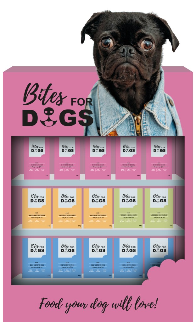
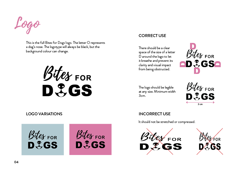
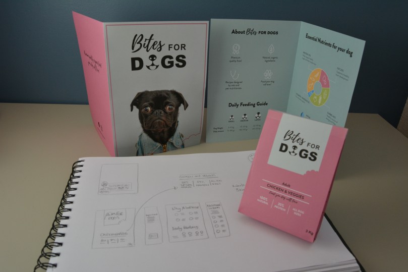
The Point of Sale I designed is a cardboard box with shelves to showcase the actual product. Its design integrates with the brand’s look and feel since it uses the same colours, shapes and photo. The logo is clearly visible, as is the byline. It is meant to be positioned at the end of a pet food supermarket aisle to persuade dog owners to buy the product.
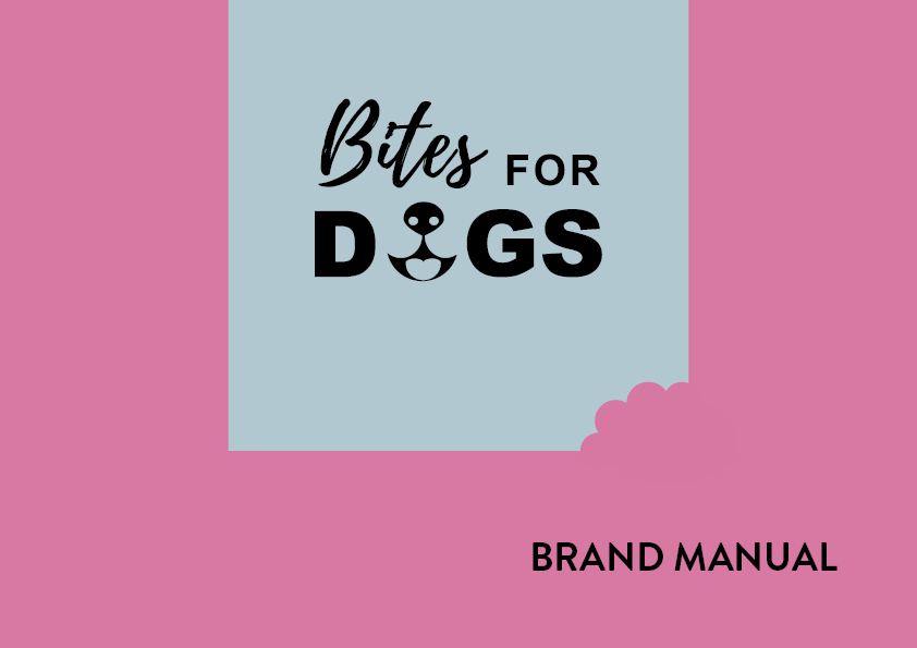
PART B Brand manual. Take pictures of your elements and include them in a presentation of your brand called a brand manual or a design manual. Your brand manual should have a minimum of 7 pages and include logo, color scheme and chosen typography as well as the different elements produced during this 4 week project period (brochure, infographic, packaging, point of sale). Hand in your brand manual as a PDF.
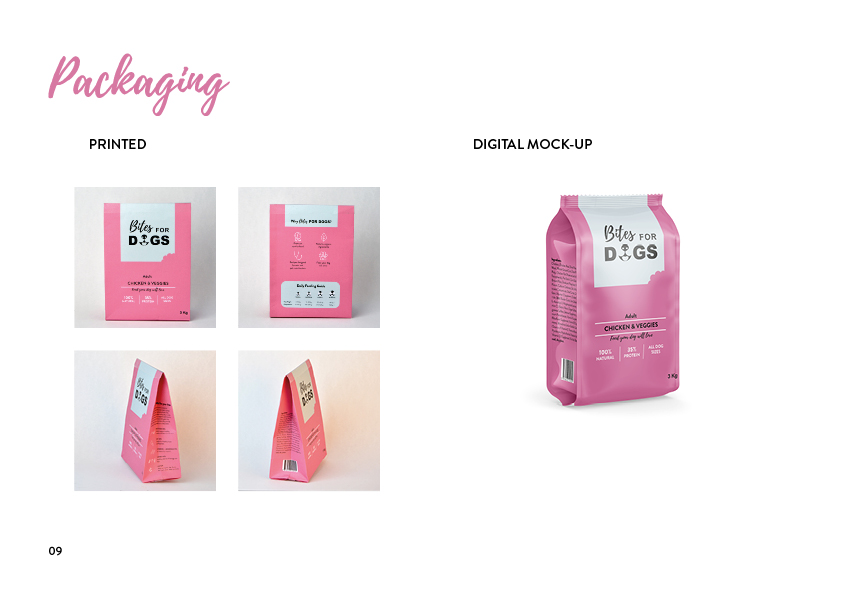
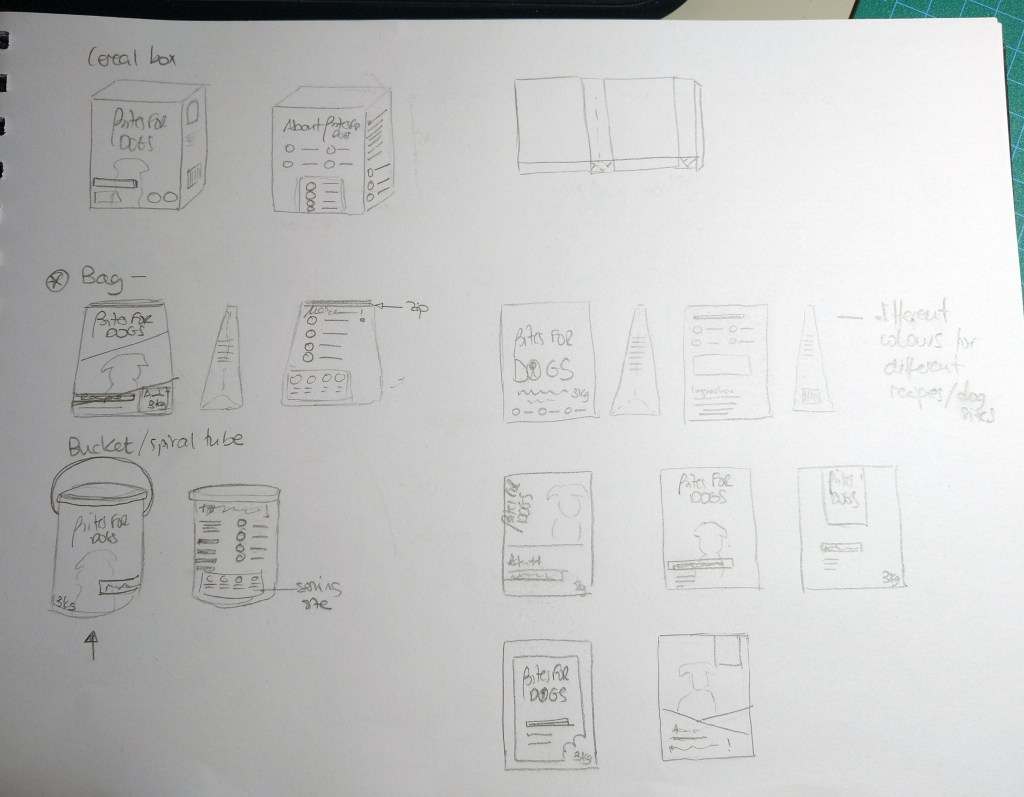
Using the logo you created in Week 1 and the brochure you designed in Week 2, think about your brand and design packaging for your product. Remember that you can decide about the detail of your product. Is it dog biscuits, meat products in a tin, dry pellets or a new and exciting product? Do your design according to the following steps:
1 – Exploration: Use sketching techniques to draw thumbnails and hand in your thumbnails as scanned PDFs.
2 – Brand integration: Choose one of your thumbnails and refine your design. Place it next to your brochure and logo and see how you can merge your design with the brand identity. Also, what fundamentals of the brand can you draw from and use in your design? Hand in a picture of your thumbnails, mock-ups, logo and brochure together.
3 – Design: Now design your packaging properly, using any design application of your choice (or a combination of e.g. Photoshop, InDesign and Illustrator). Export the flat design as a PDF.
4 – Presentation: Make a life-size mock-up of your final design and take photographs of it. Remember that you can take more than one photo to show the different angles and sides of the packaging. Here your presentation skills are vital. How do you present the final mock-up in a photo to reflect the true essence of your design?
1 – Exploration
I began by sketching a few ideas for the packaging, considering different presentations: carton box, bag, bucket.
Fist sketches
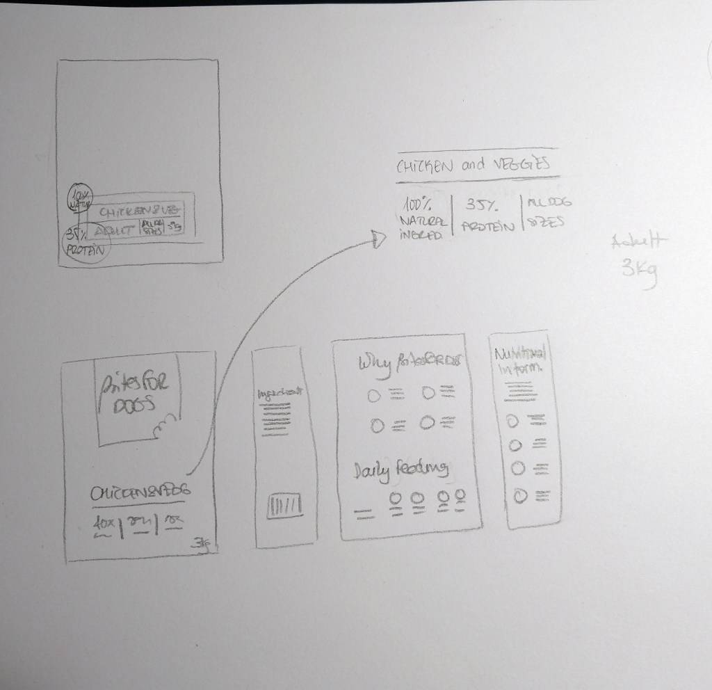
2 – Brand integration
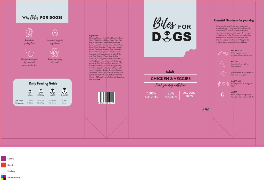
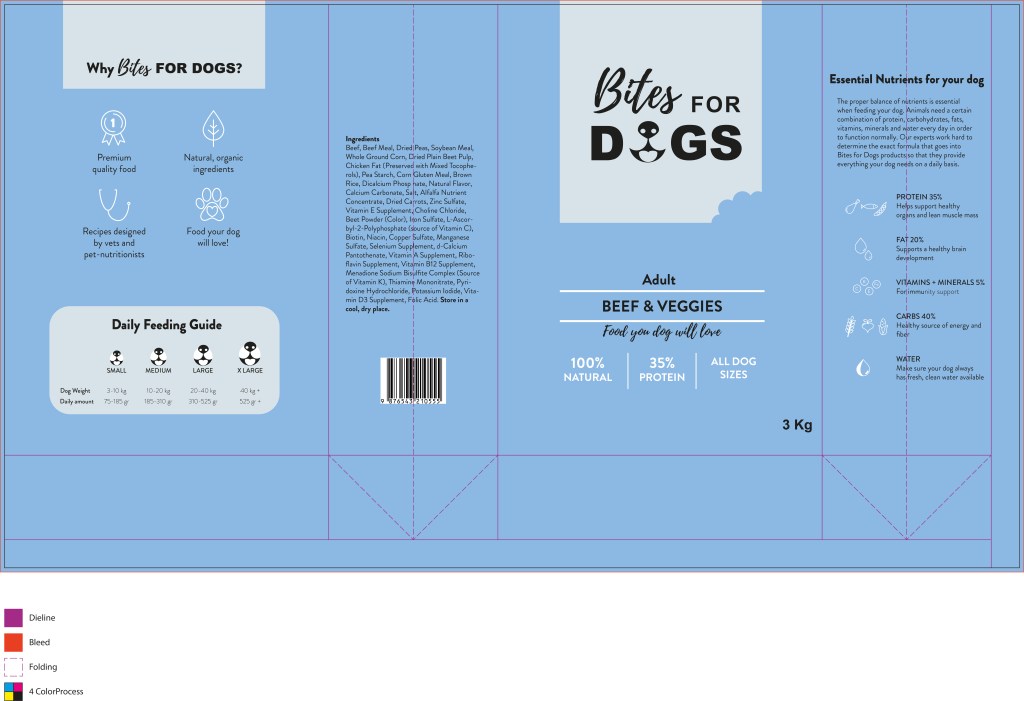
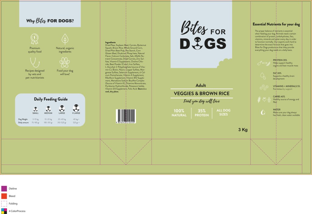
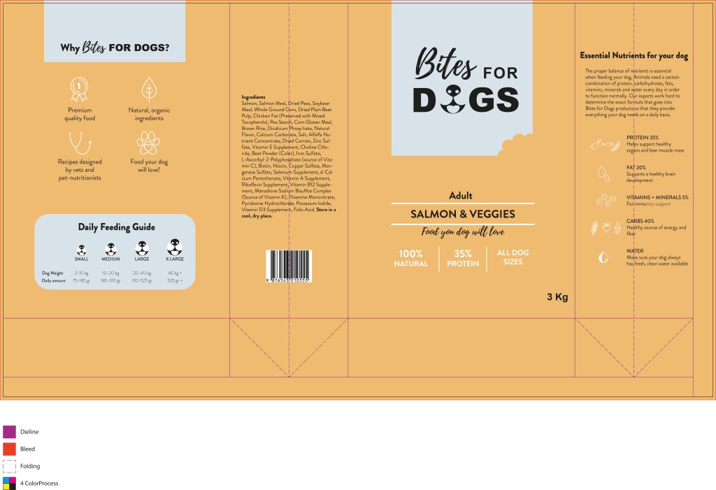
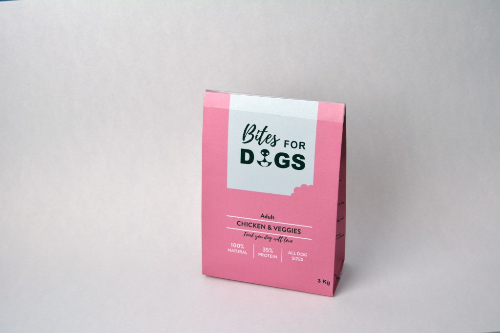
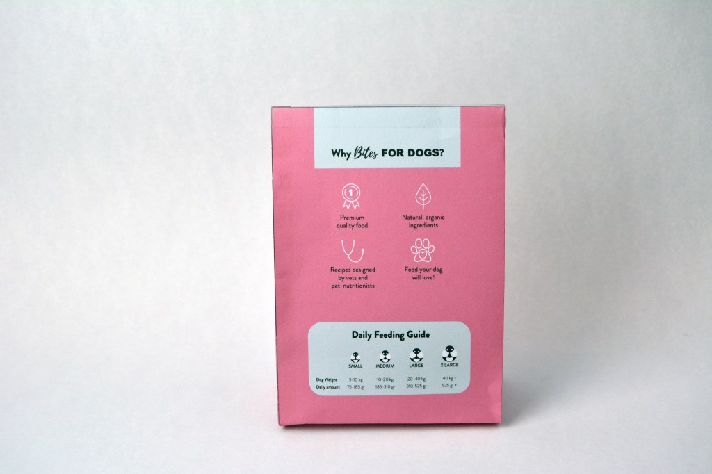
I decided to go for a bag. The product I chose to design is the packaging for dry dog food. I used the brochure and the logo designs from previous weeks to inspire the design, so the brand has a cohesive look.
Refined design
3 – Design
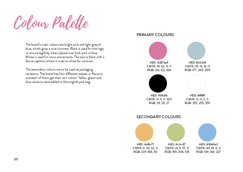
Then I moved to Illustrator and continued developing the design. I chose to use the same colours as in the brochure (photo below). I also experimented with other colours that could be used for different food recipes and/or dog ages. The colours I used are the same as in the brochure’s infographic (see pictures below).
Flat design
Colour variations for different recipes
4 – Presentation
Below I added photos of my packaging sketches together with the brand products and close-ups of the packaging mock-up I created.
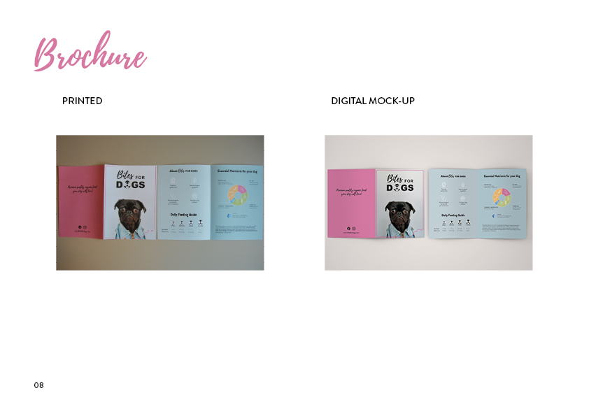
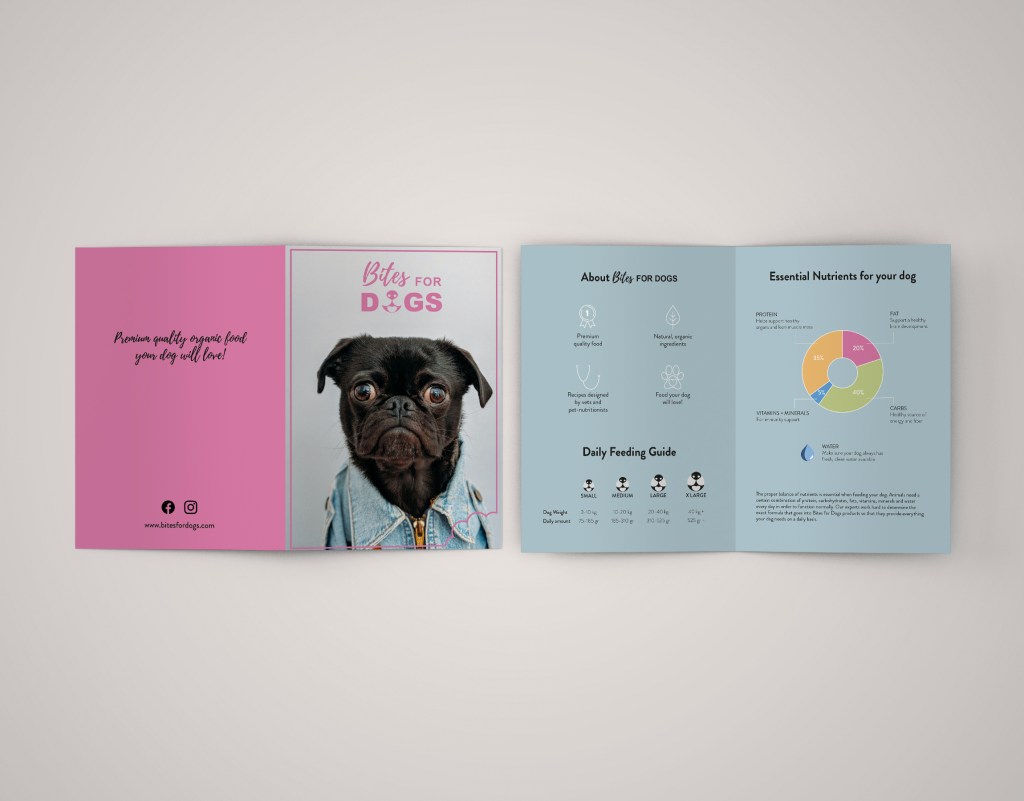
Use the logo you created in Week 1 and design a brochure for your product. You may use any format you like, just make sure that the format is in line with and adds to your logo design. Your brochure must contain an illustration. This could be the infographic alone, or it could be the infographic and the rest of the brochure (in other words, the entire brochure may be illustrated if you’d like).When designing the brochure and creating your illustration, make definite use of the fundamentals of visual language as discussed in this lesson. You must illustrate an infographic and design a brochure:
1. Illustration of infographic
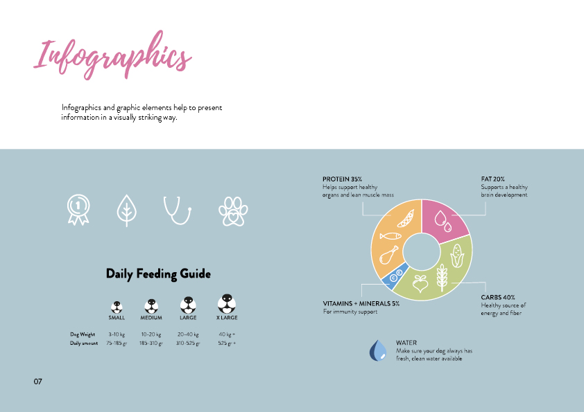
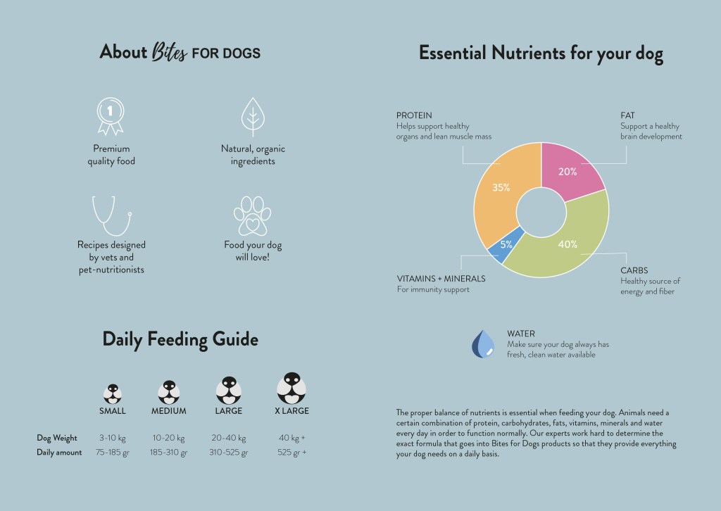
The brochure design and infographic illustration should work together. Consider the format and style of your brochure and illustrate an infographic using fictitious data (or you could do research to get a better idea of actual statistics). The infographic must display the nutritious benefit of your product to dogs. It should contain the nutritional value, as compared to the necessary nutrition intake of dogs. It must also give an indication of consumption per size of dog. You may also add information of your choice that you think is relevant.
2. Design of brochure
Design a brochure that introduces your product and includes the infographic illustrated in Question 1. You can decide on the information and format of your brochure. As a guideline, consider a brochure of A4 (lying), folding to A5 (standing). You don’t have to have more than four pages in your brochure (but it depends on your design and style). You must base your brochure design on the design of your logo. Thus, look at your logo and design a brochure that complements and blends in with it.
This is the final look of my brochure and infographics. I chose the recommended size A4 (lying).