Have a look at all the tasks and lessons you have done over the last few weeks. Your task now is to make a cover (a front page) for your very own magazine.
Go through the Graphic Design history timeline and choose a style and designer that you feel relates best to your personality.
Using that designer/style as inspiration, use your name or part of your name and create a title/name for your magazine. Feel free to be creative!
Add your own pictures, text, illustrations, elements as well as the proper typography and titles for your cover.
The expression must represent your personality (remember the color choice regarding this).
Remember to include what kind of magazine it is, for example cars/bikes, fashion, design, weddings, etc.
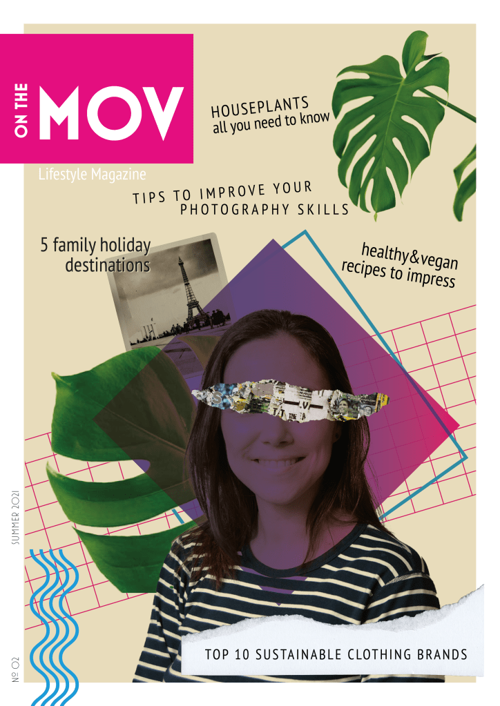
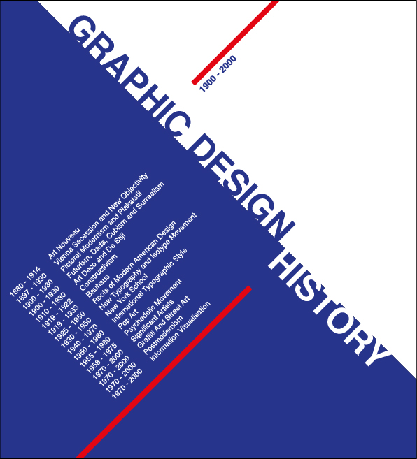
This magazine cover is inspired by the New Wave movement. New Wave designers rejected the order and cleanliness of the Swiss grid-locked design and typography, experimented and broke the rules. I find it fascinating how different elements with apparently nothing in common can work together to form exciting and beautiful compositions. I recently came across Carly Guppy’s work. She creates collage art and mixed media pieces inspired by vintage photographs, found papers and patterns, plants and animals. Her art was an inspiration for this task too.
I initially named the magazine “On the Move”, but my teacher suggested dropping the E, as this more ‘rebellious’ spelling is in line with the style, and people would still be able to read it. MOV are my initials (Mónica Otero Vidal).
The main picture is a self-portrait I took last semester with the use of a tripod and timer. I integrated it in the collage, with other stock images and graphic elements using illustrator. Blue, purple and green are my favourite colours, that is what I chose them. Both the photos and the articles describe me in a way, as I love plants, healthy and plant-based eating, photography and enjoying time with my family.
Question 2
Post your final design on the forum (Lessons and Activities forum) for comments from your tutor. Remember to include what your inspiration was (designer/style from the Graphic Design timeline). Discuss the results with your fellow students (your group) on the forum.
Explain shortly how you perceive your group members through their covers.
Do they see your personality through your cover, too?
Make a short comment if you feel they’ve nailed it!
I posted my cover in the forum and got feedback and guidance from my tutor, which helped me refine the design.
There are not many students in my group, so I also checked the covers in other groups. It was fun to see the different approaches for the same assignment.
Question 1 – Written assignment (observation and analysis)
Define the term “typography” in your own words
Write a few sentences explaining what typography is not
Typography is the study of how letterforms interact on a surface directly relating to how the type will be set when it eventually goes to press. As Gerrit Noordzij put it, typography is writing with prefabricated characters. The arrangement of letters, words and other visual material can be collected and duplicated as many times as needed.
Typography does not involve producing letters uniquely by hand or tool. It is not handwritting, lettering, carving letters, sign writing or graffiti. However, letters produced in these ways can inspire a designer to create a new typeface.
Find a case study on typeface development on the Internet (similar to the ones in Addendum A). Explain which medium (small format printing, large format printing, mobile devices, etc.) the font developed is best suited for and why. Keep legibility, size and style in mind.
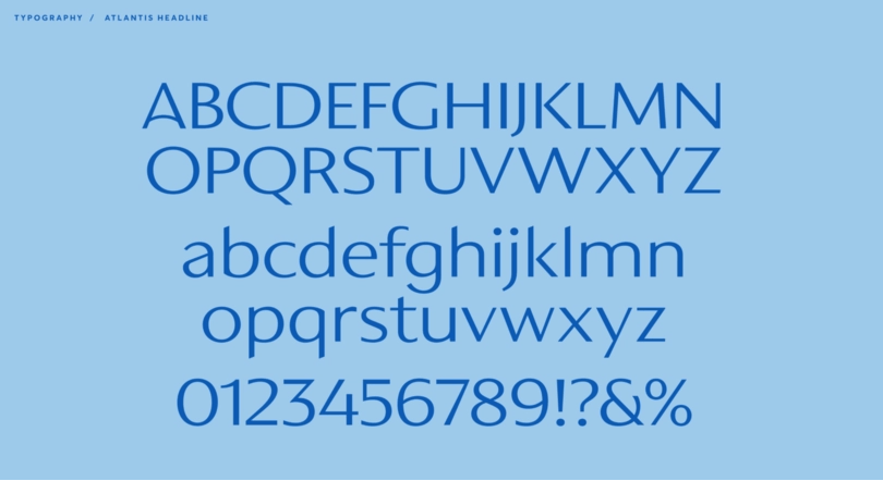
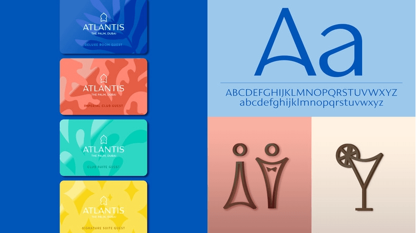
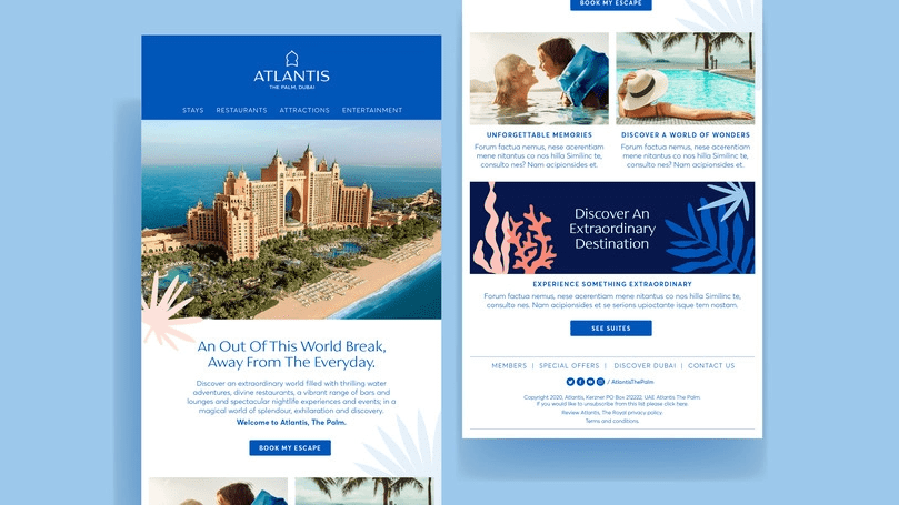
I found a case study on A new brand identity for Atlantis Resorts by Monotype.
The Resort wanted to unify their visual brand across all their properties, modernised their original typography and logo and give the brand a fresh look, but that also captured their mission to be extraordinary in everything that they do. The brand is fun, creative and experiential, which they wanted to be reflected in their trademark and branding.
The new custom typeface has distinctive letters inspired by middle eastern cultures and Arabic calligraphy. The designers were asked to create a caps only headline font. They had to be mindful of how the fonts were going to be used in signage and in-turn signage manufacturing limitations. The letterforms would be cut form steel in a range of sizes so they balanced the weights and ran tests to avoid letter strokes that were too thin. As the brand identity grew, the typeface was expanded into a full Latin character set of upper and lowercase with a view to creating continuity across the Atlantis brand.
The typeface was initially designed to be used in the logo and the resort signage. Its open proportions make it suitable for such use. A tall x-height enhances clarity and legibility, so it also works in body text used in both printing and web.
Question 2 – Research and written assignment (observation and analysis)
Document one day of your life acting as an observer of typographic design. Produce a comprehensive diary of the typographic experience of your day from first thing in the morning to last thing at night.
Keep this diary within a research folder or sketchbook. You should be prepared to use photography, photocopying and other means where necessary to evidence what you find, as well as collecting first-hand examples of typographic design.
Make notes or comments to reflect on what you have collected and documented. Your notes should help you to consider what kind of design it is that you are recording. For example, a cereal packet may have some large obvious lettering / typographic device on the front of the box, but there will also be typography in the form of information design within a “nutritional information” table on the packaging. So are you looking at promotional design/branding or information design? Or are you looking at typography? Is it lettering?
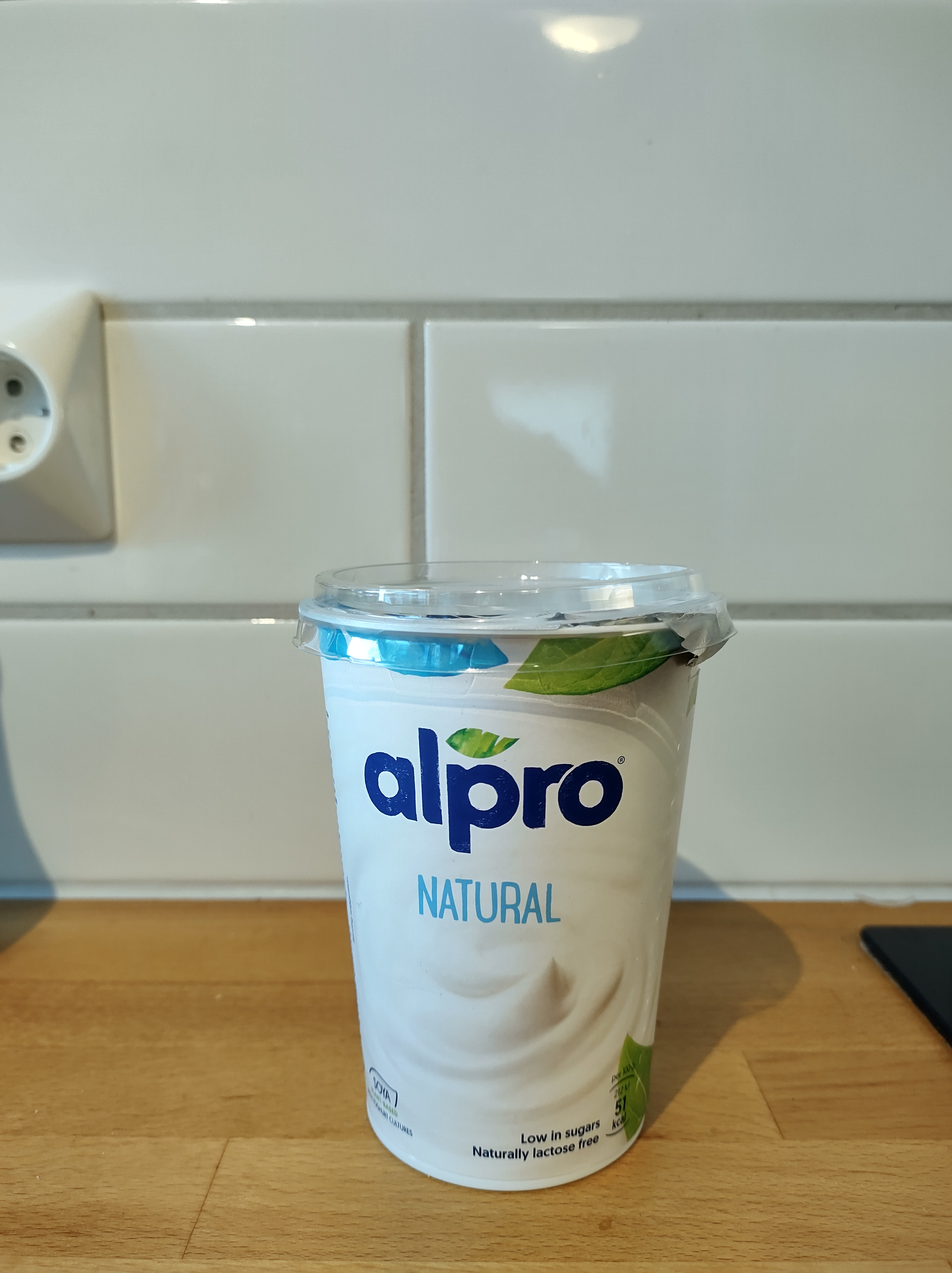
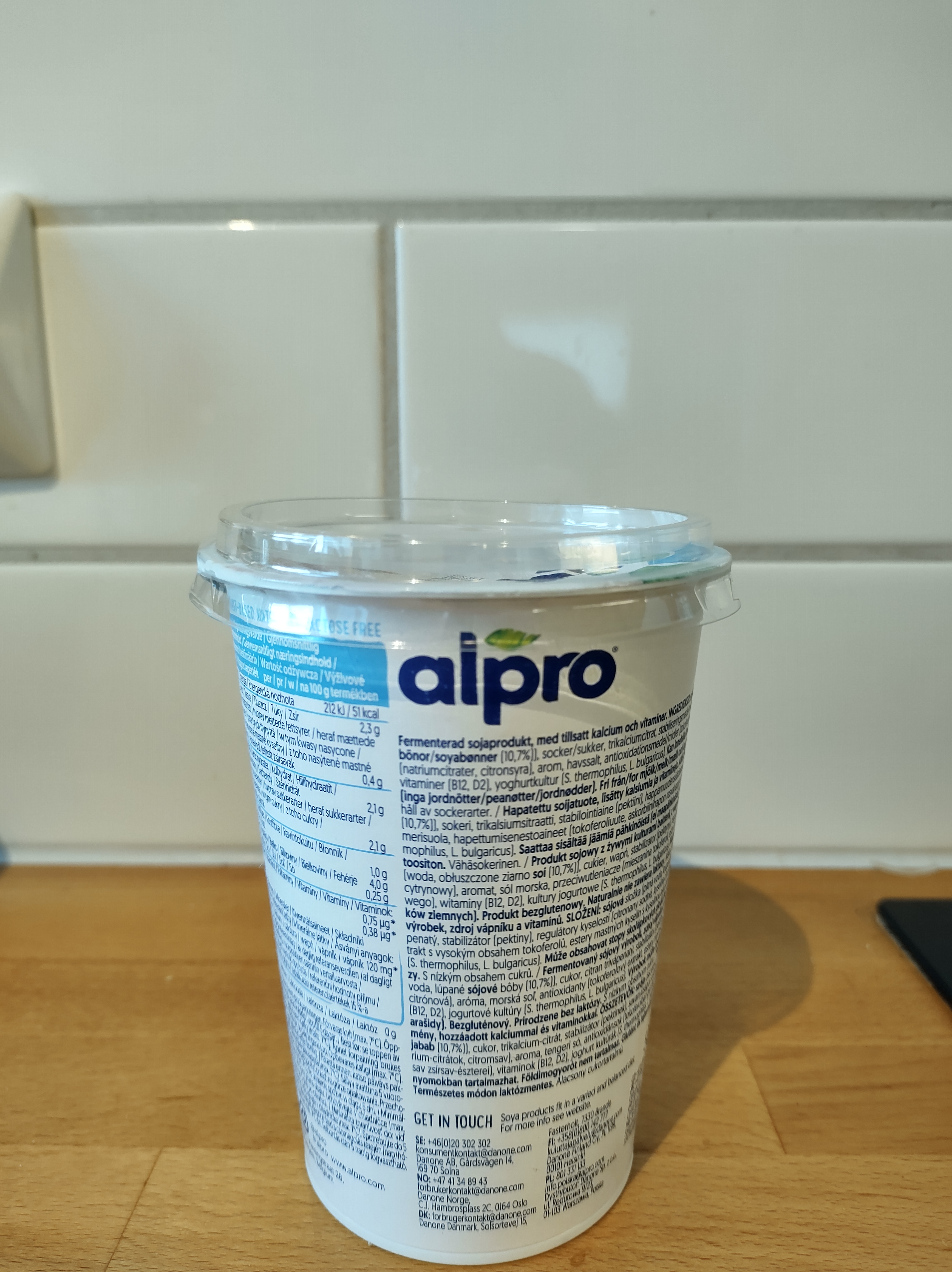
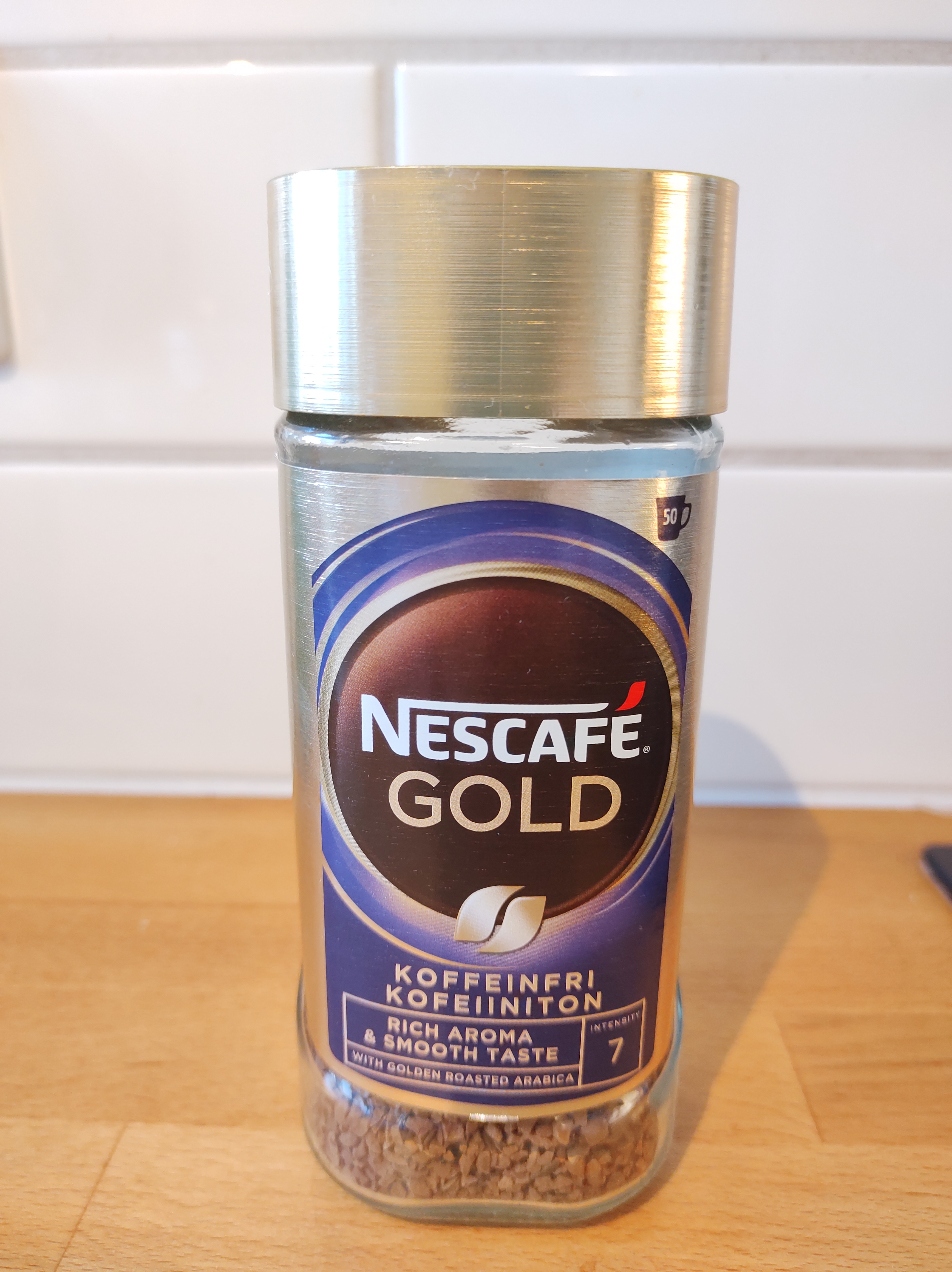
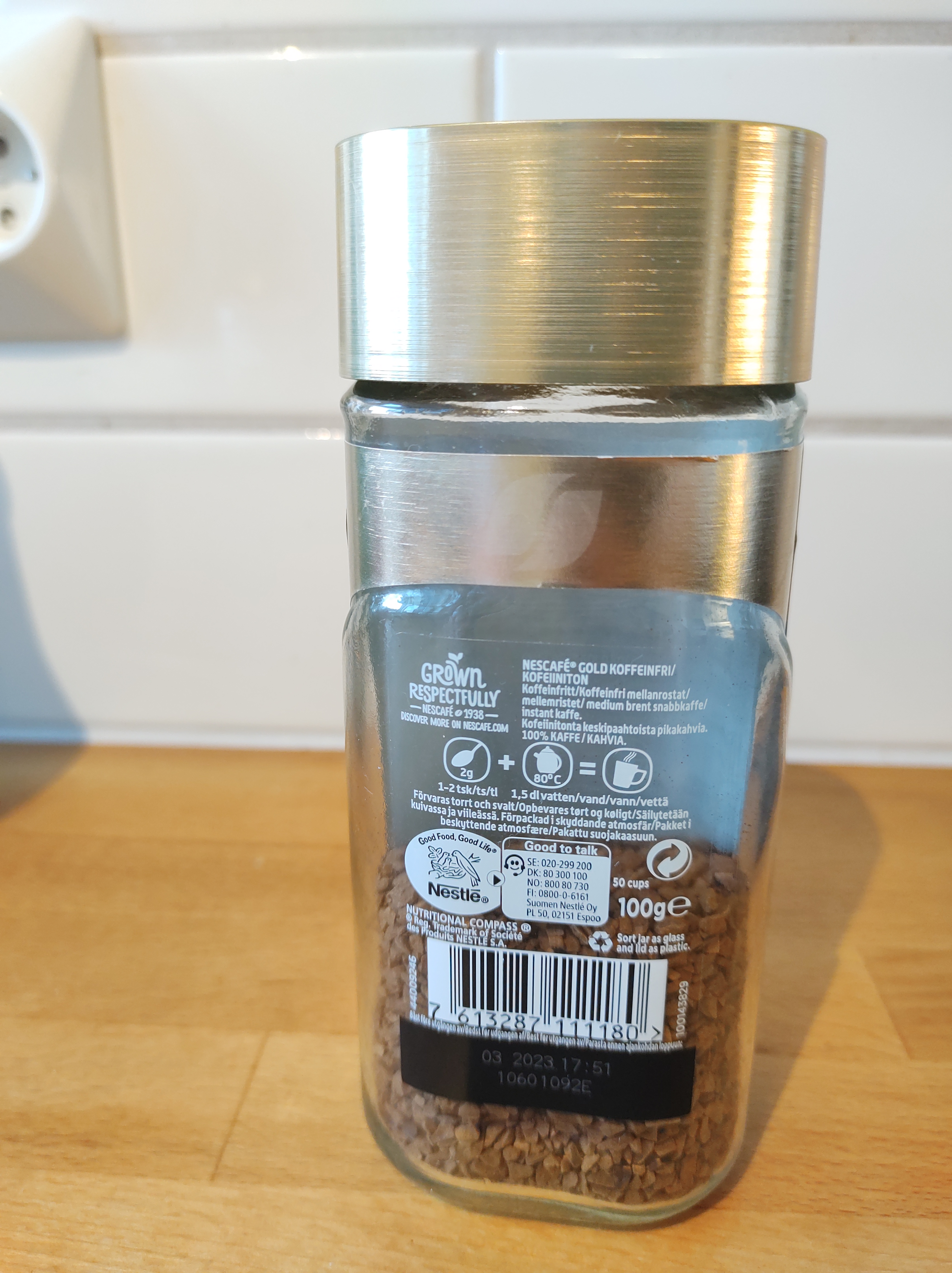
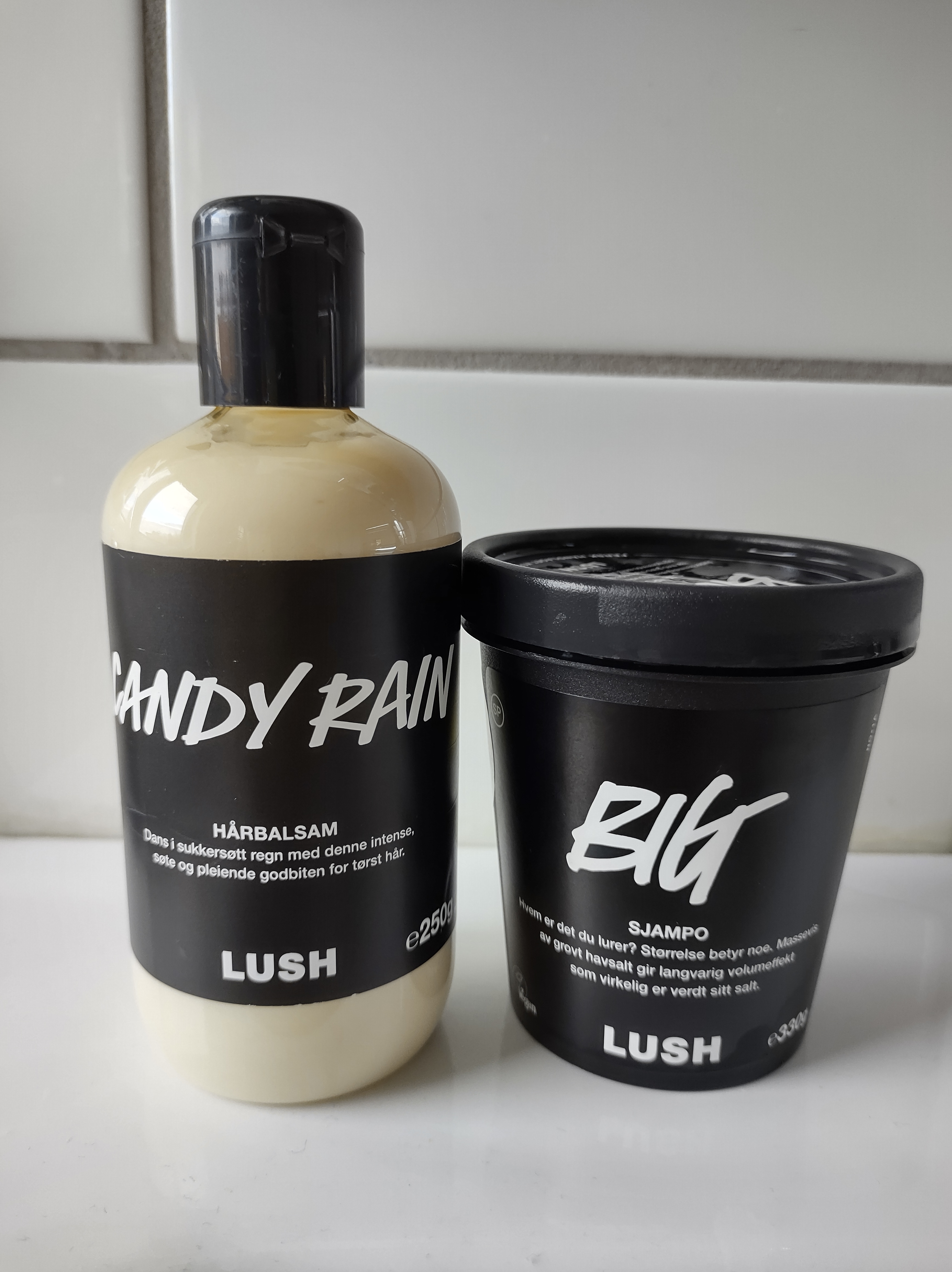
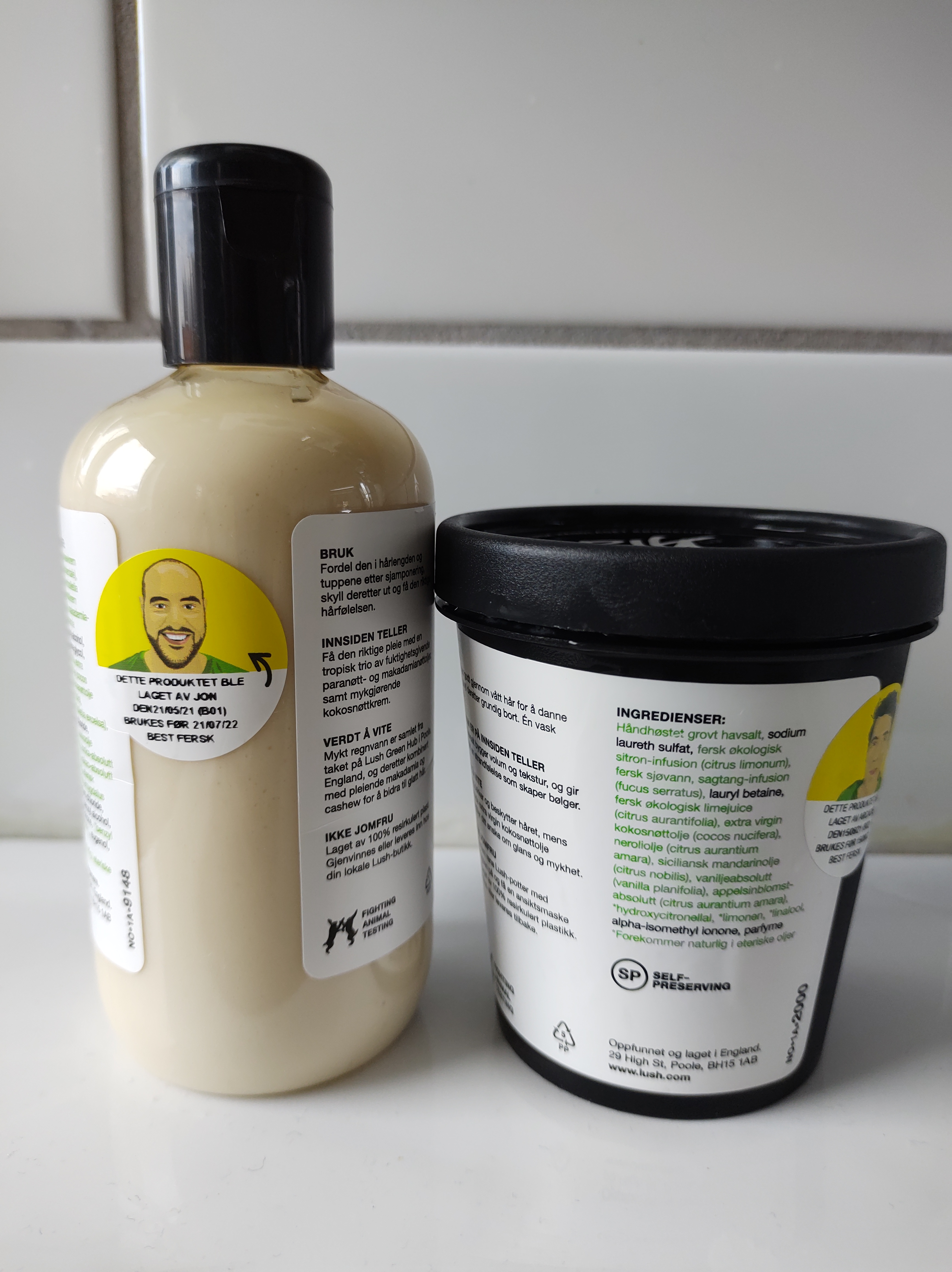
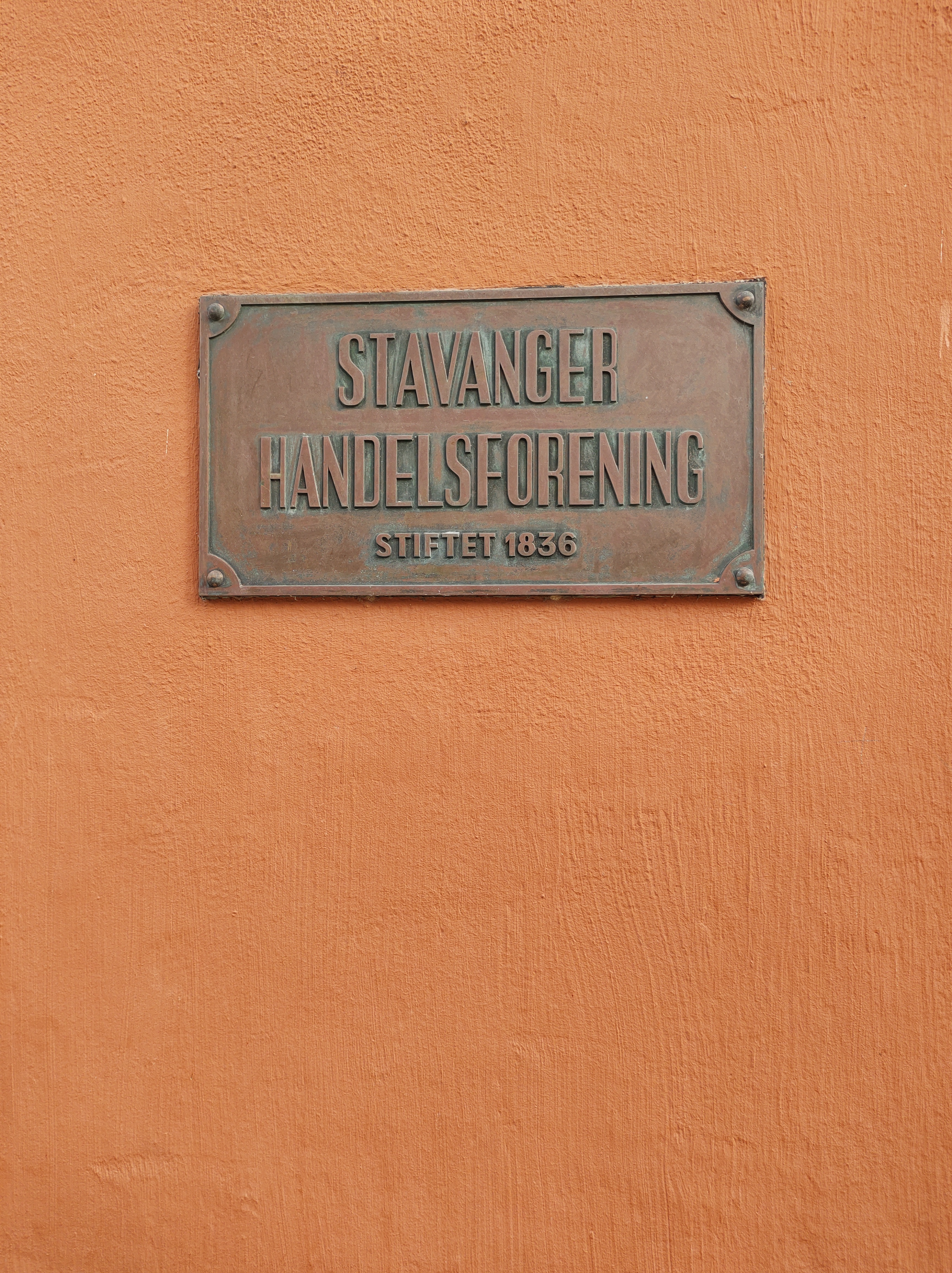
In our daily life, we are surrounded by typography that we often overlook. Thanks to this week’s lesson and learning assignment, I have paid closer attention to my surroundings and the typography of products, banners and signage in my home and around town. Here is a compilation of some of the pictures I took.
In the case of product packaging such as yoghurt, coffee, toothpaste and cosmetics, they often have a large typographic or lettering design on the front to catch the consumer’s attention and make the product more attractive. Secondary typeface adds a bit more information to it. There is a larger amount of text in a much smaller size on the back, which shows nutritional and/or ingredients information.
The information signs use symbols (pram, bicycle and arrows) and white, large and sans serif fonts on a dark background to transmit the message effectively.
Ads and commercial banners are meant to be seen, so they are huge, use mostly only very big fonts and have a lot of breathing room.
Choose two examples of design that you have collected that you consider to have either good or bad qualities. Try to analyse these further in terms of their typography. Can you identify the typefaces being used? Does the typography communicate successfully? If so, why? If not, why not?
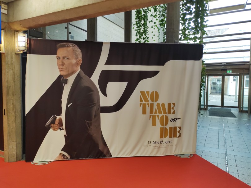
Movie advertising banner
At the cinema I found this advertising banner for the new James Bond movie. The font used for the logo is Futura ND Black, according to this article. The entire banner is black and white with the expection of the logo, which is golden. The picture of James Bond mimics the shape of the logo. The retro font works well with the theme of the film, as well as the colours and the dynamic text alignment.
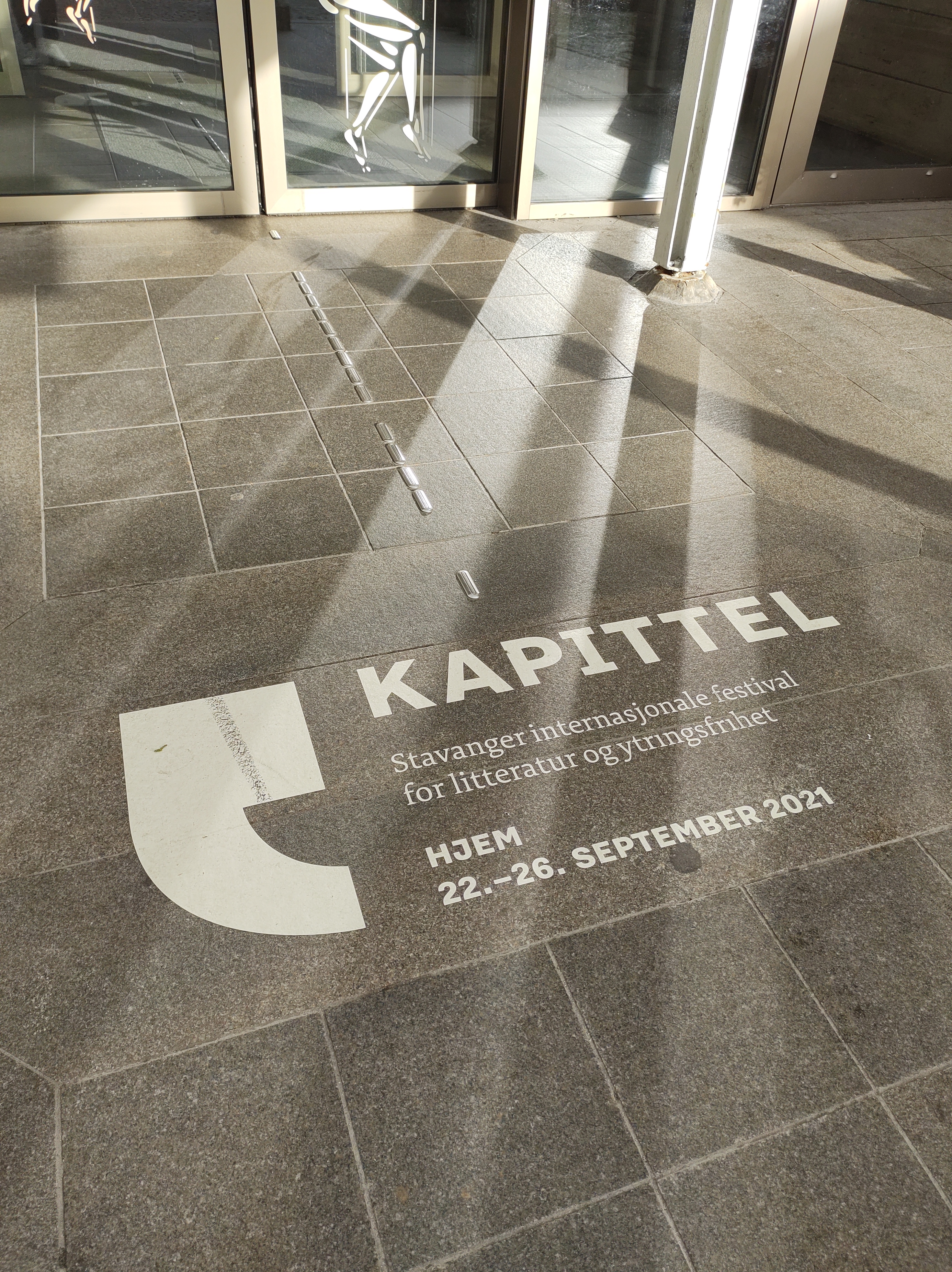
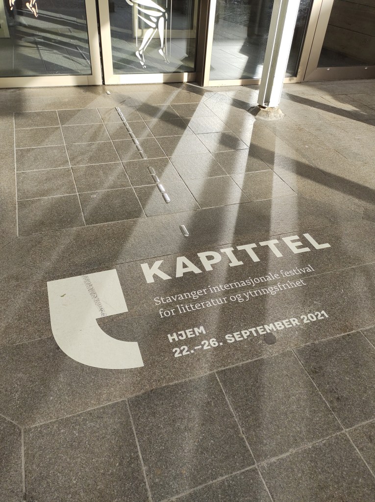
In order to promote Kapittel, Stavanger International Festival of Literature and Freedom of Speech, the local library and cultural centre drew the sign on the street floor at the entrance. This way, everyone who enters the building sees it. I think the typography is effective and communicates well. The sans serif font used for the name of the festival -Kapittel- is big and bold and catches the eye. I believe the same font, but in a smaller size is used at the bottom to indicate the dates. The text in the middle is secondary as it is a description of the event, for that the designers chose a serif which adds contrast to the design. Finally, a extra large quotation mark -which is also the festival’s logo- frames the text.
Question 3 – Practical assignment
Complete the exercise files that came with the LinkedIn video Indesign Typography. Upload them to WordPress.
I completed this course earlier in the program. I have rewatched some parts that I felt needed refreshing.
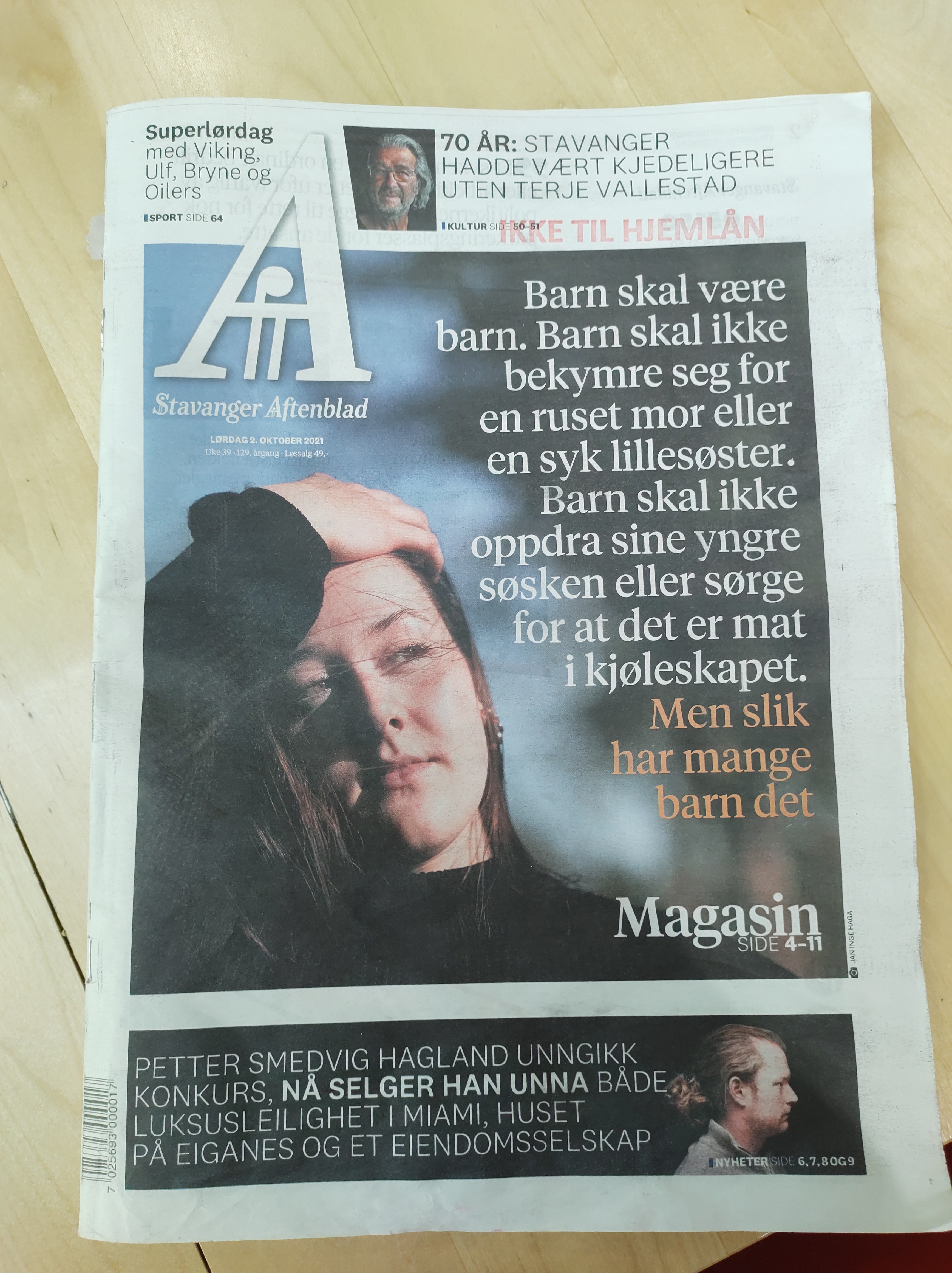
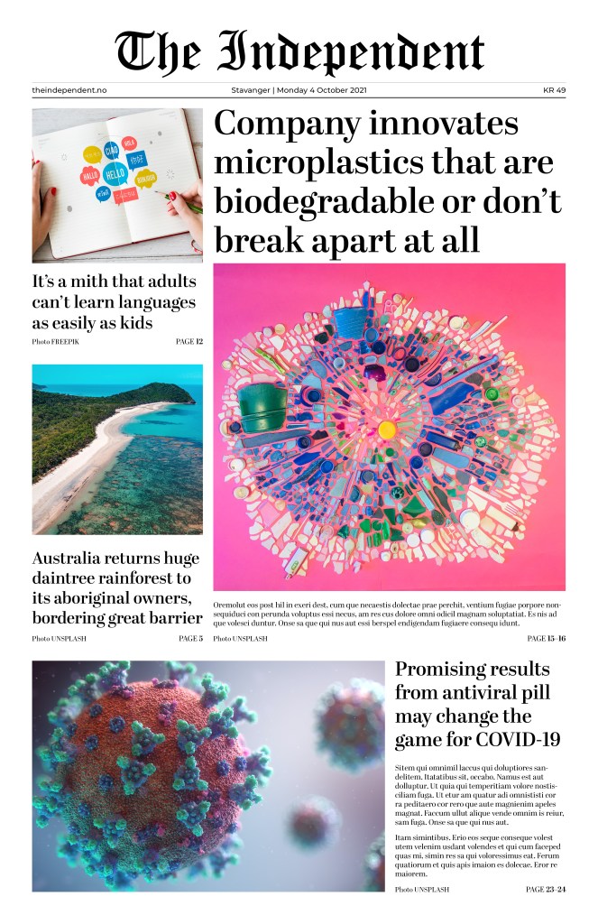
Use your design software to design a newspaper front page. Pay special attention to typography (size, leading, column width, etc.).
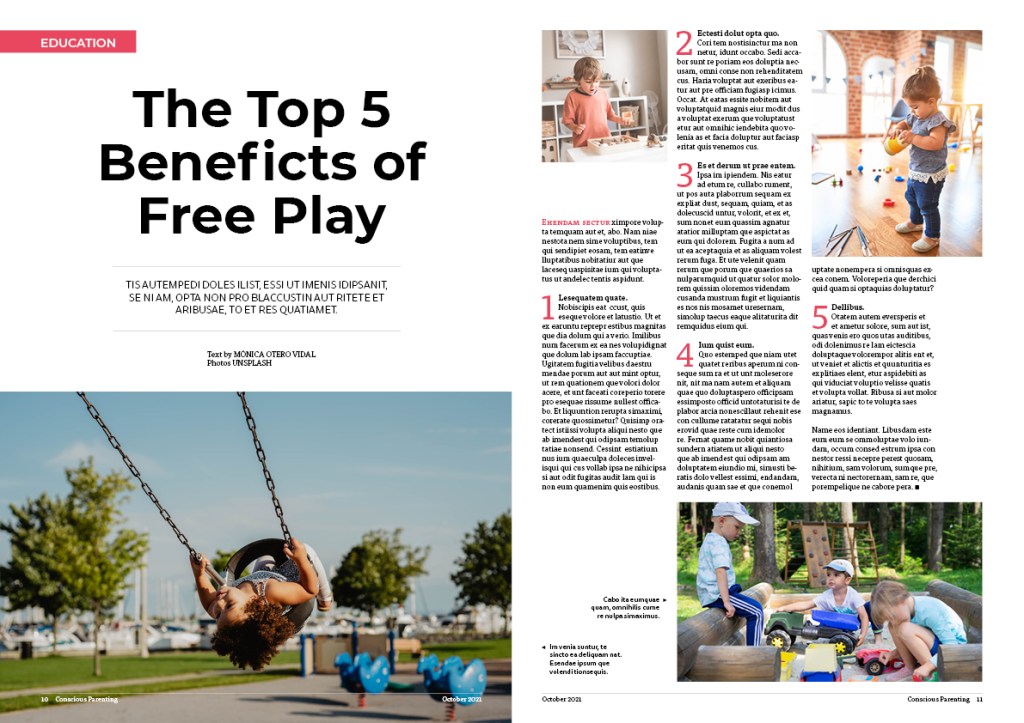
Use your design software to design a double-page spread (DPS) for your favourite magazine (look at an example of a DPS here)
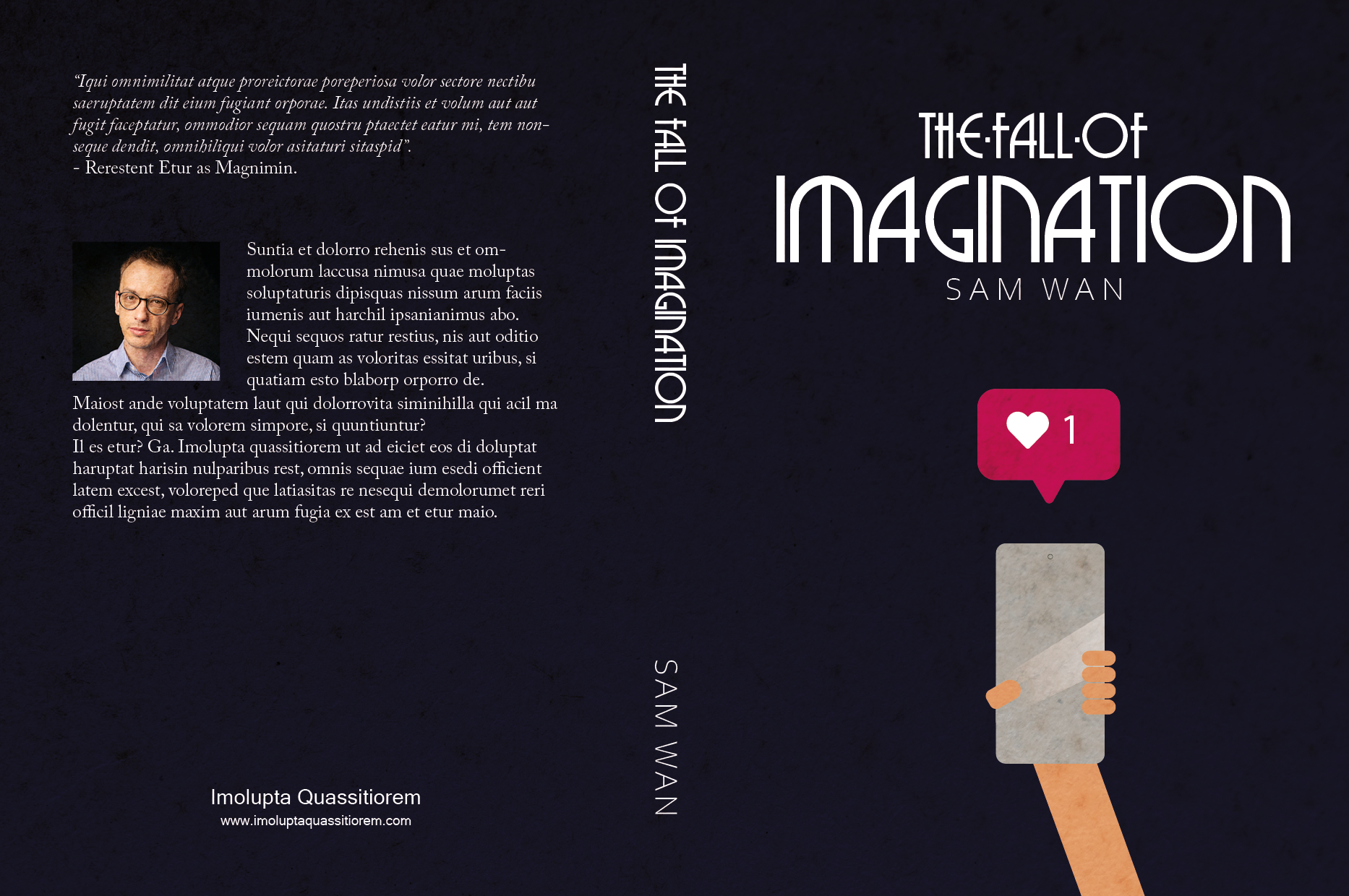
Design a book cover for a thriller book called “The Fall of Imagination” by Sam Wan. This book does not exist and is open to your interpretation as to the subject matter.
It must be designed by clearly drawing inspiration from a previous design style.
The size of the cover must be A5 and it should include a front, spine and back.
The cover must contain a simple vector illustration that forms the basis of the design.
The cover must contain the title and the name of the author.
Design an A4 poster for a humanitarian cause you feel passionate about. For example, creating awareness and a call for action against human trafficking. You must apply pastiche to your design. Use a style of propaganda used during the Modernism era and create your own, unique design in a contemporary context.
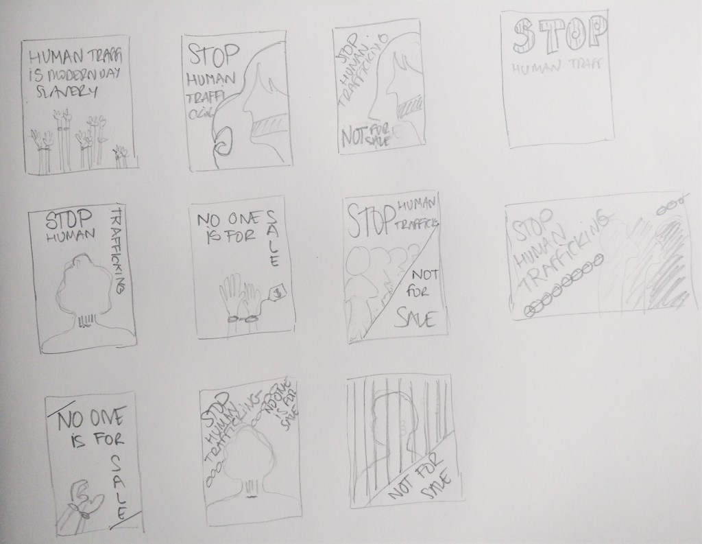
Start by creating at least 5 thumbnails for your design. These thumbnails should be handed in with your assignment.
Write a rationale or explanation for your poster of at least 350 words. Why it is necessary to create awareness of the humanitarian cause?
Give an explanation for your creative execution, mention the use of colour and graphics as well as typography.
Give examples of the designs you used as inspiration and why it is applicable to your design.
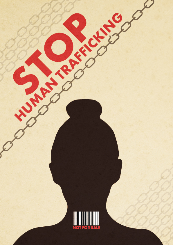
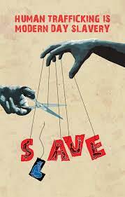
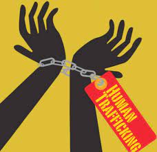
For this lesson task, I chose the humanitarian cause of human trafficking.
Thumbnails
The poster
According to the United Nations, Human Trafficking is the recruitment, transportation, transfer, harbouring or receipt of people through force, fraud or deception, with the aim of exploiting them for profit. Men, women and children of all ages and from all backgrounds can become victims of this crime, which occurs in every region of the world. The traffickers often use violence or fraudulent employment agencies and fake promises of education and job opportunities to trick and coerce their victims.
No matter where they come from, every person should be free; no one has the right to sell another person. Human Trafficking is a violation of Human Rights. It is modern-day slavery and must be stopped. We, as a society, need to find a solution to put an end to this inhumane practice.
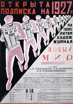
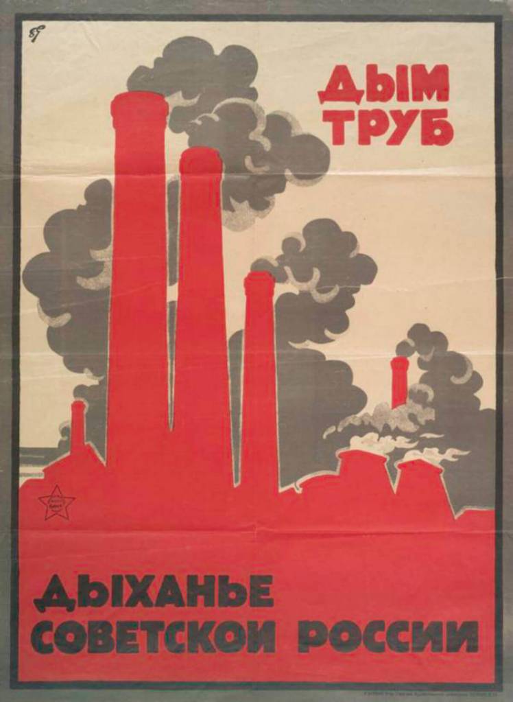
The silhouette on my design represents a victim of trafficking. The bar code on their neck depicts the person as a product that can be sold. Besides, many times, human trafficking victims are coerced into getting tattooed as a way to signify that they belong to a certain pimp/trafficker. A tattoo resembling a bar code has long been linked to human trafficking in Europe. Chains surround the person, and one of them -the darkest one- is breaking, expressing the need and hope to end this crime. The colour palette is inspired by the posters below, as well as the sans-serif bold typography.
Inspiration
To create this poster about human trafficking, I used inspiration from other propaganda posters from the Modernism era as well as from Post-modernist signs.
Q1 Practical assignment (observation and analysis)
Define, in your own words, the Bauhaus, De Stijl and Swiss Movements. For each of these movements: find examples from their eras, as well as current designs that are influenced by these styles. Explain in your own words how these designs were inspired by the movements.
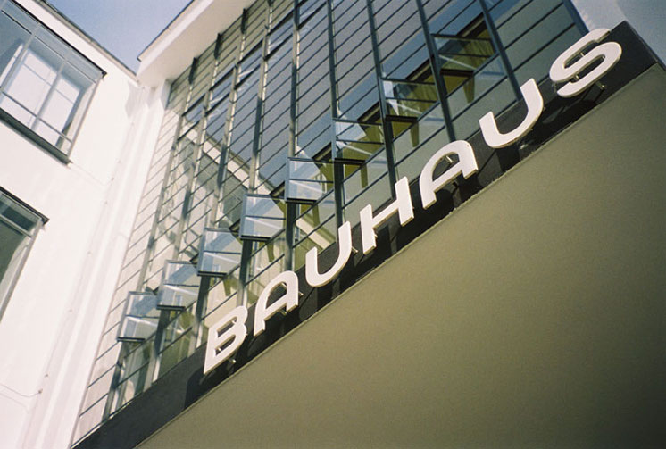
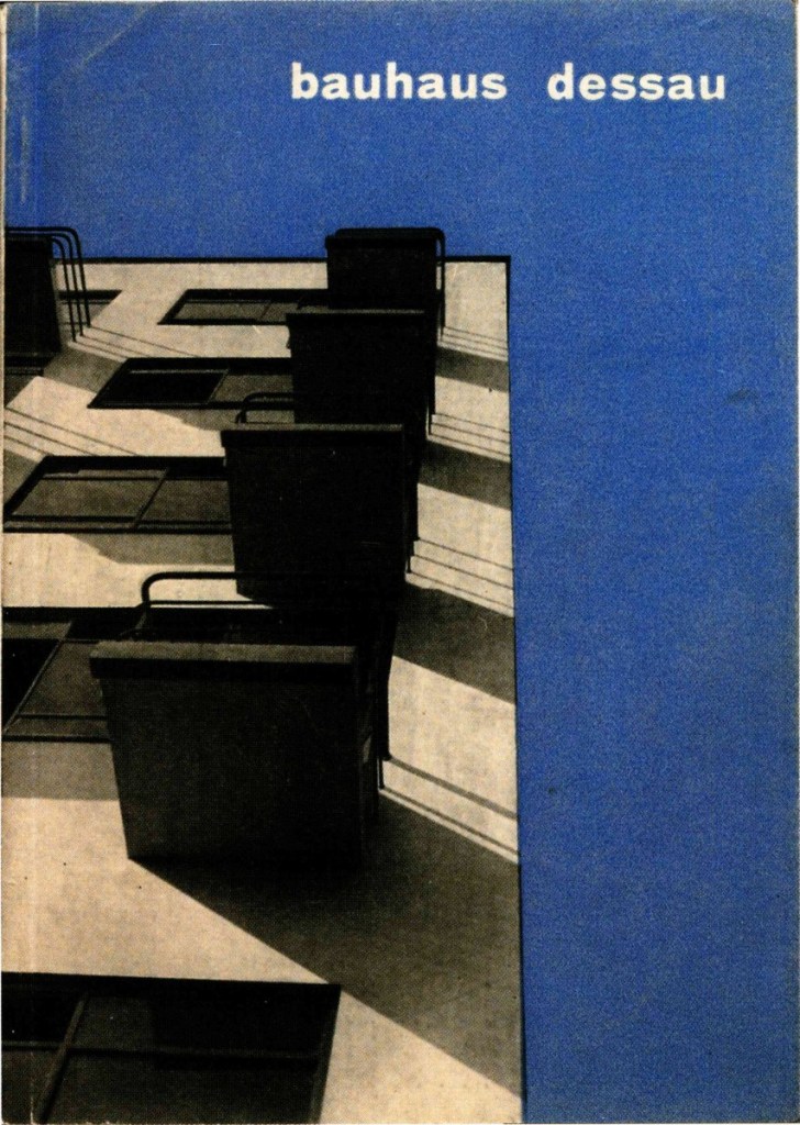
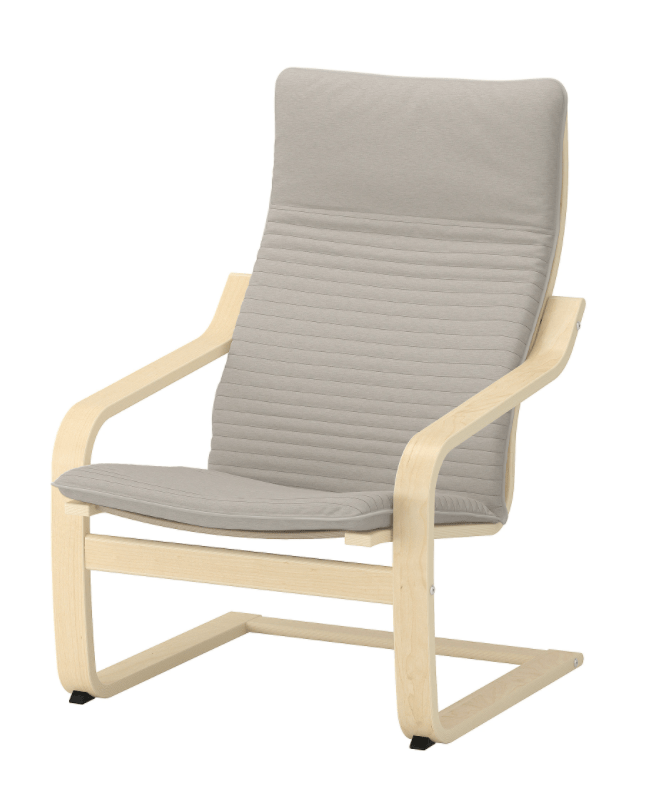
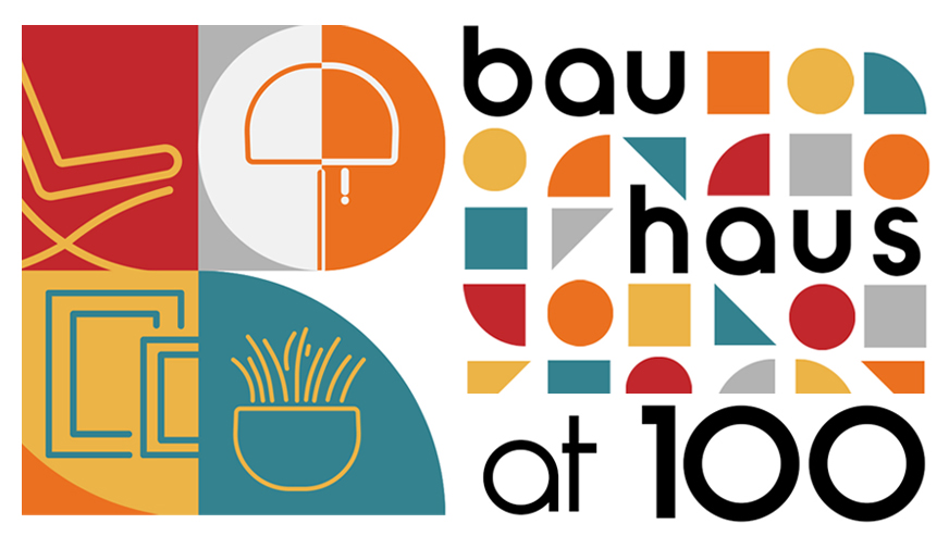
BAUHAUS
The Bauhaus was an art school that architect Walter Gropius established in Germany in 1919. It had a significant influence on the development of graphic design and the 20th century’s modern art. The Bauhaus favoured simplified forms, rationality, functionality and the idea that mass production could live in harmony with the artistic spirit of individuality. The school played a key role in developing the sans-serif typography, which they preferred because of its simplified geometric forms as an alternative to the heavily ornate German standard of blackletter typography. The Bauhaus replaced realistic drawings with photography and montage. Unfortunately, the school was forced to close its doors in 1933 due to pressure from the Nazi political party.
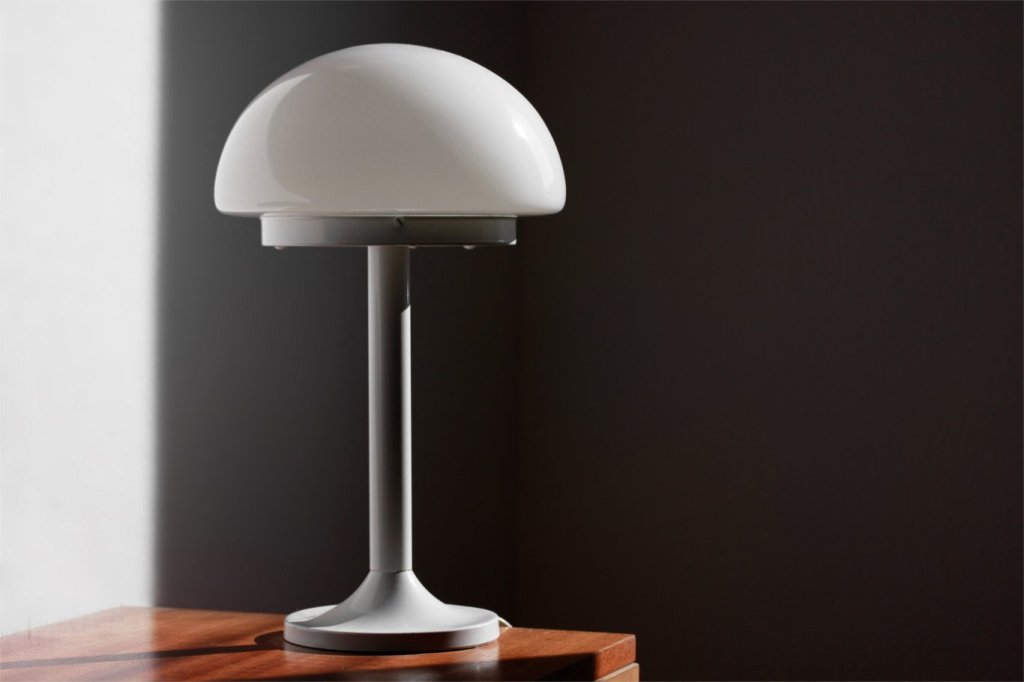
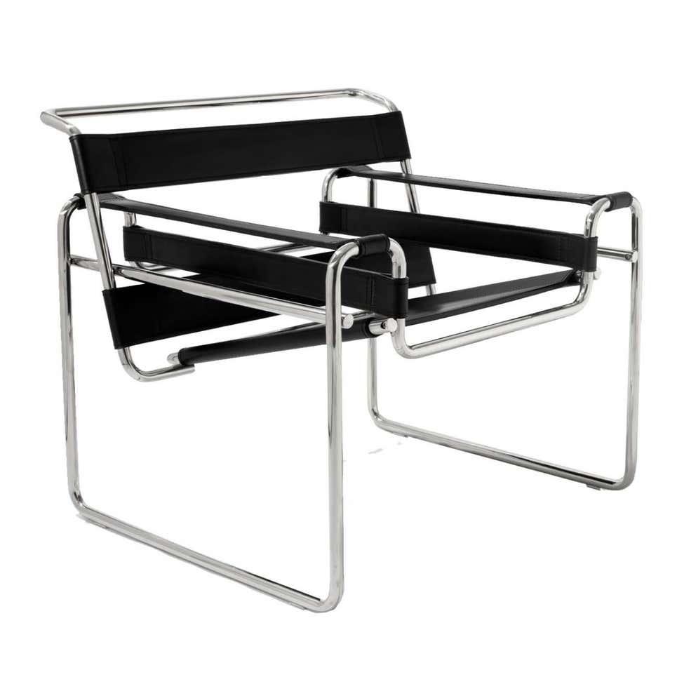
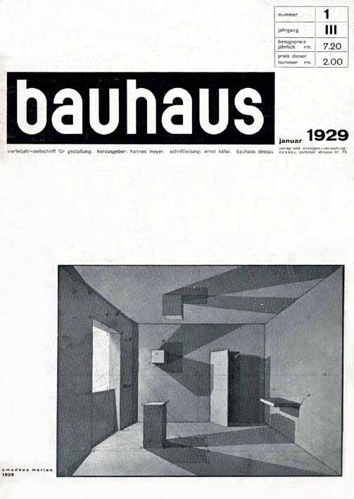
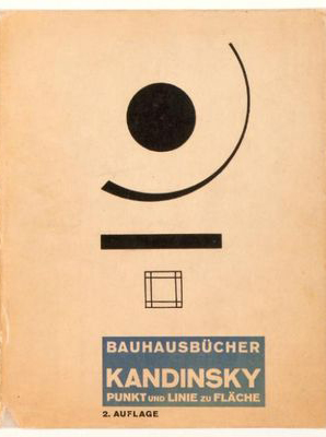
Designs from the era
Current designs inspired in the movement
The posters use simplified forms and sans-serif fonts. The chairs and lamp are functional and have a simplified, minimalistic style. All these are characteristics of the Bauhaus movement.
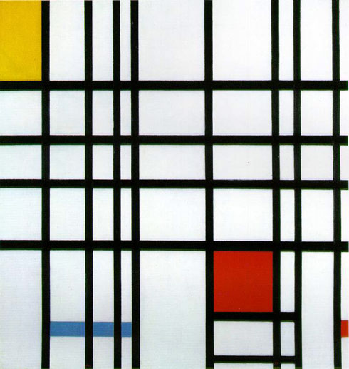
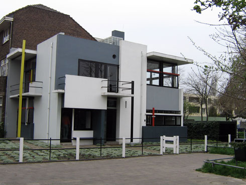
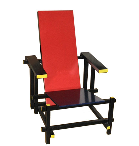
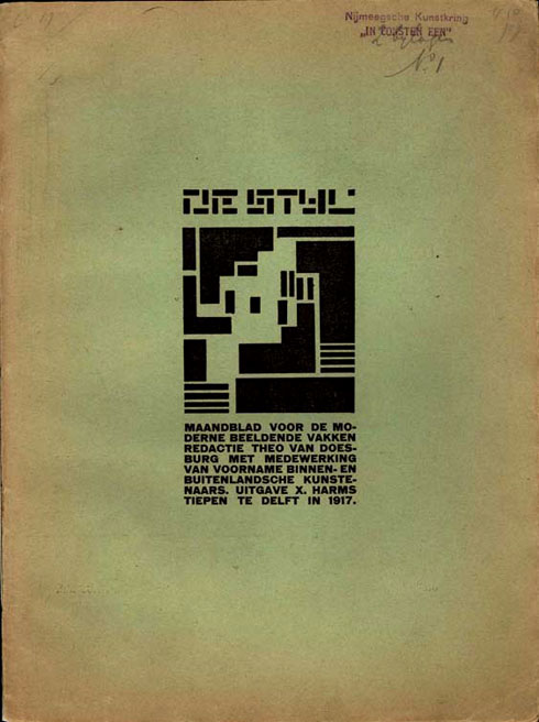
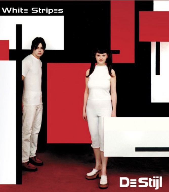
DE STIJL
De Stijl, Dutch for “The Style”, was a Dutch art movement founded in 1917 in the Netherlands. The group’s principal members were the painters Theo van Doesburg and Piet Mondrian, and the architect Gerrit Reitveld. Through simplicity and abstraction, the movement developed a utopian style of harmony and order. All De Stijl design was based on the rectangle and the use of black, white, grey and the primary colours.
De Stijl was also a magazine edited from 1917 to 1931 by Doesburg that gathered the group’s ideas and theories. This publication and the ideas of reduction of form and colour are major influences on graphic design development.
Designs from the era
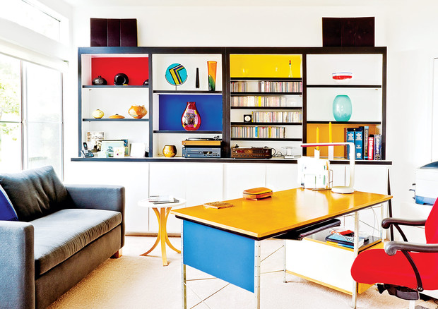
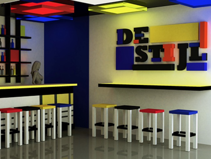
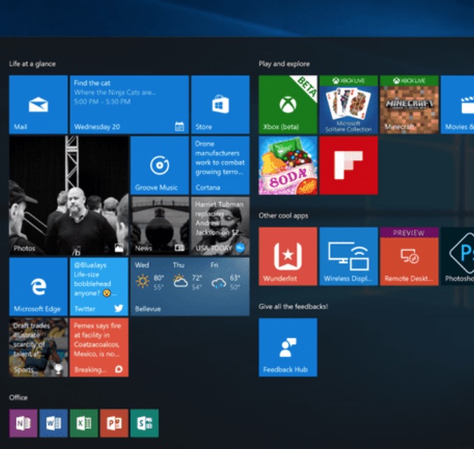
Current designs inspired in the movement
The use of colour in these examples – black, white and primary colours – is evidently inspired by De Stijl. The forms are rectangle and very simplified giving a sense or order. Web design and other user interfaces such as Windows Start Menu are influenced by this movement.
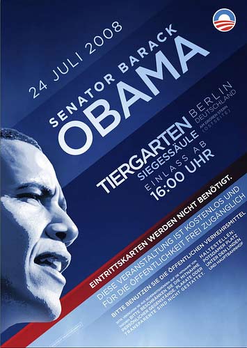
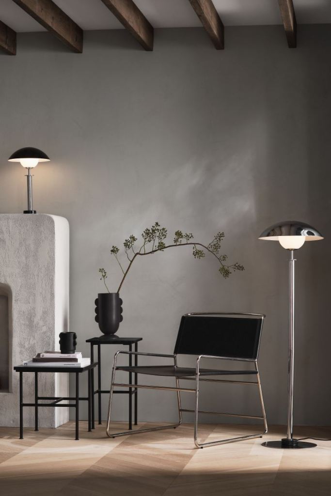
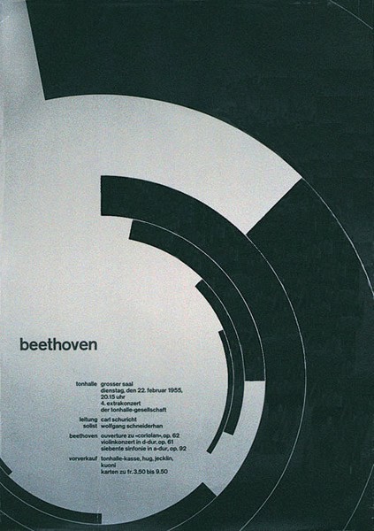
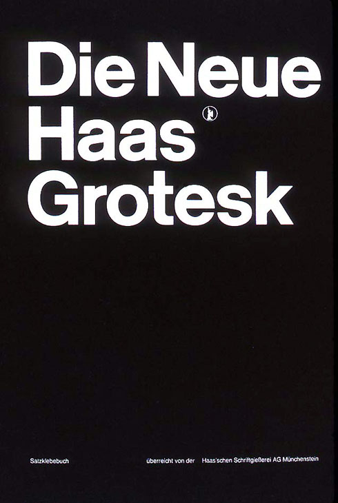
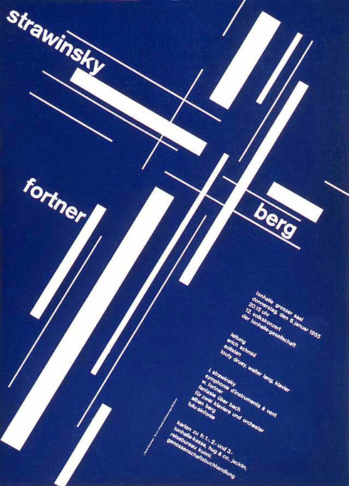
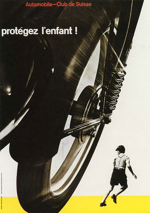
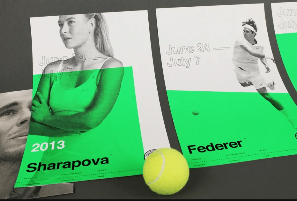
SWISS DESIGN
Swiss design, or International Style of Typography, originated in Switzerland in the 1940s and 50s and significantly influenced graphic design development during the mid 20th century. The movement took hold in two Swiss art schools, the School of Arts and Crafts in Zurich, led by Josef Müller-Brockmann, and the School of Design in Basel, led by Armin Hofmann. The characteristics of this style are object photography, sans-serif typography, lack of ornamentation, grids and asymmetrical layouts. The primary influential works were developed as posters, which were seen as the most effective means of communication.
Designs from the era
Current designs inspired in the movement
These contemporary examples play with object photography and sans-serif typography. They use grids and asymmetric layouts typical of the Swiss Design movement.
Q2 Research, written & practical assignment (problem solving)
Look at the history timeline at the beginning of this lesson. Gather information from 1900 – 2000, and design your own timeline using the Swiss Design Style as your theme. Each movement should be described in a creative way.
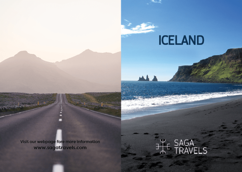
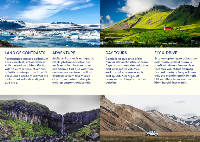
Using InDesign, design a 4-page brochure for a fictitious travel agent.
The size of the brochure should be A5 (when it is folded).
Design the brochure in full colour.
Use fake body copy, but create sensible headings.
Use titles, headings and images of your choice.
Be sure to pay attention to:
Choice of type
Choice of imagery
Use of layout and grid to communicate the content
Back and front of the brochure
Left and right inside pages
Saga Travels is a fictitious travel agent that offers trips to Iceland. This is the first brochure I design in InDesign, and there are things to improve, but in general, I’m satisfied with the result.
Compare the design (in terms of pace and contrast) of an online magazine, blog or website to that of a printed magazine, book or journal. What differences can you see between the kinds of design strategies used in the two formats?
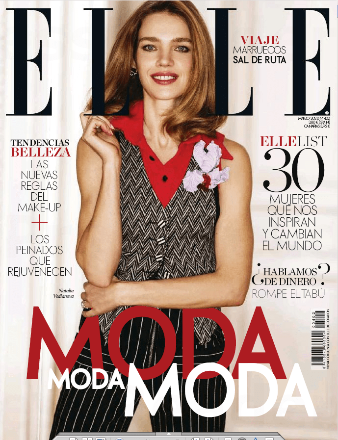
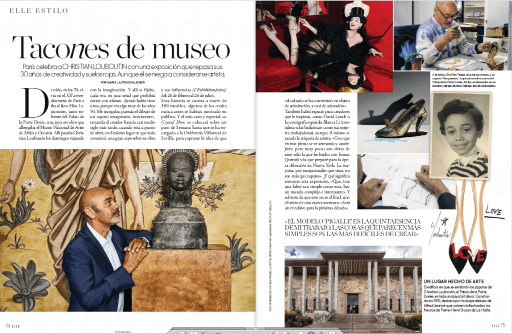
For this Learning activity, I’m going to compare the Spanish edition of Elle magazine, March 2020, both their printed and online versions.
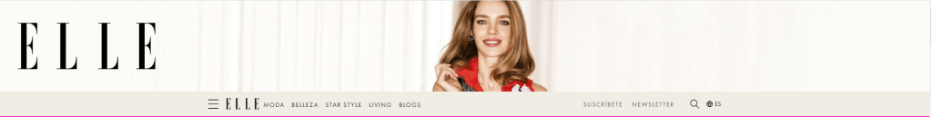
Cover of the printed magazine
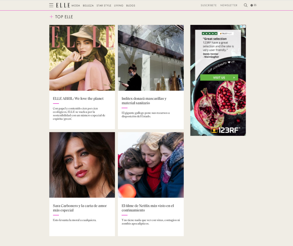
Home page of the online version
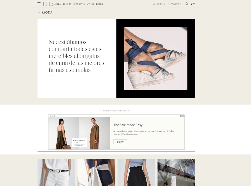
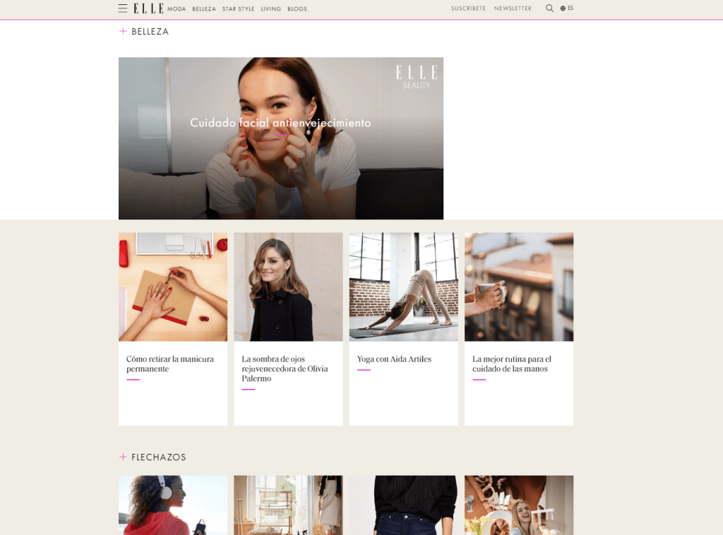
The cover of the printed version uses one big photo that can also be seen on the homepage header of the online magazine. The logo is present in both versions as well. On the printed cover, the designer has used a combination of typefaces -serif and sans-serif- to catch the attention of the reader. The online magazine also uses a mix of serif and sans-serif typefaces and similar colors as the printed one. The difference is, of course, that the web version is interactive, and the information can be presented differently. There is a menu just below the header with some fixed categories that the reader can click to get to the desired information. If we scroll down the main page, we see the same categories with some of their content, showed in a grid design with pictures and the title of the article they link to.
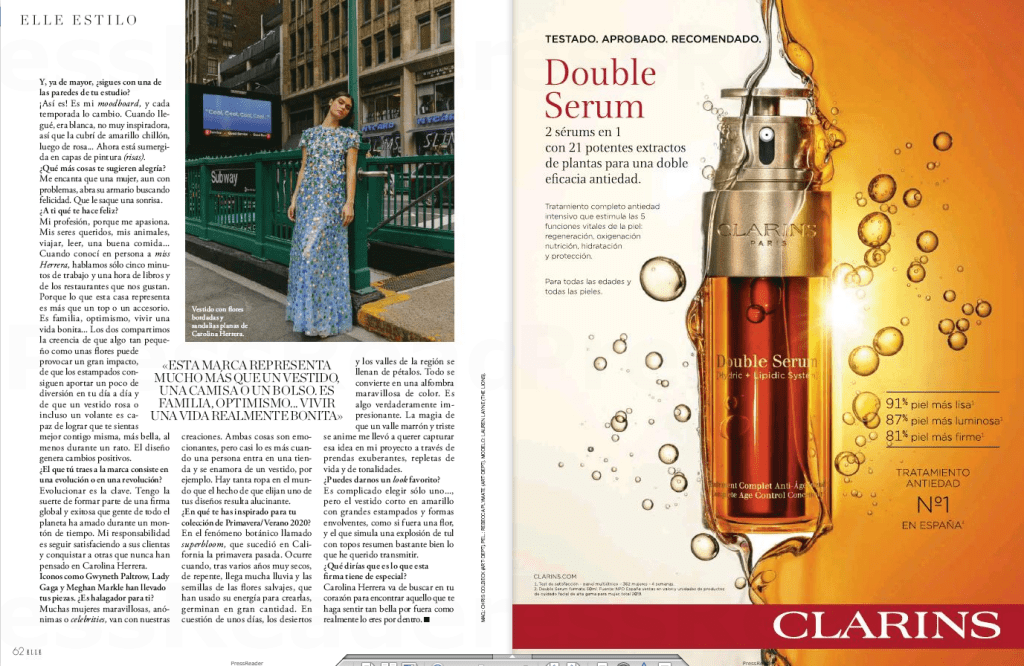
Printed spreads
Online article
The design for the printed magazine has a lot of pictures to make the read easier and more dynamic, and so does the online one. The difference lies in the way the text and photos are distributed in the article. In the images above, I show the same story in both paper and online. In the printed one, the designer uses a 3-column grid where they add large pictures, some even taking a whole page. The web article, on the other hand, has a unique column, and the photos are inserted in between the lines, more like a blog post, since the reader will scroll down to read the piece rather than turn the pages on a more traditional magazine.
The way a reader navigates a magazine is very different for printed and web, and it is essential, as a designer, to consider that aspect when designing the layout and the way the information will be presented.
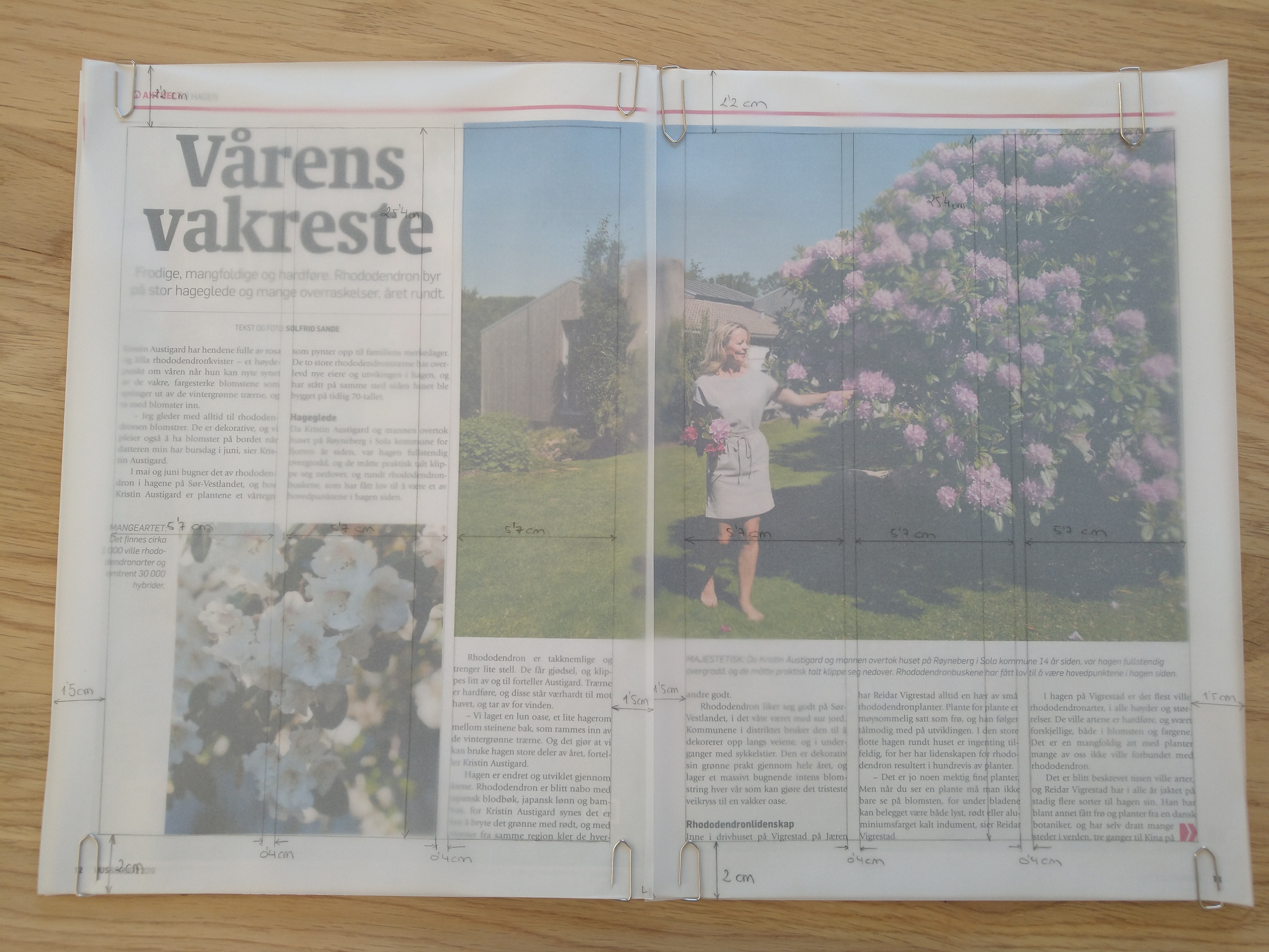
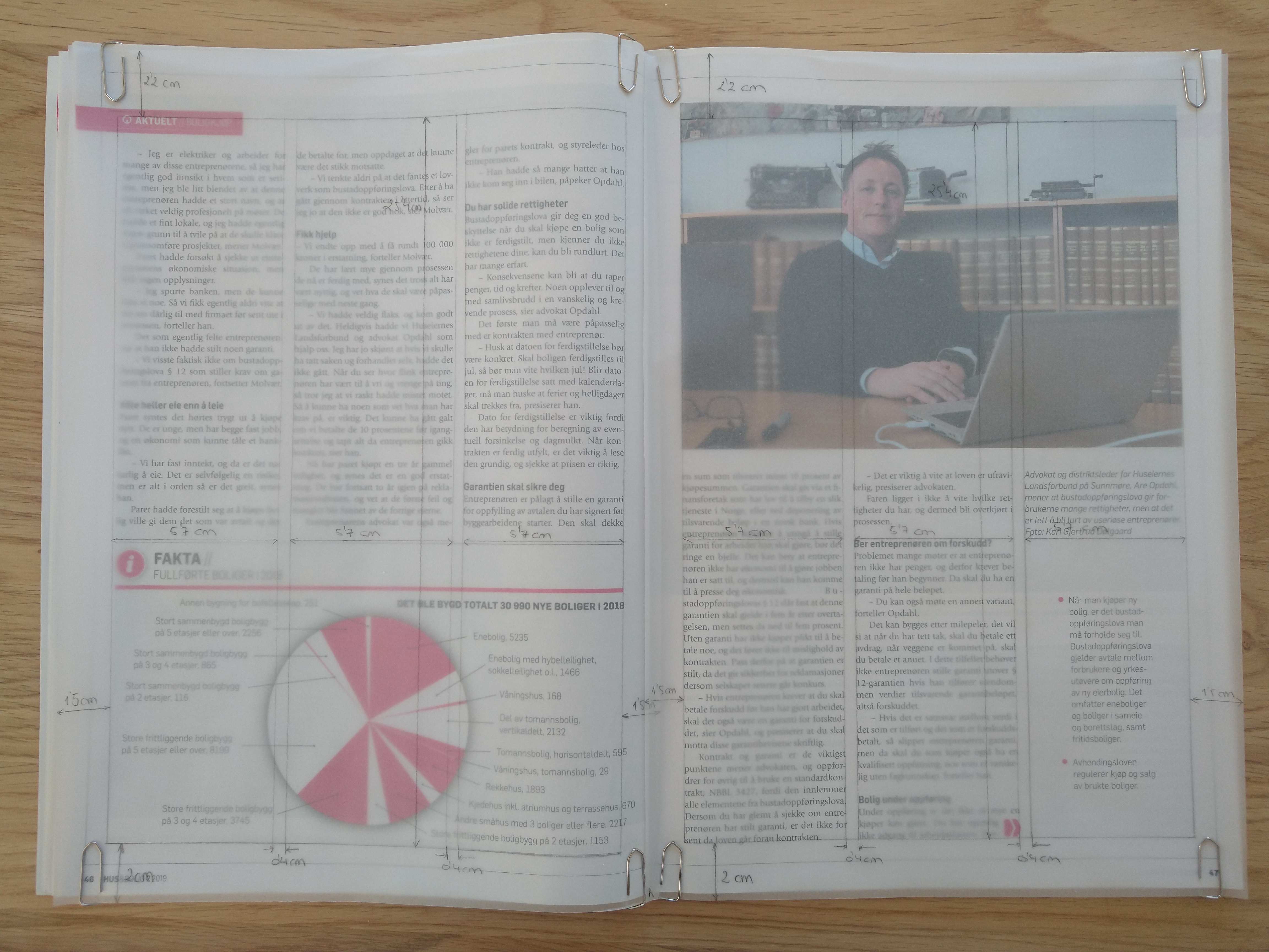
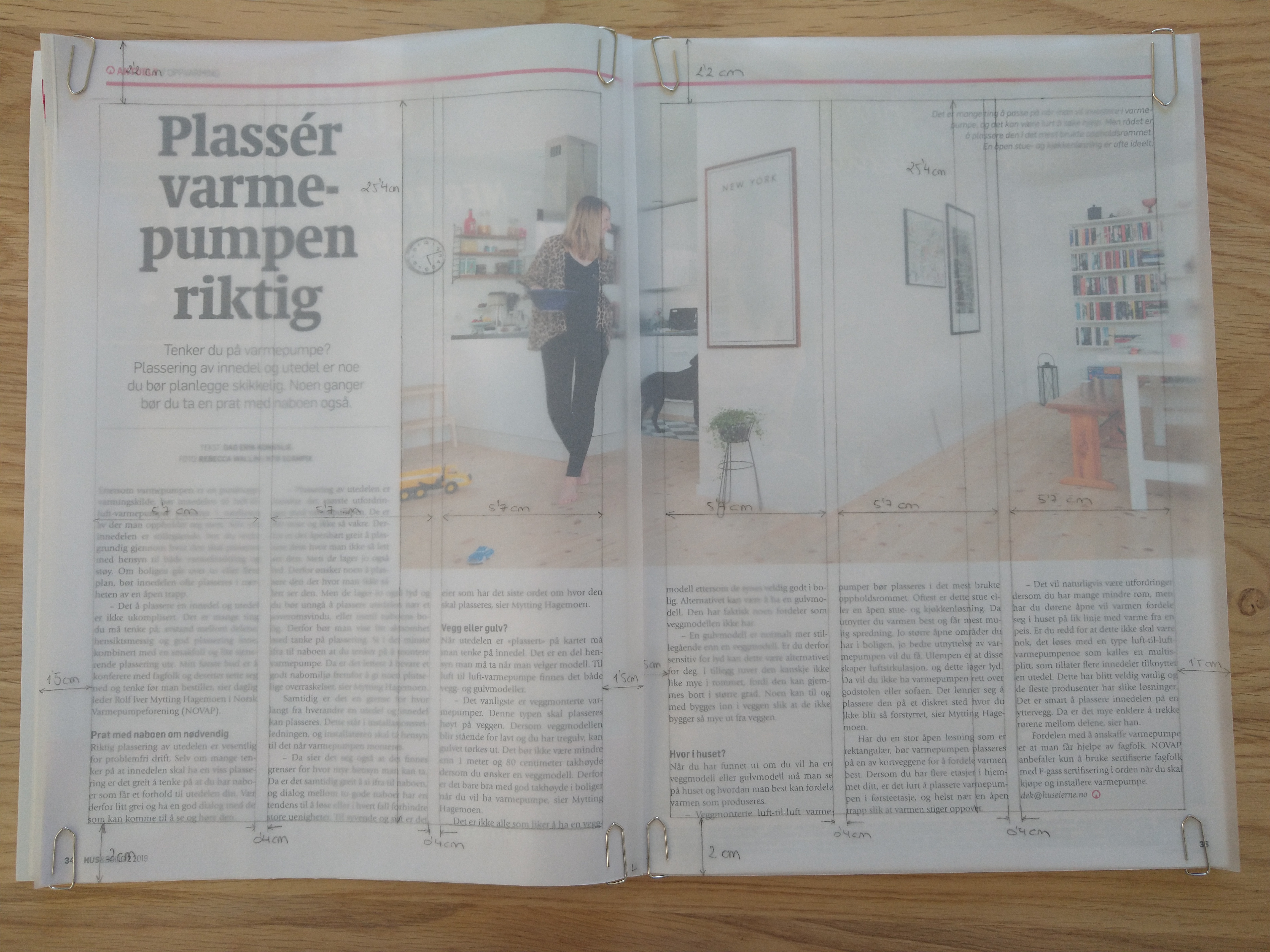
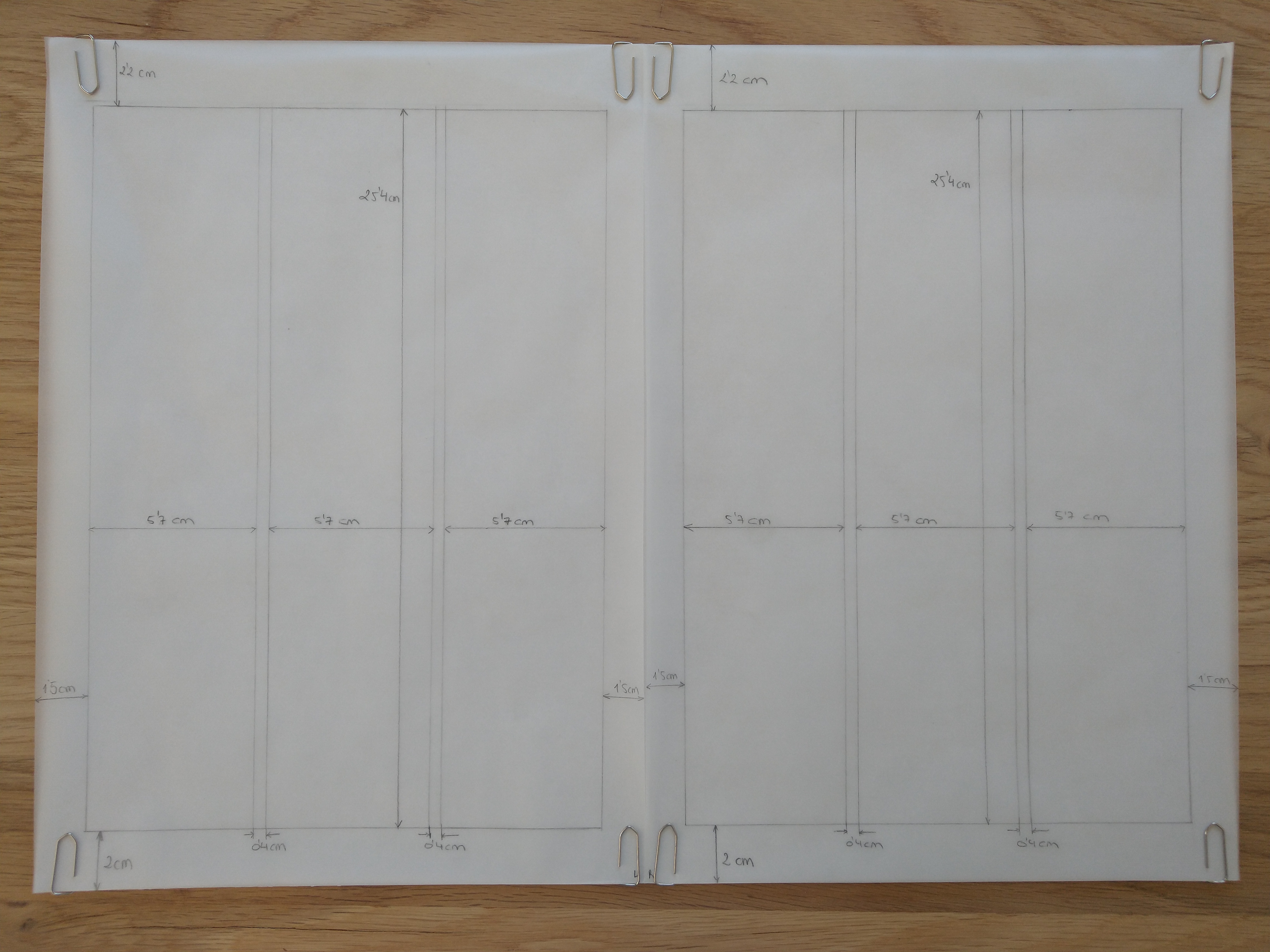
Take a magazine, newspaper or book that includes images and text. Lay tracing paper over the top of three spreads (both left-hand and right-hand pages). Using a pencil and ruler, carefully trace the grid underlying the page layouts. Remember to remove specific text elements or images, and to only draw the grid lines. Note column widths and margin sizes at the top, bottom, and to the left and right of the main body of text. Is your document based on a two-column, three-column, or another type of grid? Which elements stay the same on each page, and which change?
I decided to use the magazine Hus & Bolig. The three spreads I chose are based on a three-column grid, like most of the pages in the magazine. All the pages selected have a mid-range amount of text, which works well with this type of grid. All three spreads have large images/graphics; the first and the last one have an asymmetric distribution between picture and text, while the second one is symmetrically divided.
Column width: 5,7 cm Column hight: 25,4 cm Top margin: 2,2 cm Bottom margin: 2 cm Left margin: 1,5 cm Right margin: 1,5 cm Gutter: 0,4 cm
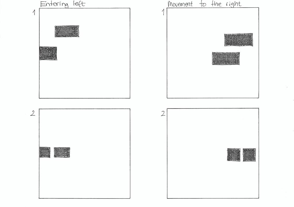
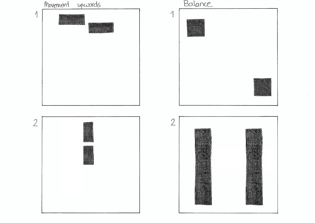
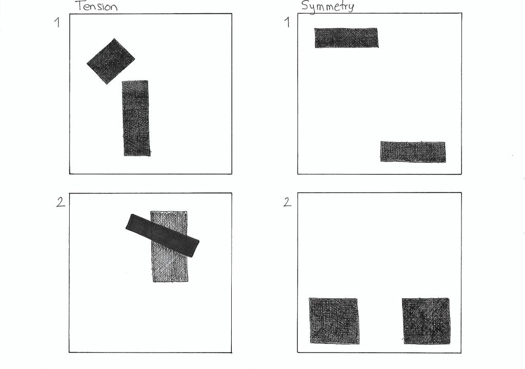
On five A4 landscape pages, I had to draw four equal squares in each. Then, I draw one or two squares or rectangles in each of the empty squares to achieve the following visual effects:
Entering left
Movement to the right
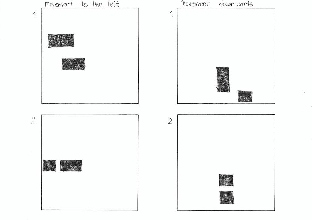
Movement to the left
Movement downwards
Movement upwards
Balance
Tension
Symmetry/asymmetry
Entering left The rectangles placed close to the left end of the square gives the impression that they are entering the page on the left side. The fact that the rectangle closest to the edge is only partially shown helps enforce that effect.
Movement to the right Placing both pieces on the right side of the square gives the impression that they are moving to the right. It doesn’t affect if I use squares or rectangles.
Movement to the left In the same way, placing the squares or rectangles on the left side of the page suggests movement to the left.
Movement downwards In order to show the effect of movement downwards, I decided to place the squares and/or rectangles close to the bottom of the big square.
Movement upwards Placing two rectangles on the top of the square gives the illusion that they are moving upwards. It works if the blocks are in line or in parallel paths.
Balance Two squares with the same size placed in opposite corners of the page suggest balance. The same happens with two equally sized rectangles on each side of the square.
Tension In the first drawing, the small rectangle is place in such a manner that seems as it was about to fall, creating tension. In the second example, the contrast of shape, color and orientation, as well as the fact that one is place on top of the other also creates tension.
Symmetry Two equally large shapes mirrored to each other create symmetry.
Asymmetry The different sizes and shapes in the first example create asymmetry. In the second drawing, even though the squares are the same size, they are not mirrored to each other, which makes them asymmetric.