Have a look at all the tasks and lessons you have done over the last few weeks. Your task now is to make a cover (a front page) for your very own magazine.
Go through the Graphic Design history timeline and choose a style and designer that you feel relates best to your personality.
Using that designer/style as inspiration, use your name or part of your name and create a title/name for your magazine. Feel free to be creative!
Add your own pictures, text, illustrations, elements as well as the proper typography and titles for your cover.
The expression must represent your personality (remember the color choice regarding this).
Remember to include what kind of magazine it is, for example cars/bikes, fashion, design, weddings, etc.
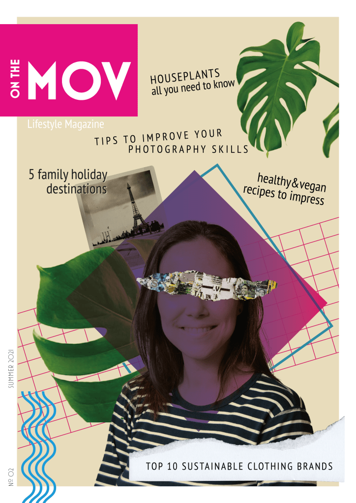
This magazine cover is inspired by the New Wave movement. New Wave designers rejected the order and cleanliness of the Swiss grid-locked design and typography, experimented and broke the rules. I find it fascinating how different elements with apparently nothing in common can work together to form exciting and beautiful compositions. I recently came across Carly Guppy’s work. She creates collage art and mixed media pieces inspired by vintage photographs, found papers and patterns, plants and animals. Her art was an inspiration for this task too.
I initially named the magazine “On the Move”, but my teacher suggested dropping the E, as this more ‘rebellious’ spelling is in line with the style, and people would still be able to read it. MOV are my initials (Mónica Otero Vidal).
The main picture is a self-portrait I took last semester with the use of a tripod and timer. I integrated it in the collage, with other stock images and graphic elements using illustrator. Blue, purple and green are my favourite colours, that is what I chose them. Both the photos and the articles describe me in a way, as I love plants, healthy and plant-based eating, photography and enjoying time with my family.
Question 2
Post your final design on the forum (Lessons and Activities forum) for comments from your tutor. Remember to include what your inspiration was (designer/style from the Graphic Design timeline). Discuss the results with your fellow students (your group) on the forum.
Explain shortly how you perceive your group members through their covers.
Do they see your personality through your cover, too?
Make a short comment if you feel they’ve nailed it!
I posted my cover in the forum and got feedback and guidance from my tutor, which helped me refine the design.
There are not many students in my group, so I also checked the covers in other groups. It was fun to see the different approaches for the same assignment.
Question 1 – Written assignment (observation and analysis)
Define the term “typography” in your own words
Write a few sentences explaining what typography is not
Typography is the study of how letterforms interact on a surface directly relating to how the type will be set when it eventually goes to press. As Gerrit Noordzij put it, typography is writing with prefabricated characters. The arrangement of letters, words and other visual material can be collected and duplicated as many times as needed.
Typography does not involve producing letters uniquely by hand or tool. It is not handwritting, lettering, carving letters, sign writing or graffiti. However, letters produced in these ways can inspire a designer to create a new typeface.
Find a case study on typeface development on the Internet (similar to the ones in Addendum A). Explain which medium (small format printing, large format printing, mobile devices, etc.) the font developed is best suited for and why. Keep legibility, size and style in mind.
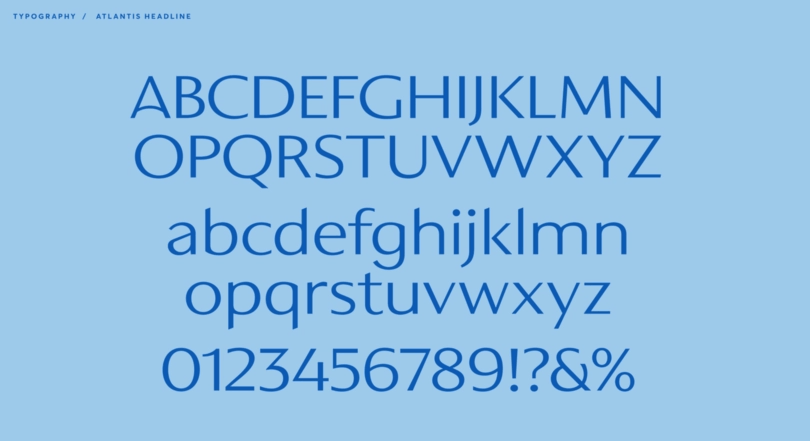
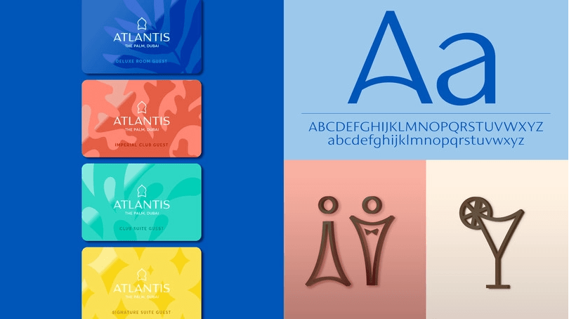
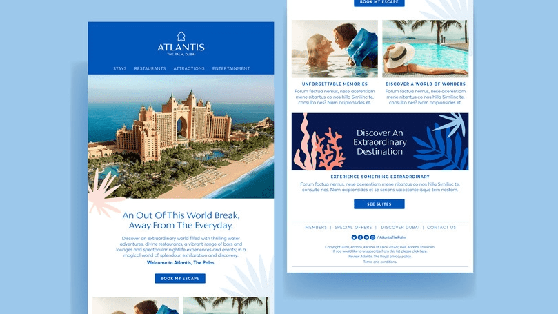
I found a case study on A new brand identity for Atlantis Resorts by Monotype.
The Resort wanted to unify their visual brand across all their properties, modernised their original typography and logo and give the brand a fresh look, but that also captured their mission to be extraordinary in everything that they do. The brand is fun, creative and experiential, which they wanted to be reflected in their trademark and branding.
The new custom typeface has distinctive letters inspired by middle eastern cultures and Arabic calligraphy. The designers were asked to create a caps only headline font. They had to be mindful of how the fonts were going to be used in signage and in-turn signage manufacturing limitations. The letterforms would be cut form steel in a range of sizes so they balanced the weights and ran tests to avoid letter strokes that were too thin. As the brand identity grew, the typeface was expanded into a full Latin character set of upper and lowercase with a view to creating continuity across the Atlantis brand.
The typeface was initially designed to be used in the logo and the resort signage. Its open proportions make it suitable for such use. A tall x-height enhances clarity and legibility, so it also works in body text used in both printing and web.
Question 2 – Research and written assignment (observation and analysis)
Document one day of your life acting as an observer of typographic design. Produce a comprehensive diary of the typographic experience of your day from first thing in the morning to last thing at night.
Keep this diary within a research folder or sketchbook. You should be prepared to use photography, photocopying and other means where necessary to evidence what you find, as well as collecting first-hand examples of typographic design.
Make notes or comments to reflect on what you have collected and documented. Your notes should help you to consider what kind of design it is that you are recording. For example, a cereal packet may have some large obvious lettering / typographic device on the front of the box, but there will also be typography in the form of information design within a “nutritional information” table on the packaging. So are you looking at promotional design/branding or information design? Or are you looking at typography? Is it lettering?
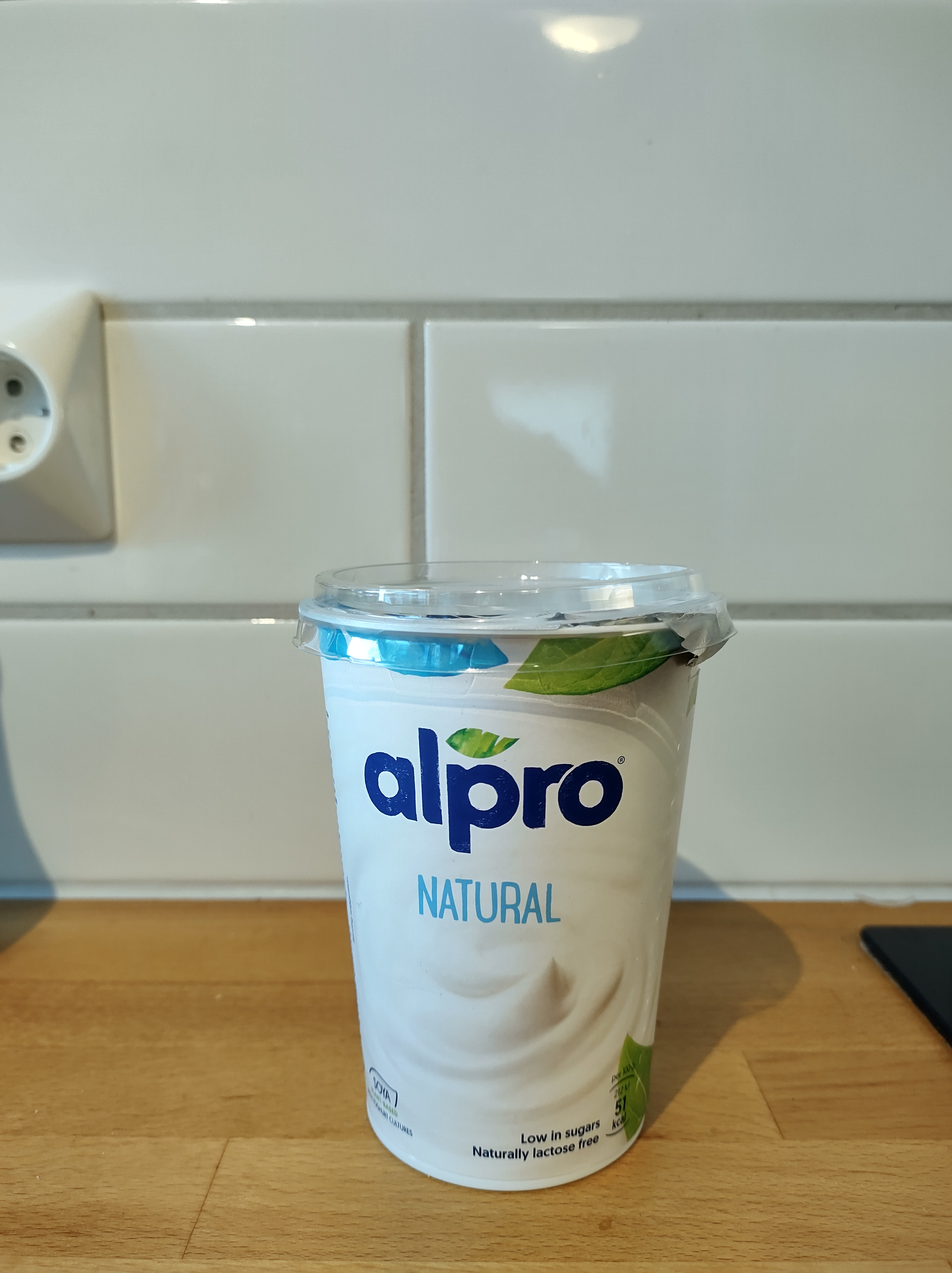
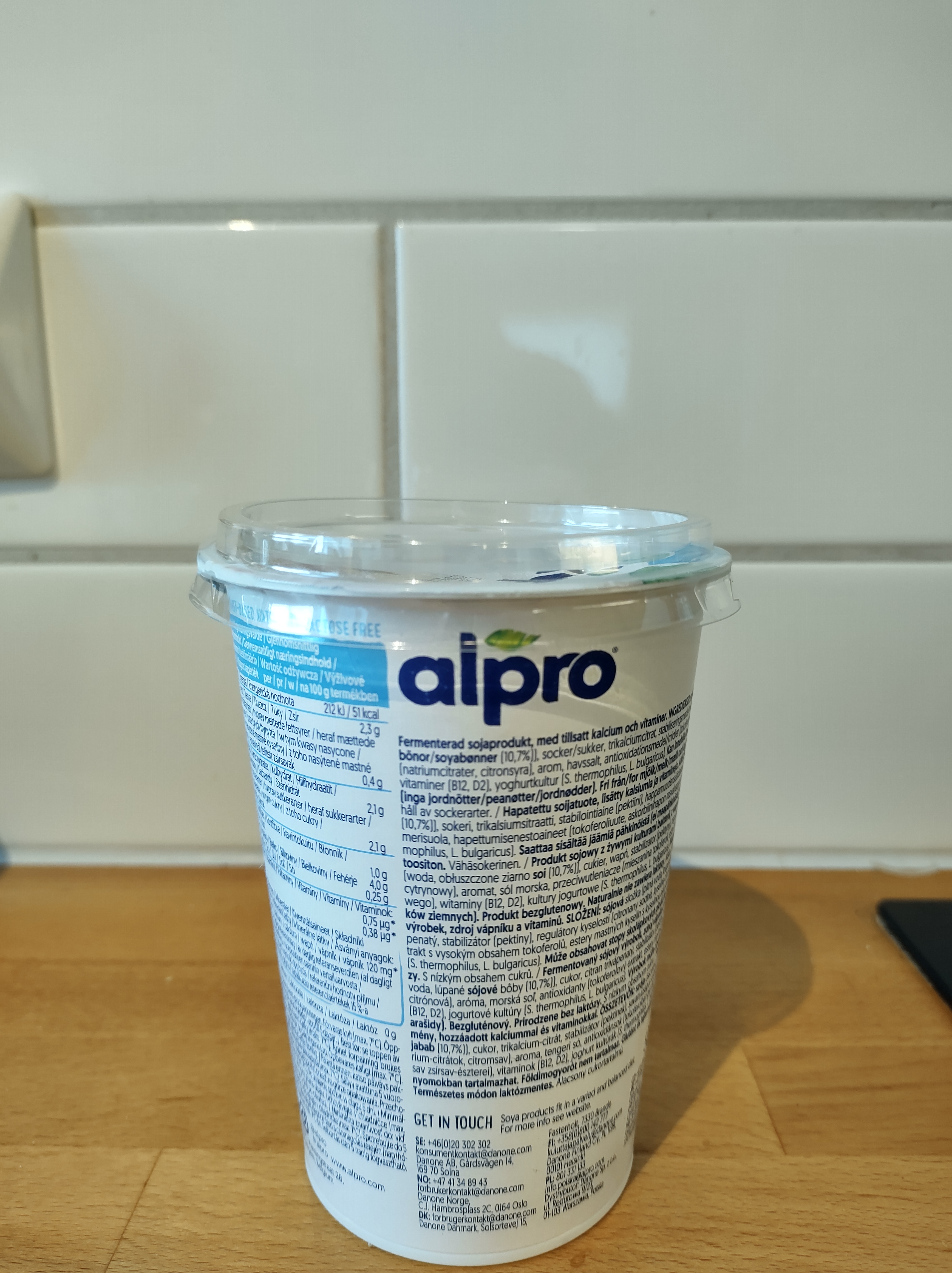
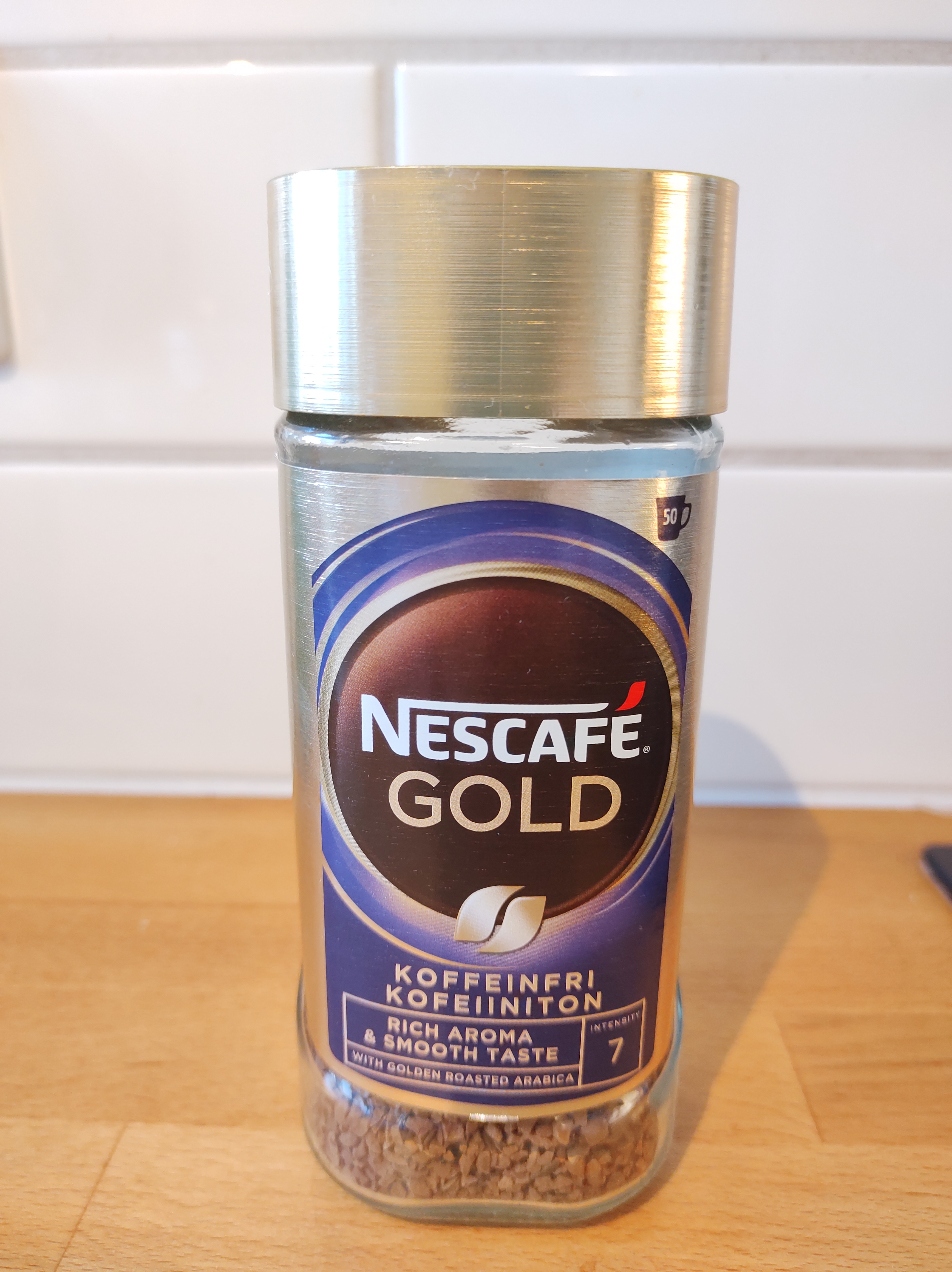
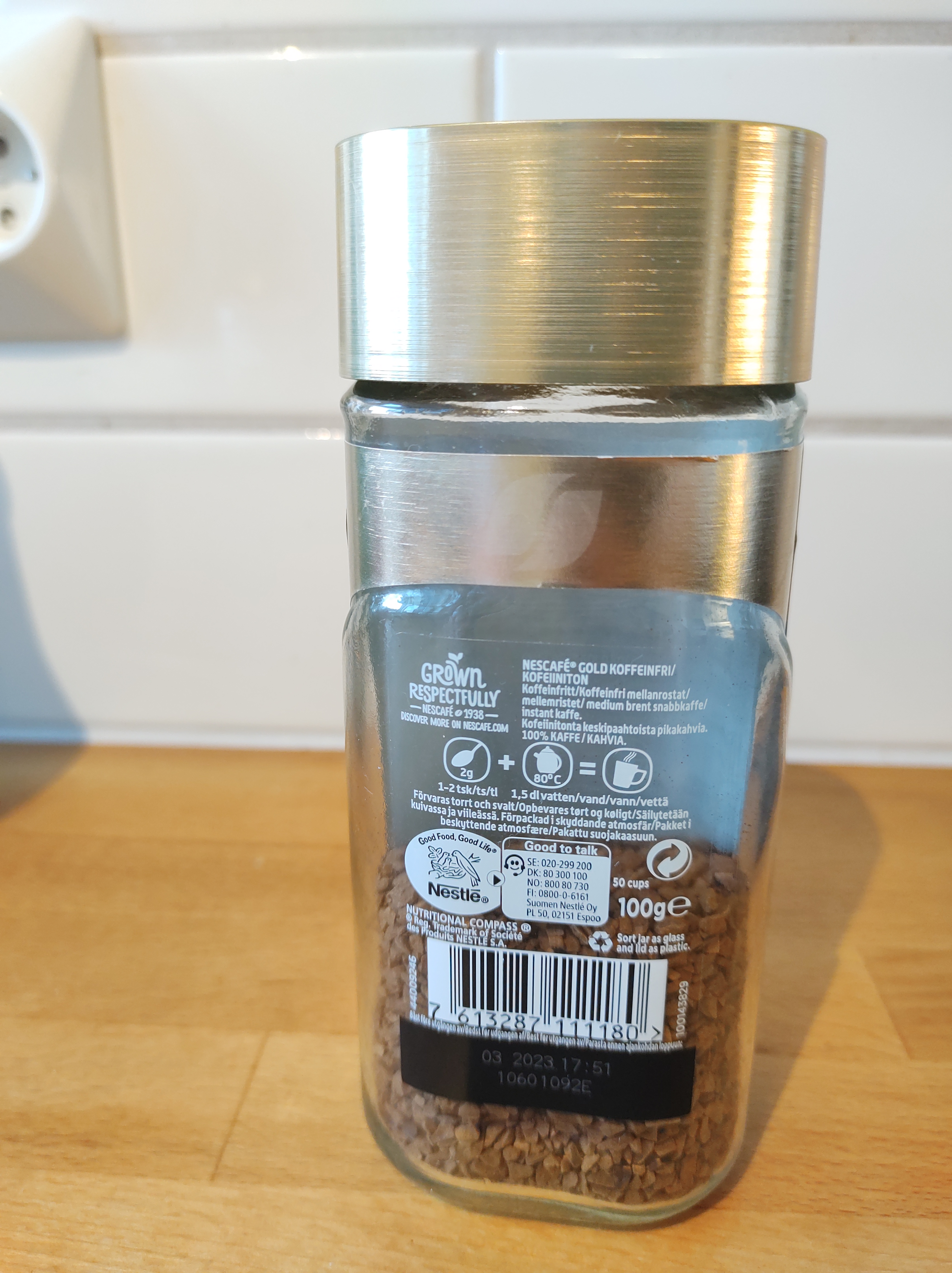
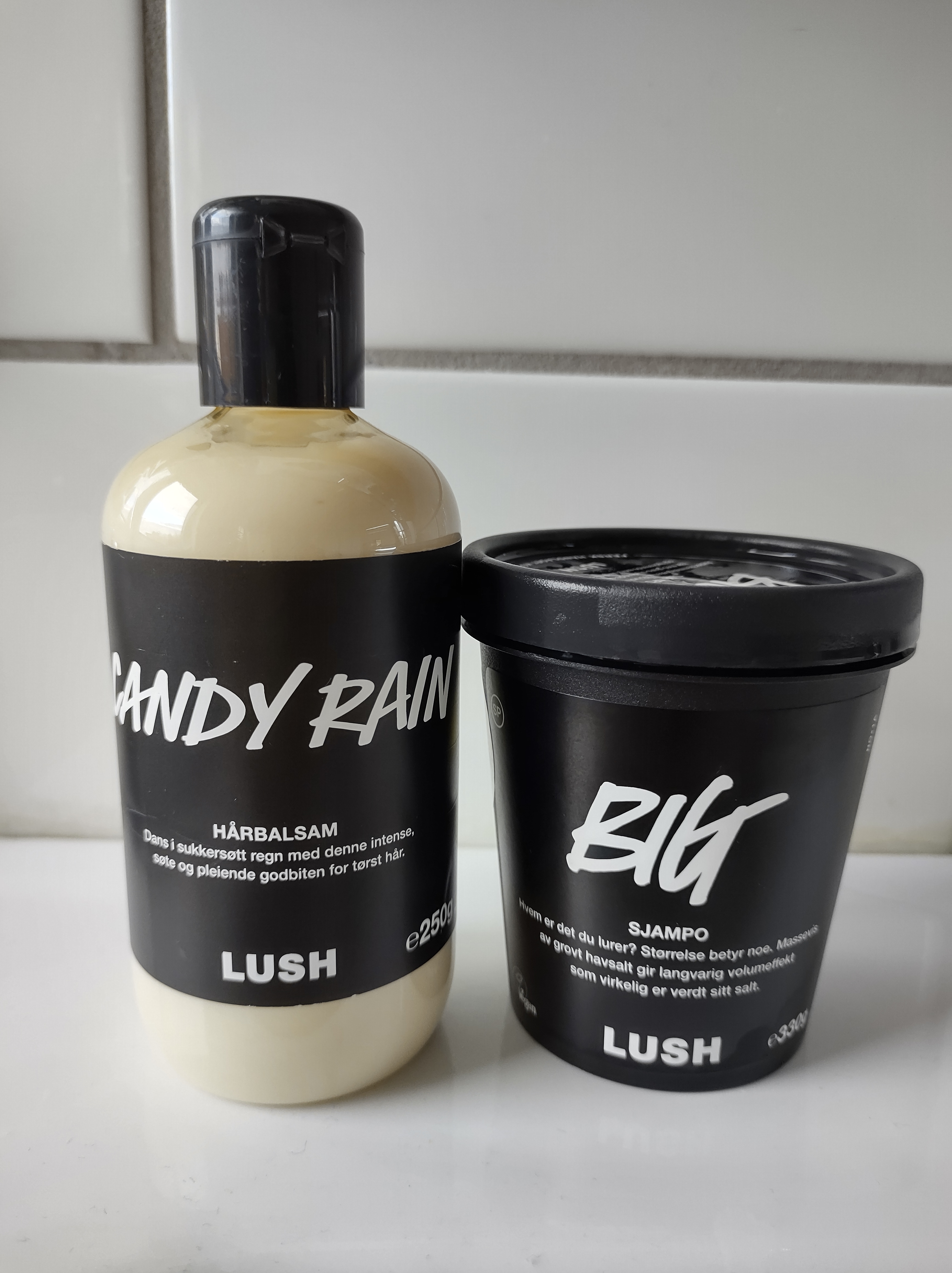
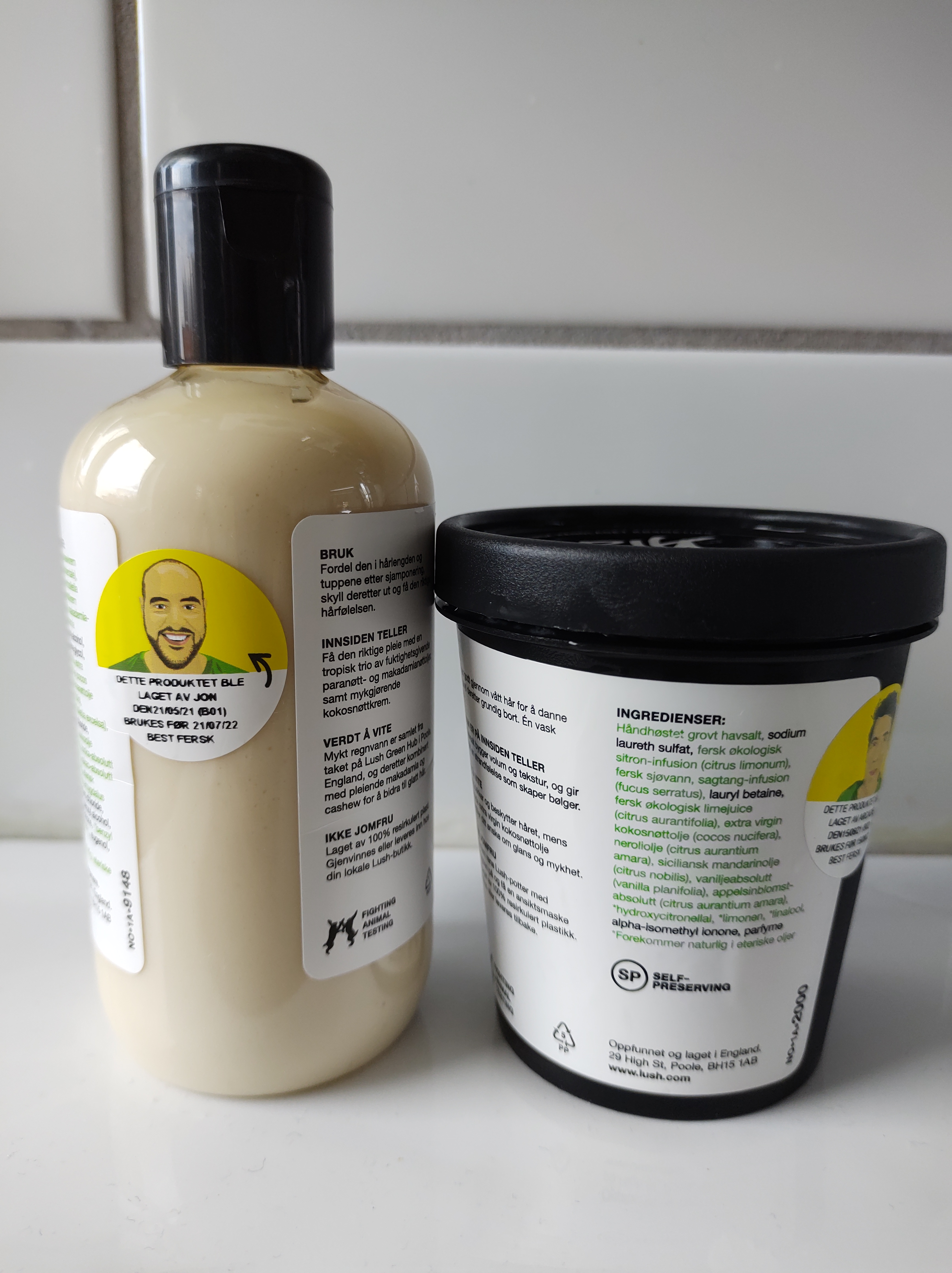
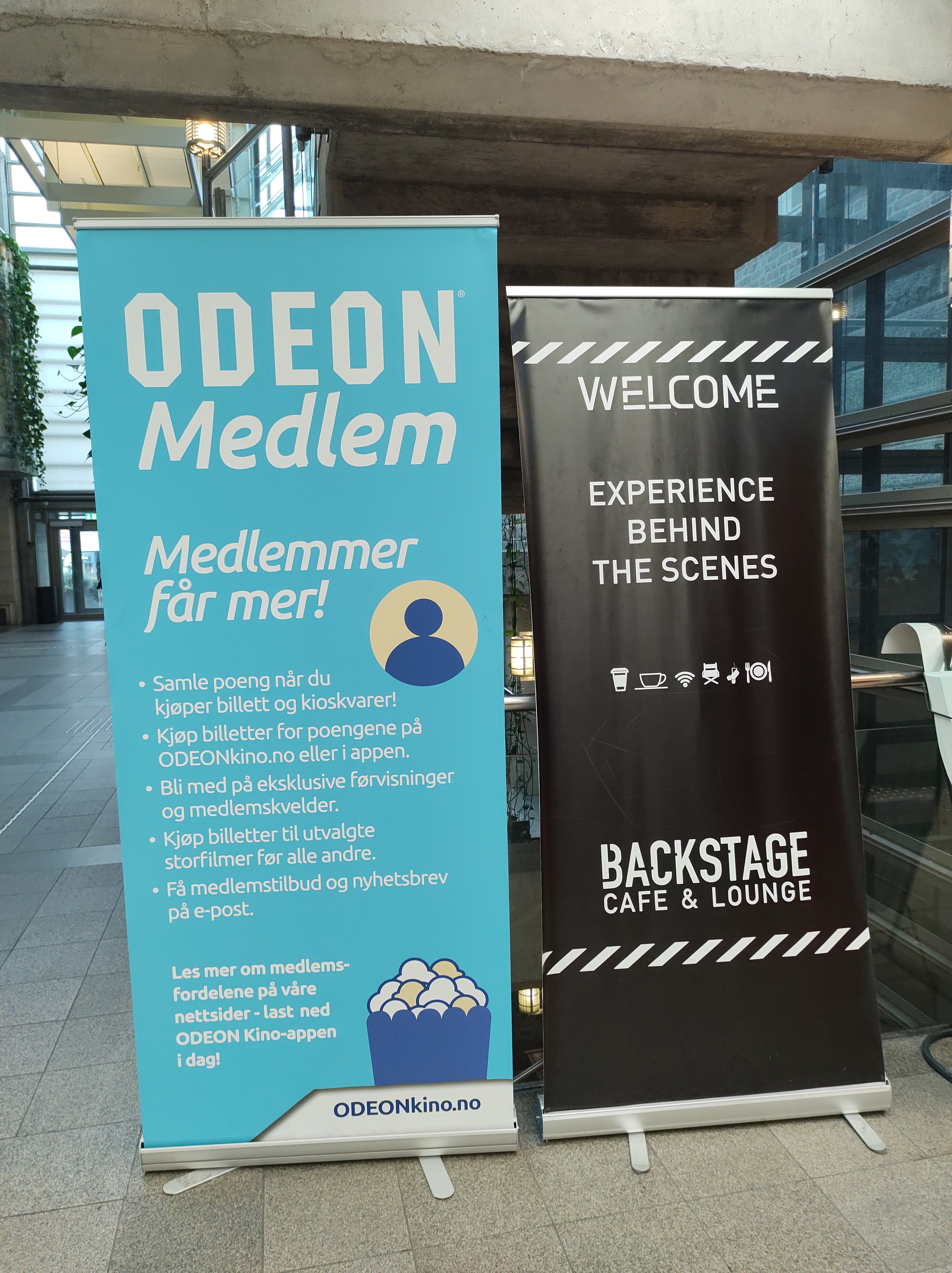
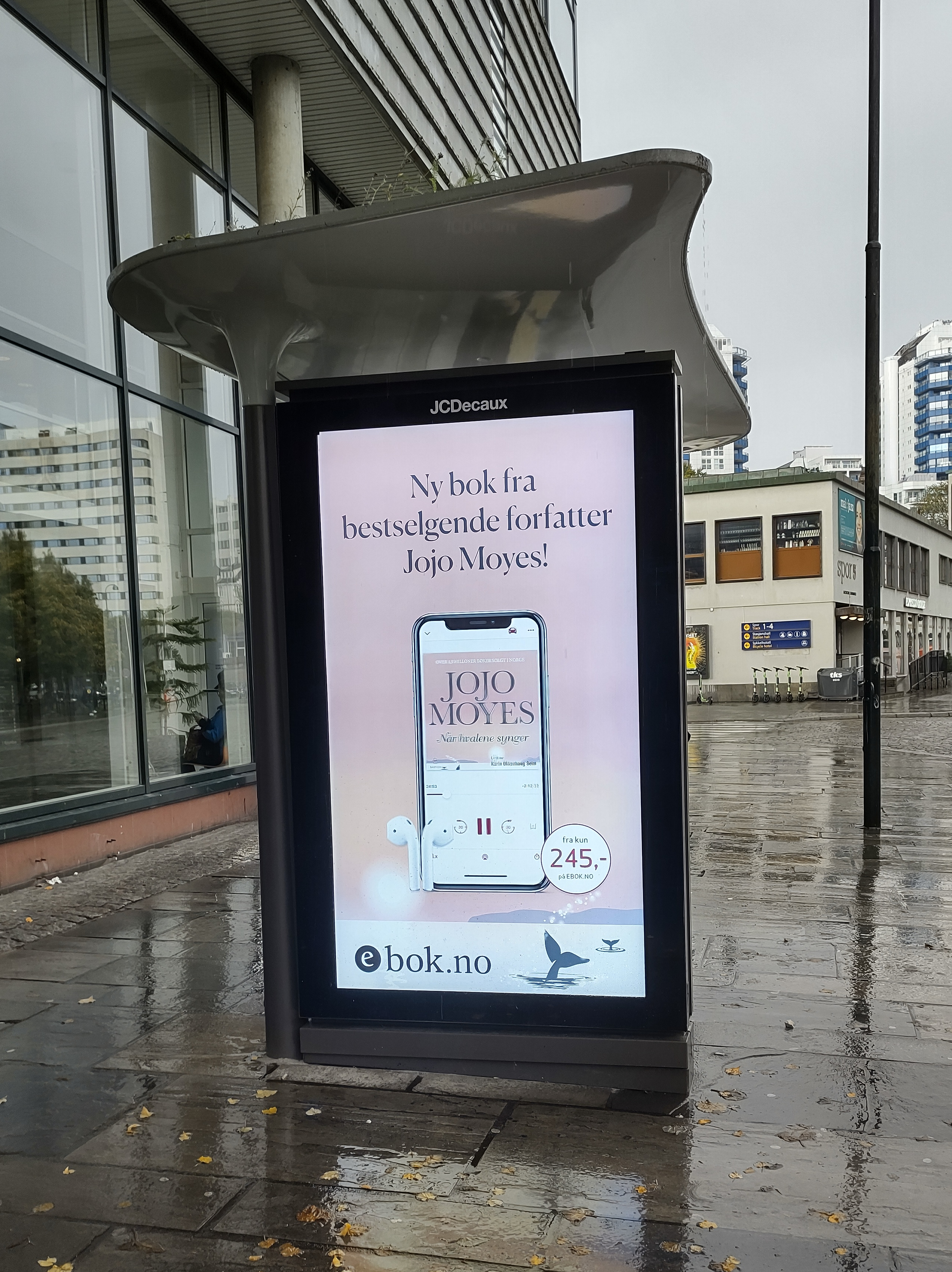
In our daily life, we are surrounded by typography that we often overlook. Thanks to this week’s lesson and learning assignment, I have paid closer attention to my surroundings and the typography of products, banners and signage in my home and around town. Here is a compilation of some of the pictures I took.
In the case of product packaging such as yoghurt, coffee, toothpaste and cosmetics, they often have a large typographic or lettering design on the front to catch the consumer’s attention and make the product more attractive. Secondary typeface adds a bit more information to it. There is a larger amount of text in a much smaller size on the back, which shows nutritional and/or ingredients information.
The information signs use symbols (pram, bicycle and arrows) and white, large and sans serif fonts on a dark background to transmit the message effectively.
Ads and commercial banners are meant to be seen, so they are huge, use mostly only very big fonts and have a lot of breathing room.
Choose two examples of design that you have collected that you consider to have either good or bad qualities. Try to analyse these further in terms of their typography. Can you identify the typefaces being used? Does the typography communicate successfully? If so, why? If not, why not?
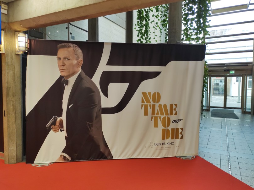
Movie advertising banner
At the cinema I found this advertising banner for the new James Bond movie. The font used for the logo is Futura ND Black, according to this article. The entire banner is black and white with the expection of the logo, which is golden. The picture of James Bond mimics the shape of the logo. The retro font works well with the theme of the film, as well as the colours and the dynamic text alignment.
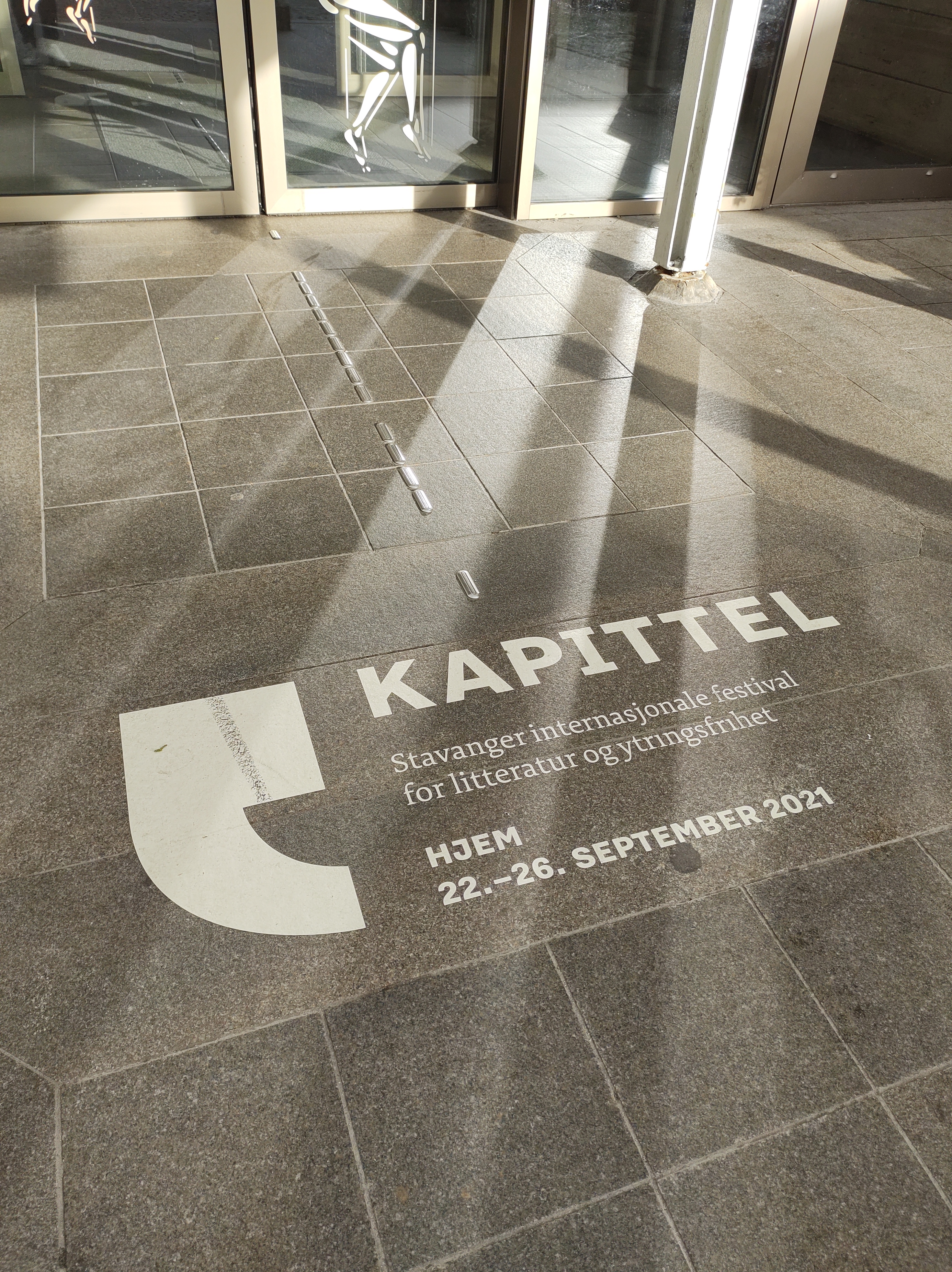
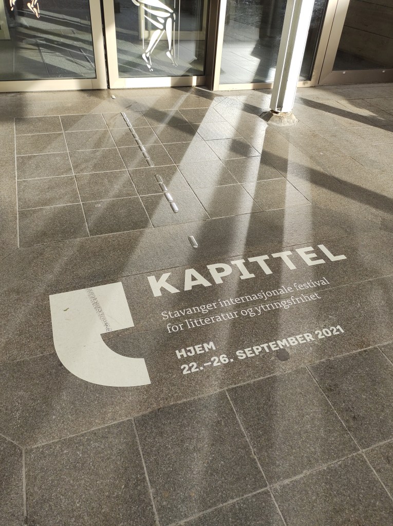
In order to promote Kapittel, Stavanger International Festival of Literature and Freedom of Speech, the local library and cultural centre drew the sign on the street floor at the entrance. This way, everyone who enters the building sees it. I think the typography is effective and communicates well. The sans serif font used for the name of the festival -Kapittel- is big and bold and catches the eye. I believe the same font, but in a smaller size is used at the bottom to indicate the dates. The text in the middle is secondary as it is a description of the event, for that the designers chose a serif which adds contrast to the design. Finally, a extra large quotation mark -which is also the festival’s logo- frames the text.
Question 3 – Practical assignment
Complete the exercise files that came with the LinkedIn video Indesign Typography. Upload them to WordPress.
I completed this course earlier in the program. I have rewatched some parts that I felt needed refreshing.
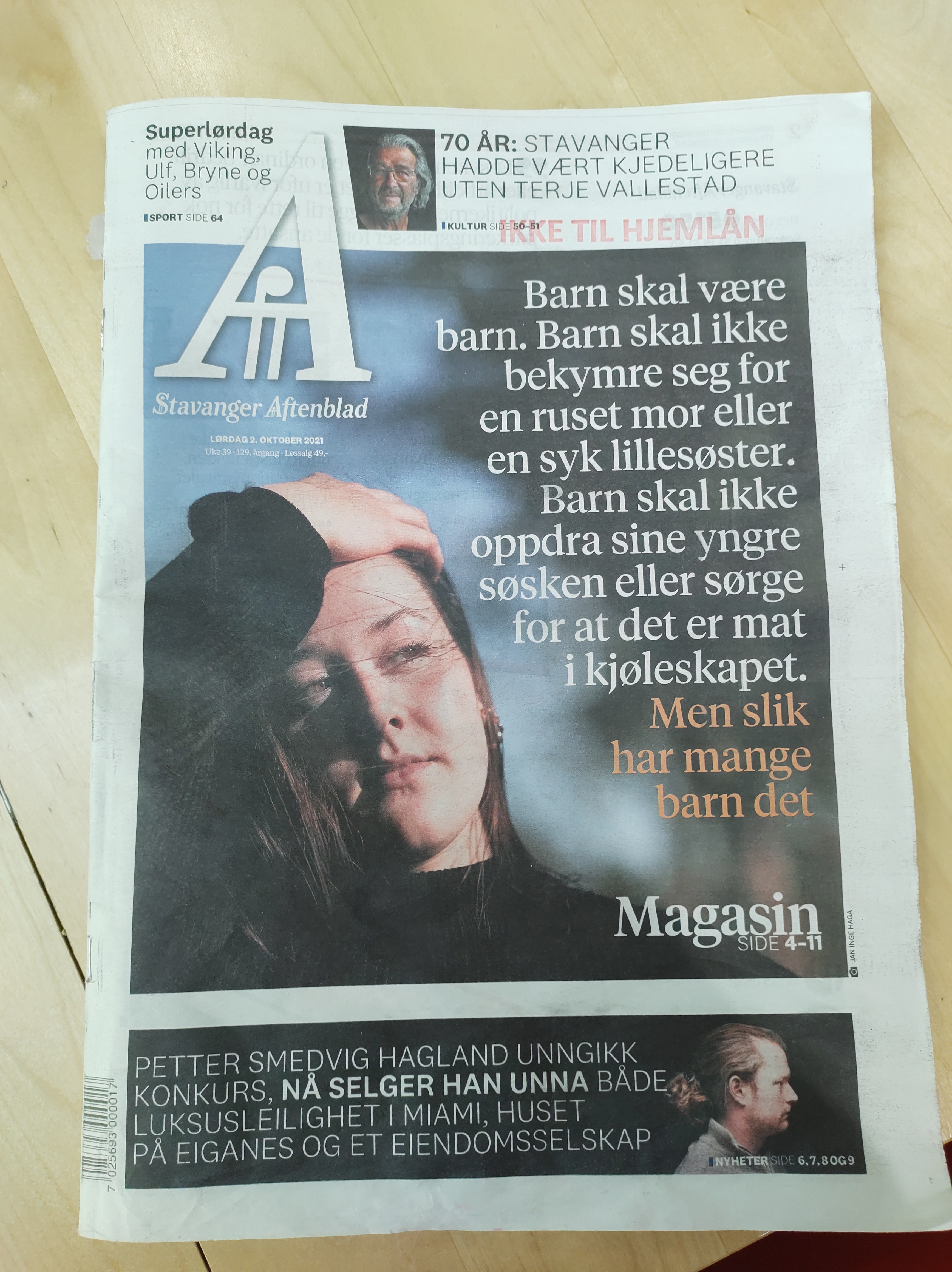
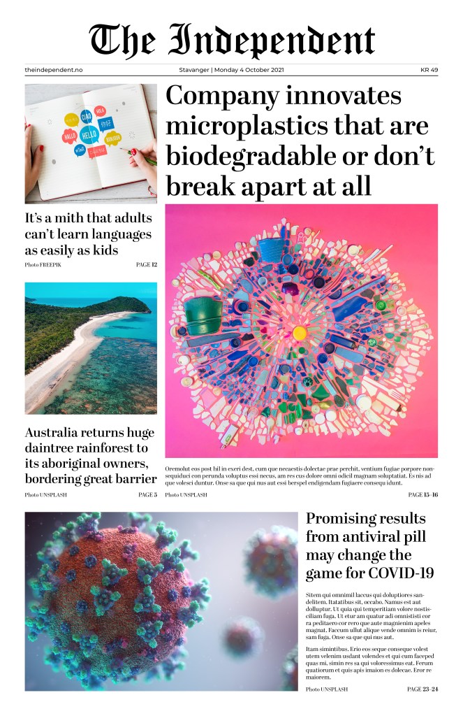
Use your design software to design a newspaper front page. Pay special attention to typography (size, leading, column width, etc.).
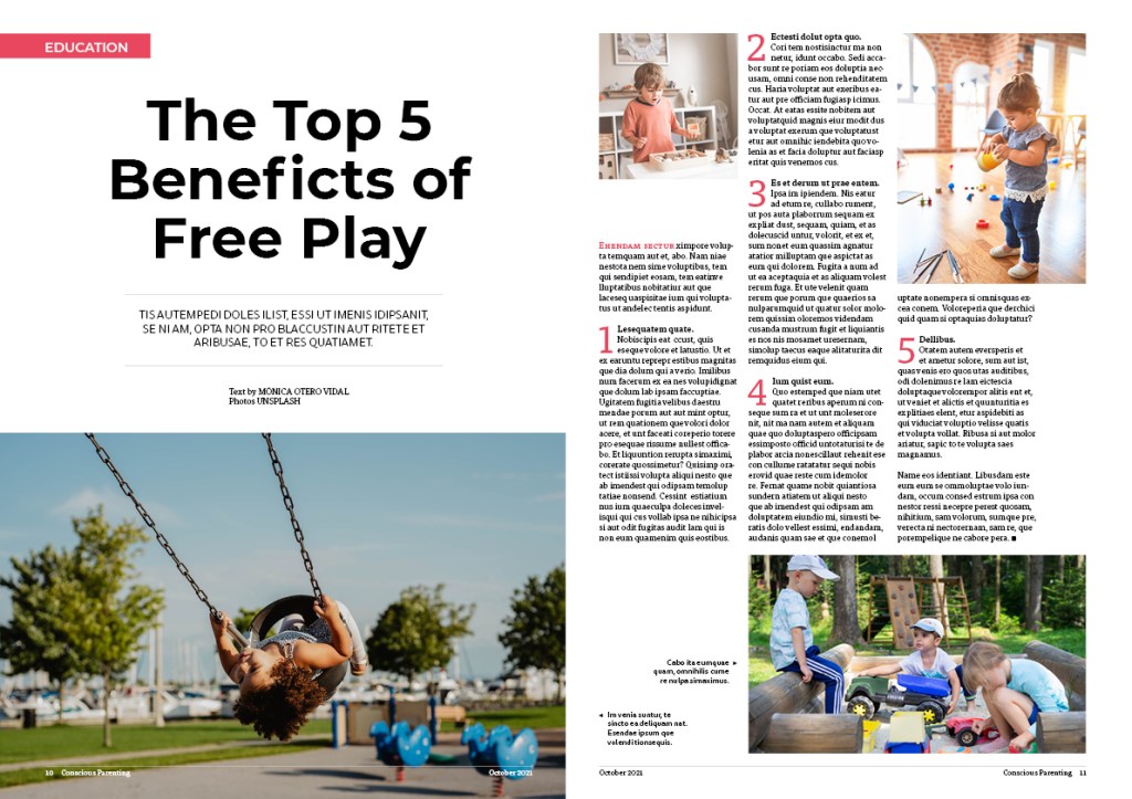
Use your design software to design a double-page spread (DPS) for your favourite magazine (look at an example of a DPS here)
For this Lesson Task I had to answer the following questions about visual identity:
Name the three most important components of visual identity.
Logo, colour, typography
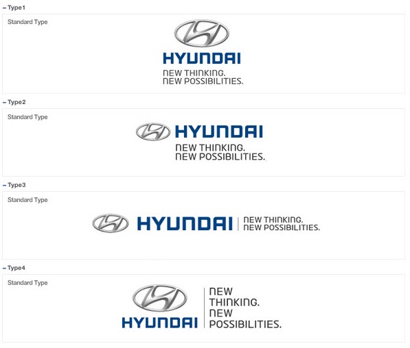
Describe the difference between logotype and signature.
A logotype is the graphic expression of a company’s name, product or service. A signature, in regards to identity design, is a structured relationship between a logotype, brand mark, and tag line.
Logotype
Signatures
Using Kuler create a colour scheme (using only three colours in each set) for the following products:
A rich chocolate cake that is made from real chocolate. The keyword here is “quality”.
A courier company that delivers internationally by air, land and sea – their main focus is fast delivery.
An international insurance company that focuses on family values.
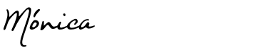
Write your name in four different typefaces, according to the following criteria. Use a typeface that: