
Weeks 4-5
1 – Look at the following logos and explain in your own words what you consider their positioning to be (do this for each one).
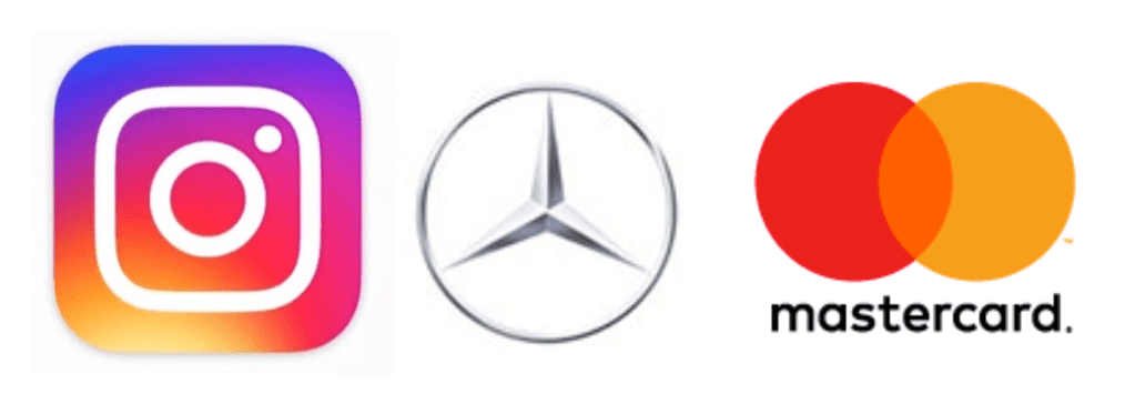
Instagram
The Instagram logo is a symbol.
It has the shape of a simple camera, which quickly gives the idea that it’s an app for photos and videos. The bright fun colours used indicate it’s directed to young people. It’s an easily recognizable symbol.
Mercedes Benz
This logo is also a symbol.
It’s a classy design using different shades of grey, which, in my opinion, makes the logo timeless and elegant. It reminds me of a steering wheel. All that makes me think that their cars are robust, classic and safe, possibly aimed at middle-aged people.
Mastercard
In this case, the logo combines a symbol and a wordmark.
It is a very recognisable logo, even when displayed without the name of the company. The two overlapping circles can be interpreted as a connection, which makes sense with what Mastercard does. It is a simple and timeless design that works.
2 – Let’s work backwards! Look at the logo on the Apple iPhone and, by doing your own research, investigate the history of the product and the company that manufactures it. Give an outline, in your own words, of what you consider the following to be:
- Describe the iPhone’s brand identity – exactly as you see it
- What do you think its positioning is currently?
- What do you think the strategy for this specific product was?
- What research do you think was done on this by the company who made it?
Before the first iPhone was released, cell phones were based more on fashion and brand rather than technological innovation. From the beginning, iPhone has always sought to push its phone to the limits of what is technologically capable. They simplified their product line and offered just one model a year while making it an expensive, high-end product. For me, iPhone means exclusivity, innovation and good quality.
More than a decade after the first iPhone, the company continues to deliver innovative, robust and modern versions of the smartphone. It has a high price tag, which still makes it exclusive and gives you the feeling that you are purchasing a solid and reliable device.
In my opinion, part of the reason why this product is so popular is that it focuses on technology, and offers a new experience for the customer. Apple also uses smart advertising campaigns and builds momentum before release day, when you can find people waiting in line all over the world -even for days!- to be one of the first ones to buy the new iPhone. As I see it, the brand creates a sense of belonging, so once you are a customer, you most likely will continue to be.
Before the iPhone era, Apple’s iPod was very popular, but they realised that people were carrying both their phone and their iPod, and that was a problem that would lead to the iPod becoming obsolete. They decided to develop a phone which would also work as an iPod. Apple probably studied how people used their cell phones and for what purpose. They anticipated their needs and created a product that changed the way we understood smartphones, merging an iPod, cell phone and internet browser that worked as efficiently as it would on a desktop.
3 – Now take the same product as in question 2 and explain, in your own words, how the visual element (in this case, the logo) fits in with the brand identity.
The logo on the back of the iPhone is the Apple logo, which is very well known and recognised worldwide. The design of Apple devices -including the iPhone- is clean, simple and elegant. The logo fits this description very well, especially since it changed to a monochromatic figure using black, silver or white colours to represent the famous apple.
