Coming Up With a Strategy

Week 2

For this week’s assignment I had to find a business owner and ask them what they want from a website, what their business strategy is and how the website would fit into it. After writing a detailed document about it, I should create the website architecture. Last, I was to create the website design strategy and justify all the major decisions I make on domain registration and hosting, design, target audience and programming.

ABOUT THE BUSINESS

Name
Flores Marta (fictitious client)

Product or service
Flores Marta is a small local florist’s located in Valladolid, Spain. We offer flower arrangements for events, interior decoration, funeral flowers and gifts. We receive part of our flowers and plants directly from Holland, one of the world’s biggest producers. Besides, we have our own nursery in the town’s outskirts, where we grow the rest of our products. This way, we guarantee the freshness of our plants and flowers, so they last longer.

BUSINESS STRATEGY

Business’ Name 
Flores Marta

Mission Statement
Normalise flowers and plants’ use in day-to-day life by offering fresh, durable and affordable arrangements and solutions.

Objectives
1 – Sell flowers and plants
2 – Offer a wide variety of floral arrangements
3 – Grow a trust relationship with the community

Value Proposition
1 – Fresh and long-lasting products
2 – Personalised arrangements
3 – Support local commerce and community

Elevator Pitch
Flores Marta guarantees fresher, longer-lasting cut flowers in your home or event.

How the website would fit into your business strategy
I want my website to showcase the work we do, showing photos of the bouquets and arrangements we prepare. Initially, we will not sell online because we prefer to create a relationship with the clients first and offer them personalised assistance. We want to use the web as a catalogue for our customers, where they can also find the contact details and address for them to contact or visit us. In the future, when the community has grown, we would like to introduce online shopping. The web should clearly state the origin of our products and our involvement in the local community. I want the website to reflect our brand with a fresh, clean design. It must be easy to navigate. 

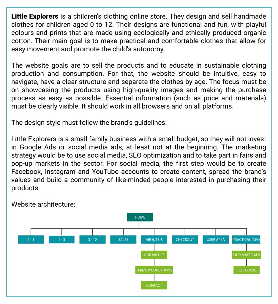
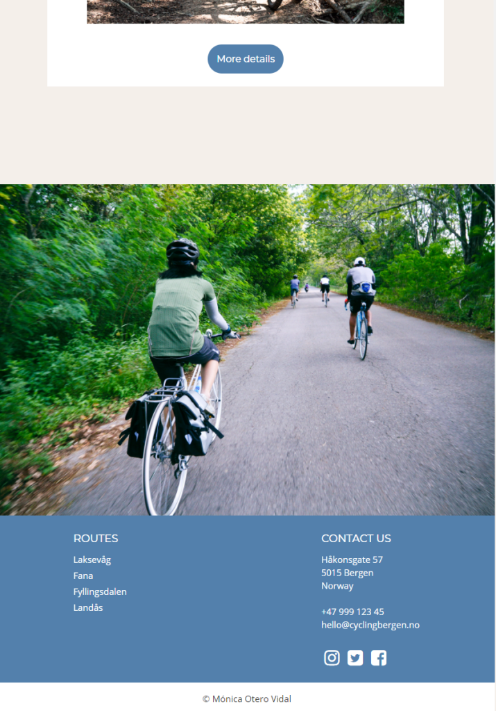
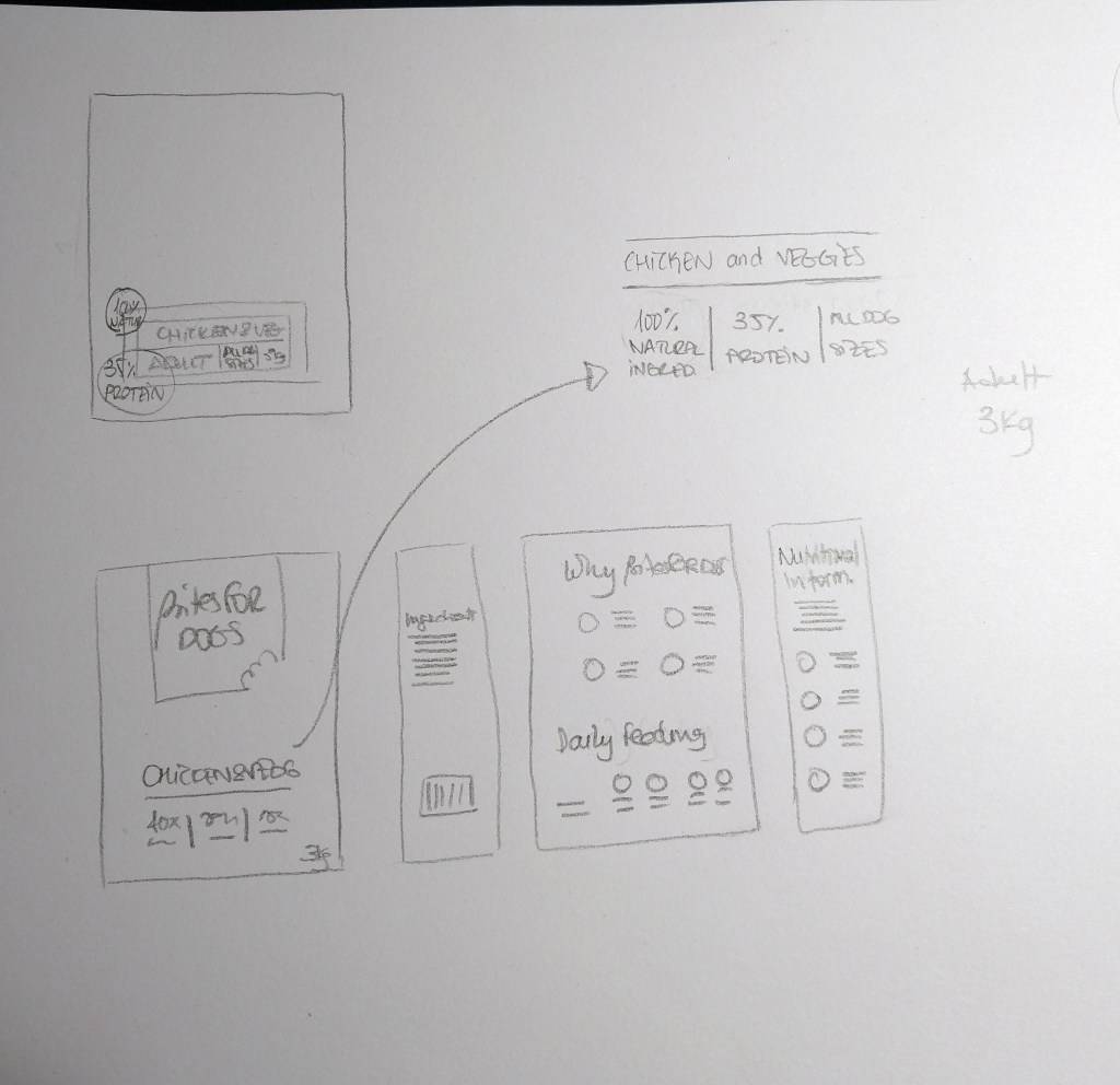
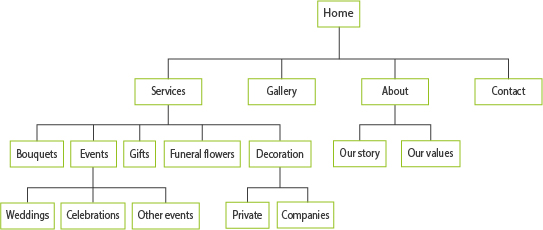
WEBSITE ARCHITECTURE

WEBDESIGN STRATEGY

Domain and hosting
The domain name suggested to my client is the business’ name, which is relevant, memorable and usable. For the suffix, we chose .com since it is available. We also decided to purchase .es, the specific suffix in Spain, and redirect it to http://www.floresmarta.com. For hosting, I recommended BlueHost, as it is currently ranked as one of the best services for small businesses, ideal for WooCommerce and very popular for WordPress sites.

Design
The website design will be clean and fresh, intuitive and user-friendly with a focus on visual content. It will display correctly in all browsers and be responsive on mobile. A picture carousel in the website header will show the florists’ most relevant work. The web will only be updated occasionally on special dates. The business’ Instagram feed will be displayed on the site to show pictures of the latest orders and work.

Target Audience
My client wants to target local women between 25 and 55 who enjoy shopping in their town and support local businesses.

Programming
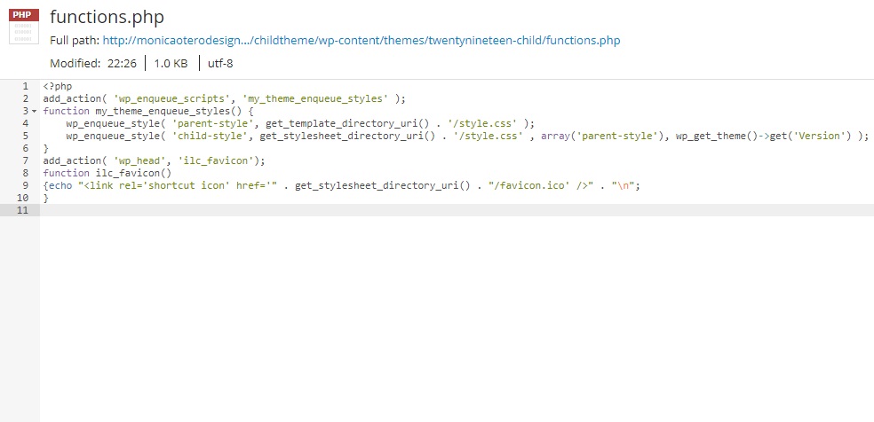
The web will be built in WordPress, as it is easier for my client to manage the occasional updates they might need. Some features can be customised with additional CSS and modifying the PHP files. Once they are ready to add online orders, it will be easy to add WooCommerce to the web to create the shop.

Creating a Brief

Week 1

This is the first Lesson Task (previously called Learning Activity) of the second year of Graphic Design (GRA2).

In this case, I was to create a detail brief for a client’s website. This brief should contain all the information that will be needed to achieve the client’s requirements. It should be good enough to hand over to any design/programming team and get a great result.

The brief should cover the following sections:

  • What is the client’s service/product?
  • What are their requirements?
  • What is the website’s goal?
  • How are you going to achieve this goal?
  • Build the website architecture (so we can see what sections will be needed)
  • What is the design style that will be required?
  • What are your suggestions for marketing the site?

I chose the same client as for my Semester Project last year. See the link here.

Project Exam 1

Week 35-39

Client: Aura Wellness Retreats host seasonal 7-day retreats for women in different locations around the globe. They are designed for small groups of up to 15 participants and include healthy meals, cooking lessons, exercise and mindfulness. Their team consists of a nutritionist and vegan chef, a yoga and pilates instructor and a meditation coach. They aim to create a safe place for their customers, where they can feel comfortable and relaxed.

This project exam’s main goal was to develop a project website for a client (fictional in my case) using what I have learned this semester. The web site should be HTML and styled with CSS. The purpose of the web is to describe the next retreat, explain what it includes and what to expect from the experience. It also shows the prices and allows the potential customer to book a spot. I also had a section introducing the team and their values and a gallery page with photos of previous events and opinions from their guests. A contact page completes the site.

MA07 – Information Design

For this mandatory assignment, I had to create a website and an A3 poster
to promote cycling as an environmentally friendly, economical and healthy
alternative to a car in Bergen, Norway.

Cycling Bergen is formed by a group of bike enthusiasts located in Bergen,
who want to encourage others to discover the city by bike. Their web
promotes four biking routes with difficulty from easy to moderate, so they
are suitable for most people.

This is the link to the web.

Below I added a few web screenshots and the poster design.

Create a WordPress Theme

Week 34

Create your own WordPress theme and then customise it. Add the hacks mentioned in the lesson CMS and WordPress part 3. Do some research on the Internet and find two more hacks and implement it on your site.

For this week’s learning activity I decided to create a child theme from an already existing WordPress theme. I created a WordPress site in one.com through 1-clic installation and chose the Twenty Nineteen theme. Since I was going to make only a few changes, I decided to work directly in one.com. I followed the LinkedIn tutorial WordPress: Building Child Themes by Patrick Rauland.

First, I edited the child’s style.css and changed the background colour as suggested in the tutorial.

After that I played around editing in the browser and changed background colours, text size and style…

Then I added a favicon to my site following the instructions on this weeks lesson. Although the parent theme I chose allows to add a favicon, I decided to try and do it by adding it to the functions.php file to see if it worked. It did. Now I know I can change the WordPress icon to the one I choose even when the selected theme doesn’t give me the option.

I changed a few more details in the Customise section. The theme I picked doesn’t allow too many changes, so I only added a menu, two extra pages and changed the colour of the links to deep red.

Finally, I added a screenshot for the preview of the child theme.

Customise a WordPress Site

Week 33

Take your theme that you have installed on your hosting account and customise it as per this module. Then I want you to find some WordPress hacks that you can use to customise your website even further. The main thing with this project is to not just do things for the sake of doing them. I would like you to explain the tweaks that you have made and your reasoning for adding certain features.

When creating my portfolio in week 32, I also added 4 posts, an about page and played around with the options to customize it. Below I list those changes and the new ones I made this week.

  • I changed some general settings such as title and tagline, site language, timezone, date format (d/m/Y) and time format (H:i).
  • I changed comment settings so no one can comment. Since it is a portfolio and there is a contact form available, I preferred to disable this option.
  • I changed the permalinks to use post name instead of the default one. It is more search engine friendly and gives the reader an idea of what the post is about.
  • I installed the WPS Hide Login plugin to protect my website by changing the login URL and preventing access to the wp-login.php page and the wp-admin directory to non-connected people.
  • Added a gravatar.
  • I uploaded a logo and a site icon.
  • I changed the number of columns in the post grid on desktop to three.
  • I added a contact form to my About page. For that, I installed the Ninja Forms plugins.
  • I added additional CSS in order to change the look of the navigation menu. The menu items were underlined and I changed it so they appear without decoration except on hover.
    This is the CSS code I added:
    .alt-nav a {text-decoration: none;}
    .alt-nav a:hover {text-decoration: underline ;}
  • Also adding additional CSS, I removed the left padding in the about page, so the photo and text are centered.
    .resume-template .entry-content {max-width: 500px; padding-left: 0;}
  • Finally, I edited the file footer.php to change the hypelink text from the blog name to my name.

Here is a link to my portfolio.

Working with WordPress

Week 32

In week 32 we began to learn about WordPress and how we can use it to create websites. For this Learning Activity I have set up a web for my portfolio using this content management system.

So far, I have added the semester’s completed mandatory assignments and some learning activities that I liked to my portfolio. I know the look of it can be improved a lot, and I will continue doing so, as this semester the portfolio is interactive.

This is the link to my Portfolio.

Point of Sale

Week 31

PART A
Consider the touchpoints of your brand in general (to ensure that all the elements work together) and then focus on your packaging. Design a set of Point of Sale elements that will promote your product in-store. The set can consist of however many elements you choose. It can be in any format that you would like it to be. Please consider the following:

1. Can customers clearly see your product in your Point of Sale elements?
Do you use your Point of Sale to also showcase your actual product?

2. Brand Integration. Does it integrate with the brand’s look and feel?
3. Designed to sell! Does it persuade customers to buy your product?

The Point of Sale I designed is a cardboard box with shelves to showcase the actual product. Its design integrates with the brand’s look and feel since it uses the same colours, shapes and photo. The logo is clearly visible, as is the byline. It is meant to be positioned at the end of a pet food supermarket aisle to persuade dog owners to buy the product.

PART B
Brand manual.
Take pictures of your elements and include them in a presentation of your brand called a brand manual or a design manual. Your brand manual should have a minimum of 7 pages and include logo, color scheme and chosen typography as well as the different elements produced during this 4 week project period (brochure, infographic, packaging, point of sale). 
Hand in your brand manual as a PDF.

Packaging

Week 30

Using the logo you created in Week 1 and the brochure you designed in Week 2, think about your brand and design packaging for your product. Remember that you can decide about the detail of your product. Is it dog biscuits, meat products in a tin, dry pellets or a new and exciting product?  Do your design according to the following steps:

1 – Exploration: Use sketching techniques to draw thumbnails and hand in your thumbnails as scanned PDFs.

2 – Brand integration: Choose one of your thumbnails and refine your design. Place it next to your brochure and logo and see how you can merge your design with the brand identity. Also, what fundamentals of the brand can you draw from and use in your design?
Hand in a picture of your thumbnails, mock-ups, logo and brochure together.

3 – Design: Now design your packaging properly, using any design application of your choice (or a combination of e.g. Photoshop, InDesign and Illustrator). Export the flat design as a PDF.

4 – Presentation: Make a life-size mock-up of your final design and take photographs of it. Remember that you can take more than one photo to show the different angles and sides of the packaging. Here your presentation skills are vital. How do you present the final mock-up in a photo to reflect the true essence of your design?

1 – Exploration

I began by sketching a few ideas for the packaging, considering different presentations: carton box, bag, bucket.

2 – Brand integration

I decided to go for a bag. The product I chose to design is the packaging for dry dog food. I used the brochure and the logo designs from previous weeks to inspire the design, so the brand has a cohesive look.

3 – Design

Then I moved to Illustrator and continued developing the design. I chose to use the same colours as in the brochure (photo below). I also experimented with other colours that could be used for different food recipes and/or dog ages. The colours I used are the same as in the brochure’s infographic (see pictures below).

4 – Presentation

Below I added photos of my packaging sketches together with the brand products and close-ups of the packaging mock-up I created.