Choose any one of the illustrations from the lesson “Design Drawing” and answer the following questions (when submitting your feedback – also provide the illustration you chose):
What fundamentals are used successfully? Describe in detail what you think is the most successful aspect of the illustration (remember to focus on the fundamentals).
What style from the past is being used in a new way in this illustration? If no previous style is clearly apparent, does it use some form of pastiche? Why do you think this specific style or pastiche was used? Describe in detail whether you think it was used successfully or not.
Read again what Mondrian said about the expression of beauty or self. Which do you think played the dominant role in the execution of this illustration? Explain your thoughts.
If you had to create this illustration, before starting the actual execution, what would your initial thoughts be on:
Colour (what would your approach to colour be?)
Line (what would you like to portray with the use of line?)
Composition (what would you wish to instil in the viewer by the use of composition alone?)
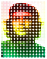
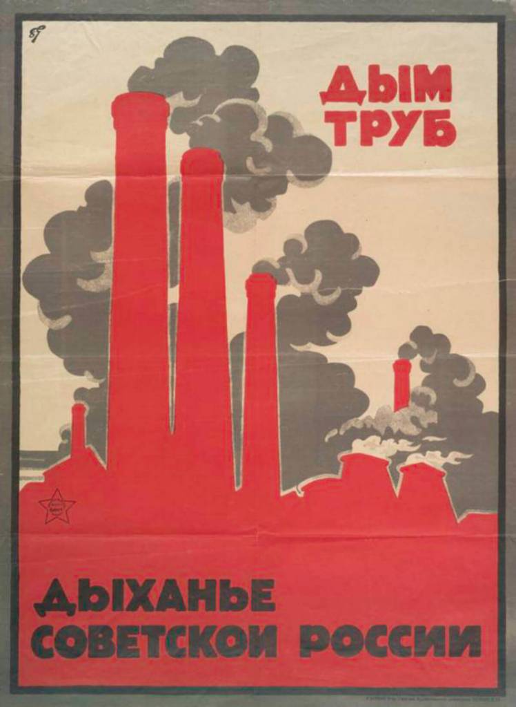
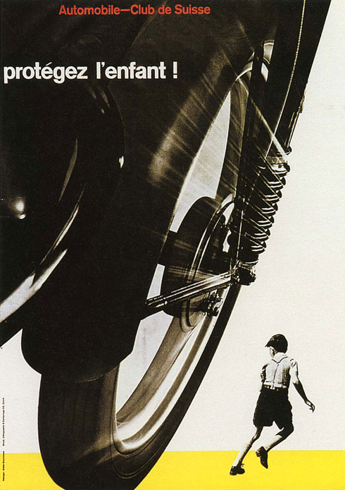
The illustration represents Che Guevara’s poster by Jim Fitzpatrick with the halftone technique, which simulates continuous-tone imagery through the use of dots, varying either in size or in spacing, thus generating a gradient-like effect (Wikipedia). In this case, the dots all have the same size and are equally distanced from one another. The change in colour and saturation is what forms the face. The Gestalt principle of proximity is successfully applied to this illustration.
The use of halftone technique, an image of a widely known person and bright colours suggests that the style used here is Pop Art.
I think Tahier Variawa is expressing himself through the execution of this illustration. It is a very popular picture that most people recognise, and he created his take on it. The dots that form the portrait are big enough to simplify the image, but not too much that is not recognisable. Instead of the original darker, even aggressive, colours (red and black), he decided to use brighter ones and more varied ones.
If I was to create this illustration, I would probably use slightly smaller dots to give it a little more detail. I don’t know why the author picks green, yellow and red in the way he does here, but I would probably use a colour palette similar to the one on the original poster. As for composition, I would keep it the same as it works fine for a portrait.
Design an A4 poster for a humanitarian cause you feel passionate about. For example, creating awareness and a call for action against human trafficking. You must apply pastiche to your design. Use a style of propaganda used during the Modernism era and create your own, unique design in a contemporary context.
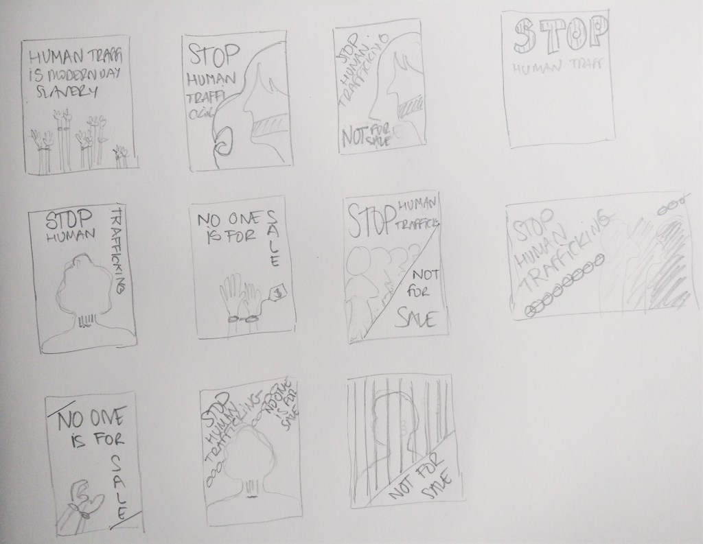
Start by creating at least 5 thumbnails for your design. These thumbnails should be handed in with your assignment.
Write a rationale or explanation for your poster of at least 350 words. Why it is necessary to create awareness of the humanitarian cause?
Give an explanation for your creative execution, mention the use of colour and graphics as well as typography.
Give examples of the designs you used as inspiration and why it is applicable to your design.
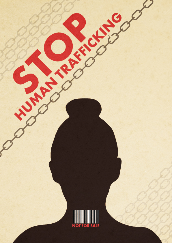
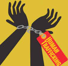
For this lesson task, I chose the humanitarian cause of human trafficking.
Thumbnails
The poster
According to the United Nations, Human Trafficking is the recruitment, transportation, transfer, harbouring or receipt of people through force, fraud or deception, with the aim of exploiting them for profit. Men, women and children of all ages and from all backgrounds can become victims of this crime, which occurs in every region of the world. The traffickers often use violence or fraudulent employment agencies and fake promises of education and job opportunities to trick and coerce their victims.
No matter where they come from, every person should be free; no one has the right to sell another person. Human Trafficking is a violation of Human Rights. It is modern-day slavery and must be stopped. We, as a society, need to find a solution to put an end to this inhumane practice.
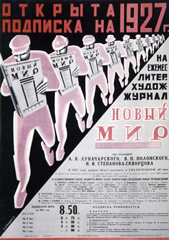
The silhouette on my design represents a victim of trafficking. The bar code on their neck depicts the person as a product that can be sold. Besides, many times, human trafficking victims are coerced into getting tattooed as a way to signify that they belong to a certain pimp/trafficker. A tattoo resembling a bar code has long been linked to human trafficking in Europe. Chains surround the person, and one of them -the darkest one- is breaking, expressing the need and hope to end this crime. The colour palette is inspired by the posters below, as well as the sans-serif bold typography.
Inspiration
To create this poster about human trafficking, I used inspiration from other propaganda posters from the Modernism era as well as from Post-modernist signs.
Within the broader milieu of Neo-modernism, we focus on Marian Bantjes, who set design trends with her unique application of typography, loose illustration and well-balanced compositions.
Objective observation During the interview, Marian mentions, “When I worked at Digitopolis, I was working almost entirely on the computer, basically the computer and with photography. And now I am using a wide variety of materials, sometimes still involved with a computer and sometimes just with the materials themselves. But having a space like this allows me to obviously store them all, and to work on these various surfaces in different media.” What is your opinion on the use of the computer combined with different media? Write one page (350 words) on your opinion of the importance of media and design and what your take is on the use of computer technology.
Throughout the program, we have learned how important it is to use pencil and paper to sketch and test our ideas before moving to the computer. Everyone works differently, of course, but I find the ideas flow much easier when I draw or write by hand rather than trying to do it directly on my PC.
Adding other media into the process of creating a design is very interesting and inspiring and opens up even more possibilities than just a few sketches on paper. It does not necessarily mean one has to use art supplies or expensive, rare things. In the movie, we see how Marian uses everyday items such as pasta or flower petals to create beautiful compositions later used to form patterns for a design.
In my opinion, any way of expressing yourself is good. I see design, photography, art and any creative discipline as parts of a whole where the different pieces intertwine. It can be intimidating to try to create something on a media we have not used much before. Still, if we see it as experimentation, we remove the pressure of having to produce an outcome, and we just play with it and see where it takes us. Maybe it is a creation worth using on a book cover, perhaps gives us inspiration for something else, or it ends up discarded. Experimenting and incorporating works made with other media can only enrich your designs and make them more personal and unique.
A computer is an essential tool available to designers. It offers many digital tools that help us work in a way it was not possible before. We live in a digital world, so it will always be necessary to bring designs to a digital form. However, I recognise the importance of testing and developing ideas before we do so. And the more materials and techniques we can use to expand our creativity, the better.
In conclusion, it might not be a requirement to combine the use of the computer with different media to be a good designer, but it can be very beneficial, and Marian Bantjes is an excellent example of it.
Pushing technology and changing philosophy While describing her development of style, Marian states, “I am not an expert on illuminated manuscripts by any stretch of the imagination, but there are a couple of purposes of it. But one of those purposes is definitely to invoke wonder in this way that was very interesting to me was feeding directly into my ideas about that symbiotic relationship between graphics and text.” How do you think this links to the philosophy of the Swiss International School? How is it different? Has technology given us an advantage in expressing the symbiotic relationship between image and text? What about Marian’s work? Is this reflected in her work? Do a write-up (350 words) on the relationship between image and text, as seen in Marian’s work and relate this back to the Swiss International School. Substantiate your answers with relevant facts. You may use a visual example of both Marian’s work and that of the Swiss International School to facilitate your analysis.
The relationship between words and images is an essential element of design. Words and images may correspond to one another. The opposite extreme occurs when the image and the words do not illustrate but rather contradict each other. When the relationship between text and images is not too literal, the viewer must play a more active role: they must discover the main idea themselves and participate in creating the meaning of the message.
In Swiss Style, there is also a symbiotic relationship between image and text. As Josef Müller-Brockmann put it: “Copy and a picture are arranged and related in accordance with objective and functional criteria. The areas are sensitively organised with an assured touch in mathematical proportions, and due attention is paid to the rules of typography”. The difference is that Swiss Style is characterised by simplicity, functionality and lack of ornamentation with the use of only sans-serif typefaces, while Marian designs are very decorative and elaborated, and the typefaces ornamental and complicated.
Communication is the Swiss Style’s primary goal, one that dictates the need for symbols appropriate to the content of the message. On the contrary, Marian’s intricated designs often make the viewer pay close attention to try and figure out their meaning or the hidden words.
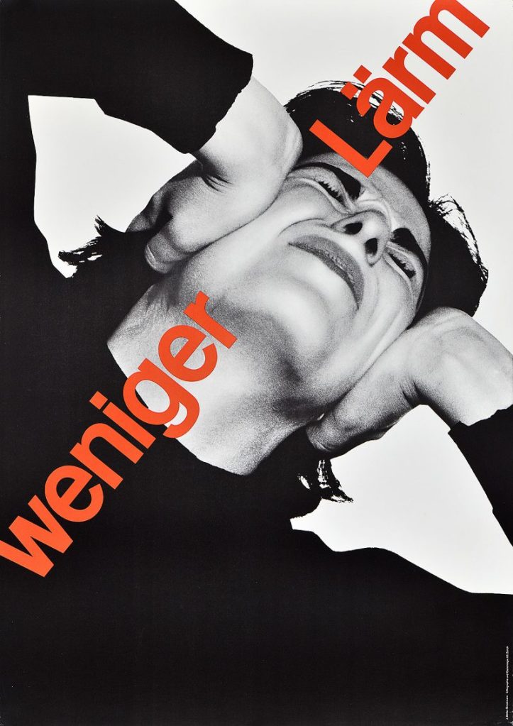
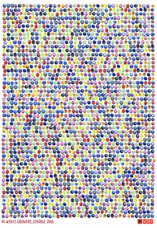
To illustrate this, I include some examples below. The poster on the left by Swiss designer Josef Müller-Brockmann reads “less noise” in red type, and the photograph shows a person covering their ears with their hands, depicting the discomfort of noise pollution. To the right, Marian Bantjes’s work, requires to pay closer attention to the poster to work out that the circles represent grapes, then realise there are letters written on them and that they actually form the names of R-Wines’ grape supliers.
Creating graphic designs in the past required a lot of labour, and making changes to them was far from easy or simple. I am not sure technology gives us an advantage in expressing the symbiotic relationship between image and text, as this relationship already existed in illuminated manuscripts in the year 400, but it is clear that it is now a much quicker and straightforward process.
Consider what we have discussed regarding Late Modernism in the USA and The Swiss International Style. Do additional research on the Swiss International Style – it may be a good idea to study some of the known designers of this style and period. As a guide, visit designishistory.com, which gives a brief outline of specific designers and styles – take note that here the Swiss International Style is listed under 1940, which is not incorrect as the style was developed in the late 40s, but flourished in the 50s. Also use additional reference sources of your own and do a write-up of the following:
Research on the Swiss International Style After you have done research on the style, give a description of your own. How would you define the style? Do a write-up of about 350 words and discuss the characteristics of the style, the typefaces that were prominent and the philosophy behind it.
The International Typographic Style emerged from Switzerland during the 1950s, also known as Swiss Style. It is one of the longest artistic movements in the twentieth century as it remained a major force for more than twenty years. Although it originated in Europe, the movement won converts throughout the world.
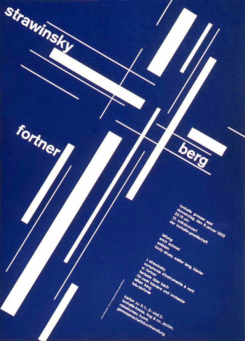
The visual characteristics of this international style are: a visual unity of design achieved by the asymmetrical organization of the elements of the design on a mathematically drawn grid; the use of sans-serif type; typography set in a flush-left and ragged-right margin configuration; objective photography and copy that present visual and verbal information in a clear and factual manner, free from the exaggerated claims of much propaganda and commercial advertising.
Detractors of this movement complain it is based on a formula and the results are similar to one another. Advocates argue that the purity of means and legibility of communication enable the designer to achieve a timeless perfection of form.
The early pioneers of the movement defined design as a socially useful and important activity. Personal expression and eccentric solutions are rejected in favour of a more universal and scientific approach to design problem-solving. For them, clarity and order is the ideal. Sans-serif typography is preferred as they believe it expresses the spirit of the present age, and that mathematical grids are the most legible and harmonious means for structuring information.
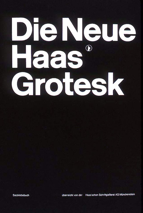
In the 1950s, Swiss Style designers created several new sans-serif typestyles inspired by the nineteenth-century Akzidenz Grotesque fonts, rejecting the geometric sans-serif styles, mathematically constructed during the 1920s and 1930s. The Swiss designer Adrian Frutiger created a visually programmed family of twenty-one sans-serif fonts named Univers. Because all twenty-one fonts have the same x-height and ascender and descender lengths, they form a uniform whole that can be used together with complete harmony. In 1961, Edouard Hoffman and Max Miedinger designed a new font called New Haas Grotesque, a refined and upgraded version of Akzidenz Grotesque. This new font, also known as Helvetica, has well-defined forms and an excellent rhythm of positive and negative shapes. Although the Helvetica family lacks the cohesiveness of Univers, it is one of the most popular typefaces of the mid-twentieth century.
Influences on Swiss International Style Do a write-up of about 350 words on what you think the main influences were on the Swiss International Style. In other words, what motivated designers to create and follow this style? It may be useful to study specific designers, such as Josef Müller-Brockmann and Armin Hofmann, pay attention to what they themselves (or other designers amongst their peers) have said about the philosophy of the style.
As with most graphic designers that can be classified as part of the Swiss International Style, Joseph Müller-Brockmann was influenced by the ideas of several different design and art movements, including Constructivism, De Stijl, Suprematism and the Bauhaus. He is perhaps the most well-known Swiss designer, and his name is probably the most easily recognized when talking about the period. He was born and raised in Switzerland, and by the age of 43, he became a teacher at the Zurich School of Arts and Crafts. Müller-Brockmann, “sought an absolute and universal form of graphic expression through objective and impersonal presentation, communicating to the audience without the interference of the designer’s subjective feelings or propagandist techniques of persuasion”.
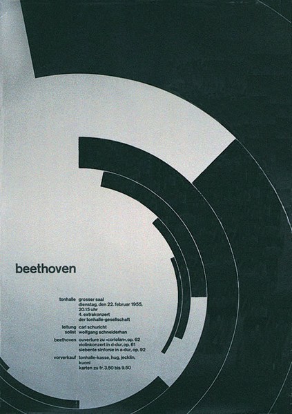
By the age of 27, Armin Hofmann had already completed an apprenticeship in lithography and had begun teaching typography at the Basel School of Design. His colleagues and students were integral in adding to work and theories that surrounded the Swiss International Style, which stressed a belief in an absolute and universal style of graphic design. The type of design they created had a goal of communication above all else, practised new techniques of photo-typesetting, photo-montage and experimental composition and heavily favoured sans-serif typography. The Swiss International Style, and Hofmann, thought that one of the most efficient forms of communication was the poster. Hofmann spent much of his career designing posters, particularly for the Basel Stadt Theater.
Swiss designers Thèo Ballmer and Max Bill studied at the Bauhaus before moving back to Switzerland. Thèo Ballmer formulated a Manifesto of Art Concret in 1930, which called for a universal art of absolute clarity. The visually controlled arithmetical construction of the painting would be created entirely from pure visual elements, that is, planes and colours. Max Bill played a major role in evolving a Constructivist ideal in graphic design. Mathematical proportion, geometric spatial division, and the use of Akzidenz Grotesque type are aspects of his work in the 1930s. In 1949, he wrote that “I am of the opinion that it is possible to develop an art largely on the basis of mathematical thinking”.
Analysis of the Swiss International Style Read up on the different schools within the Swiss International Style: The Zurich School of Arts and Krafts and The Basel School of Design and do a write-up of the similarities between them and the differences in their approaches. This write-up should be your own conclusions, based on examples of work and stated facts and should be approximately 350 words long.
The profession of graphic designer did not exist at the beginning of the 20th century. Posters, magazines and other publications were designed by artists, who used such commissioned work to pay the bills. The first courses in applied graphic design were taught at vocational arts and crafts schools in Basel and Zurich from 1915.
The Zurich School of Arts and Crafts, co-founded by Ernst Keller, contributed to the development of modern graphic design. Keller was also the school’s head of the graphic design programme from 1920 to 1956. A number of students from the Zurich school gained international renown for typeface design and for developing unique styles of their own. One of these students, Josef Müller-Brockmann, replaced Keller as a professor.
Emil Ruder and Armin Hofmann formed The Basel School of Design and helped establish the Swiss Design style. The school brought forth a great diversity of design styles. Hofmann way of teaching was often regarded as unorthodox in his ways. Much of his work focused on elements of graphic form while remaining simple and objective.
Both Armin Hofmann and Josef Müller-Brockmann were Ernst Keller’s students, and their compositions are influenced by his teachings. They had a similar approach to design, and focused on the use of grid systems and sans-serif typography. This was reflected in the similarities in the courses taught both in Zurich and Basel. The work of the designers from both schools was characterised by a design language reduced to its essentials, the use of photography and graphic symbols, sparing utilisation of colour, sans serif fonts and asymmetrical layouts.
But there are a few differences. Whereas the Zurich-based designers championed the use of a layout grid and the Helvetica typeface developed by Max Miedinger, Basel-based designers used layout grids more selectively and favoured Adrian Frutiger’s Univers typeface.
Q1 Practical assignment (observation and analysis)
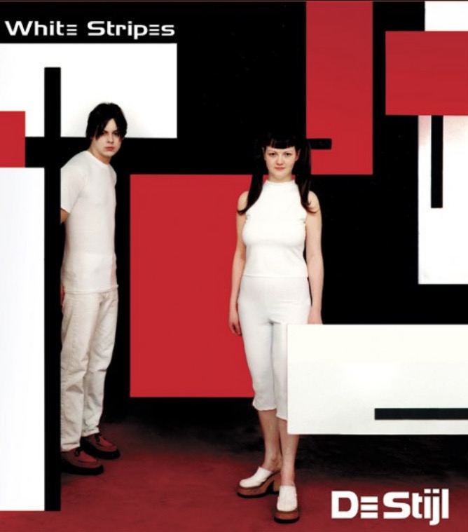
Define, in your own words, the Bauhaus, De Stijl and Swiss Movements. For each of these movements: find examples from their eras, as well as current designs that are influenced by these styles. Explain in your own words how these designs were inspired by the movements.
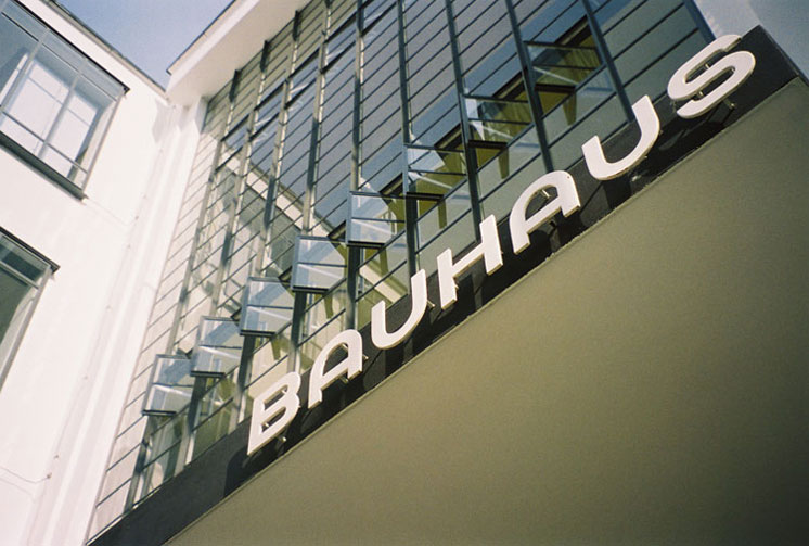
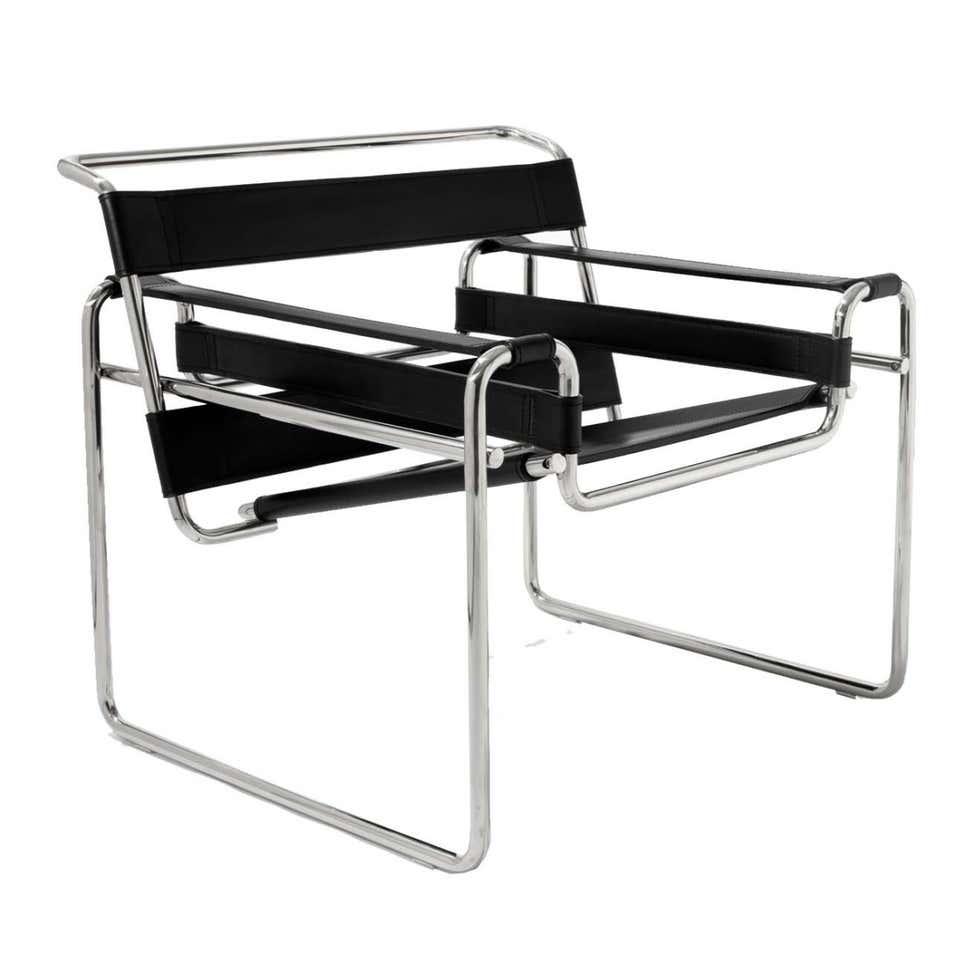
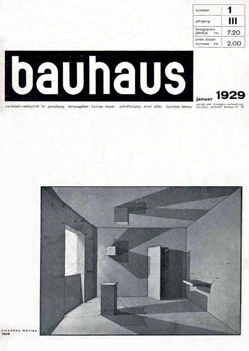
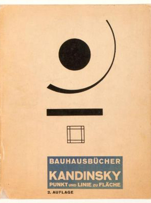
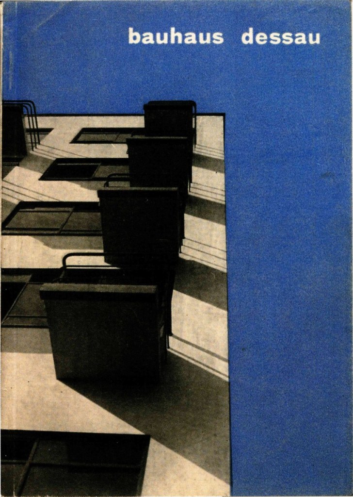
BAUHAUS
The Bauhaus was an art school that architect Walter Gropius established in Germany in 1919. It had a significant influence on the development of graphic design and the 20th century’s modern art. The Bauhaus favoured simplified forms, rationality, functionality and the idea that mass production could live in harmony with the artistic spirit of individuality. The school played a key role in developing the sans-serif typography, which they preferred because of its simplified geometric forms as an alternative to the heavily ornate German standard of blackletter typography. The Bauhaus replaced realistic drawings with photography and montage. Unfortunately, the school was forced to close its doors in 1933 due to pressure from the Nazi political party.
Designs from the era
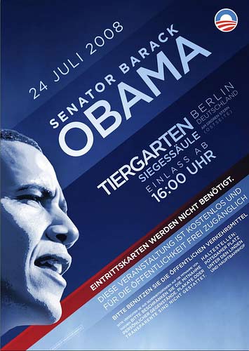
Current designs inspired in the movement
The posters use simplified forms and sans-serif fonts. The chairs and lamp are functional and have a simplified, minimalistic style. All these are characteristics of the Bauhaus movement.
DE STIJL
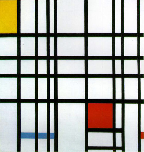
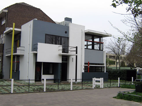
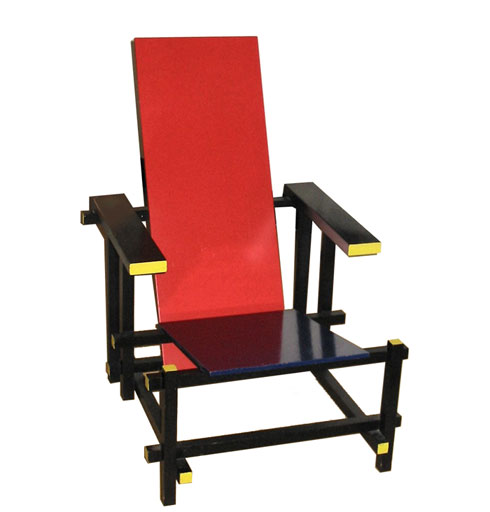
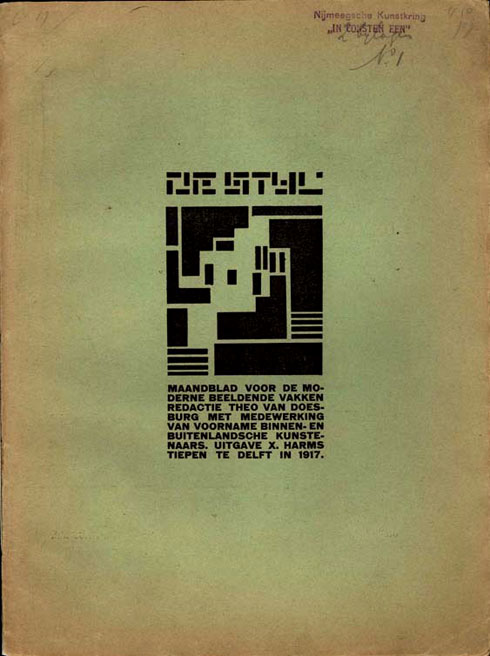
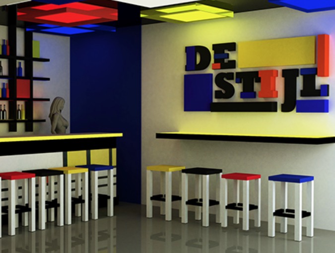
De Stijl, Dutch for “The Style”, was a Dutch art movement founded in 1917 in the Netherlands. The group’s principal members were the painters Theo van Doesburg and Piet Mondrian, and the architect Gerrit Reitveld. Through simplicity and abstraction, the movement developed a utopian style of harmony and order. All De Stijl design was based on the rectangle and the use of black, white, grey and the primary colours.
De Stijl was also a magazine edited from 1917 to 1931 by Doesburg that gathered the group’s ideas and theories. This publication and the ideas of reduction of form and colour are major influences on graphic design development.
Designs from the era
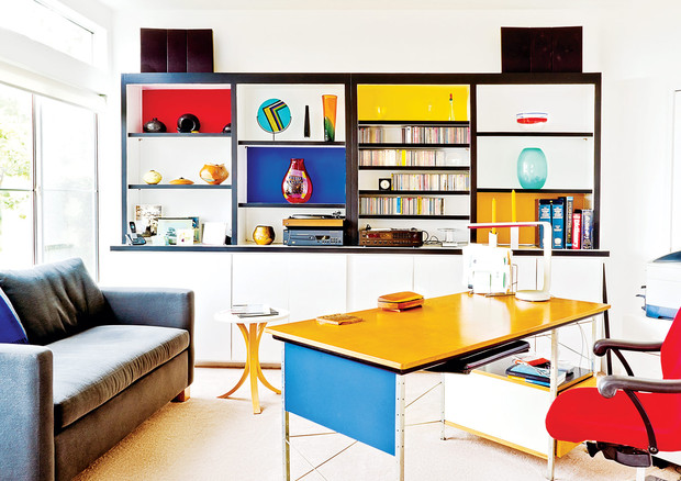
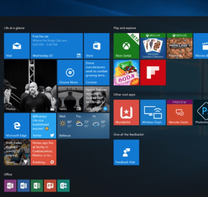
Current designs inspired in the movement
The use of colour in these examples – black, white and primary colours – is evidently inspired by De Stijl. The forms are rectangle and very simplified giving a sense or order. Web design and other user interfaces such as Windows Start Menu are influenced by this movement.
SWISS DESIGN
Swiss design, or International Style of Typography, originated in Switzerland in the 1940s and 50s and significantly influenced graphic design development during the mid 20th century. The movement took hold in two Swiss art schools, the School of Arts and Crafts in Zurich, led by Josef Müller-Brockmann, and the School of Design in Basel, led by Armin Hofmann. The characteristics of this style are object photography, sans-serif typography, lack of ornamentation, grids and asymmetrical layouts. The primary influential works were developed as posters, which were seen as the most effective means of communication.
Designs from the era
Current designs inspired in the movement
These contemporary examples play with object photography and sans-serif typography. They use grids and asymmetric layouts typical of the Swiss Design movement.
Q2 Research, written & practical assignment (problem solving)
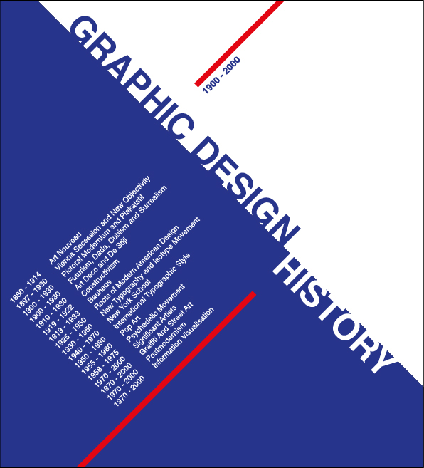
Look at the history timeline at the beginning of this lesson. Gather information from 1900 – 2000, and design your own timeline using the Swiss Design Style as your theme. Each movement should be described in a creative way.
Write, in detail, the following about your client from the previous lesson task (A Personal Survey):
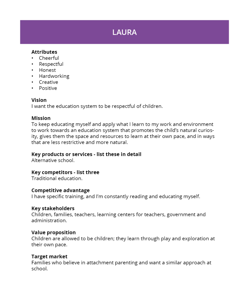
Attributes
Vision and mission
Key products or services – list these in detail
Key competitors – list three
Competitive advantage
Key stakeholders
Value proposition
Target market
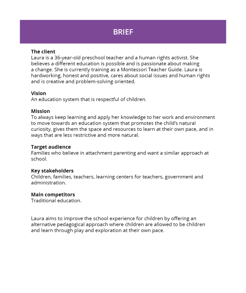
Gather your findings and analyse the one or two interviews you’ve done. Then type up your findings and create your own brief. Your brief should include any insight you may have gained from these interviews. The purpose of the brief is to create a brand. This step of the assignment is the creation of a brief only – you do not have to develop the brand yet. Publish your data from Step 1 and your brief in Step 2 in PDF format. Make sure that the document is neat and well presented.
Having learned about the basics of surveys in the past three weeks, choose someone you know (other than yourself) and create a logo for that person according to the two steps below. The person may be a family member, a friend, a fellow student, a celebrity or anyone you could physically interview and who would be able to participate in your interview.
STEP 1 – Consider what will be your Core Interview Questions and conduct an interview with your chosen individual. Make sure that you get the data on what the person’s persona is: Who are they? What are their personal goals? How do they define success? Etc.
Who are you? I’m a 36-years-old preschool teacher and a human rights activist.
What are your goals at the moment? Finish a Master in Montessori Teacher Guide. Get back to sewing. Start exercising regularly again.
How would you describe yourself? Chaotic, cheerful, multitasker.
What are the most important values for you? Honesty, hard work, empathy, positivity.
Where do you see yourself in 5/10 years? Working in a school with an alternative pedagogical approach.
How do you wish to be perceived by others? Honest, hardworking, positive.
How do you define success? Spend your time doing something meaningful that you enjoy.
What would you say are the obstacles to achieving what you want? The current traditional education system. The way society sees and treats children.
What are your strengths? Hardworking, I care about social issues and human rights, problem solving oriented, creative.
What are your weaknesses? Unorganised, I procrastinate.
What are your interests and hobbies? Sewing, reading, knitting, cinema.
What inspires you? Other schools/teachers, other activists, human rights defenders, literature, nature, I find inspiration everywhere.
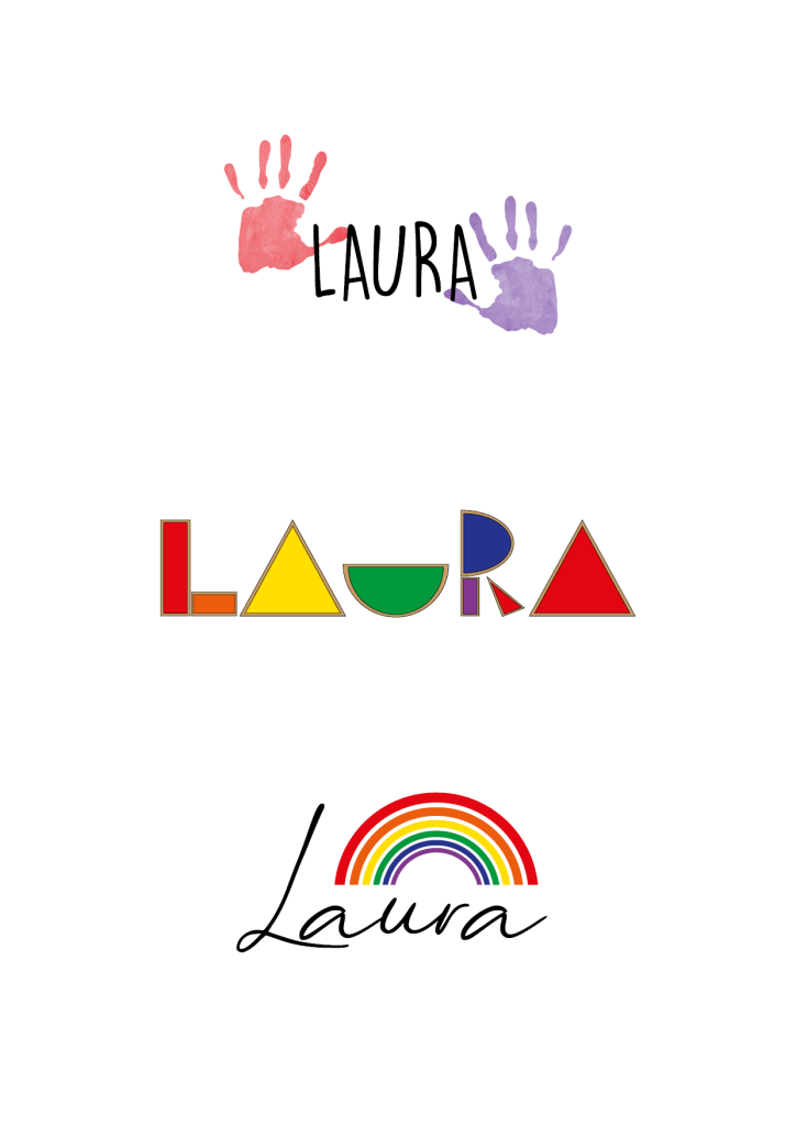
STEP 2 – Now use this person’s name to create a logo for him/her. Remember to keep the previous criteria and guidelines we’ve covered on logos in mind. For the purposes of this assignment, you should create three logo options (of which at least one should be in full colour). There are no restrictions such as type-only, etc. so be creative! It is important, though, to treat this as a professional logo execution, which the “client” may wish to use in his/her own capacity.
STEP 3 – Publish the answers/data from your survey as well as a rationale (a document in which you explain and interpret your ideas) for your logos, based on this research. Also hand in the three options of the logos as PDFs and tell me which one is your favourite, as well as which one your client preferred.
The first logo shows two handprint paintinsg on both sides of her name. The handprint is often used as a human rights symbol, and it is also an element one would easily find in a preschool classroom. I think the logo combines her two biggest passions well and therefore it is my favourite. Laura picked this logo as well.
For the second, I represented her name using transparent blocks often used in light tables at Montessori schools or homes.
Lastly, I chose a handwritten typeface for her name and put a rainbow on top. Rainbow colours are widely used in alternative schools such as Waldorf or Montessori.
For this Lesson Task I had to answer the following questions about visual identity:
Name the three most important components of visual identity.
Logo, colour, typography
Describe the difference between logotype and signature.
A logotype is the graphic expression of a company’s name, product or service. A signature, in regards to identity design, is a structured relationship between a logotype, brand mark, and tag line.
Logotype
Signatures
Using Kuler create a colour scheme (using only three colours in each set) for the following products:
A rich chocolate cake that is made from real chocolate. The keyword here is “quality”.
A courier company that delivers internationally by air, land and sea – their main focus is fast delivery.
An international insurance company that focuses on family values.
Write your name in four different typefaces, according to the following criteria. Use a typeface that:
In this Lesson Task, I had to come up with five name options for an ice cream using five given words for inspiration. I should not spend more than a few minutes on each name). The ice cream has a range of different flavours, but the unique aspect it should communicate is the fact that it is the coldest ice cream in existence.
Latin – Glacies (means ice in Latin)
Colours – Indigo (colour between blue and purple)
Metaphors – Blizzard cone
Science – Sub-zero (temperature below zero in some scale, often Fahrenheit)
Myths – Skadi (norse goddess/giantess of skiing, winter, and mountains)
Watch the movie “The Greatest Movie Ever Sold” (The official title is “POM wonderful Presents: The Greatest Movie Ever Sold”) and answer the questions that follow.
1-Do you think the movie provides insight or detail into what drives product placement in entertainment? If so, what have you learnt from that? If not, how would you change aspects of the movie to reflect insight on this?
The movie shows how the entertainment industry benefits from displaying products in films and tv shows as they get a substantial amount of money from the company. This money, in some cases, is essential to fund the movie, as is the case for “The Greatest Movie Ever Sold”. It was also interesting to see the strict contracts they have to sign and how much power the companies get over the content or promotion of the film. Of course, the bigger the movie or show, the bigger the audience they reach, and the higher the businesses are willing to pay. This also happens in sports and other sectors. Even some schools feel forced to use product placement in their school buses to get enough funds.
2-What have you observed about presentations of visual strategies/brand identity?
It is essential for the brands that the movie shows a positive image of their identity that won’t hurt their reputation. Thus, they want to have as much control as possible over how it is done and use all their power to do so.
3-Let’s consider this movie as a form of research. In other words, it was done to see what the effect of branded entertainment would be, a case study of sorts. What are your findings? What have you learnt? What has changed your pre-conceived ideas? Do you think there’s relevance in this case study? How could you apply your observations in real life?
I knew there was product placement in the entertainment business and sports, but I did not realise how much and the impact it has on our decisions. It is scary to see how we are being influenced at all times and the tricks and techniques used. It’s especially alarming when the target is children or teenagers, as they are much more vulnerable. I think it’s deceiving and commercials should be marked as such, so the audience knows when they are being targeted.
4-From the findings above (question 3) imagine that the international coffee brand, Starbucks, is your client. Give one complete strategy for a small activation campaign to advertise Starbucks on aeroplanes. Give one idea of how you would do this, by following the 5 steps of the work process. To guide you, follow the points below and do a write-up of your idea as well as the steps you followed:
Conduct research – you can visit the website http://www.starbucks.com as part of your research. Also think of quick research methods, such as surveys done on family and friends.
For my research, I first visited http://www.starbucks.com and read the sections About us and Careers. The company claims to offer great coffee while helping make the world a little bit better.
On their menu, one can find high-quality coffee, hot and iced beverages, teas, Frappuccino blended beverages, as well as pastry, sandwiches, yoghurt, salads and snacks.
Starbucks offers a full and rewarding coffeehouse experience and aims to be a neighbourhood gathering place where people come to chat, meet up or even work.
It’s their goal for all their coffee to be grown under the highest standards of quality, using ethical sourcing practices.
I also researched in-flight advertising and found out there are many possibilities: advertising in airline’s magazines, on electronic displays, sampling in planes, seatback inserts, on boarding passes, lunch boxes, on folding tables, on the headrests, overhead bins…
On their homepage, Starbucks is promoting their Rewards program, where customers earn stars every time they make a purchase and then can redeem them for free drinks or food. I decided to create the campaign for this program: passengers will find instructions on how to sign up for the Rewards plan on their folding tables. When they scan the QR code to download the app and create the account, they get a free Spring special onboard – one of their seasonal beverages-. I chose this approach because the passengers will be sitting in front of the advertisement for a long time, and, nowadays, many airlines offer free wi-fi to their customers. They will have the time to go through registering for the Starbucks Rewards and enjoy a treat for free while getting to their destination.
Clarify the strategy – Once you’ve conducted quick research, do a write-up of your findings and create your own brief.
After the research, I created the following brief:
The company: Starbucks is an American multinational that is the largest coffeehouse chain in the world, with more than 32.000 stores in 83 markets. Its headquarters are in Seattle, Washington.
Brand’s mission: To inspire and nurture the human spirit – one person, one cup and one neighbourhood at a time.
Brand’s vision: Offer high-quality products while creating a community, helping create a positive impact on the communities they serve.
Target audience: High to middle-income coffee lovers aged 25 to 50. They are busy office workers who enjoy a cup of coffee on their way to work.
Key stakeholders: Partners, customers, suppliers, investors and neighbours.
Main competitors: Costa Coffee, McDonald’s McCafe, Dunkin’ Donuts.
Campaign: The campaign aims to promote the Starbucks Rewards program, which allows the customers to earn stars with every purchase that they can redeem for free drinks and food. The Rewards plan helps build customer loyalty. The advertisement is going to be placed on the folding tables of aeroplanes, where it will be visible during most of the journey. The ad will show a QR code that the passengers can scan to download the Starbucks app and sign up for the program. Once they do, they get a complimentary Spring special beverage onboard.
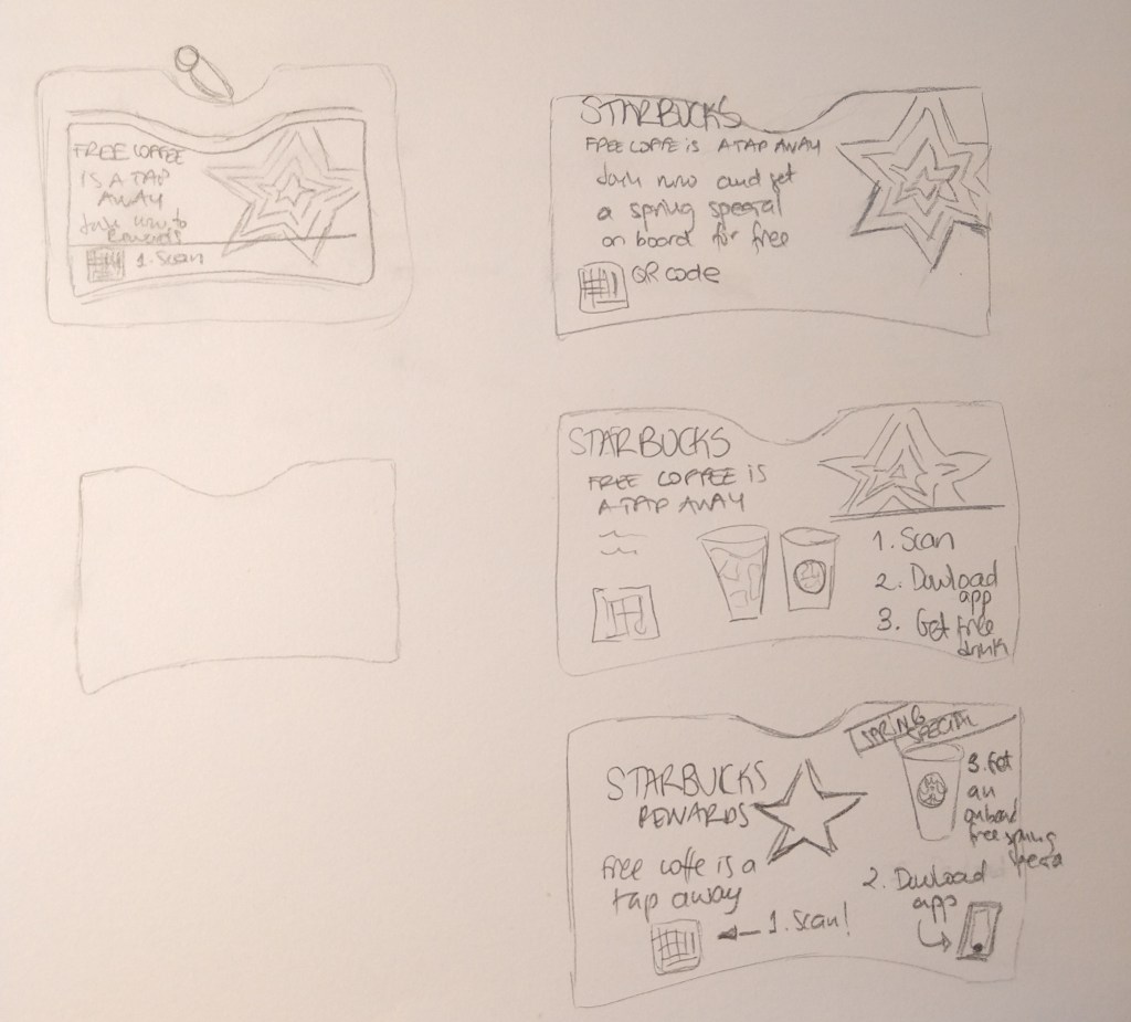
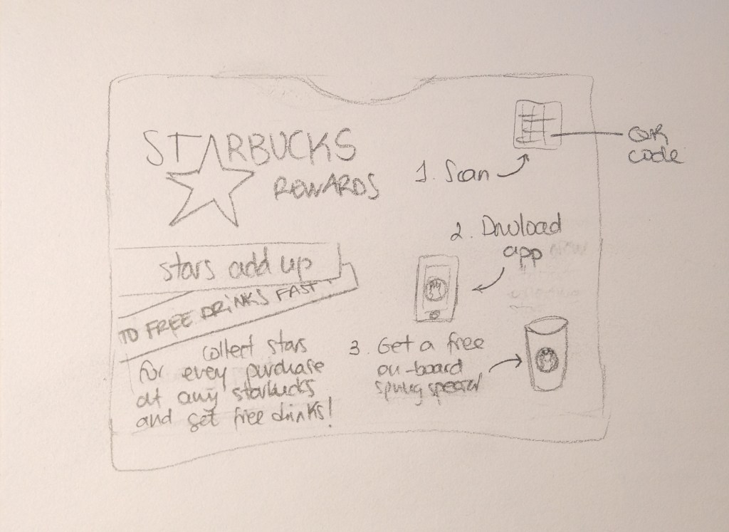
Design the identity – Here you do not need to go into lengthy design, but create sketches of your ideas and remember to think about the movie for inspiration.
Create touchpoints – As this is a focused campaign, you may have one touchpoint only; describe how you would activate your campaign using this touchpoint. If you need to, you may do sketches that would aid your communication.
The first touchpoint would be the Starbucks app that the customer downloads on the plane. Then, the free beverage they get onboard after signing up for Starbucks Rewards.
Manage the assets – As this is not a prolonged campaign, briefly describe how you would use the possible outcome of your campaign for future use. Also state what your follow-up steps would be to strengthen your message. For example, you’ve done research and decided to give free vouchers along with every boarding pass handed out. How would you collect feedback from consumers or how would you communicate to them at the airport, on the flight, etc. to support your campaign?
Thanks to the unique QR code on the plane ads, we can collect data about how many passengers signed up for the Rewards program during the weeks the campaign was active. Once a client is registered, Starbucks can send notifications to their phones with information about discounts, campaigns or new products. If the campaign works well, it can be done periodically, offering different drinks or snacks as complimentary during the flight.