Describe the steps that you will take to ensure that you take a high quality photograph in low light conditions. Refer to exposure, lenses, tripods, colour temperature, flash and ISO. Your answer should be a minimum of 350 words.
Question 2 – Practical assignment
Watch the LinkedIn course Photography 101: Shooting in Low Light by Joseph Linaschke
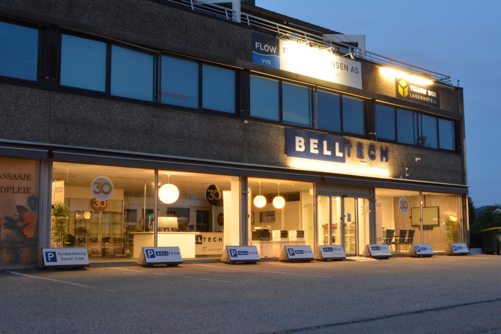
Take four low-light photographs: – One should be a sharp photograph that focuses on a static object, like a building or statue. – The second photograph should showcase moving objects, like cars or running water. – For the third photograph, take a moody portrait of a friend and use high ISO settings to your advantage. – The fourth photograph should explore using external light sources, like a Speedlite flash (please note, if you don’t have the equipment to take this last photograph, you may leave it out).
ISO 640 32 mm f/13 1.3 sec
ISO 100 32 mm f/20 10 sec
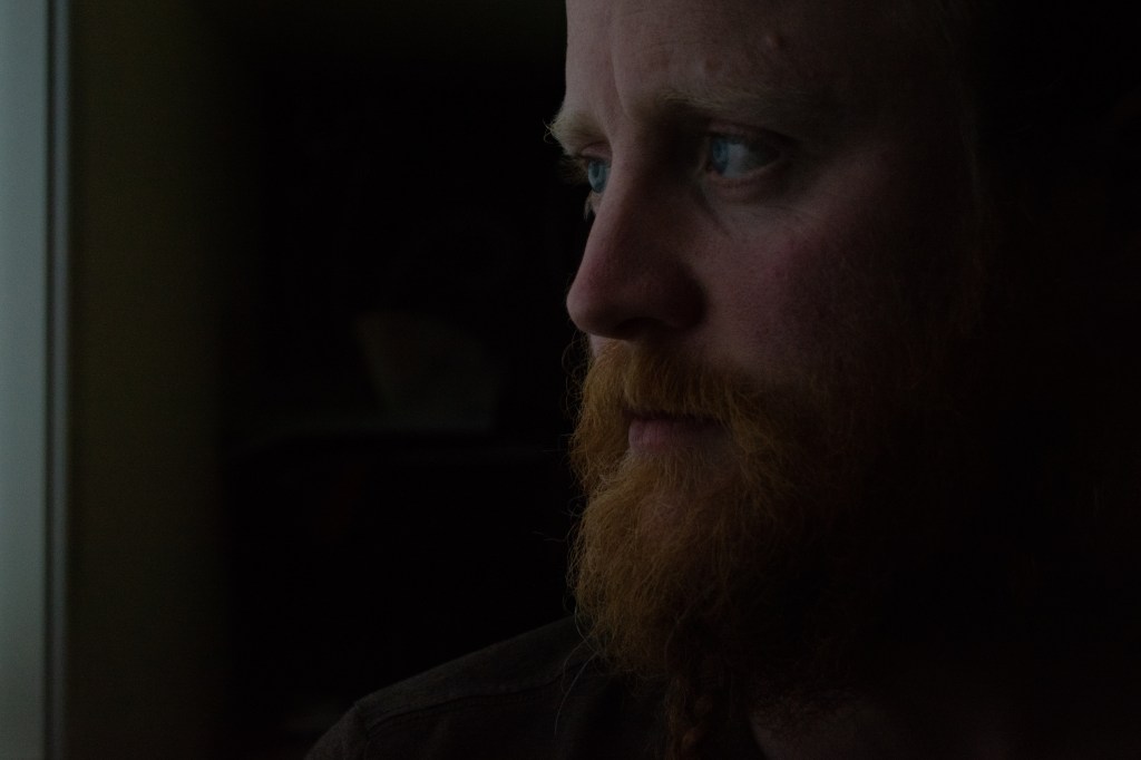
ISO 2000 55 mm f/5.6 1/50 sec
ISO 100 42 mm f/5.0 1/200 sec – Nikon Speedlight SB-300
This week I experimented with low light and slow shutter speed. I had to take photographs in the following scenarios:
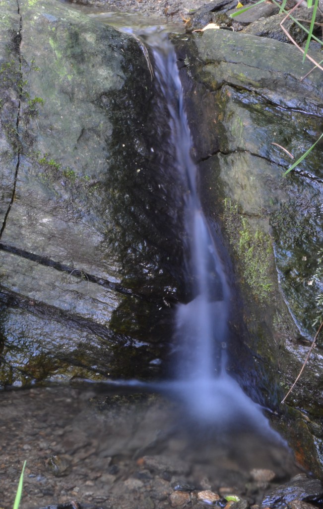
1 – Wait until it’s almost dark outside. Take your camera and go and sit in a busy tourist area. Choose a building or statue to photograph. Place your camera on a tripod and set the shutter speed to 30 seconds or more (if you don’t have a tripod, something stable, like a chair, will also work. If you don’t live close to a busy street, just get one or two people (or even your dog) to move up and down past the camera during the 30 seconds). Take a look at your photograph. Do you see a lot of people in it or just the building/statue?
ISO 100 30 mm f/29 30 sec
It doesn’t really get dark in June where I live so I had to take this picture at midnight. There were not many people out at that time so I chose a building in my neighbourhood, put the camera on a tripod, set the shutter speed to 30 seconds and walked in front of the camera several times. No image of myself walking around was captured, only the building. I thought a moving person would at leaset leave a trail, but the picture turned out completely clean. Good to know for future night shots!
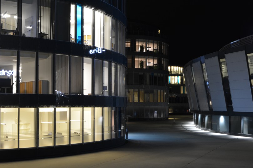
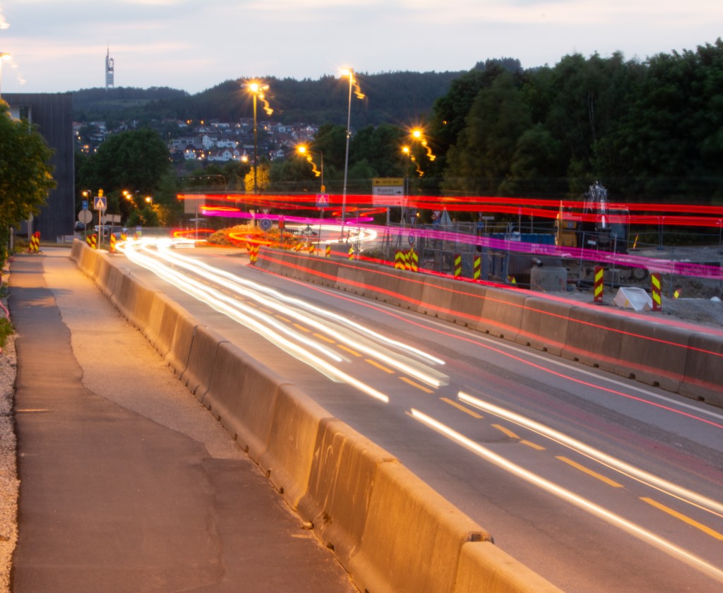
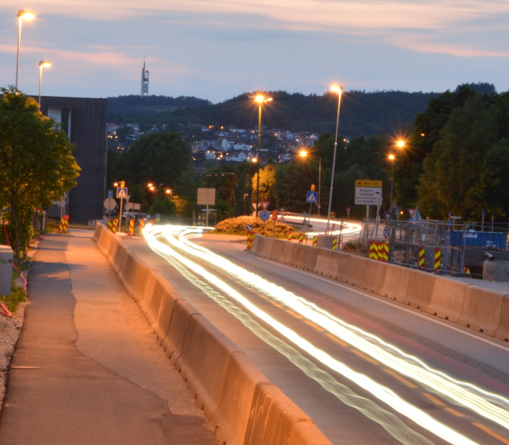
2 – Wait until it’s dark. Go and stand on a bridge over a busy street (or look from the window of a high-rise building). Place your camera on a tripod and set your shutter speed to 30 seconds or more. Inspect your photograph. What do you see?
(If there’s no bridge or high-rise building close to where you stay, find a street where there are some cars driving or alternatively ask a few people to help you by driving up and down your street. You can even pay an taxi/uber-driver. Ideally you should capture this from a bit higher than street level. You can ask a hotel in your area to use their window or the flat of a friend that stays on the second floor. Some buildings have a secret stairway to the roof… be creative, and safe!)
ISO 100 50 mm f/32 30 secISO 100 55 mm F/32 30 sec
I took this pictures from a side walk that is a bit higher than the street using a tripod. The cars and bus lights created lines as they drove away and towards the camera. In the second photo I used a timer, so there is no movement when I pressed the shutter. In the first photo I didn’t use a timer, so the street lamps “draw” some figures as the camera moved.
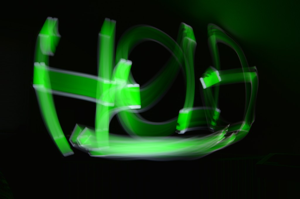
3 – Ask a friend to help you with this activity. Choose a dark room in your house and switch off the lights. Place your camera on a tripod and set your shutter speed to 30 seconds or more. Ask your friend to “draw” a picture in the air using a flashlight. Take a look at your photograph. What do you see? This fun activity is called light painting. Try an easy pattern first, but also a more complicated one.
ISO 100 18 mm f/14 30 sec ISO 100 18 mm f/14 30 sec
In this case I used a tripod and a timer, so I could move to the front of the camera. I used a green screen on my phone to draw the figures above. First, I tried a simple circle and in the second photo I wrote “HOLA” (hello in Spanish).
Question 1 – Written assignment (Research and analysis)
Draw up a list of the most important aspects of a product photograph. Refer to shadows, lighting, quality, ISO and editing in your answer. Mention at least five things.
1 – Lighthing: Good lighting is the most important aspect of product photography. We need to have full control over lighting the product. It should be soft, balanced and even.
2 – Shadows: As the lighting is diffused, the product’s shadows, if any, are soft.
3 – ISO: Should be kept at the lowest possible, ideally never higher than 100. The higher the ISO, the more noise.
4 – Quality: Product shots should be of a very good quality. It’s important to choose the highest resolution setting on the camera to get sharp photos.
5 – Editing: When the file format is Camera RAW the photos are easier to edit. The editing should be minimal, just to make small adjustments like cropping or removing the background, sharpening or adjusting the levels.
Question 2 – Practical assignment
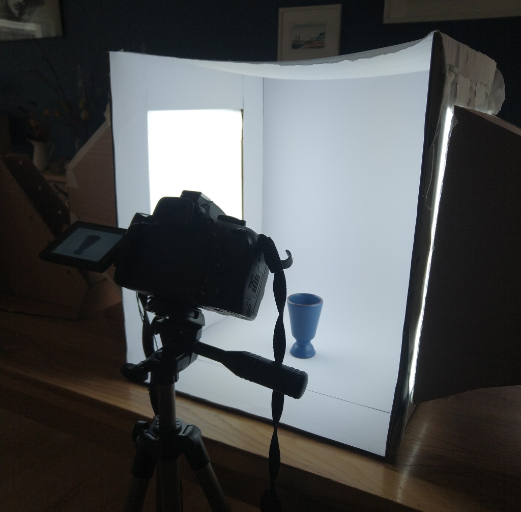
Make your own DIY light tent.
Take product photographs of the following objects:
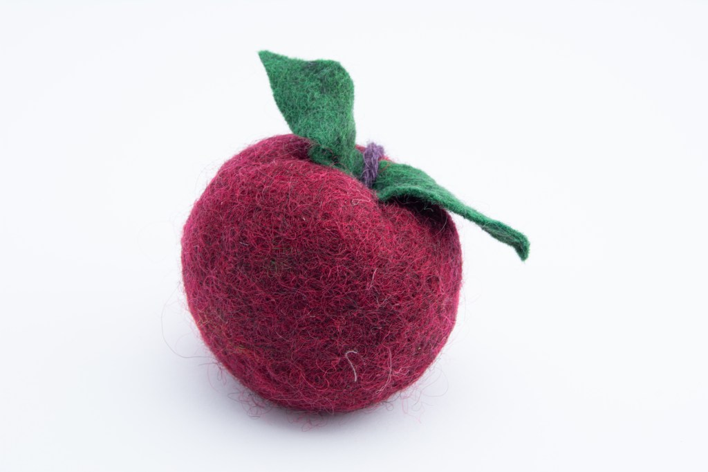
Something fluffy, like a stuffed animal
Something shiny, like a knife and fork
Something hard, like a book or a mug
A liquid, like a glass of wine
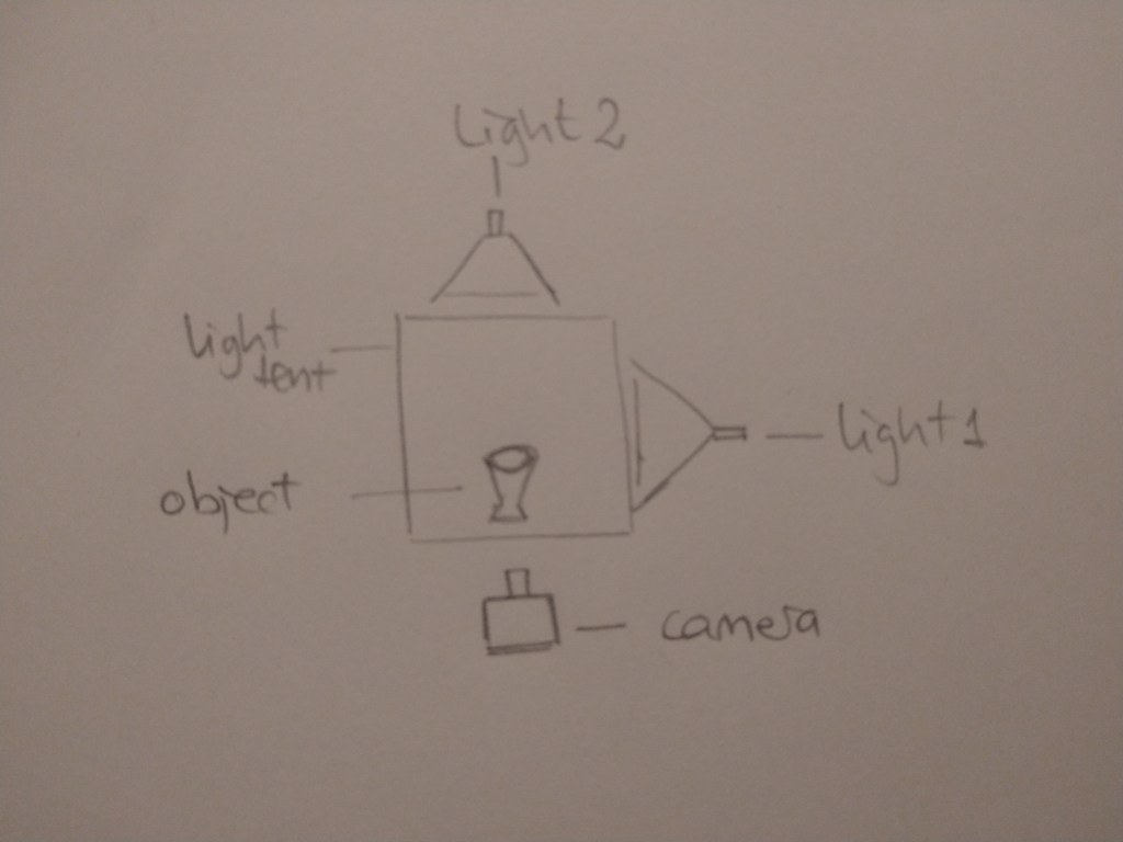
Draw a diagram of your lighting scenario for each of the above photographs and submit it along with the photographs.
Edit your photographs with the software of your choice. Write an accompanying paragraph for each of your photographs and explain what you did during the editing process.
This is the light tent I made for this assignment. I used the cardbox lamps I made for MA06 last semester.
1 – something fluffy
2 – something shiny
3 – something hard
4 – liquid
Lighting scenario for all of the pictures above:
I edited my RAW files in Lightroom. I adjusted the temperature, exposure, contrast, highlights, shadows, whites, blacks and texture until I thought the photos looked the best.
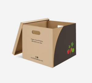
The US-based company Farm Fresh to You are planning an expansion to my local community: Jæren, Rogaland, Norway. The company recognises the need to develop a new logo and visual identity to suit new customers and markets.
For this course assignment, I had to conduct research to identify the competition, the target group, drivers and barriers and to use this information when designing the new logo and visual identity for this company. They also needed suitable packaging for their products and branding on the delivery vans.
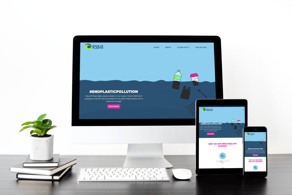
For this course assignment, I had to create an interactive website for a fictive non-profit organisation that raises awareness around plastic pollution and its impact on Marine Life.
All the information on the website should have an infographic style, the homepage being the most important part. I should create my own graphics and text to avoid copyrighting infringement. The website must adapt to all screen sizes.
Plastic Wave is a non-profit organisation that aims to raise awareness about plastic pollution and its impact on marine life. Their main goal is to inform the public about the problem and its causes and give them options to take responsibility and demand change from companies, governments and institutions.
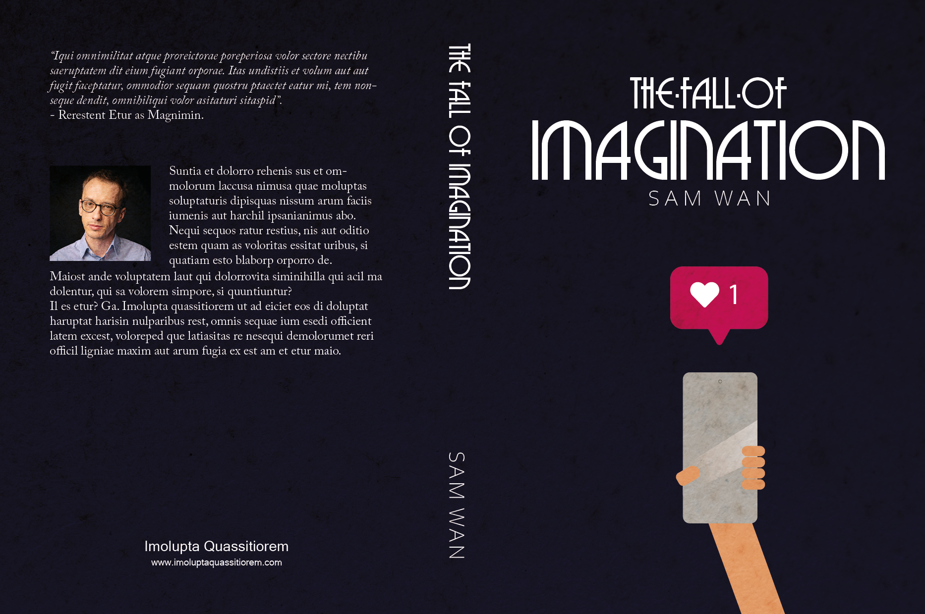
Design a book cover for a thriller book called “The Fall of Imagination” by Sam Wan. This book does not exist and is open to your interpretation as to the subject matter.
It must be designed by clearly drawing inspiration from a previous design style.
The size of the cover must be A5 and it should include a front, spine and back.
The cover must contain a simple vector illustration that forms the basis of the design.
The cover must contain the title and the name of the author.
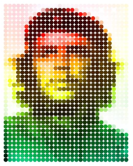
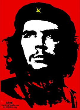
Choose any one of the illustrations from the lesson “Design Drawing” and answer the following questions (when submitting your feedback – also provide the illustration you chose):
What fundamentals are used successfully? Describe in detail what you think is the most successful aspect of the illustration (remember to focus on the fundamentals).
What style from the past is being used in a new way in this illustration? If no previous style is clearly apparent, does it use some form of pastiche? Why do you think this specific style or pastiche was used? Describe in detail whether you think it was used successfully or not.
Read again what Mondrian said about the expression of beauty or self. Which do you think played the dominant role in the execution of this illustration? Explain your thoughts.
If you had to create this illustration, before starting the actual execution, what would your initial thoughts be on:
Colour (what would your approach to colour be?)
Line (what would you like to portray with the use of line?)
Composition (what would you wish to instil in the viewer by the use of composition alone?)
The illustration represents Che Guevara’s poster by Jim Fitzpatrick with the halftone technique, which simulates continuous-tone imagery through the use of dots, varying either in size or in spacing, thus generating a gradient-like effect (Wikipedia). In this case, the dots all have the same size and are equally distanced from one another. The change in colour and saturation is what forms the face. The Gestalt principle of proximity is successfully applied to this illustration.
The use of halftone technique, an image of a widely known person and bright colours suggests that the style used here is Pop Art.
I think Tahier Variawa is expressing himself through the execution of this illustration. It is a very popular picture that most people recognise, and he created his take on it. The dots that form the portrait are big enough to simplify the image, but not too much that is not recognisable. Instead of the original darker, even aggressive, colours (red and black), he decided to use brighter ones and more varied ones.
If I was to create this illustration, I would probably use slightly smaller dots to give it a little more detail. I don’t know why the author picks green, yellow and red in the way he does here, but I would probably use a colour palette similar to the one on the original poster. As for composition, I would keep it the same as it works fine for a portrait.
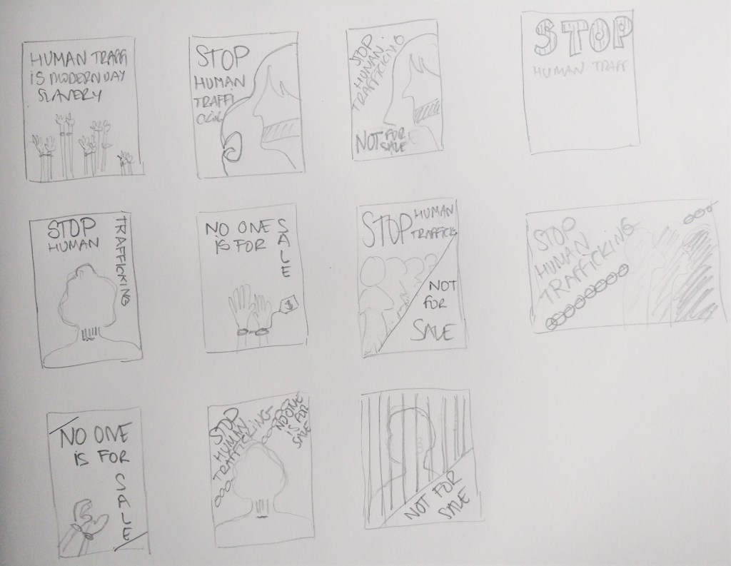
Design an A4 poster for a humanitarian cause you feel passionate about. For example, creating awareness and a call for action against human trafficking. You must apply pastiche to your design. Use a style of propaganda used during the Modernism era and create your own, unique design in a contemporary context.
Start by creating at least 5 thumbnails for your design. These thumbnails should be handed in with your assignment.
Write a rationale or explanation for your poster of at least 350 words. Why it is necessary to create awareness of the humanitarian cause?
Give an explanation for your creative execution, mention the use of colour and graphics as well as typography.
Give examples of the designs you used as inspiration and why it is applicable to your design.
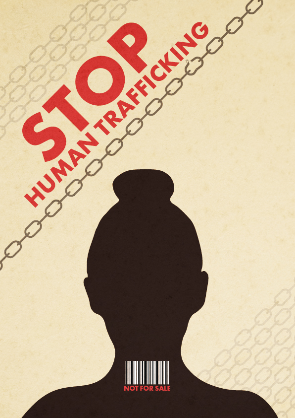
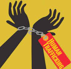
For this lesson task, I chose the humanitarian cause of human trafficking.
Thumbnails
The poster
According to the United Nations, Human Trafficking is the recruitment, transportation, transfer, harbouring or receipt of people through force, fraud or deception, with the aim of exploiting them for profit. Men, women and children of all ages and from all backgrounds can become victims of this crime, which occurs in every region of the world. The traffickers often use violence or fraudulent employment agencies and fake promises of education and job opportunities to trick and coerce their victims.
No matter where they come from, every person should be free; no one has the right to sell another person. Human Trafficking is a violation of Human Rights. It is modern-day slavery and must be stopped. We, as a society, need to find a solution to put an end to this inhumane practice.
The silhouette on my design represents a victim of trafficking. The bar code on their neck depicts the person as a product that can be sold. Besides, many times, human trafficking victims are coerced into getting tattooed as a way to signify that they belong to a certain pimp/trafficker. A tattoo resembling a bar code has long been linked to human trafficking in Europe. Chains surround the person, and one of them -the darkest one- is breaking, expressing the need and hope to end this crime. The colour palette is inspired by the posters below, as well as the sans-serif bold typography.
Inspiration
To create this poster about human trafficking, I used inspiration from other propaganda posters from the Modernism era as well as from Post-modernist signs.
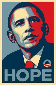
“Frank Shepard Fairey is an American contemporary graphic designer and illustrator who emerged from the skateboarding scene. He first became known for his ‘Andre the Giant Has a Posse’” (…OBEY…) (www.obeygiant.com) sticker campaign, in which he appropriated images from the comedic supermarket tabloid Weekly World News.
His work became more widely known in the 2008 U.S. presidential election, specifically his Barack Obama “Hope” poster.
Source: Wikipedia
Analyse his poster for the 2008 U.S. Presidential Election and give your opinion on the use of style and its efficacy. Also critique the use of pastiche and typography. Write one page (about 350 words) on your opinion of this design and substantiate your answers with examples.
The Barack Obama “Hope” poster designed by artist Shepard Fairey for the 2008 US Presidential Campaign is described as iconic. Although not originally part of the official campaign branding, the design proved so popular that the poster became something of a viral phenomenon, seamlessly playing into the Obama campaign’s overall ambience.
The poster shows a portrait of Obama where he is gazing slightly upward and to the side, and his expression communicates confidence and focus. Its style depicts the presidential candidate as an almost heroic figure. The word “HOPE” that accompanies the picture helps convey the message of Obama being the change to come for the people of America.
We can see how Fairey took inspiration from images of previous American presidents, such as the well-known JFK portrait or the image of Abraham Lincoln on the five-dollar bill. Choosing the same recognizable pose of previous presidents elevates Obama to the same level and depicts him as the next president of the United States, even before the election.
Source: Wikipedia
Source: Wikipedia
The “Hope” poster style imitates other propaganda posters such as Jim Fitzpatrick’s Che Guevara, where he is represented with a straight look into the distance, similar to Obama’s pose. The focus is on Che Guevara’s black and white face on a red background.
Source: Wikipedia
In his work, Sheppard Fairey often uses red and cream colours, which he also did in the “Hope” poster. In this case, he also added blue, which symbolizes trust and loyalty, strengthening Obama’s figure. Red, white and blue are the traditional American patriotic colours, but he uses a muted, desaturated palette, differentiating his work from almost all mainstream political campaign images.
Source: CareerAdict
The all-capital slogan printed under Obama’s image says “Hope” in a bold, modern, sans-serif typeface. Through this slogan, the viewer forms a correlation between the three-quarter pose and the concept of hope and generate the meaning: Barack Obama provide us hope.
In conclusion, the limited palette, the simplicity of the layout, a short slogan in bold typography and the flat-colour illustration makes the design effective and easy to recognize and remember. It also allows for the image to be widely reproduced, which was Fairey’s intention. It certainly helped to make this iconic work go viral.
Within the broader milieu of Neo-modernism, we focus on Marian Bantjes, who set design trends with her unique application of typography, loose illustration and well-balanced compositions.
Objective observation During the interview, Marian mentions, “When I worked at Digitopolis, I was working almost entirely on the computer, basically the computer and with photography. And now I am using a wide variety of materials, sometimes still involved with a computer and sometimes just with the materials themselves. But having a space like this allows me to obviously store them all, and to work on these various surfaces in different media.” What is your opinion on the use of the computer combined with different media? Write one page (350 words) on your opinion of the importance of media and design and what your take is on the use of computer technology.
Throughout the program, we have learned how important it is to use pencil and paper to sketch and test our ideas before moving to the computer. Everyone works differently, of course, but I find the ideas flow much easier when I draw or write by hand rather than trying to do it directly on my PC.
Adding other media into the process of creating a design is very interesting and inspiring and opens up even more possibilities than just a few sketches on paper. It does not necessarily mean one has to use art supplies or expensive, rare things. In the movie, we see how Marian uses everyday items such as pasta or flower petals to create beautiful compositions later used to form patterns for a design.
In my opinion, any way of expressing yourself is good. I see design, photography, art and any creative discipline as parts of a whole where the different pieces intertwine. It can be intimidating to try to create something on a media we have not used much before. Still, if we see it as experimentation, we remove the pressure of having to produce an outcome, and we just play with it and see where it takes us. Maybe it is a creation worth using on a book cover, perhaps gives us inspiration for something else, or it ends up discarded. Experimenting and incorporating works made with other media can only enrich your designs and make them more personal and unique.
A computer is an essential tool available to designers. It offers many digital tools that help us work in a way it was not possible before. We live in a digital world, so it will always be necessary to bring designs to a digital form. However, I recognise the importance of testing and developing ideas before we do so. And the more materials and techniques we can use to expand our creativity, the better.
In conclusion, it might not be a requirement to combine the use of the computer with different media to be a good designer, but it can be very beneficial, and Marian Bantjes is an excellent example of it.
Pushing technology and changing philosophy While describing her development of style, Marian states, “I am not an expert on illuminated manuscripts by any stretch of the imagination, but there are a couple of purposes of it. But one of those purposes is definitely to invoke wonder in this way that was very interesting to me was feeding directly into my ideas about that symbiotic relationship between graphics and text.” How do you think this links to the philosophy of the Swiss International School? How is it different? Has technology given us an advantage in expressing the symbiotic relationship between image and text? What about Marian’s work? Is this reflected in her work? Do a write-up (350 words) on the relationship between image and text, as seen in Marian’s work and relate this back to the Swiss International School. Substantiate your answers with relevant facts. You may use a visual example of both Marian’s work and that of the Swiss International School to facilitate your analysis.
The relationship between words and images is an essential element of design. Words and images may correspond to one another. The opposite extreme occurs when the image and the words do not illustrate but rather contradict each other. When the relationship between text and images is not too literal, the viewer must play a more active role: they must discover the main idea themselves and participate in creating the meaning of the message.
In Swiss Style, there is also a symbiotic relationship between image and text. As Josef Müller-Brockmann put it: “Copy and a picture are arranged and related in accordance with objective and functional criteria. The areas are sensitively organised with an assured touch in mathematical proportions, and due attention is paid to the rules of typography”. The difference is that Swiss Style is characterised by simplicity, functionality and lack of ornamentation with the use of only sans-serif typefaces, while Marian designs are very decorative and elaborated, and the typefaces ornamental and complicated.
Communication is the Swiss Style’s primary goal, one that dictates the need for symbols appropriate to the content of the message. On the contrary, Marian’s intricated designs often make the viewer pay close attention to try and figure out their meaning or the hidden words.
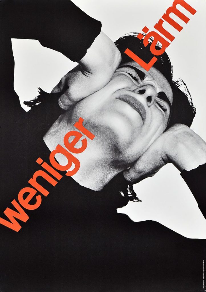
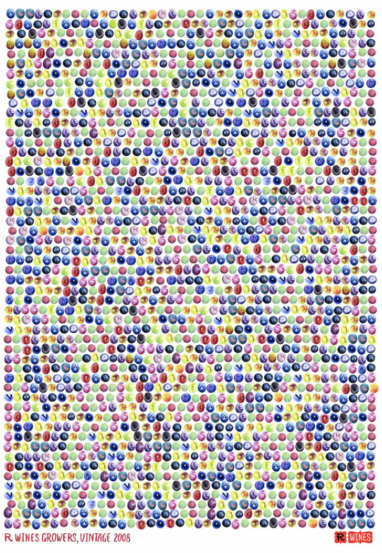
To illustrate this, I include some examples below. The poster on the left by Swiss designer Josef Müller-Brockmann reads “less noise” in red type, and the photograph shows a person covering their ears with their hands, depicting the discomfort of noise pollution. To the right, Marian Bantjes’s work, requires to pay closer attention to the poster to work out that the circles represent grapes, then realise there are letters written on them and that they actually form the names of R-Wines’ grape supliers.
Creating graphic designs in the past required a lot of labour, and making changes to them was far from easy or simple. I am not sure technology gives us an advantage in expressing the symbiotic relationship between image and text, as this relationship already existed in illuminated manuscripts in the year 400, but it is clear that it is now a much quicker and straightforward process.