Front Cover

Week 21

Question 1

Have a look at all the tasks and lessons you have done over the last few weeks. Your task now is to make a cover (a front page) for your very own magazine.

  1. Go through the Graphic Design history timeline and choose a style and designer that you feel relates best to your personality.
  2. Using that designer/style as inspiration, use your name or part of your name and create a title/name for your magazine. Feel free to be creative!
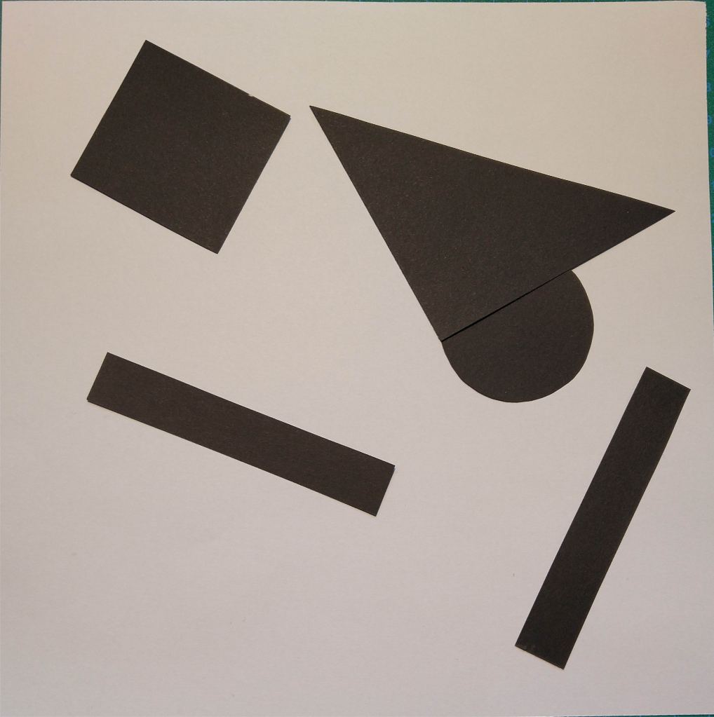
  3. Add your own pictures, text, illustrations, elements as well as the proper typography and titles for your cover.
  4. The expression must represent your personality (remember the color choice regarding this).
  5. Remember to include what kind of magazine it is, for example cars/bikes, fashion, design, weddings, etc.

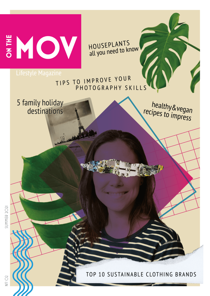
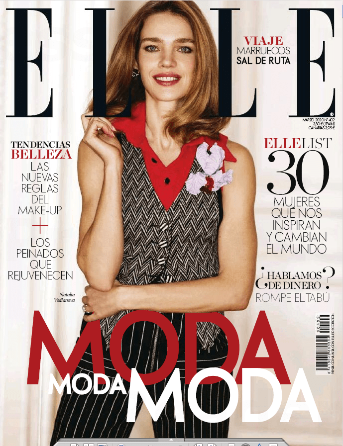
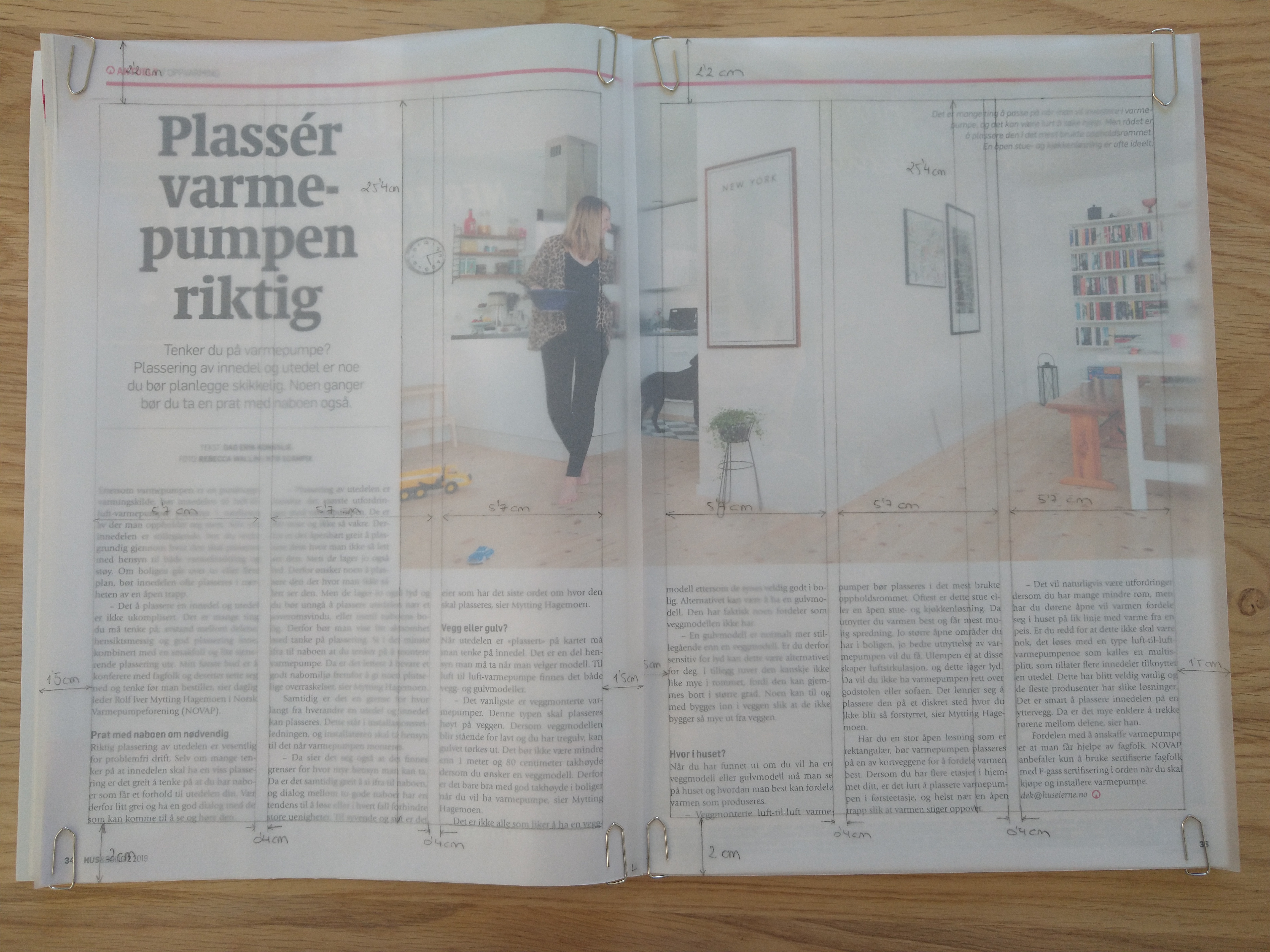
This magazine cover is inspired by the New Wave movement. New Wave designers rejected the order and cleanliness of the Swiss grid-locked design and typography, experimented and broke the rules. I find it fascinating how different elements with apparently nothing in common can work together to form exciting and beautiful compositions. I recently came across Carly Guppy’s work. She creates collage art and mixed media pieces inspired by vintage photographs, found papers and patterns, plants and animals. Her art was an inspiration for this task too.

I initially named the magazine “On the Move”, but my teacher suggested dropping the E, as this more ‘rebellious’ spelling is in line with the style, and people would still be able to read it. MOV are my initials (Mónica Otero Vidal).

The main picture is a self-portrait I took last semester with the use of a tripod and timer. I integrated it in the collage, with other stock images and graphic elements using illustrator. Blue, purple and green are my favourite colours, that is what I chose them. Both the photos and the articles describe me in a way, as I love plants, healthy and plant-based eating, photography and enjoying time with my family.

Question 2

Post your final design on the forum (Lessons and Activities forum) for comments from your tutor. Remember to include what your inspiration was (designer/style from the Graphic Design timeline). Discuss the results with your fellow students (your group) on the forum. 

  • Explain shortly how you perceive your group members through their covers.
  • Do they see your personality through your cover, too?
  • Make a short comment if you feel they’ve nailed it!

I posted my cover in the forum and got feedback and guidance from my tutor, which helped me refine the design.

There are not many students in my group, so I also checked the covers in other groups. It was fun to see the different approaches for the same assignment.


Sources:

Pace and contrast

Week 10-11

Compare the design (in terms of pace and contrast) of an online magazine, blog or website to that of a printed magazine, book or journal. What differences can you see between the kinds of design strategies used in the two formats?

For this Learning activity, I’m going to compare the Spanish edition of Elle magazine, March 2020, both their printed and online versions.

Cover of the printed magazine

Home page of the online version

The cover of the printed version uses one big photo that can also be seen on the homepage header of the online magazine. The logo is present in both versions as well.
On the printed cover, the designer has used a combination of typefaces -serif and sans-serif- to catch the attention of the reader. The online magazine also uses a mix of serif and sans-serif typefaces and similar colors as the printed one. The difference is, of course, that the web version is interactive, and the information can be presented differently. There is a menu just below the header with some fixed categories that the reader can click to get to the desired information. If we scroll down the main page, we see the same categories with some of their content, showed in a grid design with pictures and the title of the article they link to.

Printed spreads

Online article

The design for the printed magazine has a lot of pictures to make the read easier and more dynamic, and so does the online one. The difference lies in the way the text and photos are distributed in the article. In the images above, I show the same story in both paper and online. In the printed one, the designer uses a 3-column grid where they add large pictures, some even taking a whole page. The web article, on the other hand, has a unique column, and the photos are inserted in between the lines, more like a blog post, since the reader will scroll down to read the piece rather than turn the pages on a more traditional magazine.

The way a reader navigates a magazine is very different for printed and web, and it is essential, as a designer, to consider that aspect when designing the layout and the way the information will be presented.


Sources:
http://lector.kioskoymas.com/epaper/viewer.aspx?noredirect=true
https://www.elle.com/es/

Basic Principles of Layout

Week 10-11

Take a magazine, newspaper or book that includes images and text. Lay tracing paper over the top of three spreads (both left-hand and right-hand pages). Using a pencil and ruler, carefully trace the grid underlying the page layouts. Remember to remove specific text elements or images, and to only draw the grid lines. Note column widths and margin sizes at the top, bottom, and to the left and right of the main body of text. Is your document based on a two-column, three-column, or another type of grid? Which elements stay the same on each page, and which change?

I decided to use the magazine Hus & Bolig. The three spreads I chose are based on a three-column grid, like most of the pages in the magazine. All the pages selected have a mid-range amount of text, which works well with this type of grid. All three spreads have large images/graphics; the first and the last one have an asymmetric distribution between picture and text, while the second one is symmetrically divided.

Column width: 5,7 cm
Column hight: 25,4 cm
Top margin: 2,2 cm
Bottom margin: 2 cm
Left margin: 1,5 cm
Right margin: 1,5 cm
Gutter: 0,4 cm

Symmetry/Asymmetry

Week 10-11

On five A4 landscape pages, I had to draw four equal squares in each. Then, I draw one or two squares or rectangles in each of the empty squares to achieve the following visual effects:

  • Entering left
  • Movement to the right
  • Movement to the left
  • Movement downwards
  • Movement upwards
  • Balance
  • Tension
  • Symmetry/asymmetry

Entering left
The rectangles placed close to the left end of the square gives the impression that they are entering the page on the left side. The fact that the rectangle closest to the edge is only partially shown helps enforce that effect.

Movement to the right
Placing both pieces on the right side of the square gives the impression that they are moving to the right. It doesn’t affect if I use squares or rectangles.

Movement to the left
In the same way, placing the squares or rectangles on the left side of the page suggests movement to the left.

Movement downwards
In order to show the effect of movement downwards, I decided to place the squares and/or rectangles close to the bottom of the big square.

Movement upwards
Placing two rectangles on the top of the square gives the illusion that they are moving upwards. It works if the blocks are in line or in parallel paths.

Balance
Two squares with the same size placed in opposite corners of the page suggest balance. The same happens with two equally sized rectangles on each side of the square.

Tension
In the first drawing, the small rectangle is place in such a manner that seems as it was about to fall, creating tension. In the second example, the contrast of shape, color and orientation, as well as the fact that one is place on top of the other also creates tension.

Symmetry
Two equally large shapes mirrored to each other create symmetry.

Asymmetry
The different sizes and shapes in the first example create asymmetry. In the second drawing, even though the squares are the same size, they are not mirrored to each other, which makes them asymmetric.

Form and Space

Week 10-11

For this Learning Activity, I had to cut several shapes from black paper in a variety of sizes and place them into a square piece of white paper, one at a time, and move them around to try and find the point where the distinction between figure and ground becomes unclear.

As shown in the pictures above, it doesn’t matter whether the dominant space is black or white. In all of them, it’s easy to differentiate between figure and ground.

The placement of the shape within the space doesn’t seem to have an important role when it comes to separate the figure from the ground.

In the first of these two series, I decided to place the black shapes in an ordered manner. This way, I think the eye can always see what the figure is and what the ground. In the second one, however, I randomly placed the paper cuts. The look of the composition is disorganized and strange. At some point, around picture number six, the piece is too cluttered to distinguish a figure.

In conclusion, I don’t think the distinction between figure and ground is highly affected by the position of the shape, or if the white or black is the dominant part of the space. The most important is the way we place the different elements on the composition and their position respect to each other. We must include enough negative spaces between the positives for the eye to be able to differentiate the shapes and interpret the whole piece.