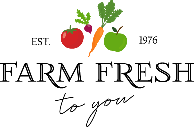
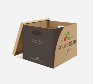
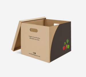
The US-based company Farm Fresh to You are planning an expansion to my local community: Jæren, Rogaland, Norway. The company recognises the need to develop a new logo and visual identity to suit new customers and markets.
For this course assignment, I had to conduct research to identify the competition, the target group, drivers and barriers and to use this information when designing the new logo and visual identity for this company. They also needed suitable packaging for their products and branding on the delivery vans.
Having learned about the basics of surveys in the past three weeks, choose someone you know (other than yourself) and create a logo for that person according to the two steps below. The person may be a family member, a friend, a fellow student, a celebrity or anyone you could physically interview and who would be able to participate in your interview.
STEP 1 – Consider what will be your Core Interview Questions and conduct an interview with your chosen individual. Make sure that you get the data on what the person’s persona is: Who are they? What are their personal goals? How do they define success? Etc.
Who are you? I’m a 36-years-old preschool teacher and a human rights activist.
What are your goals at the moment? Finish a Master in Montessori Teacher Guide. Get back to sewing. Start exercising regularly again.
How would you describe yourself? Chaotic, cheerful, multitasker.
What are the most important values for you? Honesty, hard work, empathy, positivity.
Where do you see yourself in 5/10 years? Working in a school with an alternative pedagogical approach.
How do you wish to be perceived by others? Honest, hardworking, positive.
How do you define success? Spend your time doing something meaningful that you enjoy.
What would you say are the obstacles to achieving what you want? The current traditional education system. The way society sees and treats children.
What are your strengths? Hardworking, I care about social issues and human rights, problem solving oriented, creative.
What are your weaknesses? Unorganised, I procrastinate.
What are your interests and hobbies? Sewing, reading, knitting, cinema.
What inspires you? Other schools/teachers, other activists, human rights defenders, literature, nature, I find inspiration everywhere.
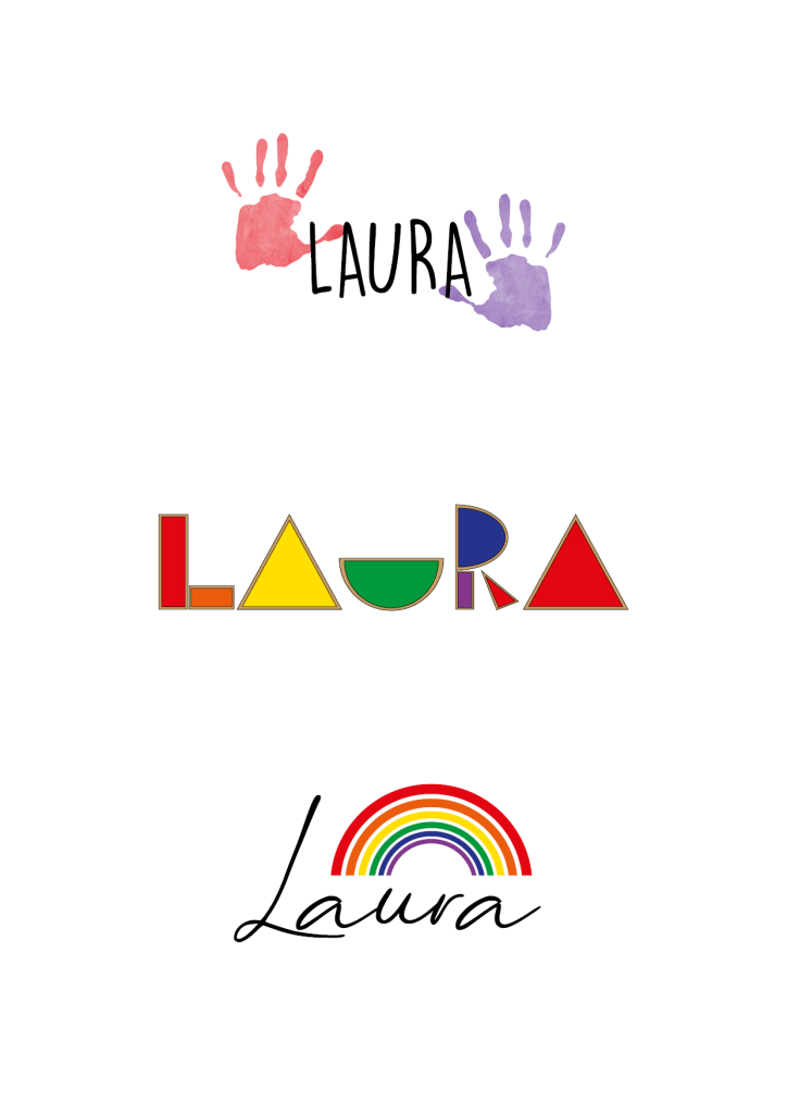
STEP 2 – Now use this person’s name to create a logo for him/her. Remember to keep the previous criteria and guidelines we’ve covered on logos in mind. For the purposes of this assignment, you should create three logo options (of which at least one should be in full colour). There are no restrictions such as type-only, etc. so be creative! It is important, though, to treat this as a professional logo execution, which the “client” may wish to use in his/her own capacity.
STEP 3 – Publish the answers/data from your survey as well as a rationale (a document in which you explain and interpret your ideas) for your logos, based on this research. Also hand in the three options of the logos as PDFs and tell me which one is your favourite, as well as which one your client preferred.
The first logo shows two handprint paintinsg on both sides of her name. The handprint is often used as a human rights symbol, and it is also an element one would easily find in a preschool classroom. I think the logo combines her two biggest passions well and therefore it is my favourite. Laura picked this logo as well.
For the second, I represented her name using transparent blocks often used in light tables at Montessori schools or homes.
Lastly, I chose a handwritten typeface for her name and put a rainbow on top. Rainbow colours are widely used in alternative schools such as Waldorf or Montessori.
For this Lesson Task I had to answer the following questions about visual identity:
Name the three most important components of visual identity.
Logo, colour, typography
Describe the difference between logotype and signature.
A logotype is the graphic expression of a company’s name, product or service. A signature, in regards to identity design, is a structured relationship between a logotype, brand mark, and tag line.
Logotype
Signatures
Using Kuler create a colour scheme (using only three colours in each set) for the following products:
A rich chocolate cake that is made from real chocolate. The keyword here is “quality”.
A courier company that delivers internationally by air, land and sea – their main focus is fast delivery.
An international insurance company that focuses on family values.
Write your name in four different typefaces, according to the following criteria. Use a typeface that:
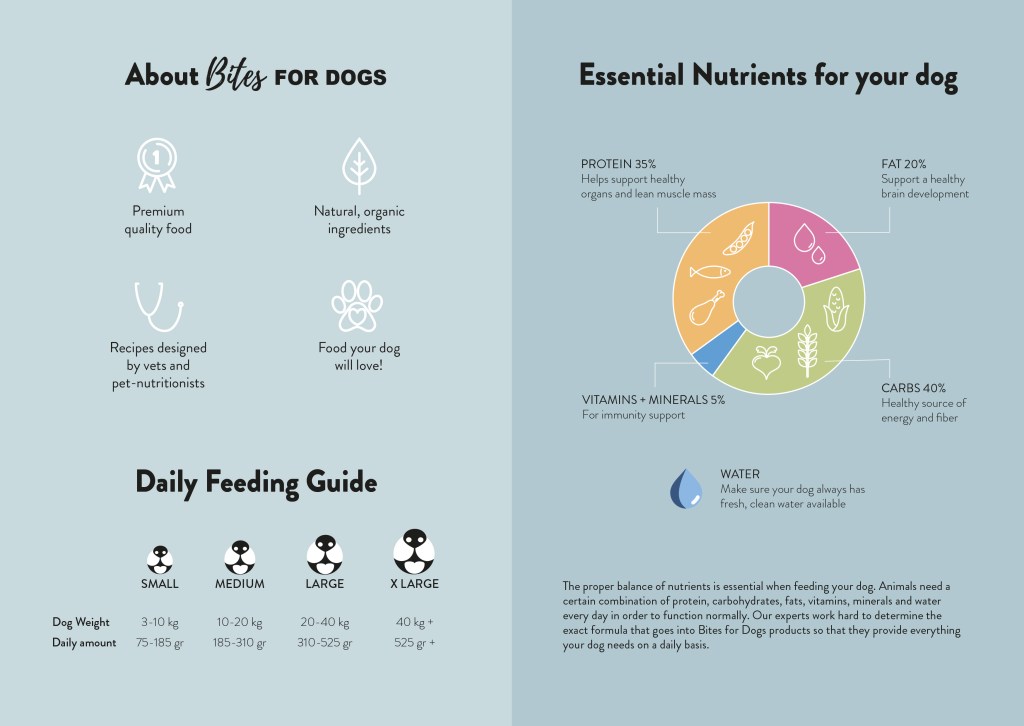
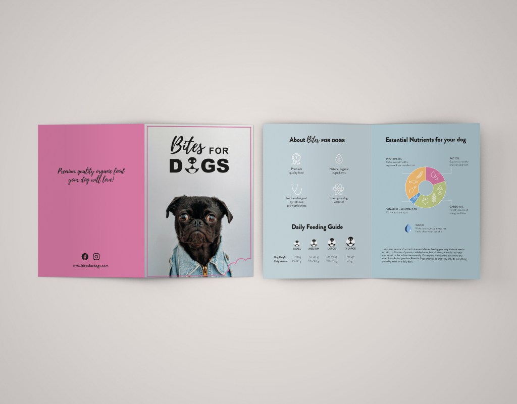
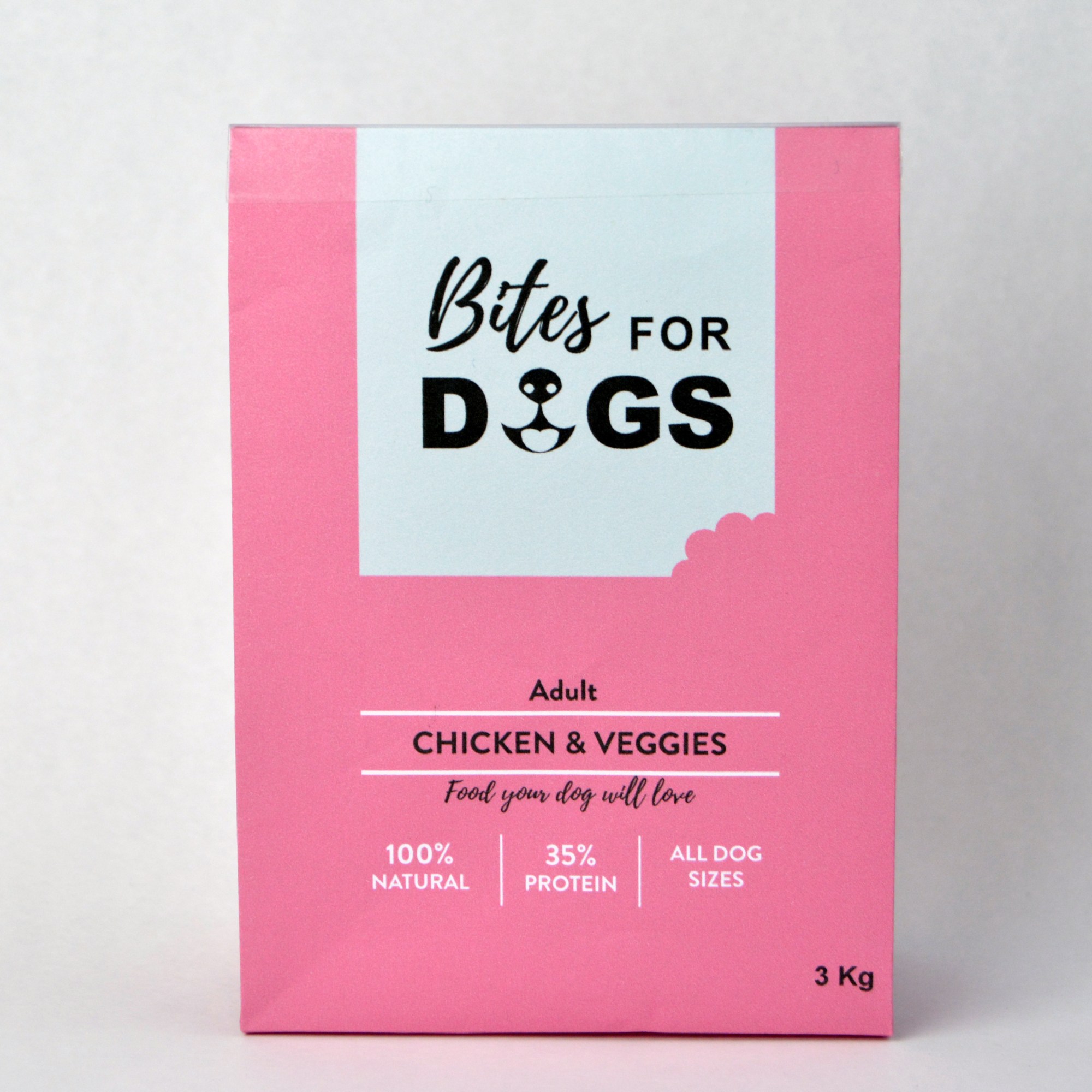
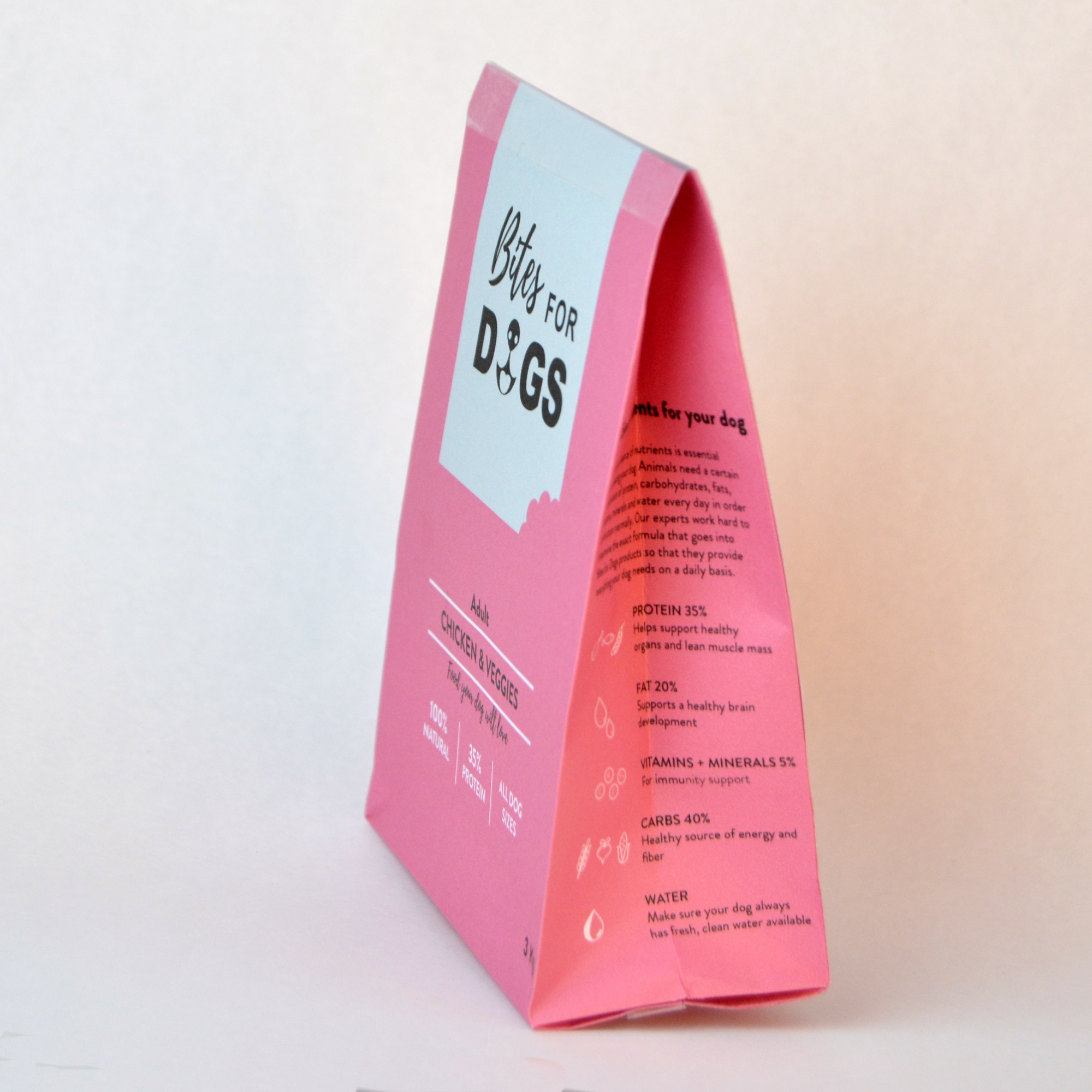
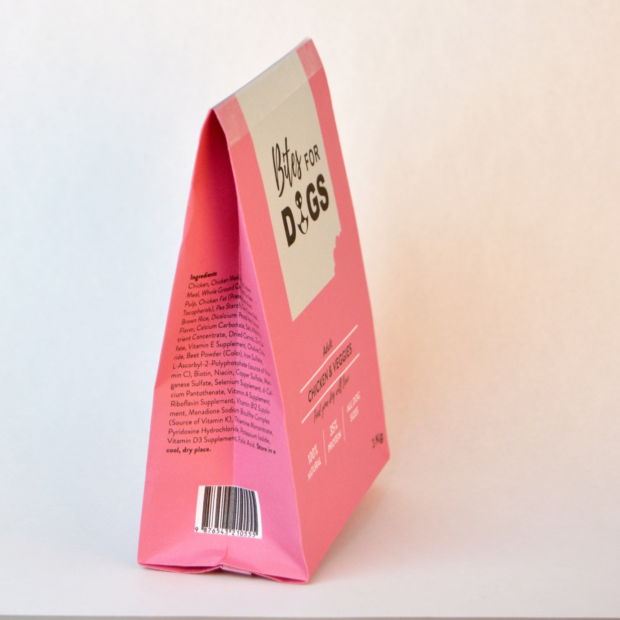
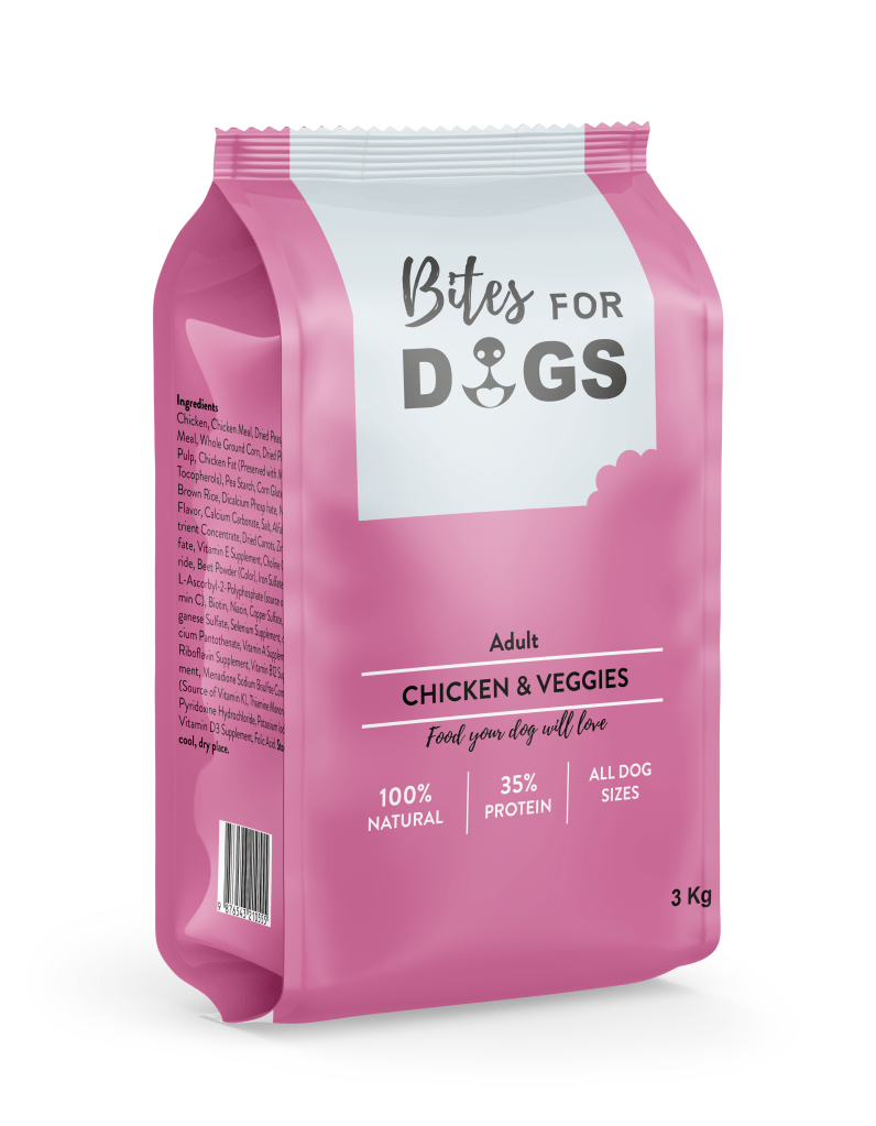
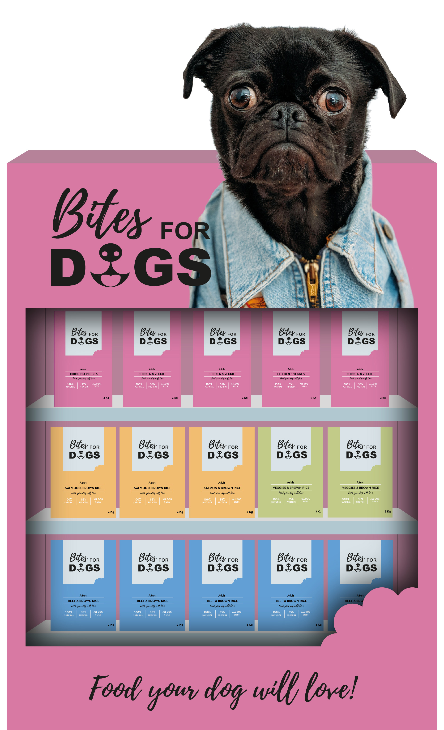
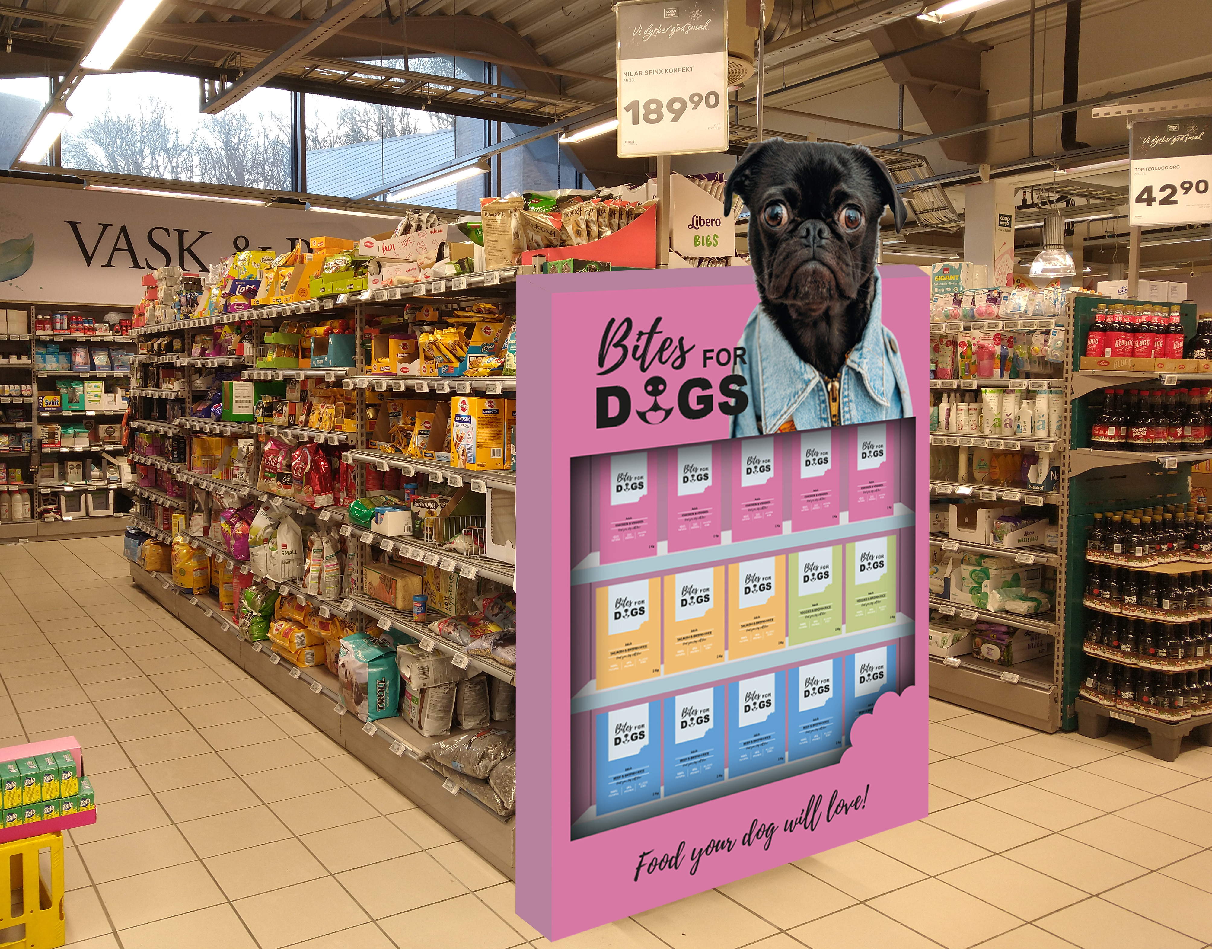
The outcome of this Mandatory Assignment was the branding, packaging and presentation of a dog food product. It is a collection of the work from weeks 28 through 31 that I already posted here. Since I have changed a few details through the process, I decided to make a new post to collect all the products’ final versions. These have been some intense weeks, but I managed to complete all the tasks and have learned a lot while developing the brand.
Brand name and logo
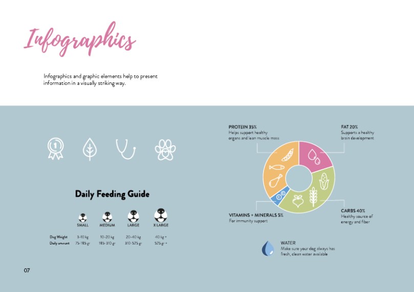
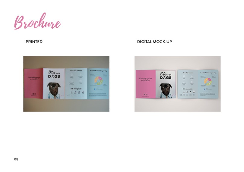
Illustrated infographic and brochure
Outside
Inside
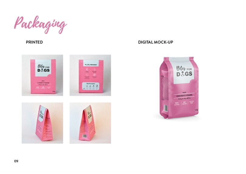
Digital mockup
Packaging (build a printed mockup and photograph it)
Develop a name for a dog food product. Design a logo for this product, using full colour. The logo must contain a main visual and typography. (Use the “People Saving Pets” logo as a guide – this does not mean your design should be the same, it is simply an example.) Follow each of the fundamental steps outlined above, in that sequence and take note of what needs to be handed in as you progress through these steps:
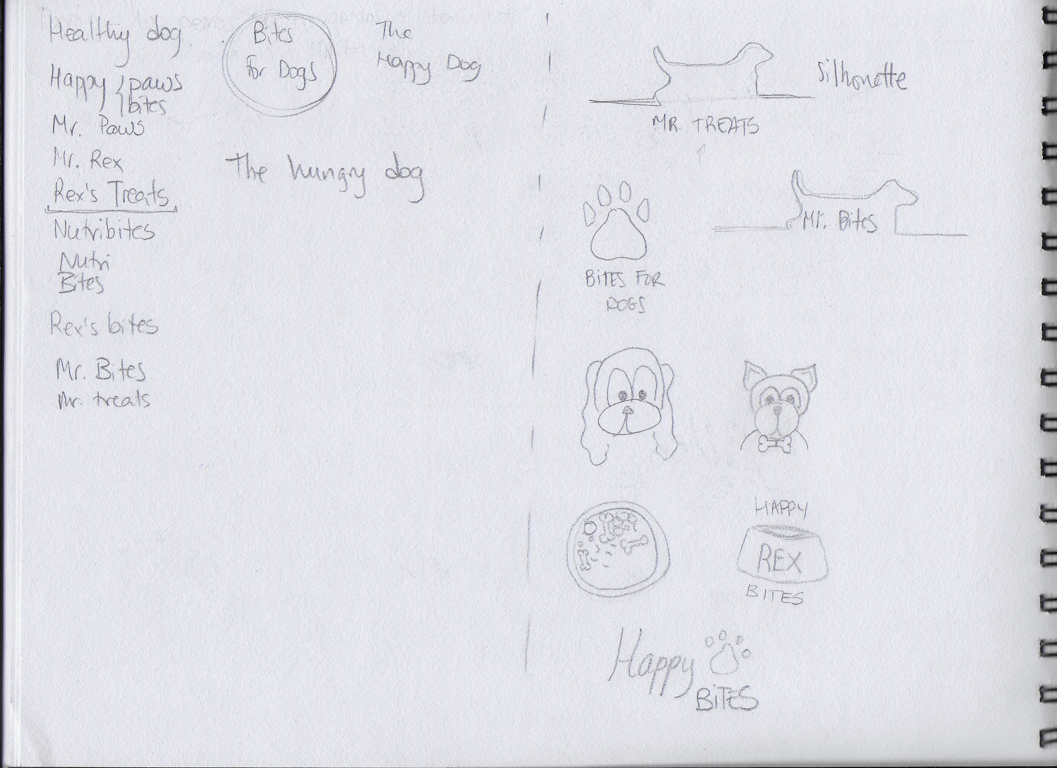
Exploration – Use sketching techniques to draw thumbnails and hand in your thumbnails as scanned PDFs.
Focus – Highlight three of the thumbnail ideas that you consider the best options and state why. Hand in an A4 with visuals of the three chosen thumbnails; include reasons for choosing each of these three options.
Construction – Use sketching techniques and redraw ONE of your chosen concepts until you’ve reached a conclusion on a successful logo. Hand in your drawings as scanned PDFs.
Testing – Experiment more with your favourite options from Step 3 and ask the opinion of a few people. Hand in examples of the logos shown to people and write their feedback or opinion on each.
Refinement – Choose your final design and execute it in Adobe Illustrator, along with the name of the product. Hand in your final logo as an A4 PDF.
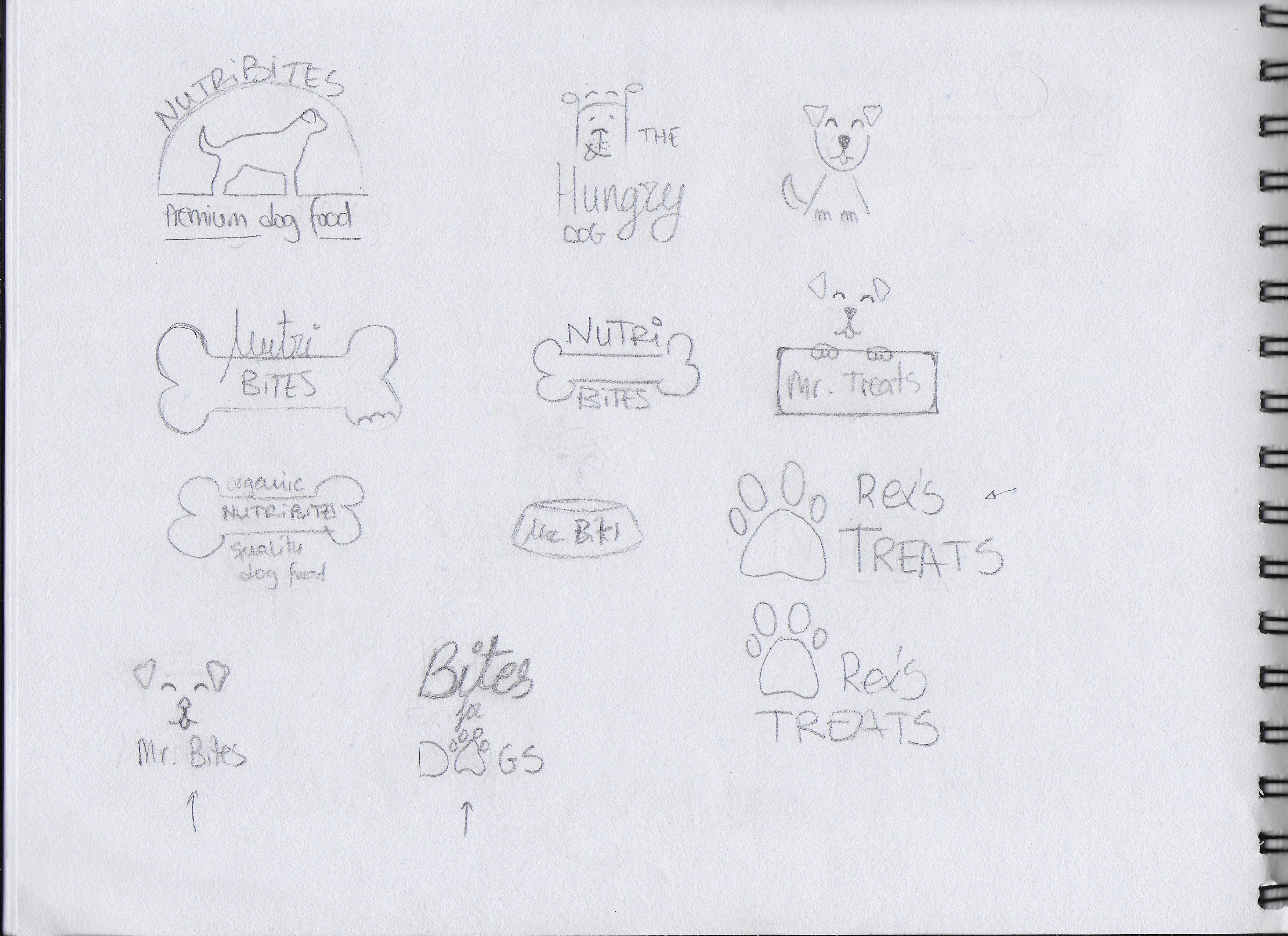
EXPLORATION First of all, I spent some time brainstorming and deciding how I wanted my brand to look. I also did some research and looked at examples of existing brands, packages and logos. After that, I began to sketch all the ideas that came to my mind. I also played with a few different names. Below are some of my first sketches.
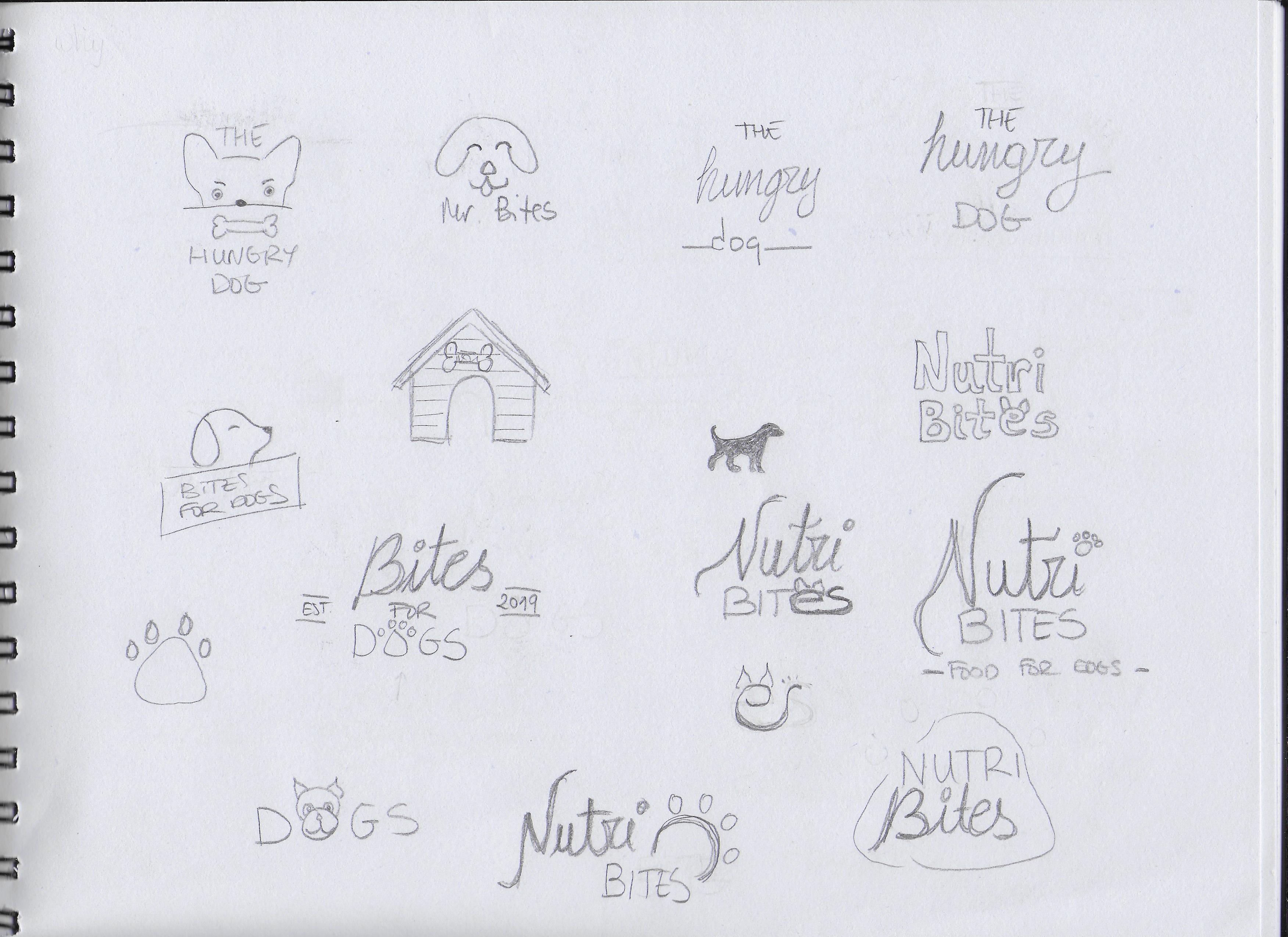
FOCUS The following are the three options I picked of them all:
I picked this option because I liked the idea of having an icon that could be used with or without the brand name, depending on where the logo is going to be placed. I also liked the clear and readable text.
I chose this one for its simplicity. I thought it could work to have only a few lines representing a dog’s face.
This is a slightly more elegant option due to the script font used for “Bites”. I used the paw print as well, but I integrated it into the word “DOGS”.
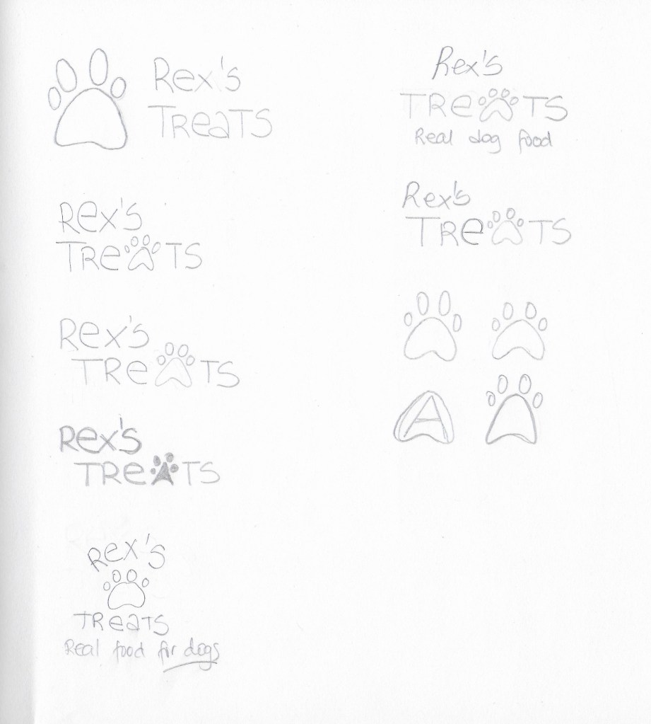
CONSTRUCTION I picked the first logo idea from the previous step and worked on it further, although it did not end up being the final choice.
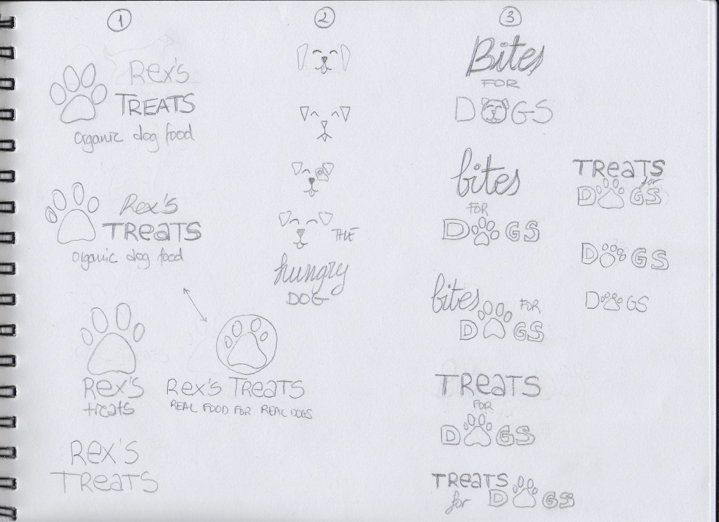
TESTING I experimented more with my three picks on paper. I decided to also do some digital sketches in Adobe Illustrator so it would be easier to show the logos and get feedback.
1
2
3
The most popular logo was number 3. I received the feedback that logo number 1 could work for any dog food while number 3 gives the feel that it is more quality food. Some thought number 2 was a bit childish looking.
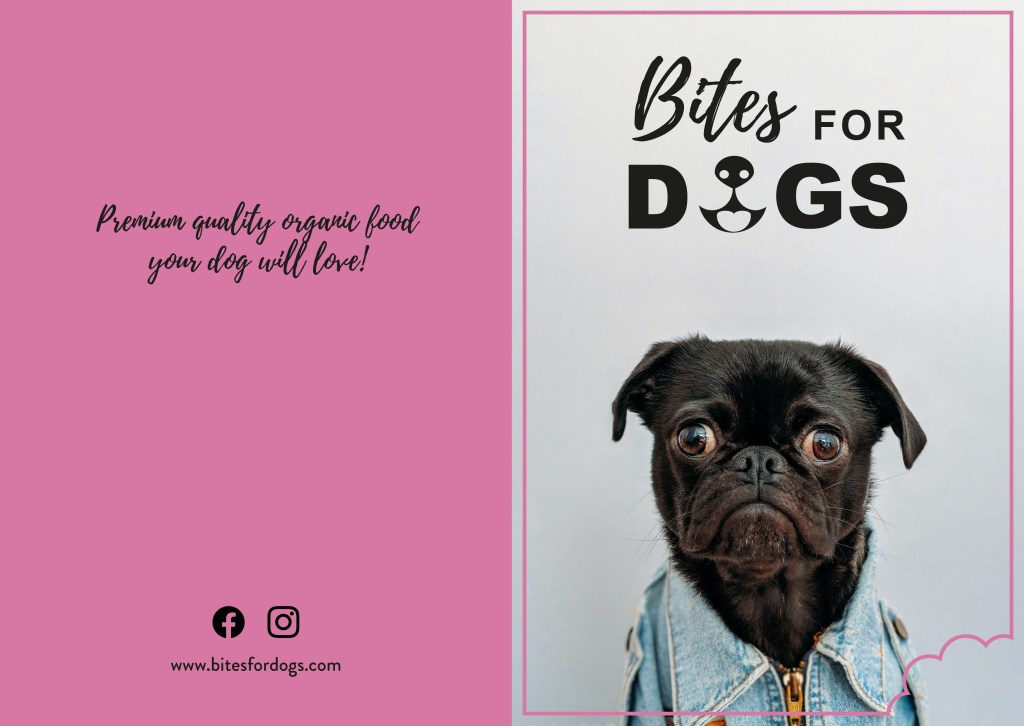
REFINEMENT I finally chose logo number 3, because it has a slightly more serious look than the other two. I want my brand to be a bit playful but also to show that it offers quality products. I worked a bit more with it in Illustrator and tried different colours to see how it would look with different backgrounds.
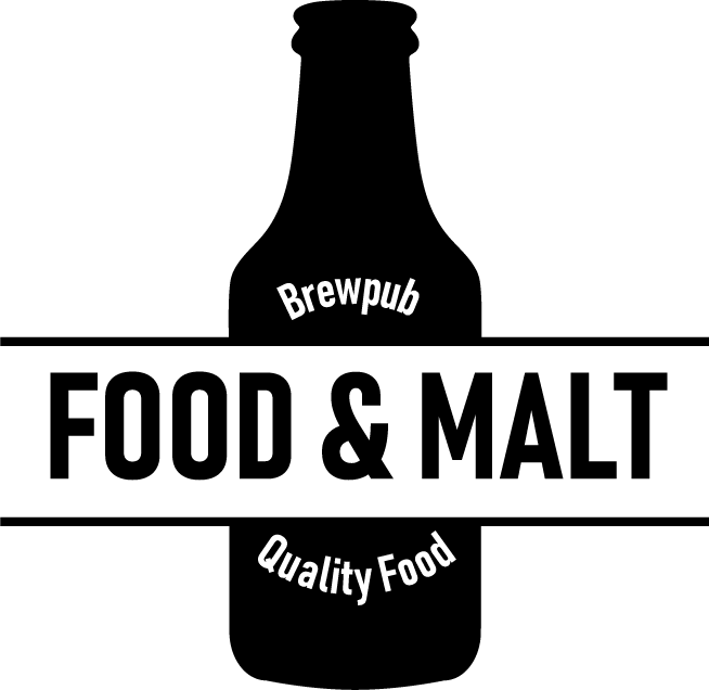
Here I show the last version of the Food & Malt logo for the Mandatory Assignment 02. I decided to go for a black and white style since I think it makes for a bolder, more hipster design, which describes better the company’s character.
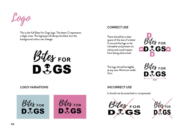
I have also included the brand style guide I made as part of the report, where logo variations are displayed, as well as the colors and fonts used. It was the first time I ever made one guide like that, and I find it very useful to express the whole idea behind a design.
Overall, this has been an exciting and fun process, and I have learned a lot. I look forward to seeing the next challenges this program brings!
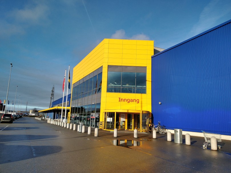
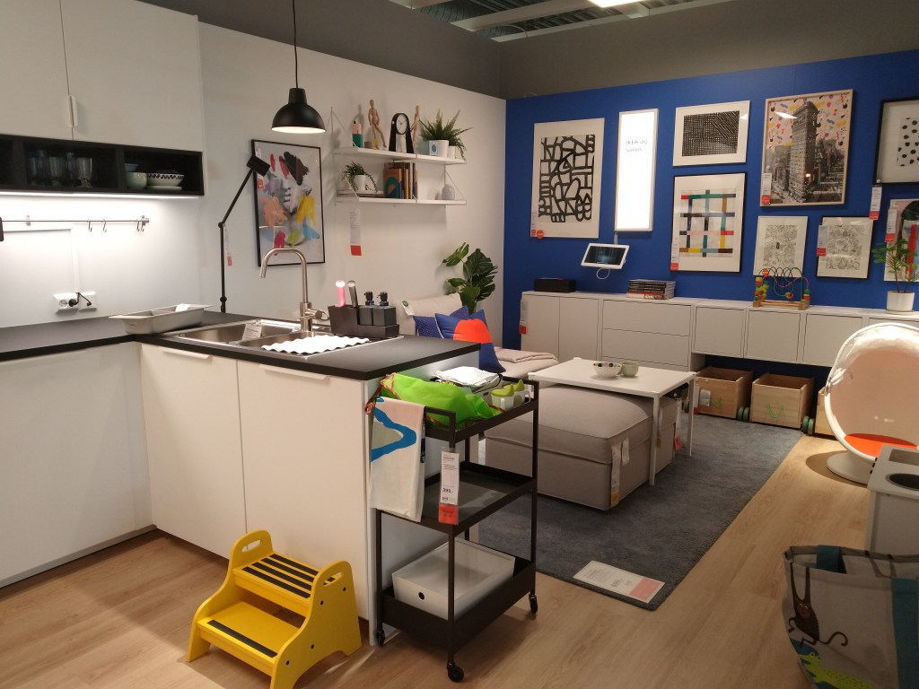
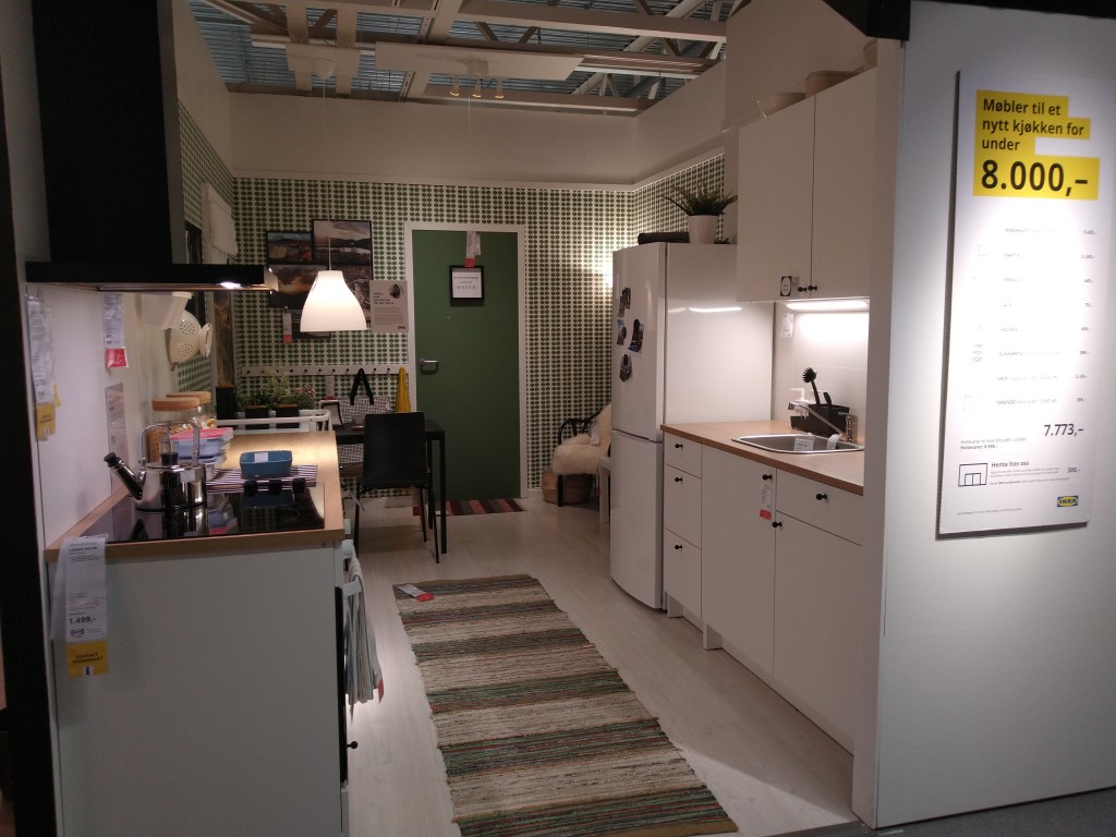
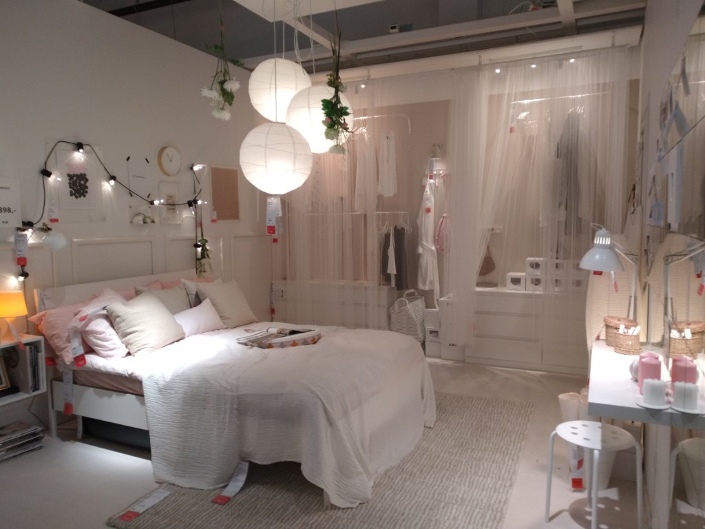
For this Learning Activity, I had to visit a well-known store and evaluate how they remain true to their brand identity or how they do not. I chose to go to IKEA.
Logo
Ikea’s logo is a wordmark. It uses a thick font to display the name of the brand in blue and yellow, like the flag of Sweden, home to Ikea. The same colors are found all over their stores, from the building itself to the bags, shopping baskets, posters, and staff uniforms.
Their brand ideal
The IKEA vision is “to create a better everyday life for the many people”, and they achieve that by offering a wide range of well-designed, functional home furnishing products at prices so low that as many people as possible will be able to afford them.
How they remain true to their brand ideal within their shops
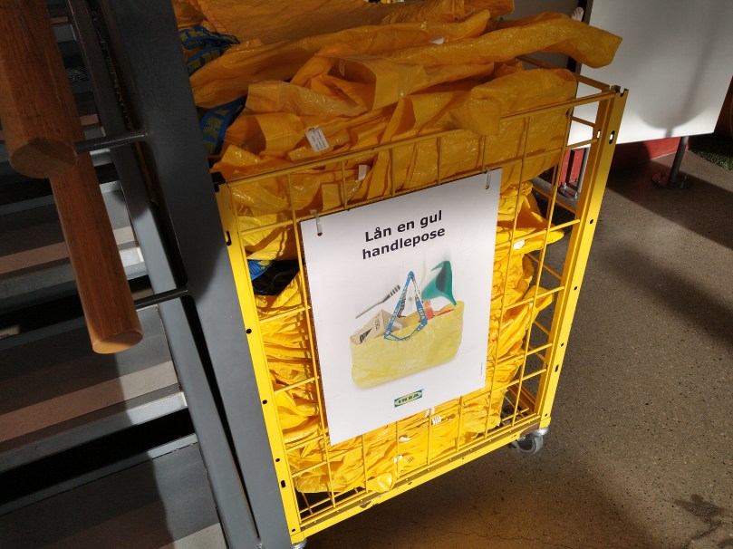
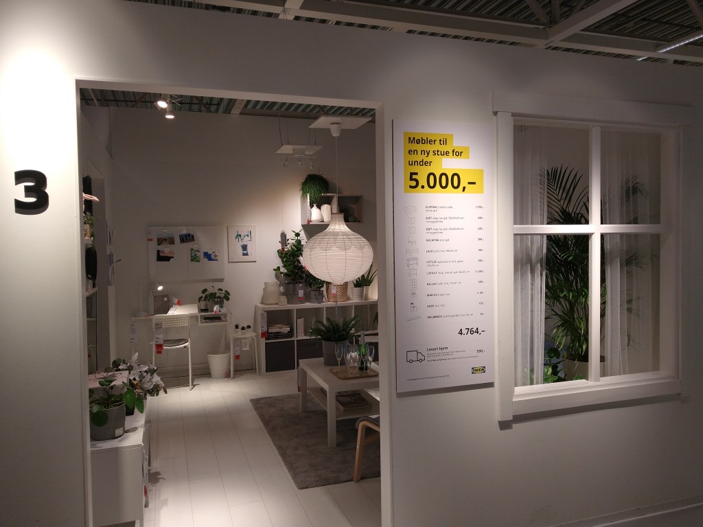
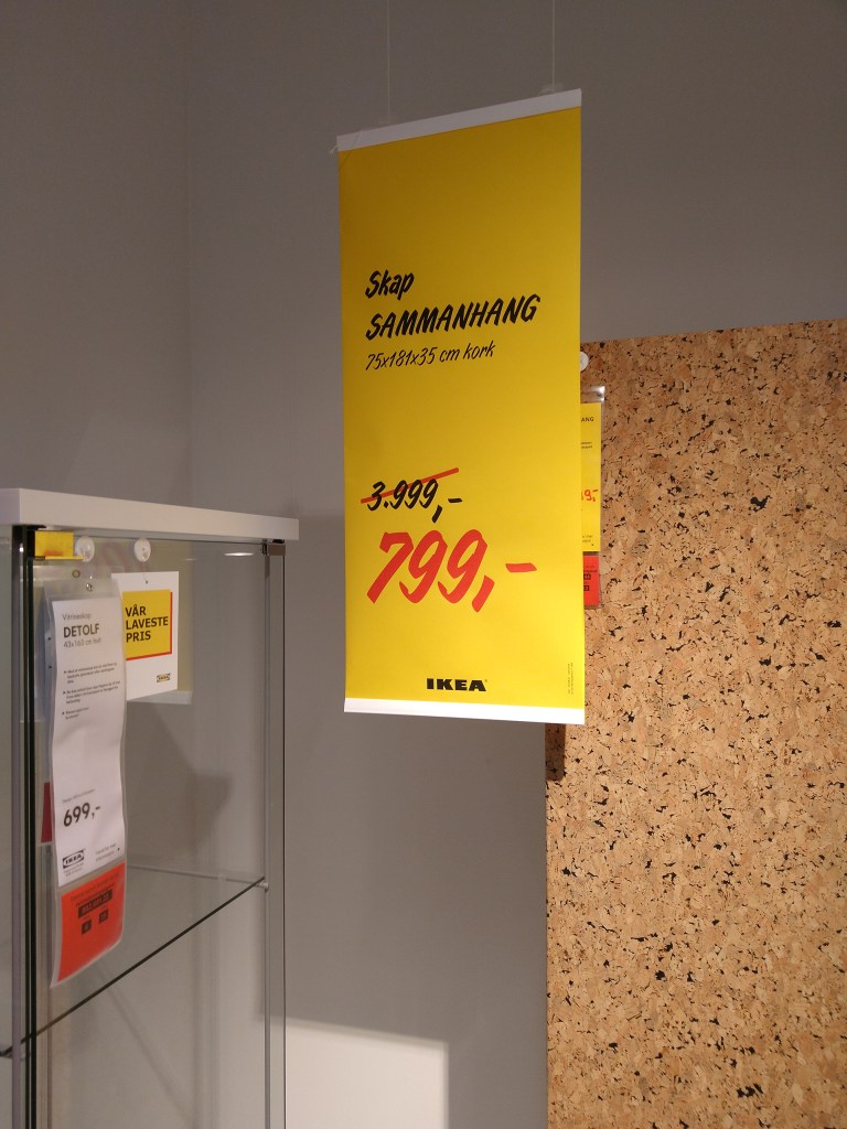
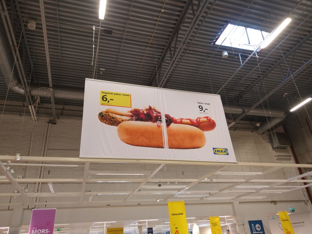
In their shops, Ikea shows a wide variety of styles and functional solutions at low prices. They recreate various types of houses in many sizes to make it easier for the customer to find a solution for their own home. Their furniture is practical, customisable and easy to fit in different spaces. There are plenty of posters showing their low prices and offers all around the shop, and even a combined price for entire rooms in the house. Everything at Ikea shows its brand ideal.
Furniture for a new living room for under 5.000,-NOK
The customer experience according to the brand ideal
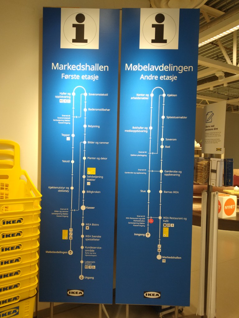
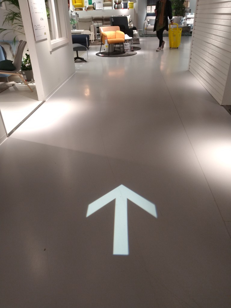
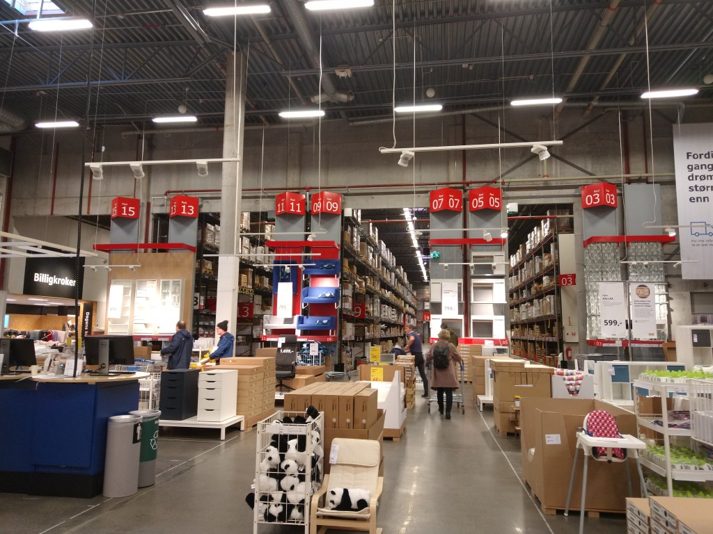
Ikea makes it very easy to navigate their stores due to the way they are divided and distributed. There are three main sections: a showroom, where you can see a wide variety of their furniture; a market hall with textiles, accessories, lighting and decoration items; and a self-serve furniture area. The store is designed to follow a path that takes you through all the departments; signs on the floor show you the direction.
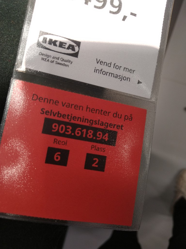
At the entrance, there is a big map of the building with all the store departments so you can find your way around quickly, including shortcuts. Throughout the store, customers can find little stands where they can take a paper measuring tape, pencils and a printed version of the floor plan that can also be used as a shopping list. Each item on the shop is marked with a number that indicates the location where you can find it at the self-serve furniture area.
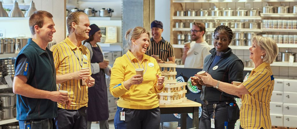
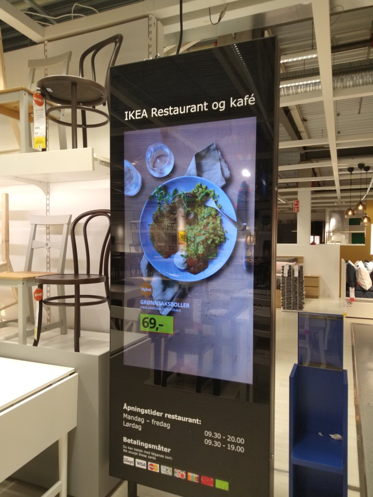
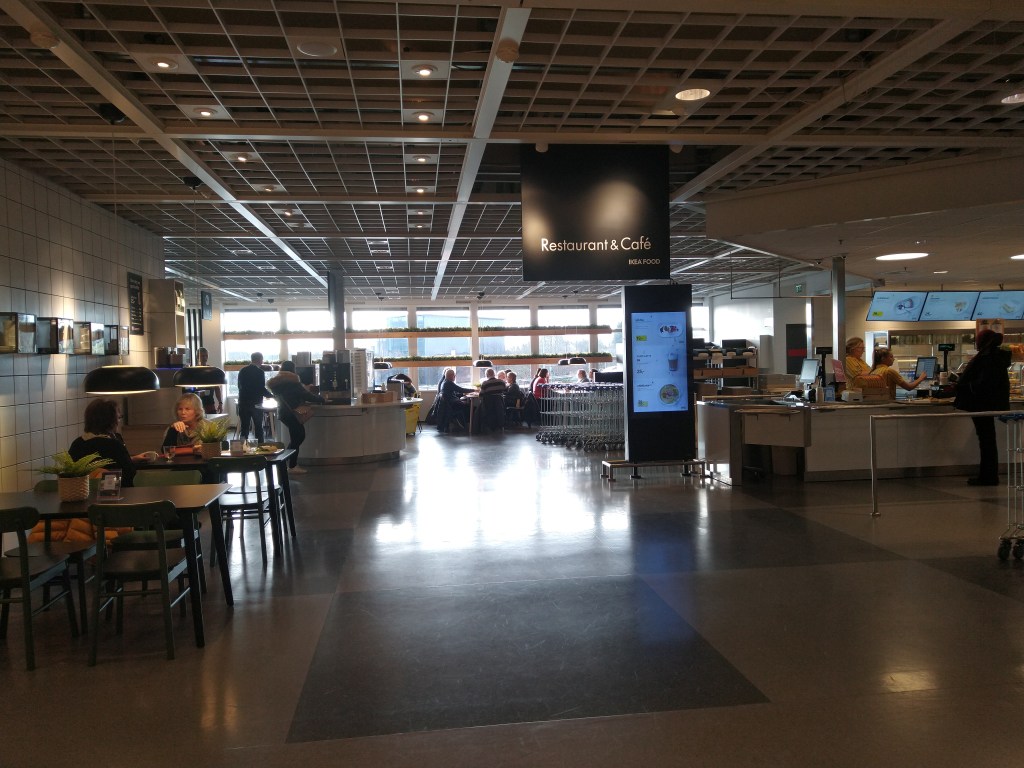
Another essential part of the experience as a customer is Ikea’s restaurant and cafe, where they serve varied quality foods at low prices.
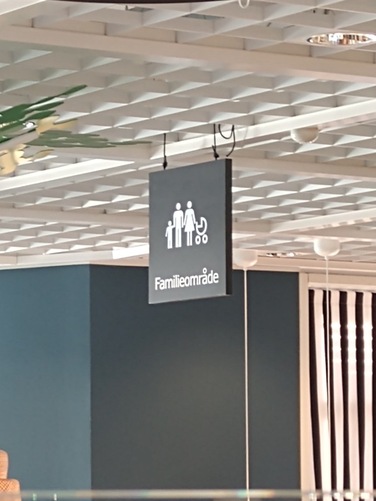
Also, Ikea is very family-friendly; they have a playground for kids, special menus and toys in the restaurant, and toilets and sinks adapted for them.
Playground
Family area
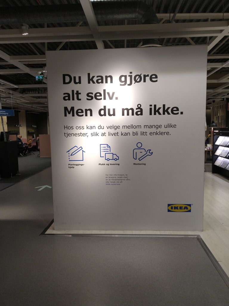
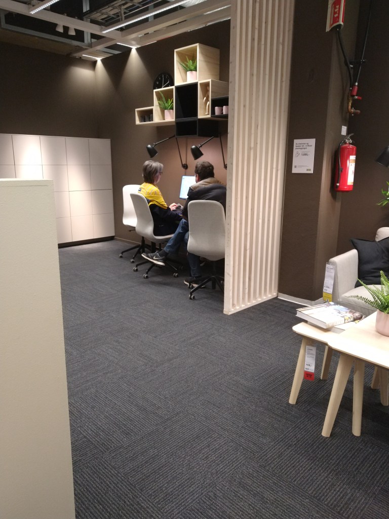
It’s quite easy to shop at Ikea, which agrees with their brand ideal, but in case you need assistance, their staff can guide you and even help you design your kitchen or wardrobe.
You can do it all yourself. But you don’t have to.
The visual display of products according to the brand ideal
As mentioned before, one of Ikea’s sections is a showroom, where they recreate rooms and houses using their furniture and accessories. They design it to look like a real home, and everything they display is on sale at the store. If you like what you see, you only have to write down the number and pick it up before check-out.
All in all, Ikea wants to make a better and easier everyday life, not only at home but also while shopping at their stores.
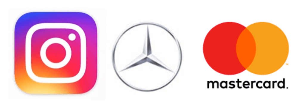
1 – Look at the following logos and explain in your own words what you consider their positioning to be (do this for each one).
Instagram The Instagram logo is a symbol. It has the shape of a simple camera, which quickly gives the idea that it’s an app for photos and videos. The bright fun colours used indicate it’s directed to young people. It’s an easily recognizable symbol.
Mercedes Benz This logo is also a symbol. It’s a classy design using different shades of grey, which, in my opinion, makes the logo timeless and elegant. It reminds me of a steering wheel. All that makes me think that their cars are robust, classic and safe, possibly aimed at middle-aged people.
Mastercard In this case, the logo combines a symbol and a wordmark. It is a very recognisable logo, even when displayed without the name of the company. The two overlapping circles can be interpreted as a connection, which makes sense with what Mastercard does. It is a simple and timeless design that works.
2 – Let’s work backwards! Look at the logo on the Apple iPhone and, by doing your own research, investigate the history of the product and the company that manufactures it. Give an outline, in your own words, of what you consider the following to be:
Describe the iPhone’s brand identity – exactly as you see it
What do you think its positioning is currently?
What do you think the strategy for this specific product was?
What research do you think was done on this by the company who made it?
Before the first iPhone was released, cell phones were based more on fashion and brand rather than technological innovation. From the beginning, iPhone has always sought to push its phone to the limits of what is technologically capable. They simplified their product line and offered just one model a year while making it an expensive, high-end product. For me, iPhone means exclusivity, innovation and good quality.
More than a decade after the first iPhone, the company continues to deliver innovative, robust and modern versions of the smartphone. It has a high price tag, which still makes it exclusive and gives you the feeling that you are purchasing a solid and reliable device.
In my opinion, part of the reason why this product is so popular is that it focuses on technology, and offers a new experience for the customer. Apple also uses smart advertising campaigns and builds momentum before release day, when you can find people waiting in line all over the world -even for days!- to be one of the first ones to buy the new iPhone. As I see it, the brand creates a sense of belonging, so once you are a customer, you most likely will continue to be.
Before the iPhone era, Apple’s iPod was very popular, but they realised that people were carrying both their phone and their iPod, and that was a problem that would lead to the iPod becoming obsolete. They decided to develop a phone which would also work as an iPod. Apple probably studied how people used their cell phones and for what purpose. They anticipated their needs and created a product that changed the way we understood smartphones, merging an iPod, cell phone and internet browser that worked as efficiently as it would on a desktop.
3 – Now take the same product as in question 2 and explain, in your own words, how the visual element (in this case, the logo) fits in with the brand identity.
The logo on the back of the iPhone is the Apple logo, which is very well known and recognised worldwide. The design of Apple devices -including the iPhone- is clean, simple and elegant. The logo fits this description very well, especially since it changed to a monochromatic figure using black, silver or white colours to represent the famous apple.
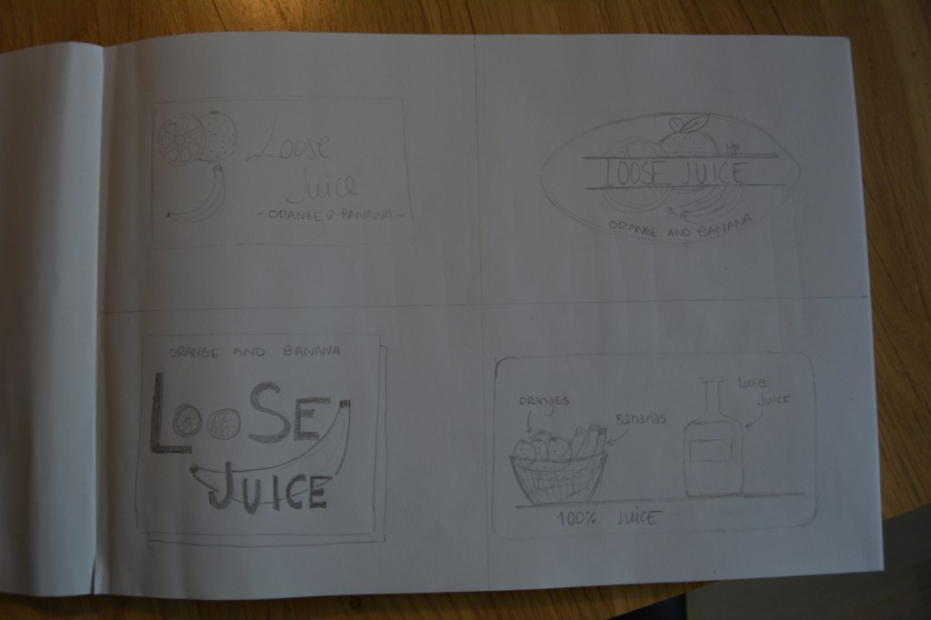
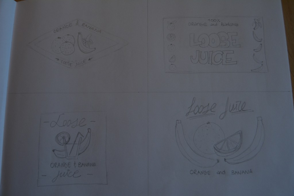
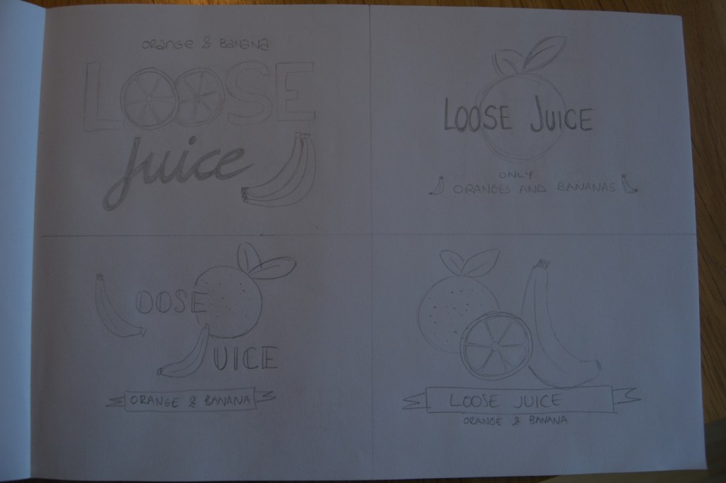
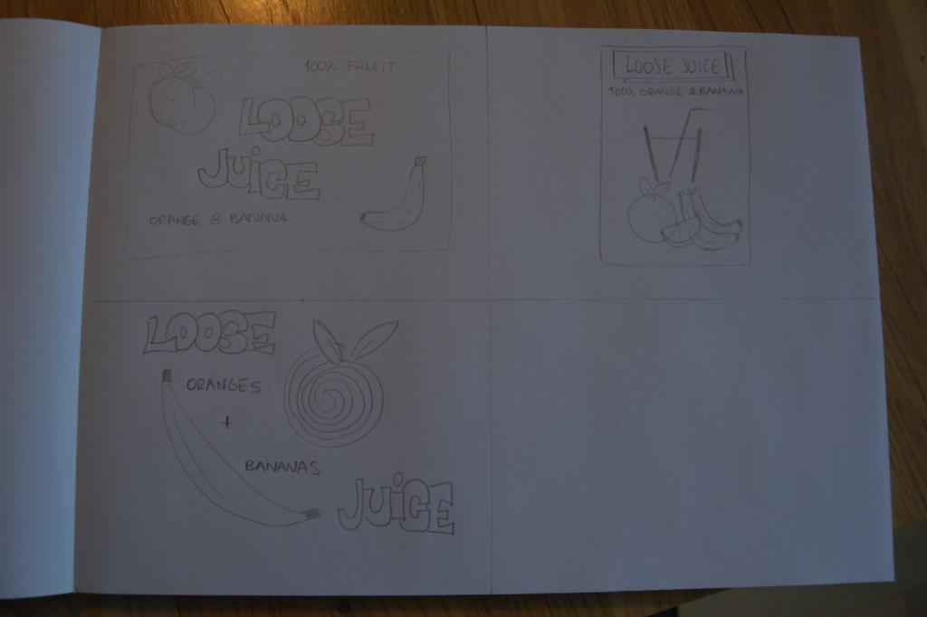
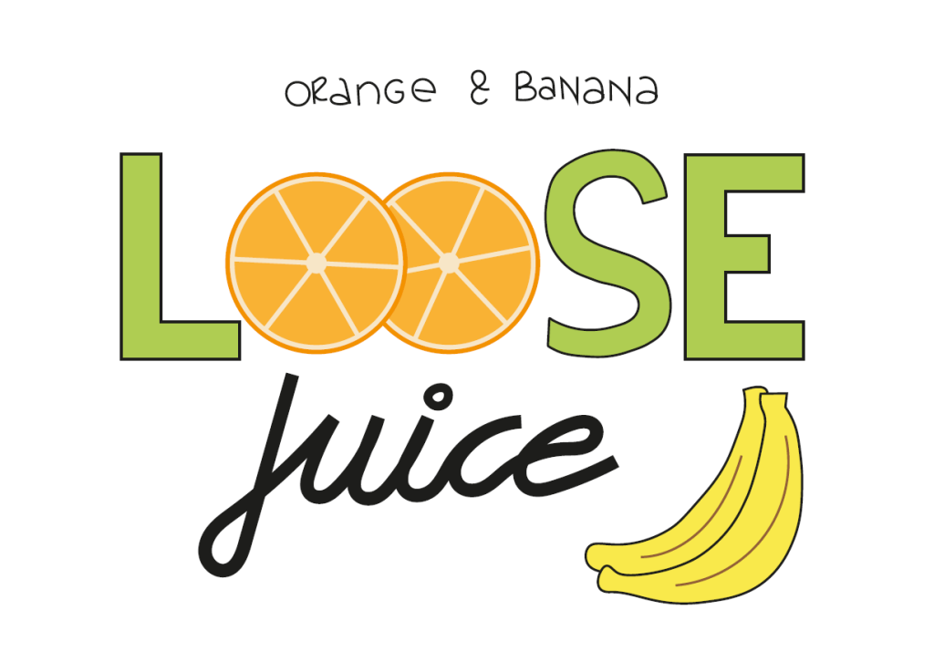
For this week’s Learning Activity I had to make an illustration for fruit juice packaging. The flavour is orange and banana, and the name of the product is Loose Juice.
Firstly, I draw 15 sketches of the label. All of them include the fruit, the name of the flavour and the name of the product. It was an interesting process. In the beginning, I thought I wouldn’t be able to come up with 15 different ideas, but after a while, it was exciting to see how easily new concepts came to my mind. This assignment made me realise how essential sketching is for a designer. It’s a good practice that I will try to incorporate into my routine. These are my sketches:
Then, I picked the design I liked the most and drew the label using Adobe Illustrator. This is the final result:
Label illustration
This is the first time I use Adobe Illustrator, and it took me a while to be able to make the drawing. At the same, the task was easy enough to allow me to experiment and try the different tools I learned in the tutorials during the last couple of weeks. It didn’t become frustrating or too difficult; it was actually a fun challenge!