
Week 10
“Frank Shepard Fairey is an American contemporary graphic designer and illustrator who emerged from the skateboarding scene. He first became known for his ‘Andre the Giant Has a Posse’” (…OBEY…) (www.obeygiant.com) sticker campaign, in which he appropriated images from the comedic supermarket tabloid Weekly World News.
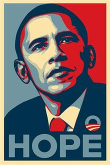
His work became more widely known in the 2008 U.S. presidential election, specifically his Barack Obama “Hope” poster.
Analyse his poster for the 2008 U.S. Presidential Election and give your opinion on the use of style and its efficacy. Also critique the use of pastiche and typography.
Write one page (about 350 words) on your opinion of this design and substantiate your answers with examples.
The Barack Obama “Hope” poster designed by artist Shepard Fairey for the 2008 US Presidential Campaign is described as iconic. Although not originally part of the official campaign branding, the design proved so popular that the poster became something of a viral phenomenon, seamlessly playing into the Obama campaign’s overall ambience.
The poster shows a portrait of Obama where he is gazing slightly upward and to the side, and his expression communicates confidence and focus. Its style depicts the presidential candidate as an almost heroic figure. The word “HOPE” that accompanies the picture helps convey the message of Obama being the change to come for the people of America.
We can see how Fairey took inspiration from images of previous American presidents, such as the well-known JFK portrait or the image of Abraham Lincoln on the five-dollar bill. Choosing the same recognizable pose of previous presidents elevates Obama to the same level and depicts him as the next president of the United States, even before the election.

Source: Wikipedia 
Source: Wikipedia
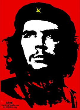
The “Hope” poster style imitates other propaganda posters such as Jim Fitzpatrick’s Che Guevara, where he is represented with a straight look into the distance, similar to Obama’s pose. The focus is on Che Guevara’s black and white face on a red background.
In his work, Sheppard Fairey often uses red and cream colours, which he also did in the “Hope” poster. In this case, he also added blue, which symbolizes trust and loyalty, strengthening Obama’s figure. Red, white and blue are the traditional American patriotic colours, but he uses a muted, desaturated palette, differentiating his work from almost all mainstream political campaign images.
The all-capital slogan printed under Obama’s image says “Hope” in a bold, modern, sans-serif typeface. Through this slogan, the viewer forms a correlation between the three-quarter pose and the concept of hope and generate the meaning: Barack Obama provide us hope.
In conclusion, the limited palette, the simplicity of the layout, a short slogan in bold typography and the flat-colour illustration makes the design effective and easy to recognize and remember. It also allows for the image to be widely reproduced, which was Fairey’s intention. It certainly helped to make this iconic work go viral.
