Skip to content
  • My Reflective Journal
  • Latest posts
  • Semester 1
    • Week 1 – Introduction
    • Week 2 – Idea development
    • Week 3 – Sketching techniques
    • Week 4-5 – Brand identity
    • Week 6 – Typography
    • Week 7 – Color theory
    • Week 8 – History of photography
    • Week 9 – Know your camera
    • Week 10-11 – Layout
    • Week 12-13 – Print preparation
    • Week 14-17 – Semester project 1
    • Mandatory assignments
  • Semester 2
    • Week 19 – Introduction to design for screen 1
    • Week 20 – Design for screen 1: Planning
    • Week 21 – Design for screen 1, Part 1
    • Week 22 – Design for Screen 1, Part 2
    • Week 23 – Introduction to lighting equipment & studio setups
    • Week 24 – The Art of Photography
    • Week 25 – Web Design Process 3 – Development 1
    • Week 26 – Web Design Process 3 – Development 2
    • Week 27 – Web Design Process 3 – Development 3
    • Week 28 – Creative Workflow
    • Week 29 – Visual Language
    • Week 30 – Packaging Design
    • Week 31 – Point of Sale
    • Week 32 – CMS and WordPress (part 1)
    • Week 33 – CMS and WordPress (part 2)
    • Week 34 – CMS and WordPress (Part 3)
    • Week 35-39 – Project Exam 1
    • Mandatory Assignments
  • Semester 3
    • Week 1 – Screen Based Design Introduction
    • Week 2 – Websites and Business Strategies Part 1
    • Week 3 – Websites and Business Strategies Part 2
    • Week 4 – Websites and Mobile Devices
    • Week 5 – Strategic Design Overview
    • Week 6 – Visual Identity and Brand Manual
    • Week 7 – Branding and Marketing
    • Week 8 – Graphic Design History
    • Week 9 – Design History and Styles
    • Week 10 – Design History and Styles Part 2 & 3
    • Week 11 – Product Photography
    • Week 12 – Low-Light Photography
    • Course Assignments – semester 3
  • Semester 4
    • Week 18 – Idea Development and Research
    • Week 19 – Sketching Techniques
    • Week 20 – Layout: Typography
    • Week 21 – Layout Design
    • Week 24 – Motion Design – Introduction
    • Week 26 – Animation Principles
    • Week 27 – After Effects Principles
    • Week 30 – Introduction to Fashion Photography
    • Week 31 – Introduction to Fashion Photography
  • About me
Search
Close

Mónica's Design Journey

Tag: visual identity

CA02 – Farm Fresh to You

June 7, 2021June 8, 2021 monicaovLeave a comment

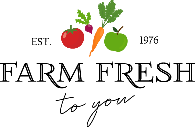
The US-based company Farm Fresh to You are planning an expansion to my local community: Jæren, Rogaland, Norway. The company recognises the need to develop a new logo and visual identity to suit new customers and markets.

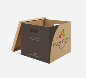
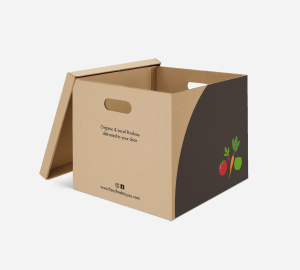
For this course assignment, I had to conduct research to identify the competition, the target group, drivers and barriers and to use this information when designing the new logo and visual identity for this company. They also needed suitable packaging for their products and branding on the delivery vans.

  • Van wrap
  • Box front
  • Box back

The Components of Visual Identity

May 6, 2021May 8, 2021 monicaovLeave a comment

Week 6

For this Lesson Task I had to answer the following questions about visual identity:

Name the three most important components of visual identity.

Logo, colour, typography

Describe the difference between logotype and signature.

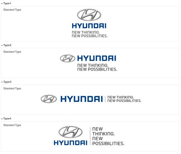
A logotype is the graphic expression of a company’s name, product or service. A signature, in regards to identity design, is a structured relationship between a logotype, brand mark, and tag line.

  • Logotype
  • Signatures

Using Kuler create a colour scheme (using only three colours in each set) for the following products:

A rich chocolate cake that is made from real chocolate. The keyword here is “quality”.

A courier company that delivers internationally by air, land and sea – their main focus is fast delivery.

An international insurance company that focuses on family values.

Write your name in four different typefaces, according to the following criteria. Use a typeface that:

expresses a unique quality about you (practical)

Juana by Latinotype

is inspired by your favourite food (greek)

Ermou by TEKNIKE

makes your name look sophisticated

Linotype Didot by Linotype

is drawn by hand

Night Wind Sent by Ana’s Fonts

Sources:

  • http://blog.gcibrands.com/logos-logotypes-symbols-signatures-and-monograms/
  • https://medium.com/corporate-identity-we-stand-together/creating-a-logo-signature-400f21d5bd3f

About me

Categories

  • Course Assignment (2)
  • Learning Activity (39)
  • Lesson Task (26)
  • Mandatory Assignment (11)
  • Project Exam (1)
  • Semester 2 (22)
  • Semester 3 (23)
  • Semester 4 (9)
  • Semester Project (1)
  • Semester1 (25)
  • Uncategorized (1)

Enter your email address to follow this blog and receive notifications of new posts by email.

Blog at WordPress.com.
Back to top
  • Subscribe Subscribed
    • Mónica's Design Journey
    • Join 55 other subscribers
    • Already have a WordPress.com account? Log in now.
    • Mónica's Design Journey
    • Subscribe Subscribed
    • Sign up
    • Log in
    • Report this content
    • View site in Reader
    • Manage subscriptions
    • Collapse this bar
 

Loading Comments...