Use the logo you created in Week 1 and design a brochure for your product. You may use any format you like, just make sure that the format is in line with and adds to your logo design. Your brochure must contain an illustration. This could be the infographic alone, or it could be the infographic and the rest of the brochure (in other words, the entire brochure may be illustrated if you’d like).When designing the brochure and creating your illustration, make definite use of the fundamentals of visual language as discussed in this lesson. You must illustrate an infographic and design a brochure:
1. Illustration of infographic
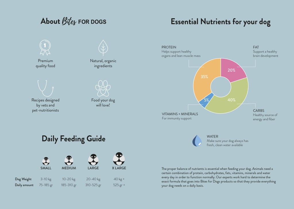
The brochure design and infographic illustration should work together. Consider the format and style of your brochure and illustrate an infographic using fictitious data (or you could do research to get a better idea of actual statistics). The infographic must display the nutritious benefit of your product to dogs. It should contain the nutritional value, as compared to the necessary nutrition intake of dogs. It must also give an indication of consumption per size of dog. You may also add information of your choice that you think is relevant.
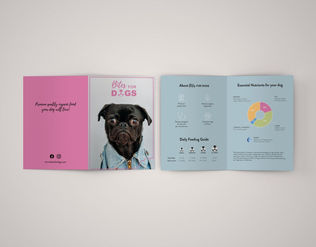
2. Design of brochure
Design a brochure that introduces your product and includes the infographic illustrated in Question 1. You can decide on the information and format of your brochure. As a guideline, consider a brochure of A4 (lying), folding to A5 (standing). You don’t have to have more than four pages in your brochure (but it depends on your design and style). You must base your brochure design on the design of your logo. Thus, look at your logo and design a brochure that complements and blends in with it.
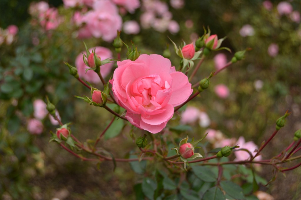
This is the final look of my brochure and infographics. I chose the recommended size A4 (lying).
Develop a name for a dog food product. Design a logo for this product, using full colour. The logo must contain a main visual and typography. (Use the “People Saving Pets” logo as a guide – this does not mean your design should be the same, it is simply an example.) Follow each of the fundamental steps outlined above, in that sequence and take note of what needs to be handed in as you progress through these steps:
Exploration – Use sketching techniques to draw thumbnails and hand in your thumbnails as scanned PDFs.
Focus – Highlight three of the thumbnail ideas that you consider the best options and state why. Hand in an A4 with visuals of the three chosen thumbnails; include reasons for choosing each of these three options.
Construction – Use sketching techniques and redraw ONE of your chosen concepts until you’ve reached a conclusion on a successful logo. Hand in your drawings as scanned PDFs.
Testing – Experiment more with your favourite options from Step 3 and ask the opinion of a few people. Hand in examples of the logos shown to people and write their feedback or opinion on each.
Refinement – Choose your final design and execute it in Adobe Illustrator, along with the name of the product. Hand in your final logo as an A4 PDF.
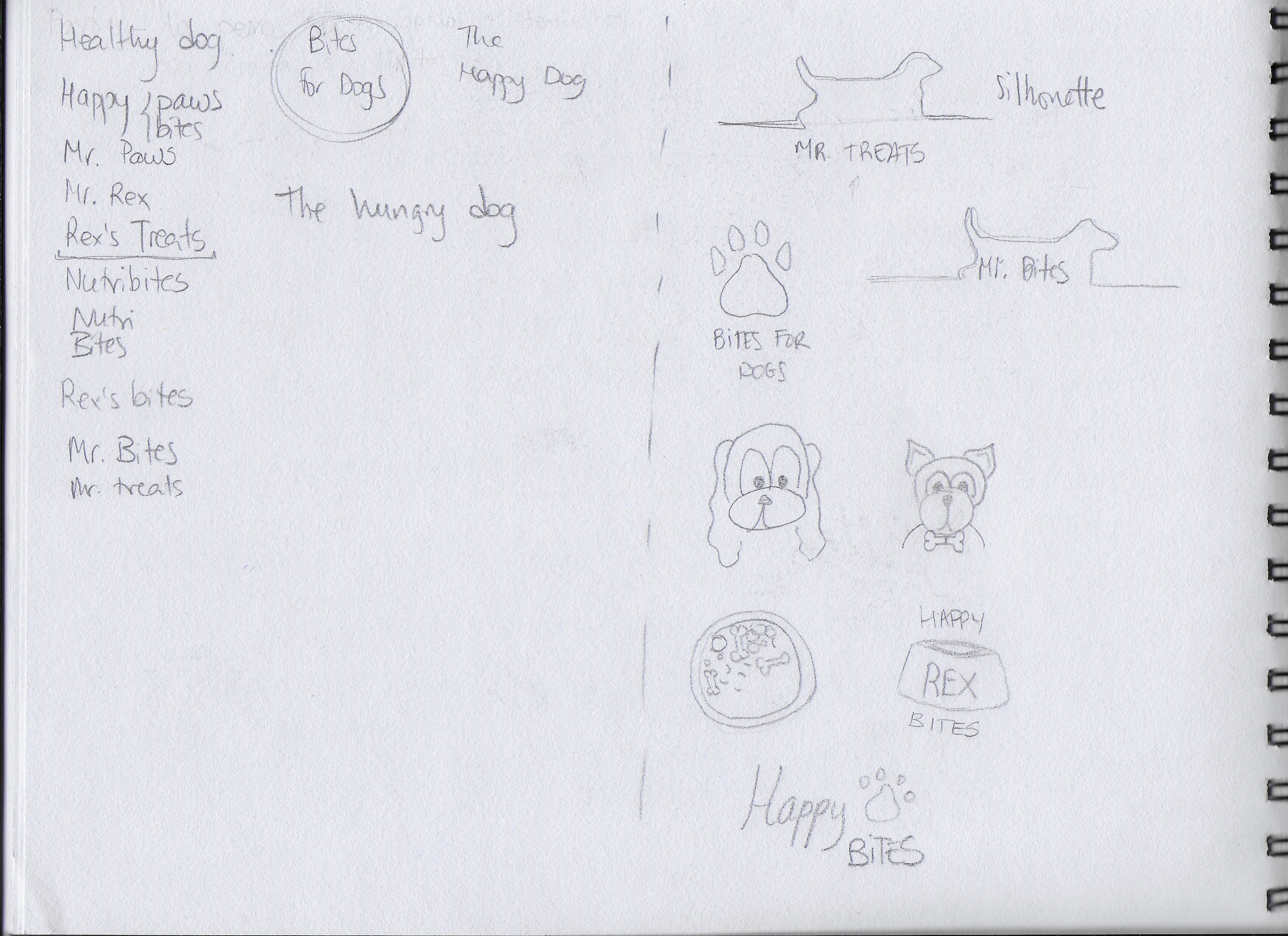
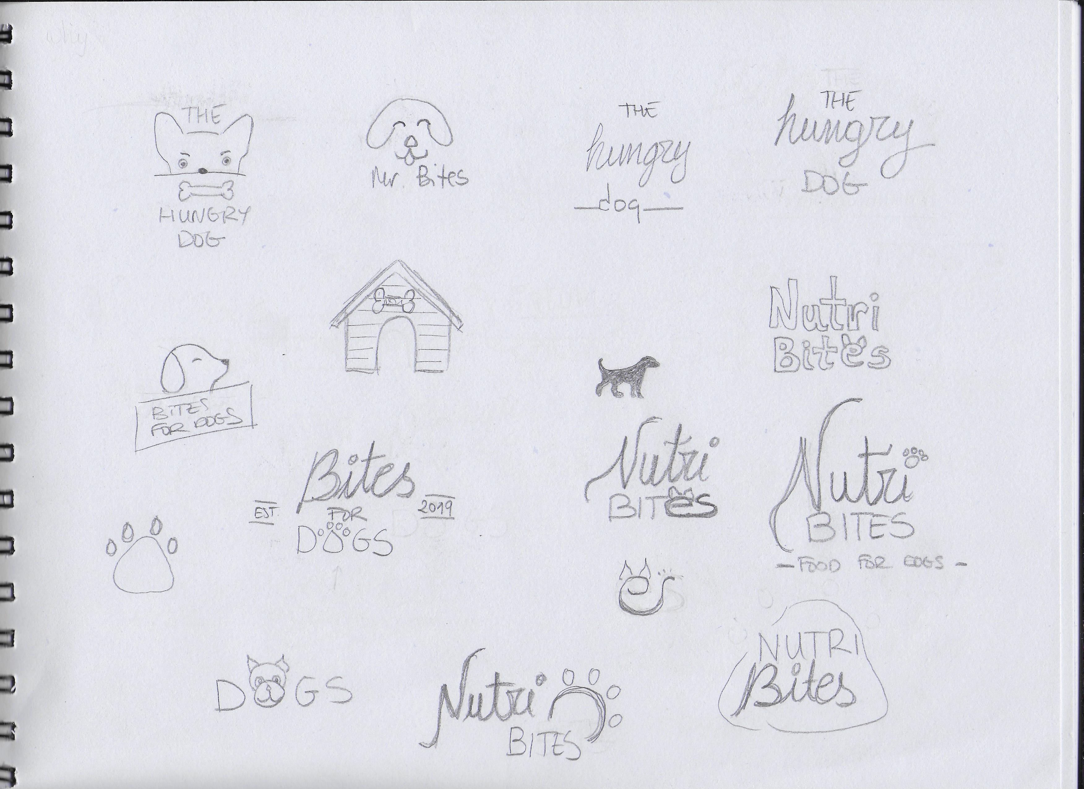
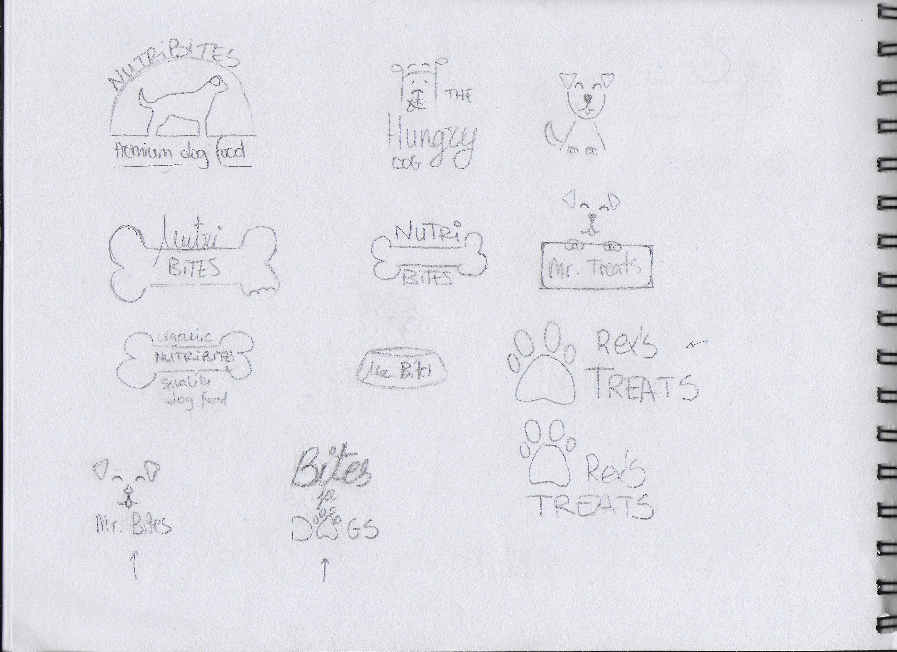
EXPLORATION First of all, I spent some time brainstorming and deciding how I wanted my brand to look. I also did some research and looked at examples of existing brands, packages and logos. After that, I began to sketch all the ideas that came to my mind. I also played with a few different names. Below are some of my first sketches.
FOCUS The following are the three options I picked of them all:
I picked this option because I liked the idea of having an icon that could be used with or without the brand name, depending on where the logo is going to be placed. I also liked the clear and readable text.
I chose this one for its simplicity. I thought it could work to have only a few lines representing a dog’s face.
This is a slightly more elegant option due to the script font used for “Bites”. I used the paw print as well, but I integrated it into the word “DOGS”.
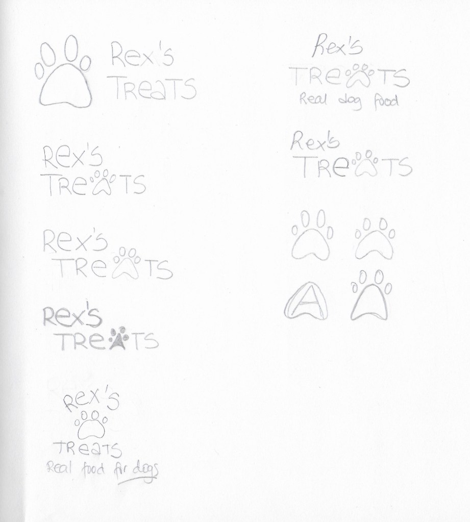
CONSTRUCTION I picked the first logo idea from the previous step and worked on it further, although it did not end up being the final choice.
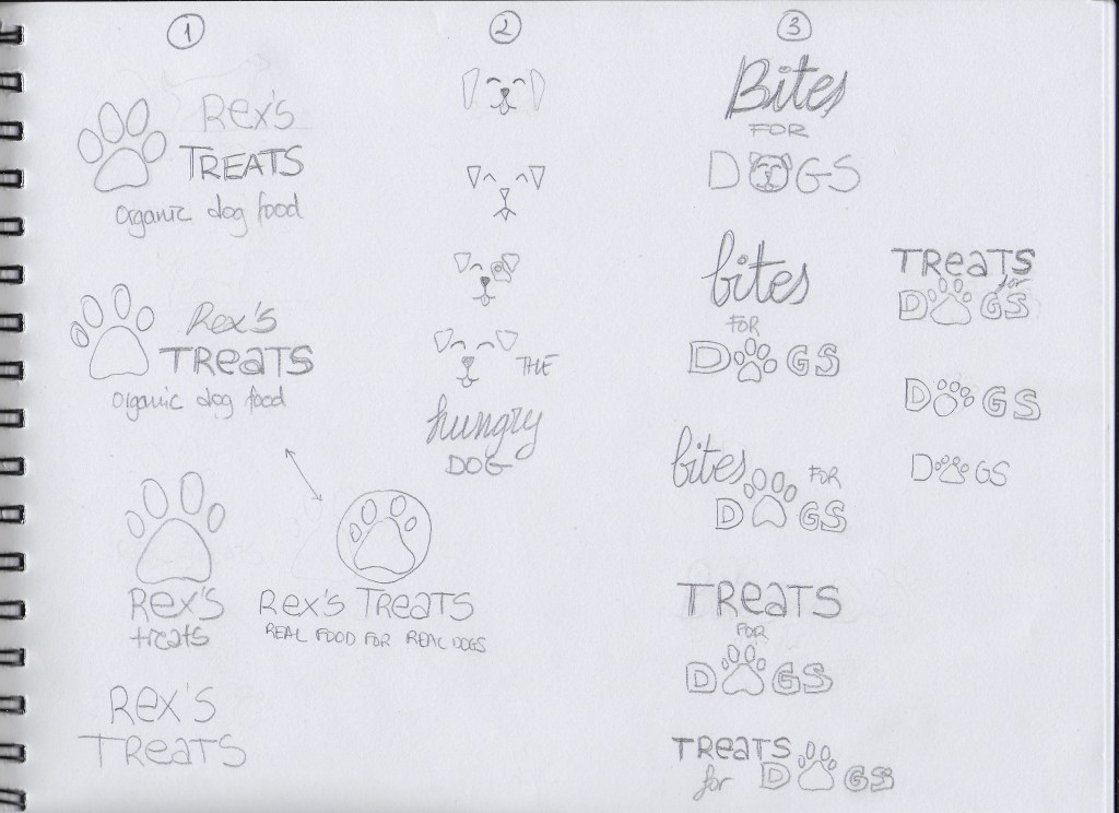
TESTING I experimented more with my three picks on paper. I decided to also do some digital sketches in Adobe Illustrator so it would be easier to show the logos and get feedback.
1
2
3
The most popular logo was number 3. I received the feedback that logo number 1 could work for any dog food while number 3 gives the feel that it is more quality food. Some thought number 2 was a bit childish looking.
REFINEMENT I finally chose logo number 3, because it has a slightly more serious look than the other two. I want my brand to be a bit playful but also to show that it offers quality products. I worked a bit more with it in Illustrator and tried different colours to see how it would look with different backgrounds.
Radio Satire is a new radio station which offers old classic humour like Monty Python and Fleksnes with focus on 60’s and 70’s classics. They need an advertisement to create interest and attract new listeners. They want to promote themselves on various public transport platforms as well as on the internet platform Spotify. Additionally, they want studio pictures of one or more people.
The purpose of this mandatory assignment is to design the advertisement for both print and online versions and do a studio photoshoot.
Now that you have built and tested your website, I would like you to market it. Let’s say that your budget is NOK 10 000 (or 1800 $ US). Please do the following:
Do some research on what advertising costs. You could for instance contact your local newspaper, print shop and other websites.
Make a detailed list of how you would market your website. Remember to keep your budget in mind.
What if you had double the budget? Come up with a second marketing strategy, this time with NOK 20 000 at your disposal. (3600 $ US)
Come up with a viral idea. It doesn’t have to be a video; it can be guys dancing at the airport in gorilla suits. You can use ANYTHING that is at your disposal. Be creative!
The website provides information about the town of León, located in the north-west part of Spain. Advertising the web on the local radio or newspaper didn’t seem like a good idea since I’d be reaching people who already live in the city or are familiar with the place. Besides, when it comes to a webpage, I think it’s better to promote it online, where the potential users will only have to click on a link, rather than remember its name or URL.
10000 NOK (930€)
Facebook and Instagram accounts (free). I would focus on creating quality content to attract and grow audience overtime.
Facebook ads (average cost-per-click is 0.97$). Limit to 150€.
Instagram ads (cost-per-click from 0.20 to 2€). Limit to 150€.
Hire an influencer (500€ for 50.000+ followers) who would show the website to their supporters.
Print 500 leaflets (110€). I would initially leave the leaflets in neighbouring provinces’ tourist offices.
20000 NOK (1860€)
All of the above.
Viral idea – Create a promotional video (up to 2 minutes long) about the city and the activities that one can enjoy when visiting (700€). This video would be used on social media to advertise the website. I’d also create an Instagram contest in which people have to find the answers to three questions about León in the promotional video. Those who answer all the questions correctly get the chance to win a weekend getaway for two. This costs 200-250€ because the hotels and restaurants would offer low prices as they get the promotion through the contest as well.
This week we have continued learning about web design. The task was to take the basic website I designed in previous Learning Activities (Put Thought Into Your Design and Planning the Structure) and convert that into HTML and CSS code.
I have learned a lot during the week while coding the website. There are quite a few things I would like to fix/improve, but I did what I could with the time I had (and the skills at the time!).
EDIT: I used Atom to code the web as well as Chrome’s Inspect tool.
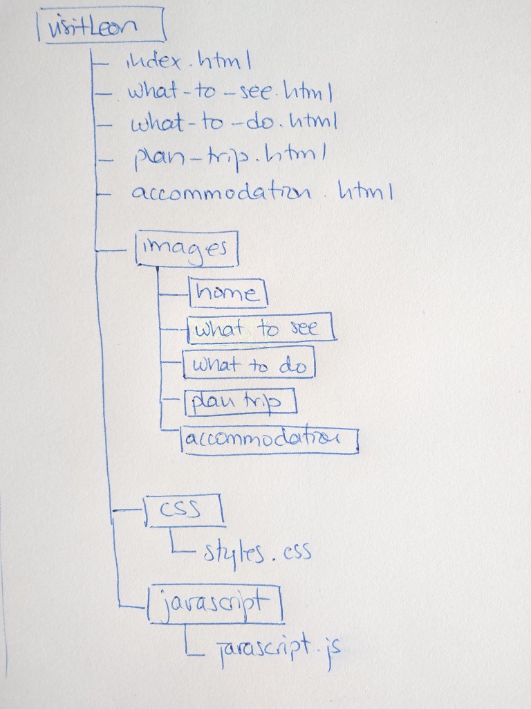
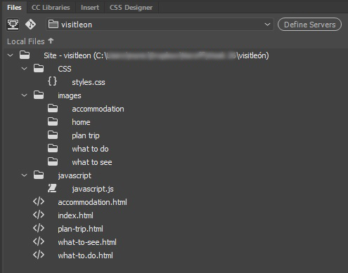
This week I had to create the structure of my web page I designed on week 22 –Put Thought Into Your Design– in terms of HTML files and folders. First I used a pen and paper to do my planning and then do it on the computer.
Below is the structure I planed for my web.
Inside the images folder there is one folder for each webpage
This week we have learned about composition in photography. I had fun experimenting with my camera and trying to capture the compositional principles. These are my best photos.
1 – Name three lighting sources and their functions.
Flashguns -also known as speed-lights- are external flash units employed by the photographers. These battery-powered flash units are mounted to the hot shoe or can be used off-camera by attaching them to the slave units. The sole purpose of the external flashes is to boost the flash-range of on-camera flash.
Head and power packs consist of a flash and a small power pack that acts as the generator for operating the flash light. You can attach multiple flash heads to a single power pack, and all these flash heads are comfortably controlled by the controls & knobs provided on the power pack itself.
A monolight is a portable photographic flash lighting unit which has its own independent power source. Unlike a head and power pack kit, it does not depend on a centralized power supply. Each monolight has its own power settings and light output.
2 – Name two light modifiers and explain the difference between them.
Umbrellas are one of the basic lighting equipment found in any basic lighting kit. Photographers use these reflective umbrellas as a diffusion device which soften and evenly spread the light over a larger area. The strobe light is mounted to the umbrella in such a way that the light hits the inside of the umbrella and bounces back to the subject with soft light and even illumination.
A softbox is also used for softening and diffusing the light. They come in varied shapes and sizes, but the most basic consists of a reflective surface surrounded by a diffuser. The flash head is fitted in such a way that the light falls on the reflective surface, passes through the translucent diffuser and produces a controlled soft light.
The difference between the two is that the light coming out of the softbox is more controlled and doesn’t spill elsewhere as it happens with umbrellas.
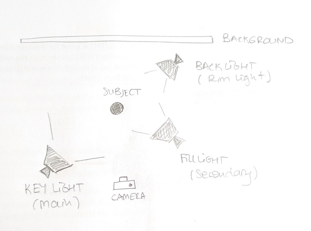
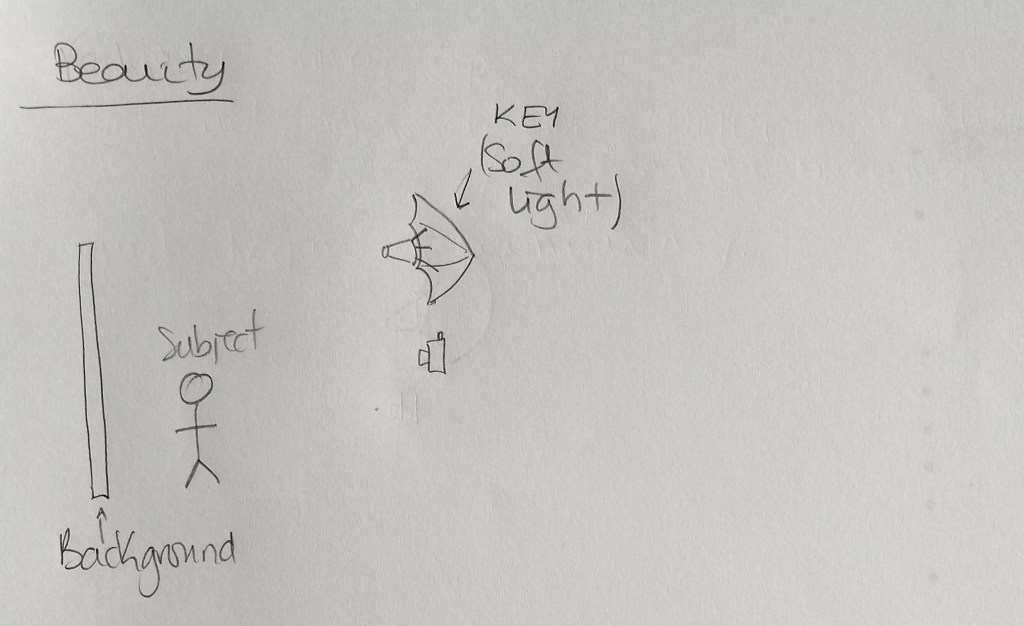
3 – Draw a diagram of and describe the three-point lighting setup.
3-point lighting setup
The key light is the main source of light that is positioned to light up the subject. It’s often the brightest light and plays a great role in determining where the highlight and shadow area in your photograph would be. It is usually placed at a 45º angle to the camera, slightly above the eye-level of the subject and angles down towards them.
The fill light can also be called the secondary light. It aims to “fill in” dark shadows and help soften their intensity. The filling light is placed on the opposite side of the camera to the key light, usually at a 45º angle and a bit lower than the main light source. It’s normally half as bright as the key light (or even less) and can be adjusted depending on how intense you want the shadows to be.
The back light, also called the rim light, is placed opposite the fill light or key light, behind the subject to create a “rim” around the subject, by highlighting their hair and shoulders and separate them from the background.
Question 2 – Research assignment
1 – Draw three studio setups for the following subject matters and list all the equipment that you would use to light your subjects:
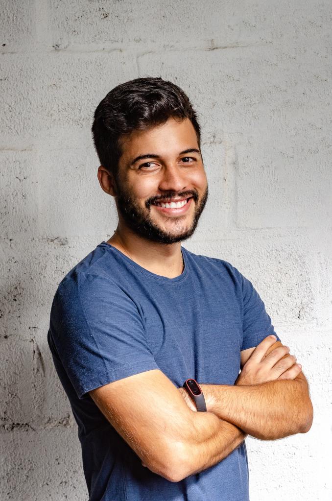
Portrait
For a portrait photo I would use a 3-point lighting setup. A key light at a 45º angle a slightly above eye-level, a fill light in the opposite side at eye-level to avoid harsh shadows under the eyes and the chin. The main light is twice as bright as the secondary. Finally, and this is optional, I would add a back light to separate the subject from the background, in case it is needed.
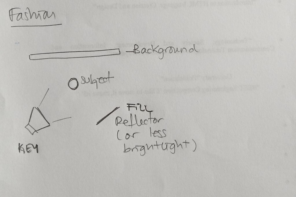
Fashion
In case of a fashion shooting, I would use a key light at 45º on one side of the model and a quite lighter light (8:1 or 4:1 ratio) or a reflector on the opposite side of the subject to fill in some of the shadows but keep some contrast.
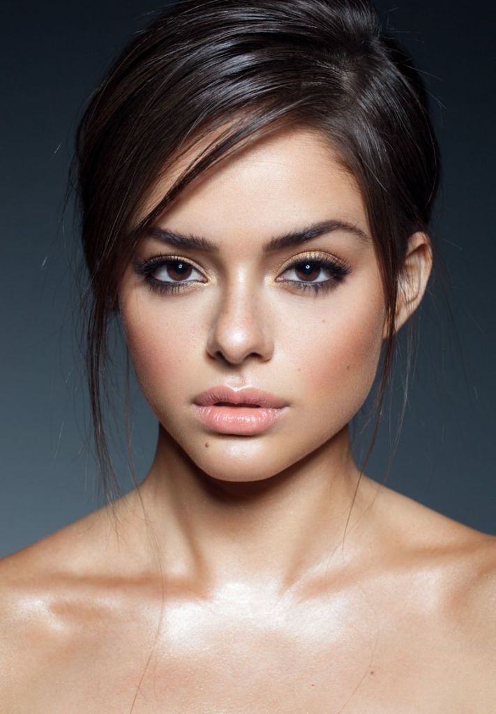
Beauty
Beauty shots usually use front light to soften texture, wrinckles and skin imperfections. For that reason, I chose to have an umbrella reflecting the light right into the subject. This way, the light is soft and spreads nicely, illuminating both the subject and the background.
2 – In a magazine or on the Internet, find one fashion shot, a beauty shot and a portrait shot and explain how you think the lighting was set up in each shot.
Portrait
For this shot I think the key light was located to the left of the subject, probably at 45º. To soften the shadows on his right side, there is probably a secondary light or a reflector. I don’t think there is a back light, as the white wall would acts as a reflector.
Fashion
Her shadow on the floor indicates there is a source of light coming from the model’s right side. There is probably a reflector to her left.
Beauty
The highlights on the model’s nose and chest suggest the light is placed right in front of her. I believe there is also a back light, that separates her from the dark background.
Question 3 – Practical assignment
Take some portrait shots and pay specific attention to the lighting you use. I would like to see a shot with soft lighting and one with more dramatic, harder lighting. It would be beneficial to hire studio lighting, but if you can’t, you may use natural light, reflectors and your camera’s flash.
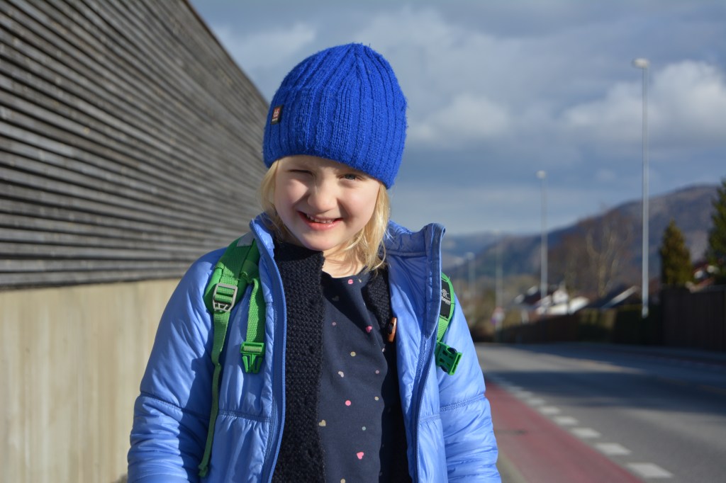
Hard light
The sun is shining on the subject’s left side, creating harsh shadows on the right side of her face.
Soft light
In this case, the sun is entering the window in front of the subject, but the white blinds that are pulled down act as a diffuser and thus the light is soft.
For this learning activity I had to design a 5-page website or blog to promote my hometown (or any other place of my choosing). I should present my design along with a strategy that explains the decisions I’ve made during the design process.
I decided to make the website to promote the town of León, located in the northwest of Spain. Strategic design helps you combine beautiful design with functionality to create a website that meets the client’s and the end user’s goals. In the following lines, I explain the strategy I followed when designing this web.
Establish goals The goal of this website is to promote the city of León to attract both foreign and domestic visitors.
Define the audience The audience is adults who want a getaway to a historical town, different from the obvious -and well-known- Spanish beach destination.
Determine the brand’s image A town full of history, culture and tradition, located on the French Way of the Camino de Santiago where the visitor can also enjoy its fantastic food and (free!) tapas.
Solve the problem The web provides practical information to the traveller, divided into 5 pages with links to further details about places, activities, accommodation and more.
Measure the results It is not possible to measure the results at this point, as this is a mockup website. If it were to be uploaded, I could use a tool such as Google Analytics to do so.
Look for little improvements Again, once the web is uploaded, I could study the results from a monitoring system and make the adjustments needed to improve it.
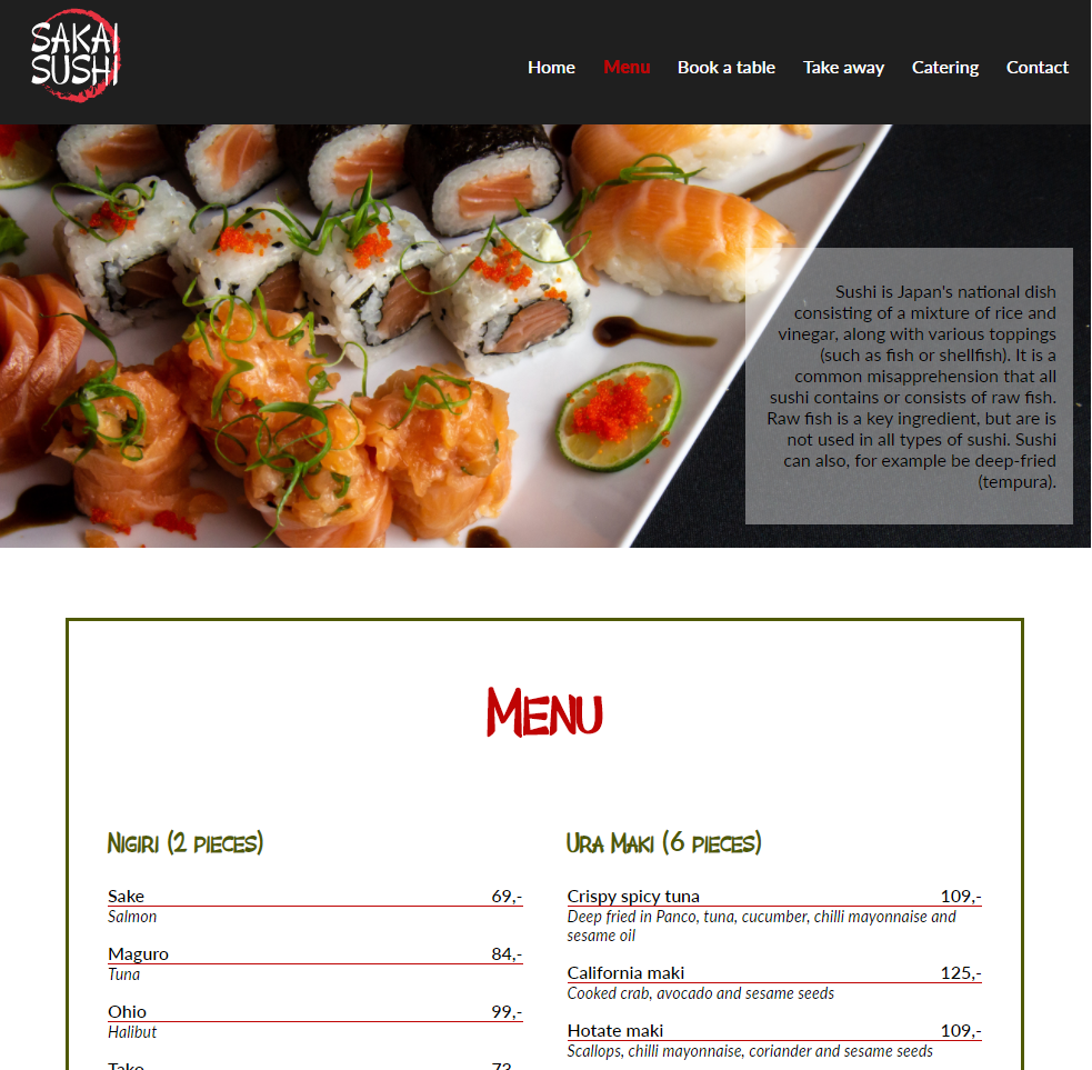
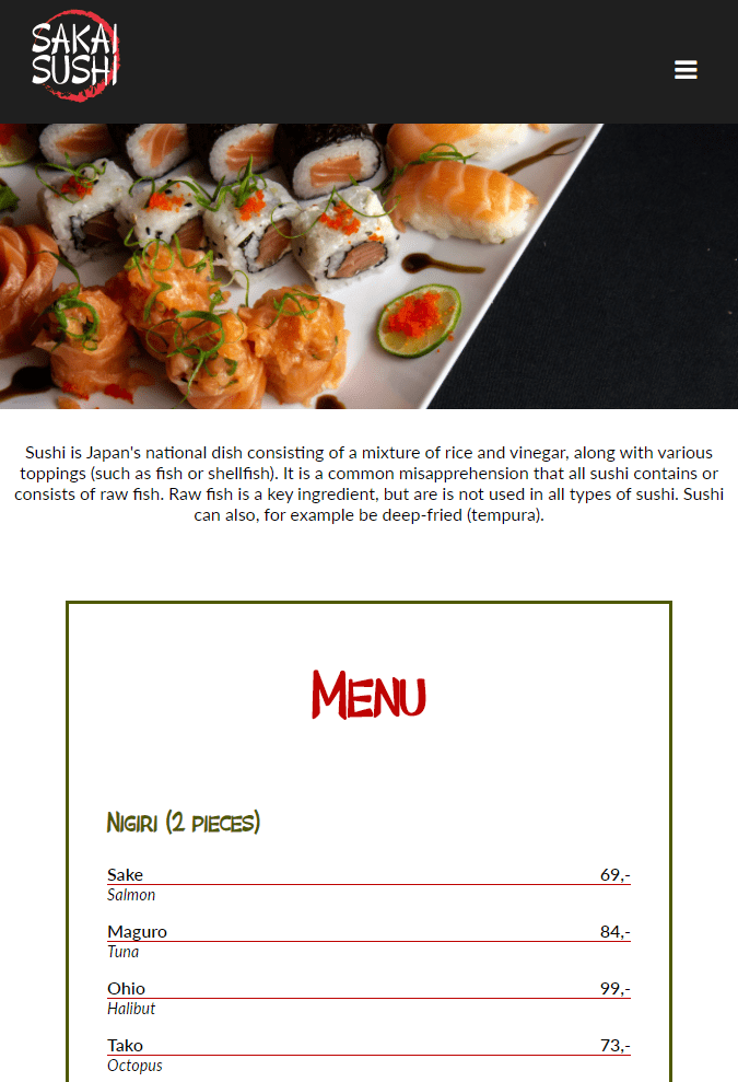
Sakai Sushi is a sushi restaurant that already has a website their customers frequently use. The customers use the site to find contact information, book a table and see what is being served. Sakai Sushi is considering investing more in catering and takeaways. Because of this, they want to design an online menu to add to their website.
The purpose of this mandatory assignment is to design the menu, presented as a web page, coded using HTML and CSS. It should function on various screen platforms, from desktop to mobile; the look should be well designed and appealing.
I used Adobe Dreamweaver to create the web page and Adobe Illustrator for the logo. Here is a link to the live web.


