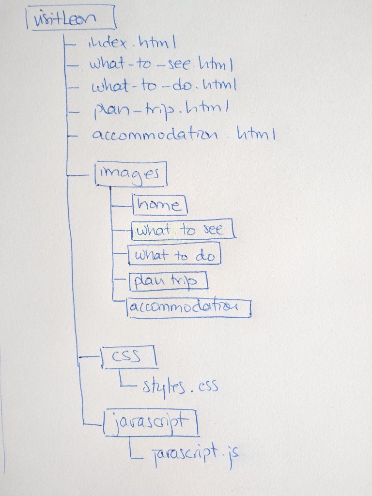
Bad websites
1 – http://www.alovelyworld.com/index.html
All the content on this website is aligned left, leaving half of the screen empty. There is no description of what the page is about, showing only a long gallery of photos of the world. Once you click on one of these photos, you land on another page which has a menu bar with some options, but still, it’s not clear what the purpose of A lovely world is.
2 – https://www.grannen.no
The homepage of Naboen Pub and Restaurant is an empty page with only a logo. It is not evident that the user needs to click on it to access the information. After clicking on the logo, the design doesn’t get much better: there are three tiny, unrelated and unrecognisable pictures and a few lines of text, where each word has a different, random size. At the bottom, four buttons lead to their menus, photos and bookings. The user has to dig to find useful information. Also, the url has nothing to do with the pub’s name, which make it difficult to remember.
3 – http://ve.no/Index_henrik.html
The headings and body copy are too small and difficult to read. The website has a menu sidebar, but the design is not great, it’s just a list of names. The pictures they use are very small, have no caption and seem unrelated to what a bar has to offer. If looking for a bar in Bergen and based only on their web, I would never pick Henrik Øl & Vinstove.
4 – http://www.petersbuss.se
The name of this company is Peters Buss (bus in Swedish), but the images on their web show a cruise and a spa, so it is not clear what they offer. There are too many colours that clash with each other; it is evident that little thought went into the design. There is too much information, and it seems unrelated. There is no consistency in typography, the endless list of links on the left use different sizes and colours without an apparent reason.
5 – http://www.gatesnfences.com
Gate N Fences’ web is cluttered with information and links; it’s not easy to find your way around this site. The colour choices are not working, especially the red text over a grey or green background, which is very difficult to read. The buttons on the left side look out of style and unattractive. The background image doesn’t make sense with the rest of the page. There seems to have no organisation whatsoever; it’s a random placement of photos and text. Overall, it’s an unpleasant design.
6 – https://mednat.news
The top part of this homepage has an unattractive logo and a cyan background. The text on the bar menu is too small. Besides, moving text makes it look old-fashioned. It seems to be a natural medicine guide, but the overall look of the web is a bunch of quotes and links, all in too small size to be comfortable to read. Scrolling down, we can see a couple of videos and some images with yet more quotes. It is not easy to follow and find your way around this website.
7 – http://www.irishwrecksonline.net
The homepage has four images; three of the links do not work. To enter the web, the user needs to click on the fourth image, and it’s so unclear that a message with instructions is necessary. Once you enter, the design is like a mixed colour palette, which contains plenty of conflicting colours, including the background pattern. The text is small and not easy to read. Also, the navigation is quite complicated.
8 – https://www.lingscars.com
There is so much going on on this site that it’s difficult to even look at it. There are moving images all over the place, a loud video that automatically plays when you access the web and a very colourful, demanding background pattern.
9 – https://www.art.yale.edu
Even though the website belongs to Yale School of Art, it has quite an unappealing design. This web page is a collaborative project, and all member of the school can add content to it; this might explain the wrong choices made: all the text is aligned to the left, the background is too busy and distracting and the copy size too small in many cases. The colours do not work together either, and the yellow gradient in the text boxes makes it look outdated.
10 – http://www.arngren.net/
Again, another overwhelming website that could not fit one more piece of information. It has a random selection of colours, image and text sizes. It’s not user friendly or pleasant to look at.