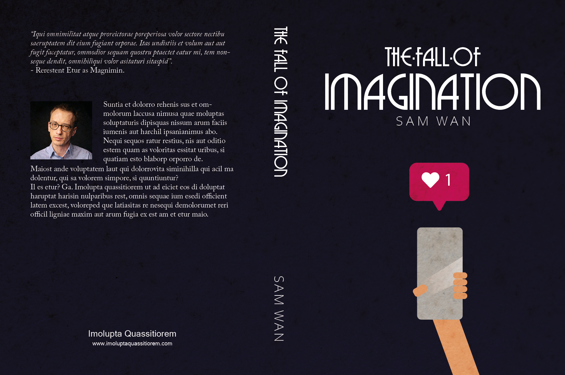
Design a book cover for a thriller book called “The Fall of Imagination” by Sam Wan. This book does not exist and is open to your interpretation as to the subject matter.
It must be designed by clearly drawing inspiration from a previous design style.
The size of the cover must be A5 and it should include a front, spine and back.
The cover must contain a simple vector illustration that forms the basis of the design.
The cover must contain the title and the name of the author.
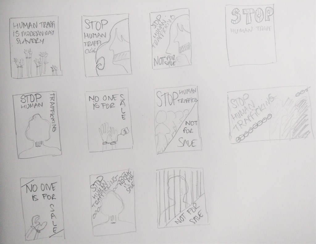
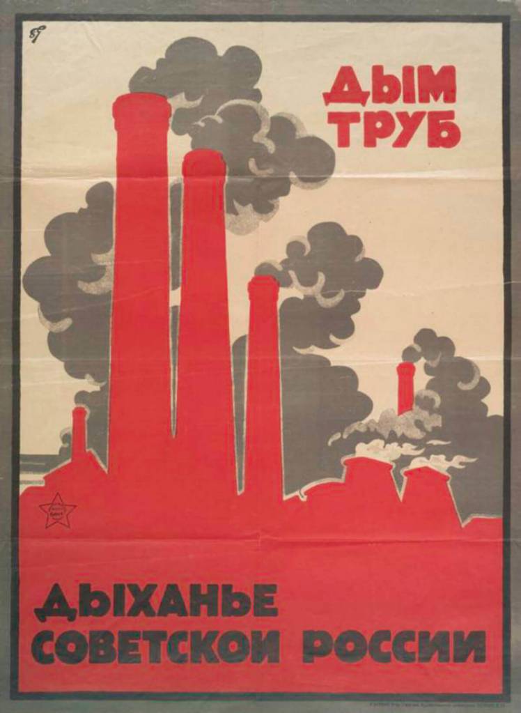
Design an A4 poster for a humanitarian cause you feel passionate about. For example, creating awareness and a call for action against human trafficking. You must apply pastiche to your design. Use a style of propaganda used during the Modernism era and create your own, unique design in a contemporary context.
Start by creating at least 5 thumbnails for your design. These thumbnails should be handed in with your assignment.
Write a rationale or explanation for your poster of at least 350 words. Why it is necessary to create awareness of the humanitarian cause?
Give an explanation for your creative execution, mention the use of colour and graphics as well as typography.
Give examples of the designs you used as inspiration and why it is applicable to your design.
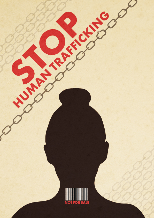
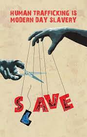
For this lesson task, I chose the humanitarian cause of human trafficking.
Thumbnails
The poster
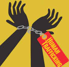
According to the United Nations, Human Trafficking is the recruitment, transportation, transfer, harbouring or receipt of people through force, fraud or deception, with the aim of exploiting them for profit. Men, women and children of all ages and from all backgrounds can become victims of this crime, which occurs in every region of the world. The traffickers often use violence or fraudulent employment agencies and fake promises of education and job opportunities to trick and coerce their victims.
No matter where they come from, every person should be free; no one has the right to sell another person. Human Trafficking is a violation of Human Rights. It is modern-day slavery and must be stopped. We, as a society, need to find a solution to put an end to this inhumane practice.
The silhouette on my design represents a victim of trafficking. The bar code on their neck depicts the person as a product that can be sold. Besides, many times, human trafficking victims are coerced into getting tattooed as a way to signify that they belong to a certain pimp/trafficker. A tattoo resembling a bar code has long been linked to human trafficking in Europe. Chains surround the person, and one of them -the darkest one- is breaking, expressing the need and hope to end this crime. The colour palette is inspired by the posters below, as well as the sans-serif bold typography.
Inspiration
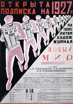
To create this poster about human trafficking, I used inspiration from other propaganda posters from the Modernism era as well as from Post-modernist signs.
“Frank Shepard Fairey is an American contemporary graphic designer and illustrator who emerged from the skateboarding scene. He first became known for his ‘Andre the Giant Has a Posse’” (…OBEY…) (www.obeygiant.com) sticker campaign, in which he appropriated images from the comedic supermarket tabloid Weekly World News.
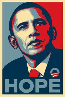
His work became more widely known in the 2008 U.S. presidential election, specifically his Barack Obama “Hope” poster.
Source: Wikipedia
Analyse his poster for the 2008 U.S. Presidential Election and give your opinion on the use of style and its efficacy. Also critique the use of pastiche and typography. Write one page (about 350 words) on your opinion of this design and substantiate your answers with examples.
The Barack Obama “Hope” poster designed by artist Shepard Fairey for the 2008 US Presidential Campaign is described as iconic. Although not originally part of the official campaign branding, the design proved so popular that the poster became something of a viral phenomenon, seamlessly playing into the Obama campaign’s overall ambience.
The poster shows a portrait of Obama where he is gazing slightly upward and to the side, and his expression communicates confidence and focus. Its style depicts the presidential candidate as an almost heroic figure. The word “HOPE” that accompanies the picture helps convey the message of Obama being the change to come for the people of America.
We can see how Fairey took inspiration from images of previous American presidents, such as the well-known JFK portrait or the image of Abraham Lincoln on the five-dollar bill. Choosing the same recognizable pose of previous presidents elevates Obama to the same level and depicts him as the next president of the United States, even before the election.
Source: Wikipedia
Source: Wikipedia
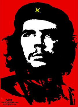
The “Hope” poster style imitates other propaganda posters such as Jim Fitzpatrick’s Che Guevara, where he is represented with a straight look into the distance, similar to Obama’s pose. The focus is on Che Guevara’s black and white face on a red background.
Source: Wikipedia
In his work, Sheppard Fairey often uses red and cream colours, which he also did in the “Hope” poster. In this case, he also added blue, which symbolizes trust and loyalty, strengthening Obama’s figure. Red, white and blue are the traditional American patriotic colours, but he uses a muted, desaturated palette, differentiating his work from almost all mainstream political campaign images.
Source: CareerAdict
The all-capital slogan printed under Obama’s image says “Hope” in a bold, modern, sans-serif typeface. Through this slogan, the viewer forms a correlation between the three-quarter pose and the concept of hope and generate the meaning: Barack Obama provide us hope.
In conclusion, the limited palette, the simplicity of the layout, a short slogan in bold typography and the flat-colour illustration makes the design effective and easy to recognize and remember. It also allows for the image to be widely reproduced, which was Fairey’s intention. It certainly helped to make this iconic work go viral.
Within the broader milieu of Neo-modernism, we focus on Marian Bantjes, who set design trends with her unique application of typography, loose illustration and well-balanced compositions.
Objective observation During the interview, Marian mentions, “When I worked at Digitopolis, I was working almost entirely on the computer, basically the computer and with photography. And now I am using a wide variety of materials, sometimes still involved with a computer and sometimes just with the materials themselves. But having a space like this allows me to obviously store them all, and to work on these various surfaces in different media.” What is your opinion on the use of the computer combined with different media? Write one page (350 words) on your opinion of the importance of media and design and what your take is on the use of computer technology.
Throughout the program, we have learned how important it is to use pencil and paper to sketch and test our ideas before moving to the computer. Everyone works differently, of course, but I find the ideas flow much easier when I draw or write by hand rather than trying to do it directly on my PC.
Adding other media into the process of creating a design is very interesting and inspiring and opens up even more possibilities than just a few sketches on paper. It does not necessarily mean one has to use art supplies or expensive, rare things. In the movie, we see how Marian uses everyday items such as pasta or flower petals to create beautiful compositions later used to form patterns for a design.
In my opinion, any way of expressing yourself is good. I see design, photography, art and any creative discipline as parts of a whole where the different pieces intertwine. It can be intimidating to try to create something on a media we have not used much before. Still, if we see it as experimentation, we remove the pressure of having to produce an outcome, and we just play with it and see where it takes us. Maybe it is a creation worth using on a book cover, perhaps gives us inspiration for something else, or it ends up discarded. Experimenting and incorporating works made with other media can only enrich your designs and make them more personal and unique.
A computer is an essential tool available to designers. It offers many digital tools that help us work in a way it was not possible before. We live in a digital world, so it will always be necessary to bring designs to a digital form. However, I recognise the importance of testing and developing ideas before we do so. And the more materials and techniques we can use to expand our creativity, the better.
In conclusion, it might not be a requirement to combine the use of the computer with different media to be a good designer, but it can be very beneficial, and Marian Bantjes is an excellent example of it.
Pushing technology and changing philosophy While describing her development of style, Marian states, “I am not an expert on illuminated manuscripts by any stretch of the imagination, but there are a couple of purposes of it. But one of those purposes is definitely to invoke wonder in this way that was very interesting to me was feeding directly into my ideas about that symbiotic relationship between graphics and text.” How do you think this links to the philosophy of the Swiss International School? How is it different? Has technology given us an advantage in expressing the symbiotic relationship between image and text? What about Marian’s work? Is this reflected in her work? Do a write-up (350 words) on the relationship between image and text, as seen in Marian’s work and relate this back to the Swiss International School. Substantiate your answers with relevant facts. You may use a visual example of both Marian’s work and that of the Swiss International School to facilitate your analysis.
The relationship between words and images is an essential element of design. Words and images may correspond to one another. The opposite extreme occurs when the image and the words do not illustrate but rather contradict each other. When the relationship between text and images is not too literal, the viewer must play a more active role: they must discover the main idea themselves and participate in creating the meaning of the message.
In Swiss Style, there is also a symbiotic relationship between image and text. As Josef Müller-Brockmann put it: “Copy and a picture are arranged and related in accordance with objective and functional criteria. The areas are sensitively organised with an assured touch in mathematical proportions, and due attention is paid to the rules of typography”. The difference is that Swiss Style is characterised by simplicity, functionality and lack of ornamentation with the use of only sans-serif typefaces, while Marian designs are very decorative and elaborated, and the typefaces ornamental and complicated.
Communication is the Swiss Style’s primary goal, one that dictates the need for symbols appropriate to the content of the message. On the contrary, Marian’s intricated designs often make the viewer pay close attention to try and figure out their meaning or the hidden words.
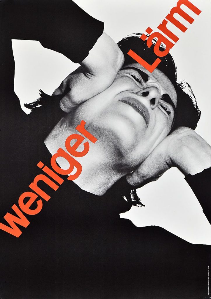
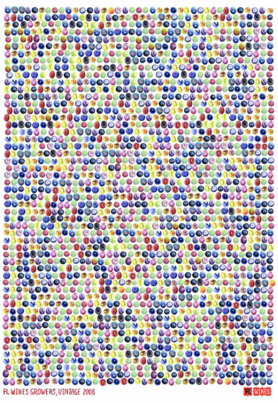
To illustrate this, I include some examples below. The poster on the left by Swiss designer Josef Müller-Brockmann reads “less noise” in red type, and the photograph shows a person covering their ears with their hands, depicting the discomfort of noise pollution. To the right, Marian Bantjes’s work, requires to pay closer attention to the poster to work out that the circles represent grapes, then realise there are letters written on them and that they actually form the names of R-Wines’ grape supliers.
Creating graphic designs in the past required a lot of labour, and making changes to them was far from easy or simple. I am not sure technology gives us an advantage in expressing the symbiotic relationship between image and text, as this relationship already existed in illuminated manuscripts in the year 400, but it is clear that it is now a much quicker and straightforward process.
Compare the design (in terms of pace and contrast) of an online magazine, blog or website to that of a printed magazine, book or journal. What differences can you see between the kinds of design strategies used in the two formats?
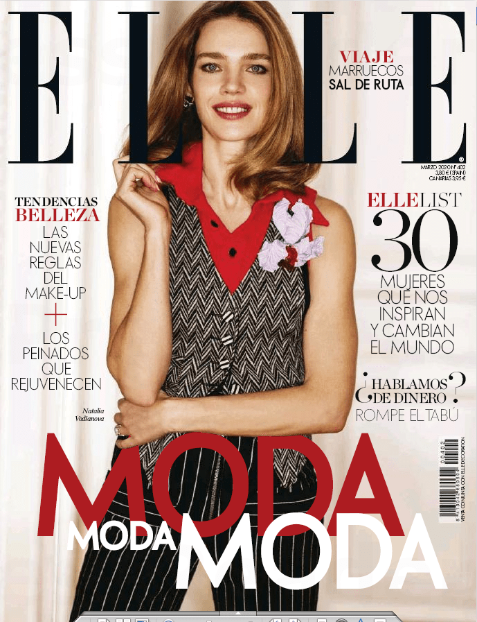
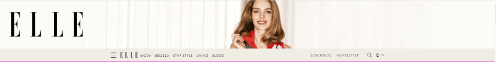
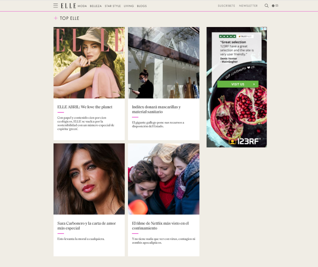
For this Learning activity, I’m going to compare the Spanish edition of Elle magazine, March 2020, both their printed and online versions.
Cover of the printed magazine
Home page of the online version
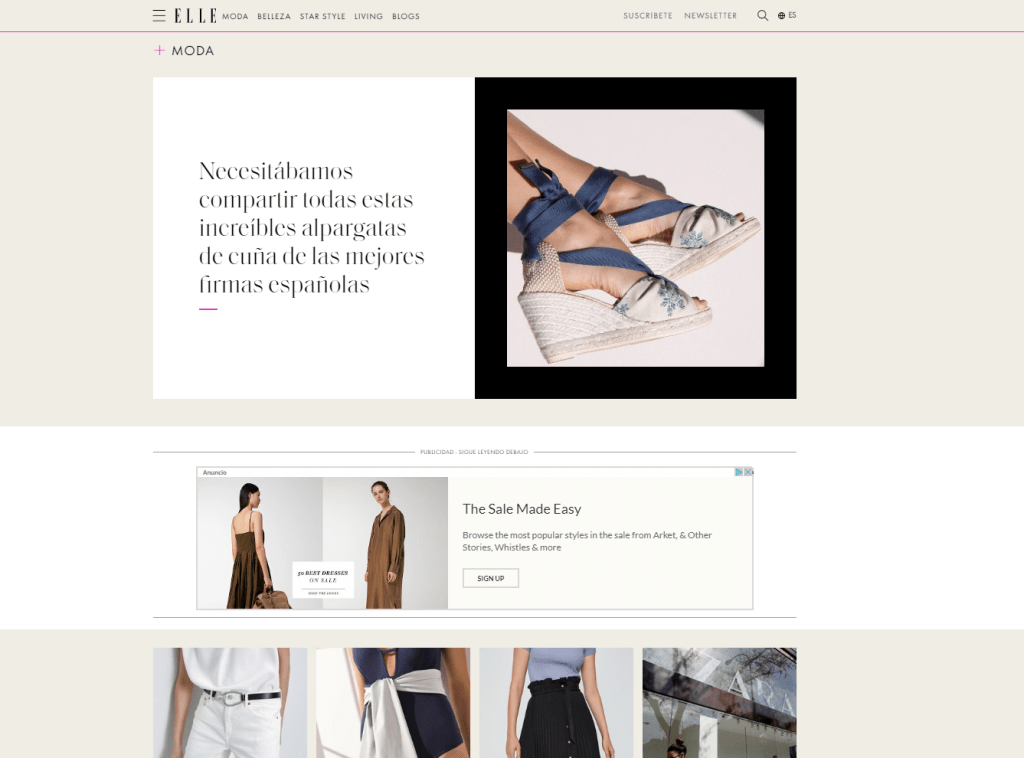
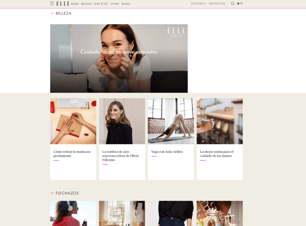
The cover of the printed version uses one big photo that can also be seen on the homepage header of the online magazine. The logo is present in both versions as well. On the printed cover, the designer has used a combination of typefaces -serif and sans-serif- to catch the attention of the reader. The online magazine also uses a mix of serif and sans-serif typefaces and similar colors as the printed one. The difference is, of course, that the web version is interactive, and the information can be presented differently. There is a menu just below the header with some fixed categories that the reader can click to get to the desired information. If we scroll down the main page, we see the same categories with some of their content, showed in a grid design with pictures and the title of the article they link to.
Printed spreads
Online article
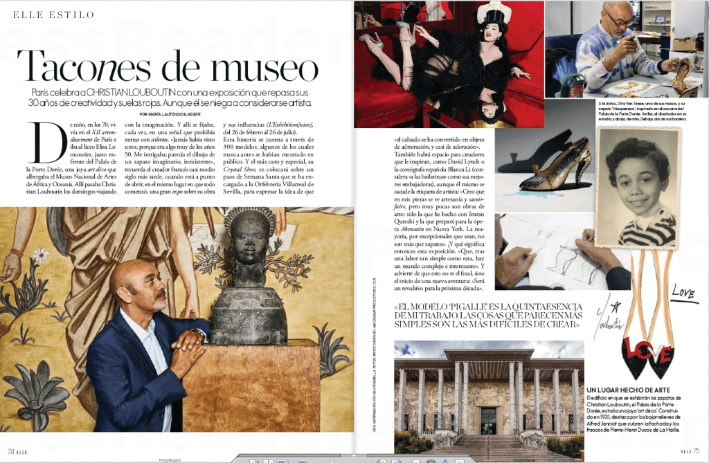
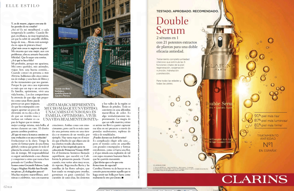
The design for the printed magazine has a lot of pictures to make the read easier and more dynamic, and so does the online one. The difference lies in the way the text and photos are distributed in the article. In the images above, I show the same story in both paper and online. In the printed one, the designer uses a 3-column grid where they add large pictures, some even taking a whole page. The web article, on the other hand, has a unique column, and the photos are inserted in between the lines, more like a blog post, since the reader will scroll down to read the piece rather than turn the pages on a more traditional magazine.
The way a reader navigates a magazine is very different for printed and web, and it is essential, as a designer, to consider that aspect when designing the layout and the way the information will be presented.
Take a magazine, newspaper or book that includes images and text. Lay tracing paper over the top of three spreads (both left-hand and right-hand pages). Using a pencil and ruler, carefully trace the grid underlying the page layouts. Remember to remove specific text elements or images, and to only draw the grid lines. Note column widths and margin sizes at the top, bottom, and to the left and right of the main body of text. Is your document based on a two-column, three-column, or another type of grid? Which elements stay the same on each page, and which change?
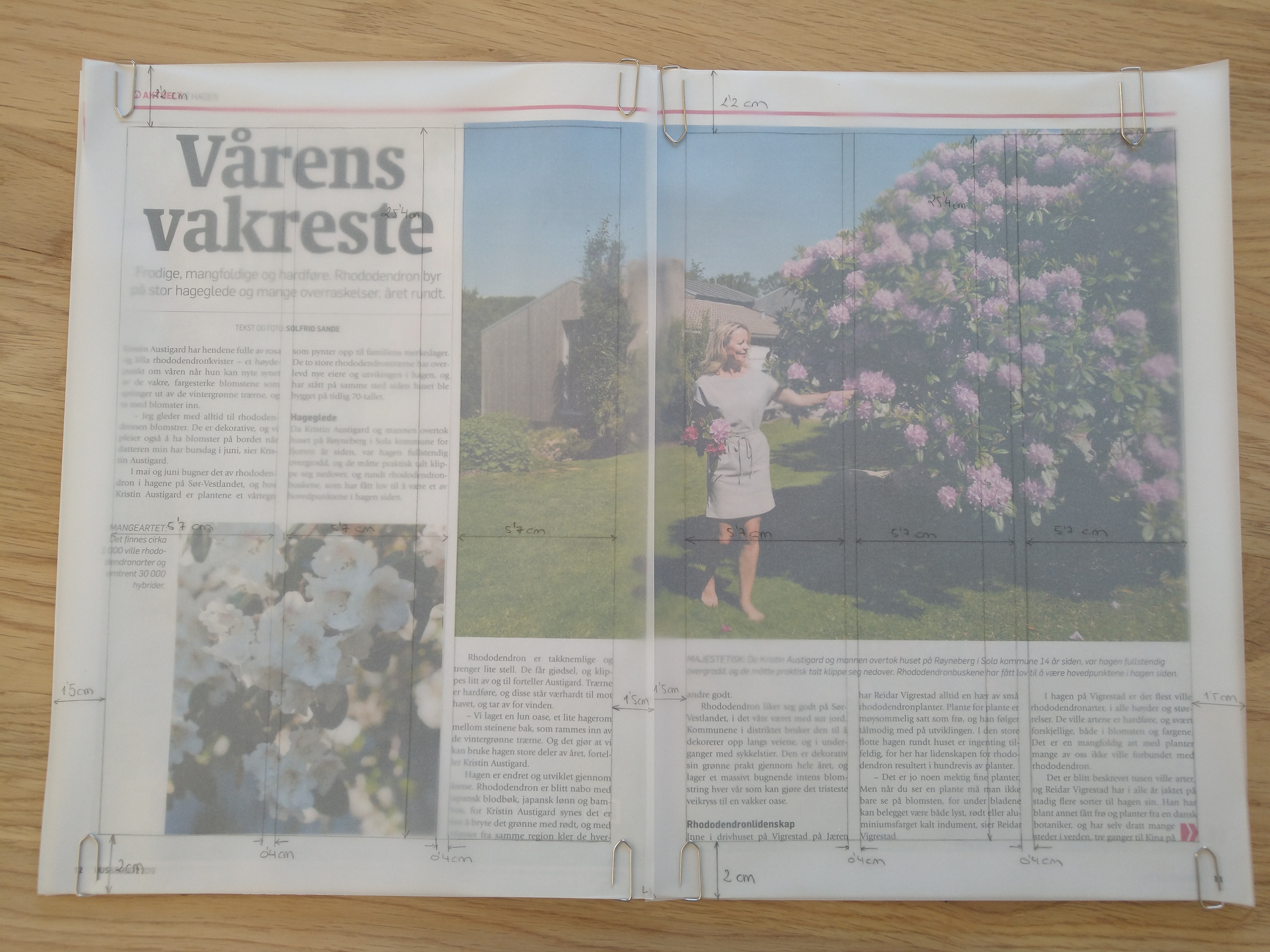
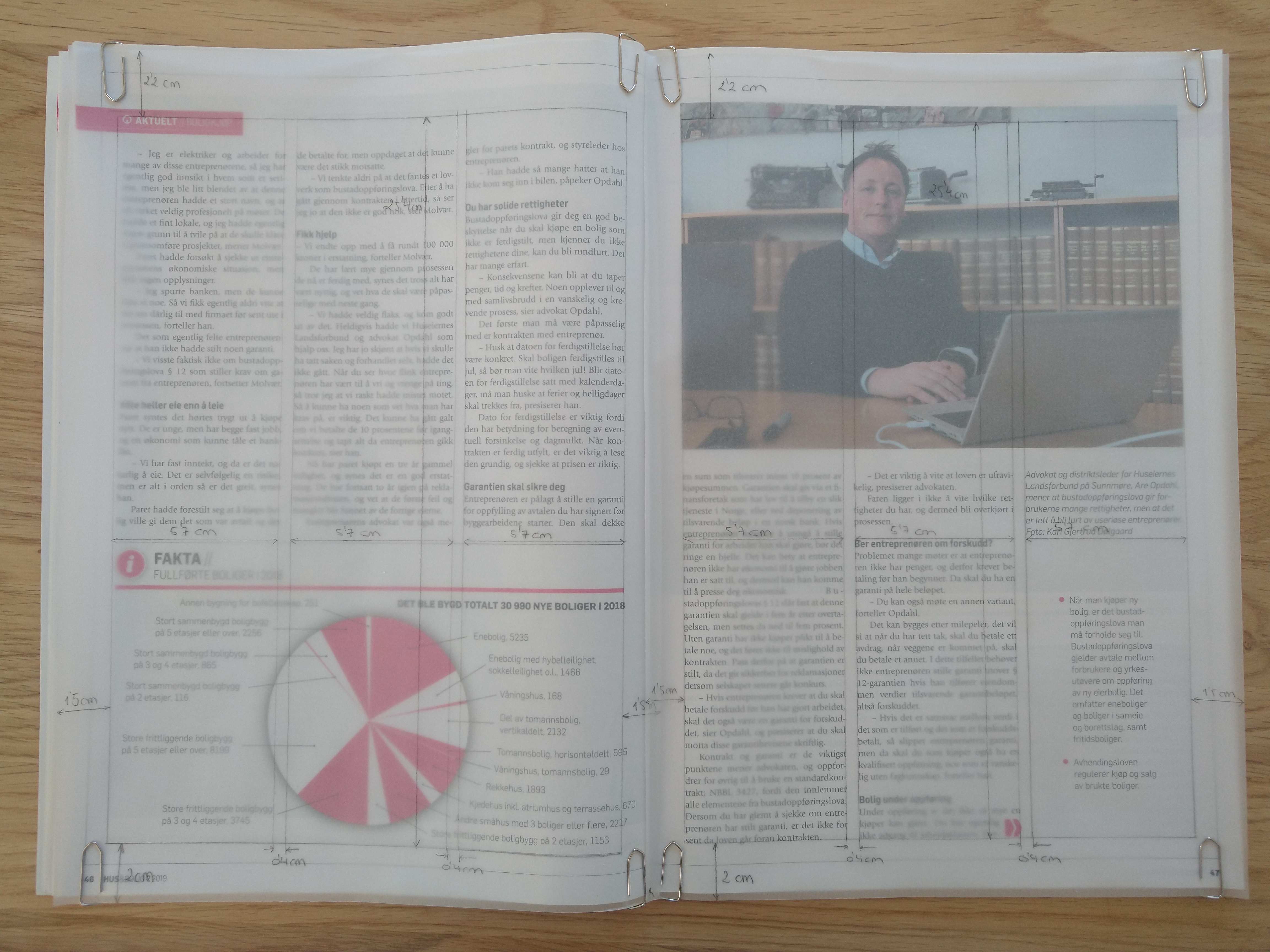
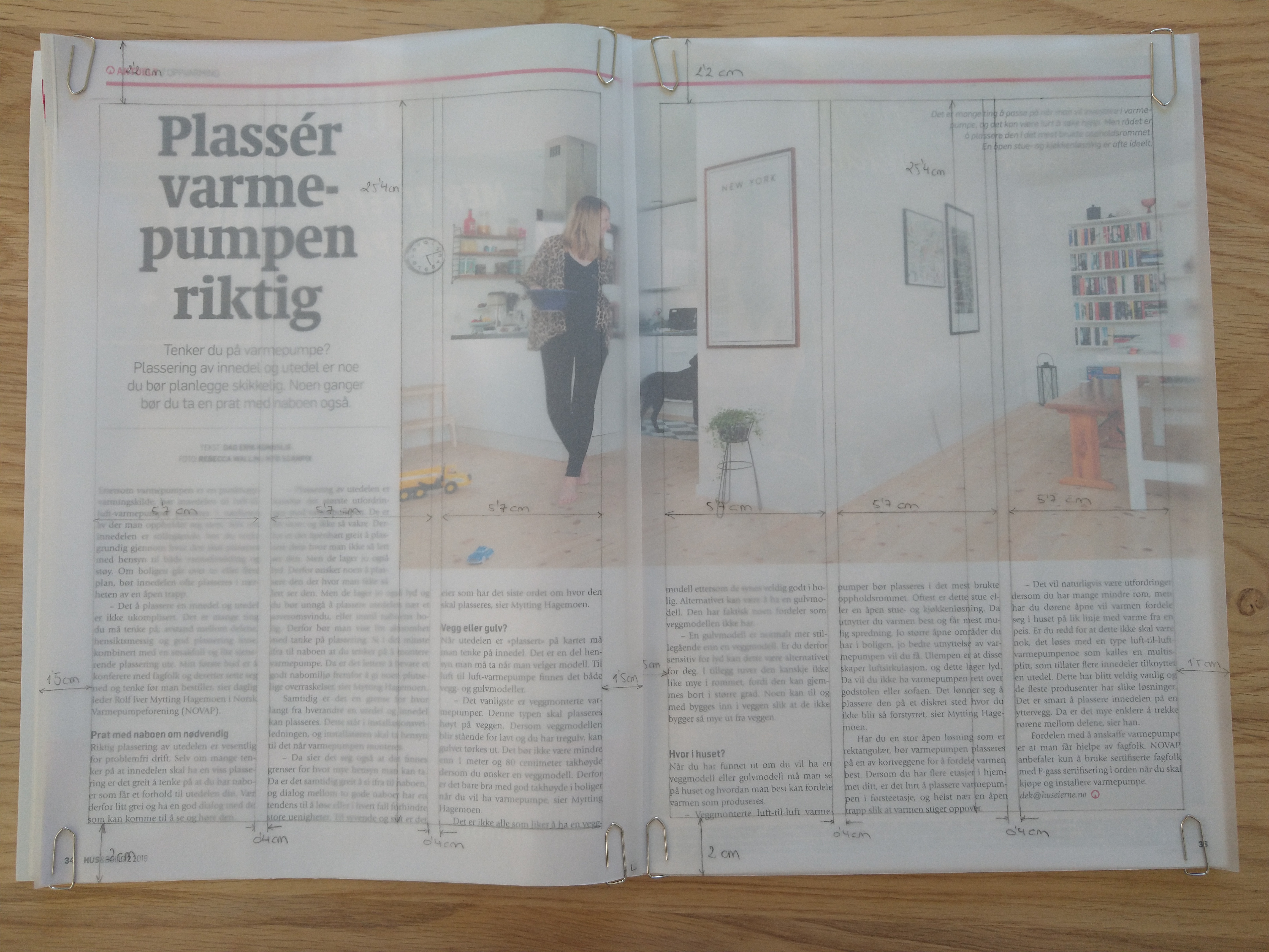
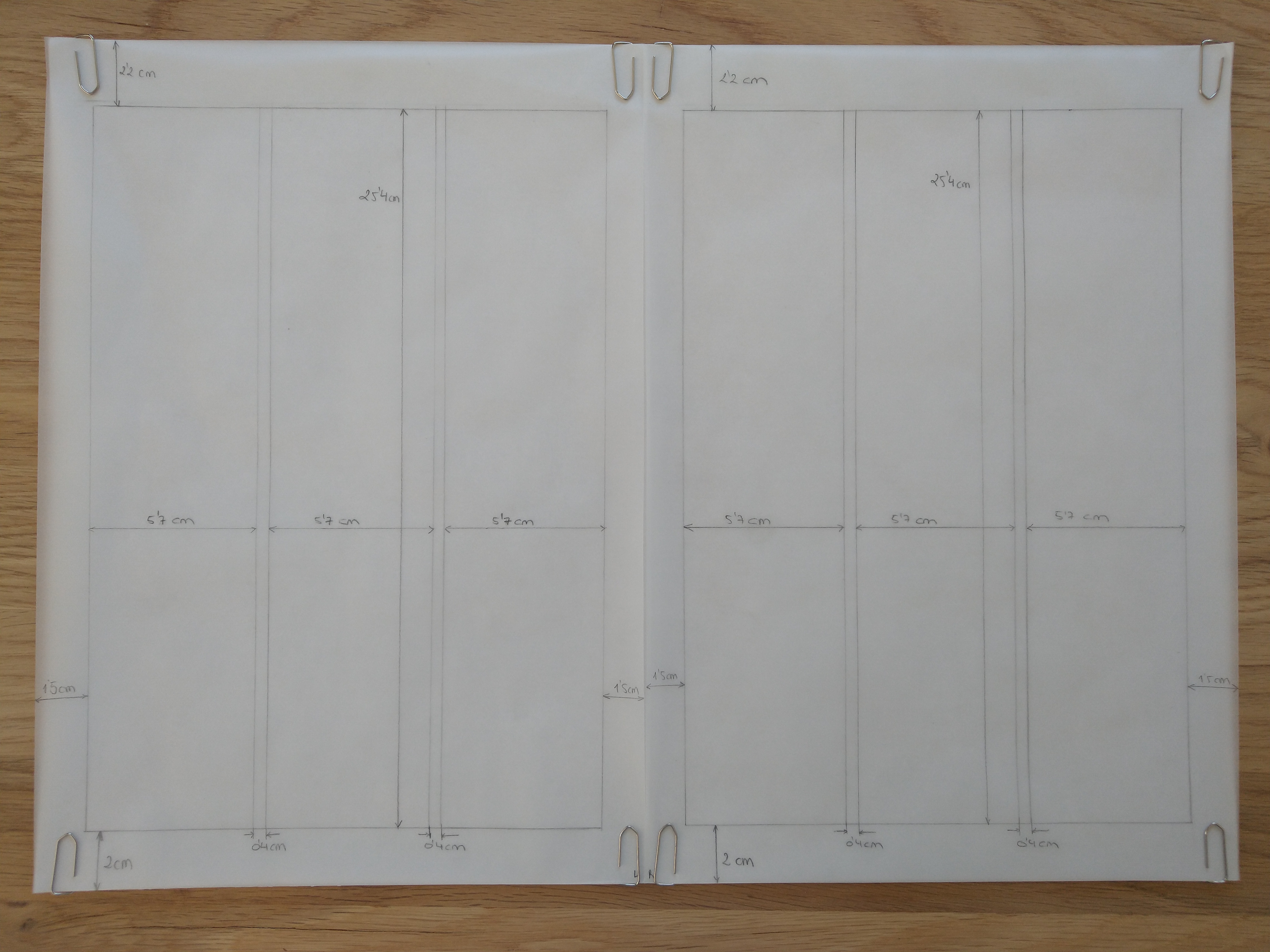
I decided to use the magazine Hus & Bolig. The three spreads I chose are based on a three-column grid, like most of the pages in the magazine. All the pages selected have a mid-range amount of text, which works well with this type of grid. All three spreads have large images/graphics; the first and the last one have an asymmetric distribution between picture and text, while the second one is symmetrically divided.
Column width: 5,7 cm Column hight: 25,4 cm Top margin: 2,2 cm Bottom margin: 2 cm Left margin: 1,5 cm Right margin: 1,5 cm Gutter: 0,4 cm
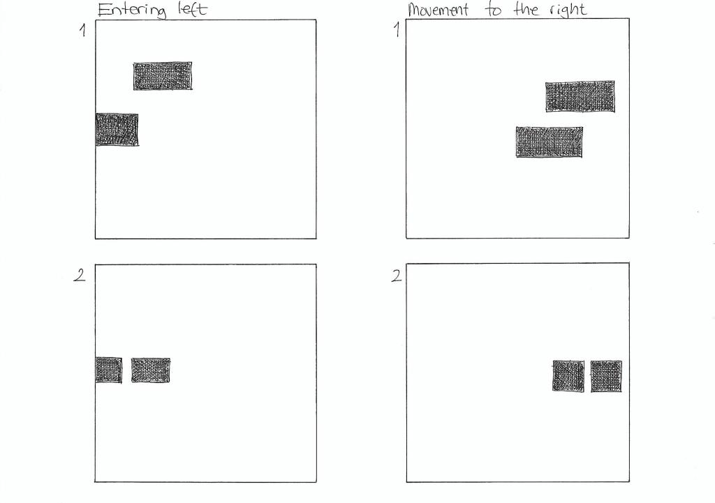
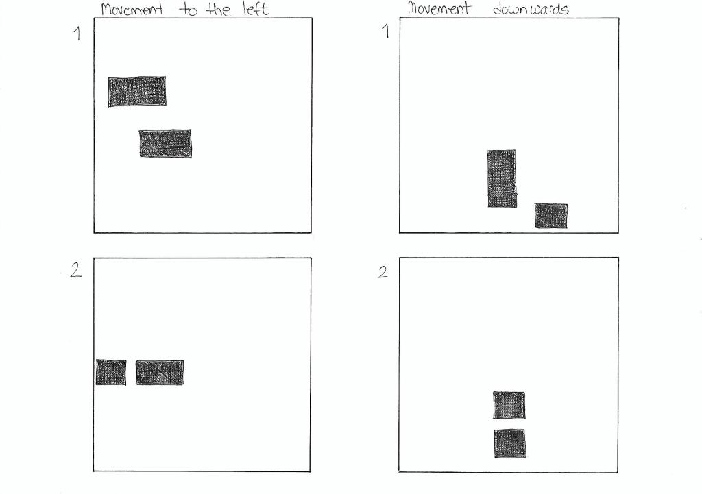
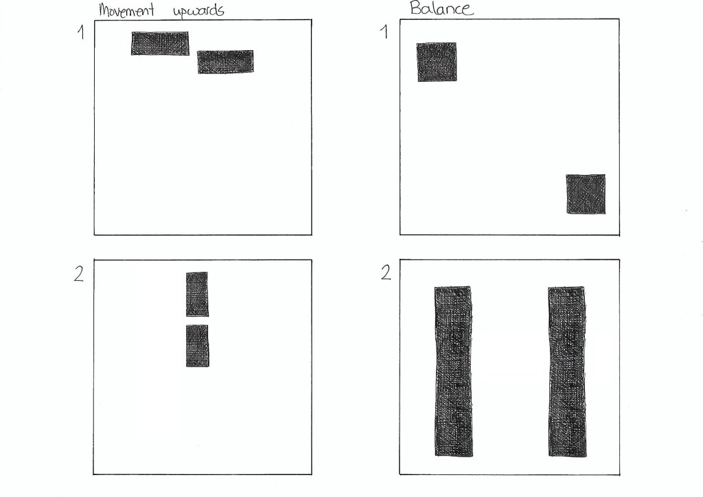
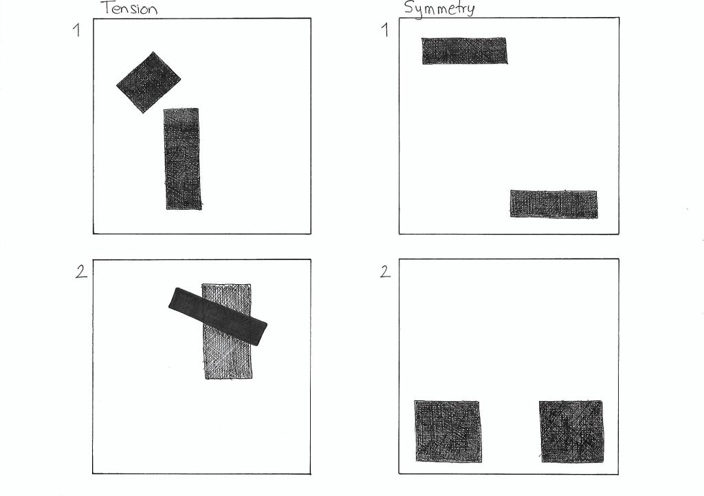
On five A4 landscape pages, I had to draw four equal squares in each. Then, I draw one or two squares or rectangles in each of the empty squares to achieve the following visual effects:
Entering left
Movement to the right
Movement to the left
Movement downwards
Movement upwards
Balance
Tension
Symmetry/asymmetry
Entering left The rectangles placed close to the left end of the square gives the impression that they are entering the page on the left side. The fact that the rectangle closest to the edge is only partially shown helps enforce that effect.
Movement to the right Placing both pieces on the right side of the square gives the impression that they are moving to the right. It doesn’t affect if I use squares or rectangles.
Movement to the left In the same way, placing the squares or rectangles on the left side of the page suggests movement to the left.
Movement downwards In order to show the effect of movement downwards, I decided to place the squares and/or rectangles close to the bottom of the big square.
Movement upwards Placing two rectangles on the top of the square gives the illusion that they are moving upwards. It works if the blocks are in line or in parallel paths.
Balance Two squares with the same size placed in opposite corners of the page suggest balance. The same happens with two equally sized rectangles on each side of the square.
Tension In the first drawing, the small rectangle is place in such a manner that seems as it was about to fall, creating tension. In the second example, the contrast of shape, color and orientation, as well as the fact that one is place on top of the other also creates tension.
Symmetry Two equally large shapes mirrored to each other create symmetry.
Asymmetry The different sizes and shapes in the first example create asymmetry. In the second drawing, even though the squares are the same size, they are not mirrored to each other, which makes them asymmetric.
Here I show the last version of the Food & Malt logo for the Mandatory Assignment 02. I decided to go for a black and white style since I think it makes for a bolder, more hipster design, which describes better the company’s character.
I have also included the brand style guide I made as part of the report, where logo variations are displayed, as well as the colors and fonts used. It was the first time I ever made one guide like that, and I find it very useful to express the whole idea behind a design.
Overall, this has been an exciting and fun process, and I have learned a lot. I look forward to seeing the next challenges this program brings!
You are given a teaspoon as an object. Now apply each one of the SCAMPER techniques to it and give a brief explanation of what new product comes of this and how it can be marketed.
S – Substitute The first thing I thought of was to substitute the material or the color of the spoon, but then I thought it’d be better to replace the handle by a straw. This way, you can add sugar or other condiments to your drink, mix it and drink it, all with one item. It could be of interest for cafes and restaurants.
C – Combine I thought of combining the spoon with a fork at the other end of the handle. It could be marketed to people that take their lunch to school or work. It’s also useful when traveling or going out in nature. No more single-use plastic cutlery.
A – Adapt Making the spoon foldable makes it easier to carry it with you. If we combine this option with the previous one – spoon + fork – it’s an even better solution for portable cutlery.
M – Modify I modified one side of the bowl of the spoon to give it the shape of a serrated knife. It would be useful for eating certain fruits, like kiwi, without the need to peel it. It could be sold at any store where silverware is sold, or next to the fruit section at the supermarket.
P – Put to other uses Another use I came up with for any metal teaspoon is to roll up metal tubes in the kitchen, like those for mayonnaise or cream cheese.
E – Eliminate If we eliminate the bowl of the spoon, we are left with a stick to mix drinks. The advantage is that it takes less space to store than a regular teaspoon. It could be marketed to students or people who live in small apartments and need to save space. It’d probably be interesting for cafes and restaurants as well.
R – Reverse or rearrange it By linking the handle of the spoon to both sides of the bowl, we could use a simple spoon as a bracelet. It could be aimed at coffee/tea lovers and sold at cafes, for example.
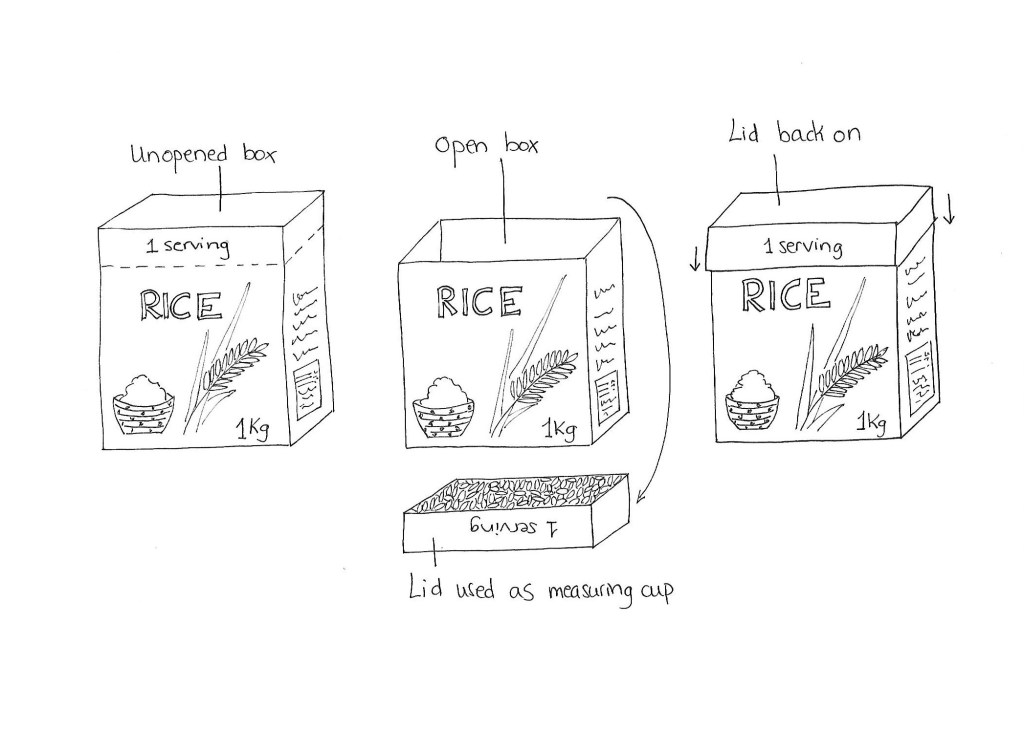
Rice packaging
You have to design packaging for rice. The packaging has to be different from what is out there in the market. Apply each one of the SCAMPER techniques and do a write‑up on your findings. Then choose the option that you think would work best and do a sketch of what the packaging would look like.
S – Substitute The most obvious substitution would be to find a new material for the packaging. For example, glass, metal, fabric or even leaves (which would make it biodegradable and more eco-friendly).
C – Combine It would be easy to combine the rice with salt, spices and dried herbs to make the preparation easier as it eliminates the need to add them afterward.
A – Adapt I usually cook too much or too little rice as I find it difficult to calculate the portions. One way to avoid this problem is to adapt the packaging to include a measuring cup. The top part of the cardboard box would detach from the rest of the box and could be used as a measuring tool. It would also work as a lid while storing the leftover uncooked rice.
M – Modify The package could be modified so it includes a dispenser that would release one serving of uncooked rice every time you push it. This would be useful in the same way as the option above.
P – Put to other uses The box could be made in such a way that it could be reused once the rice is finished. One application could be to store different products around the house or even to use as blocks for kids to play with.
E – Eliminate What if we eliminate the packaging altogether? We would be left with only rice, and the customers would need to buy it in bulk and bring their own container from home.
R – Reverse or rearrange it Usually, the rice packages are opened near the top. We could rearrange it and have the box open at the bottom part. If we combine this solution with the dispenser explained in the Modify section, we have a better solution.
Some of the ideas presented in this exercise already exist on the market. Adding a rice dispenser to the packaging would probably result in a price increase. The option of using part of the packaging as a measuring tool gives you the same results; however, it would be cheaper. For that reason is the design I picked. Here is the sketch.