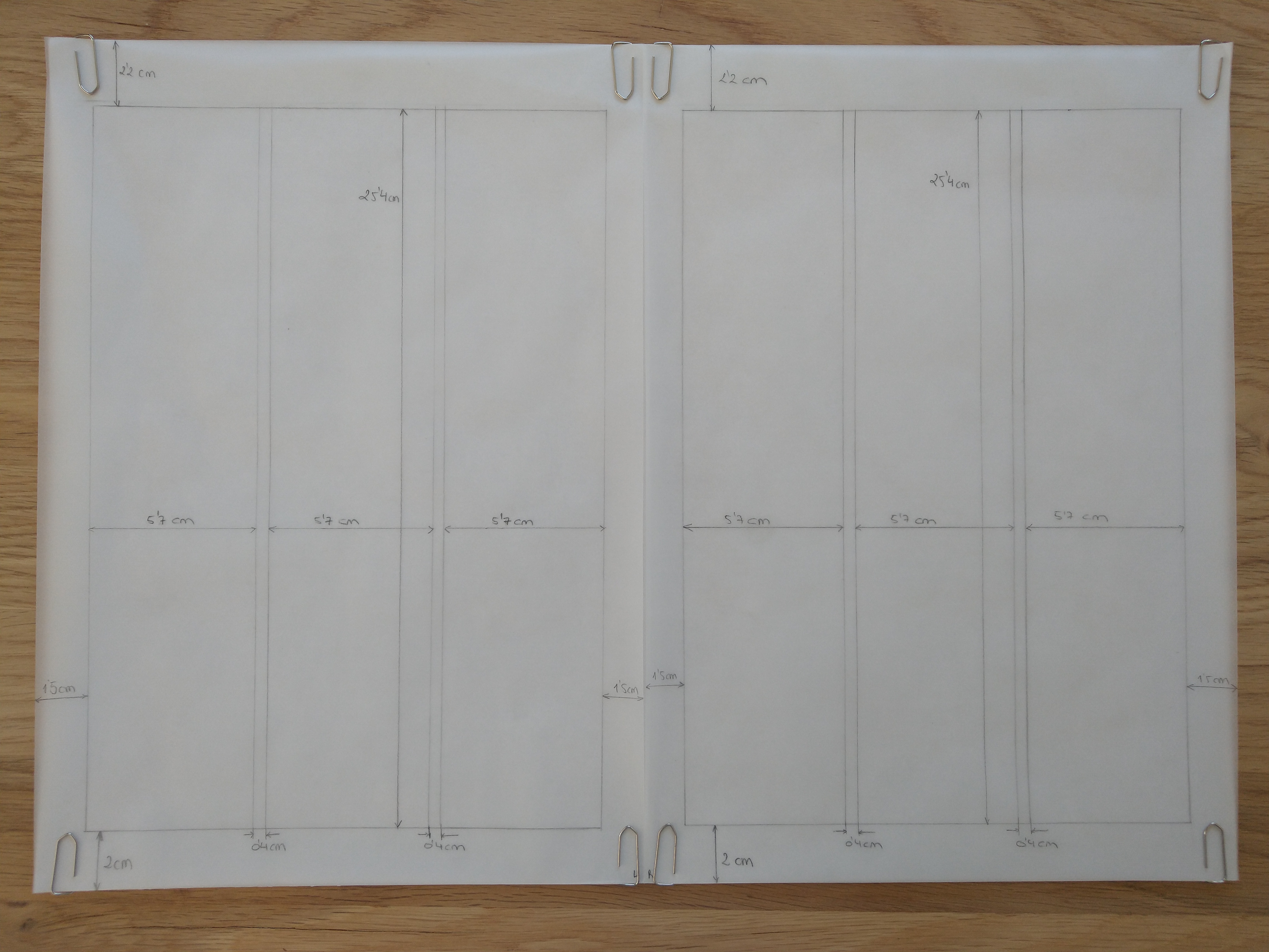
Take a magazine, newspaper or book that includes images and text. Lay tracing paper over the top of three spreads (both left-hand and right-hand pages). Using a pencil and ruler, carefully trace the grid underlying the page layouts. Remember to remove specific text elements or images, and to only draw the grid lines. Note column widths and margin sizes at the top, bottom, and to the left and right of the main body of text. Is your document based on a two-column, three-column, or another type of grid? Which elements stay the same on each page, and which change?
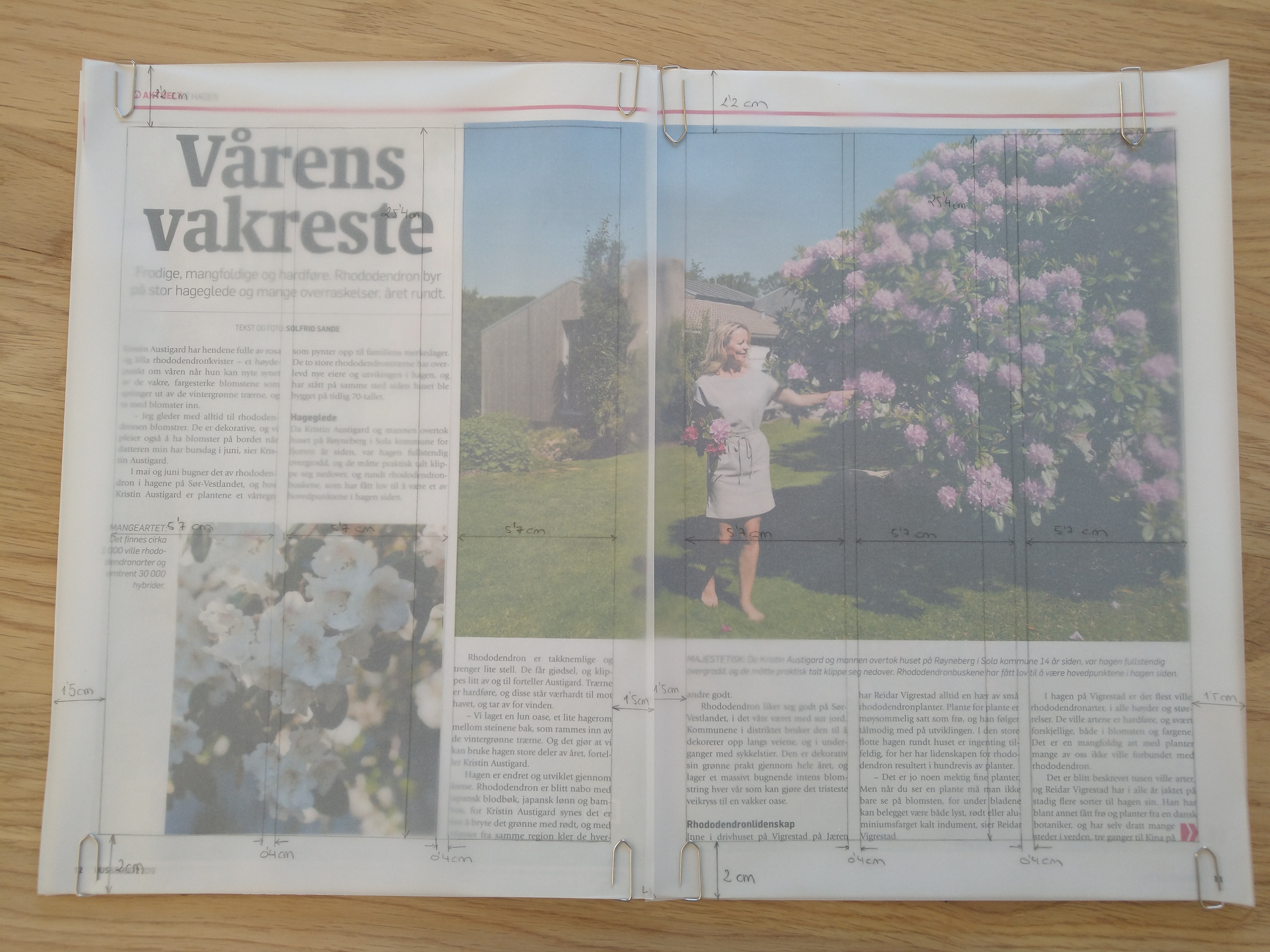
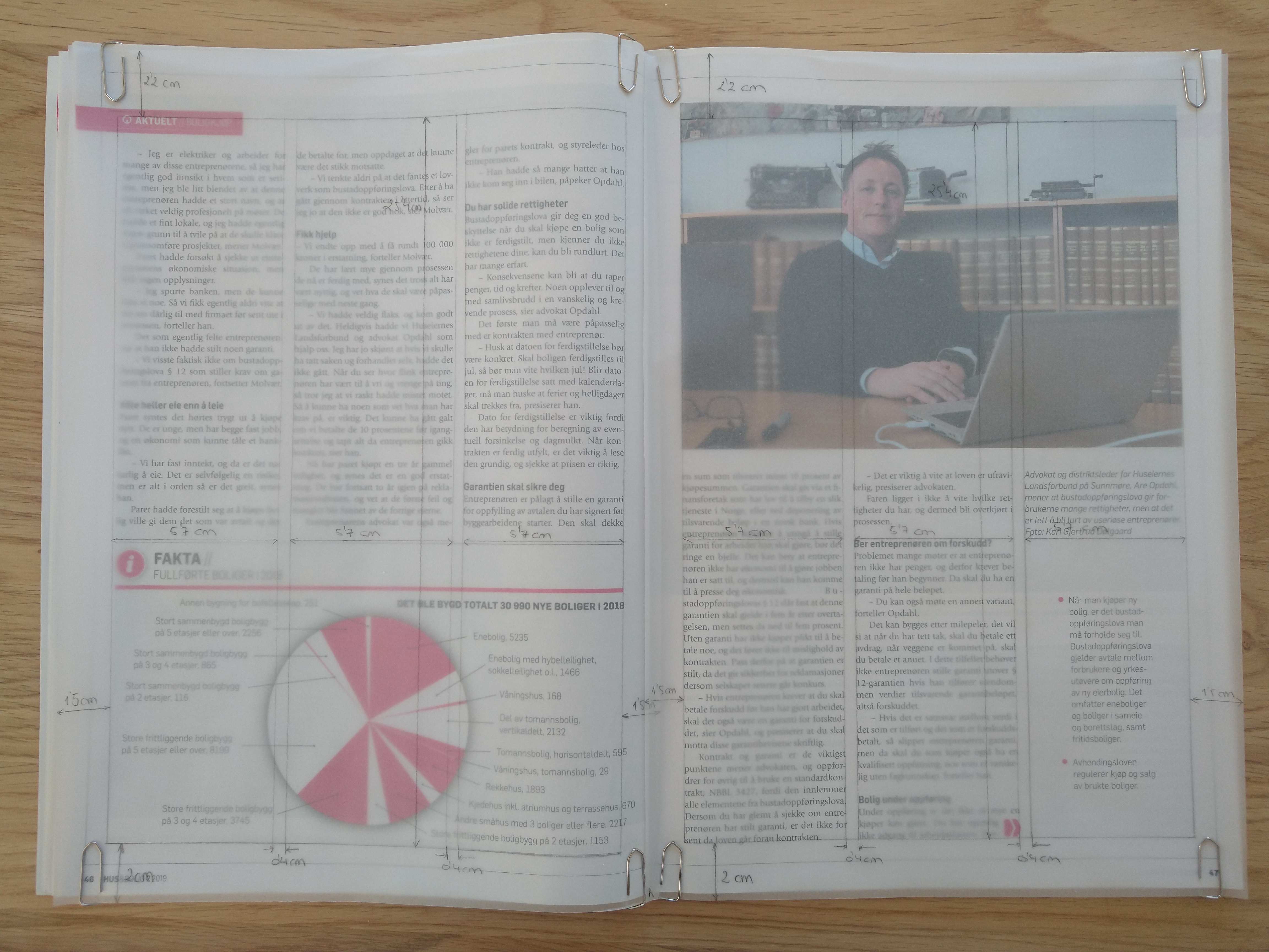
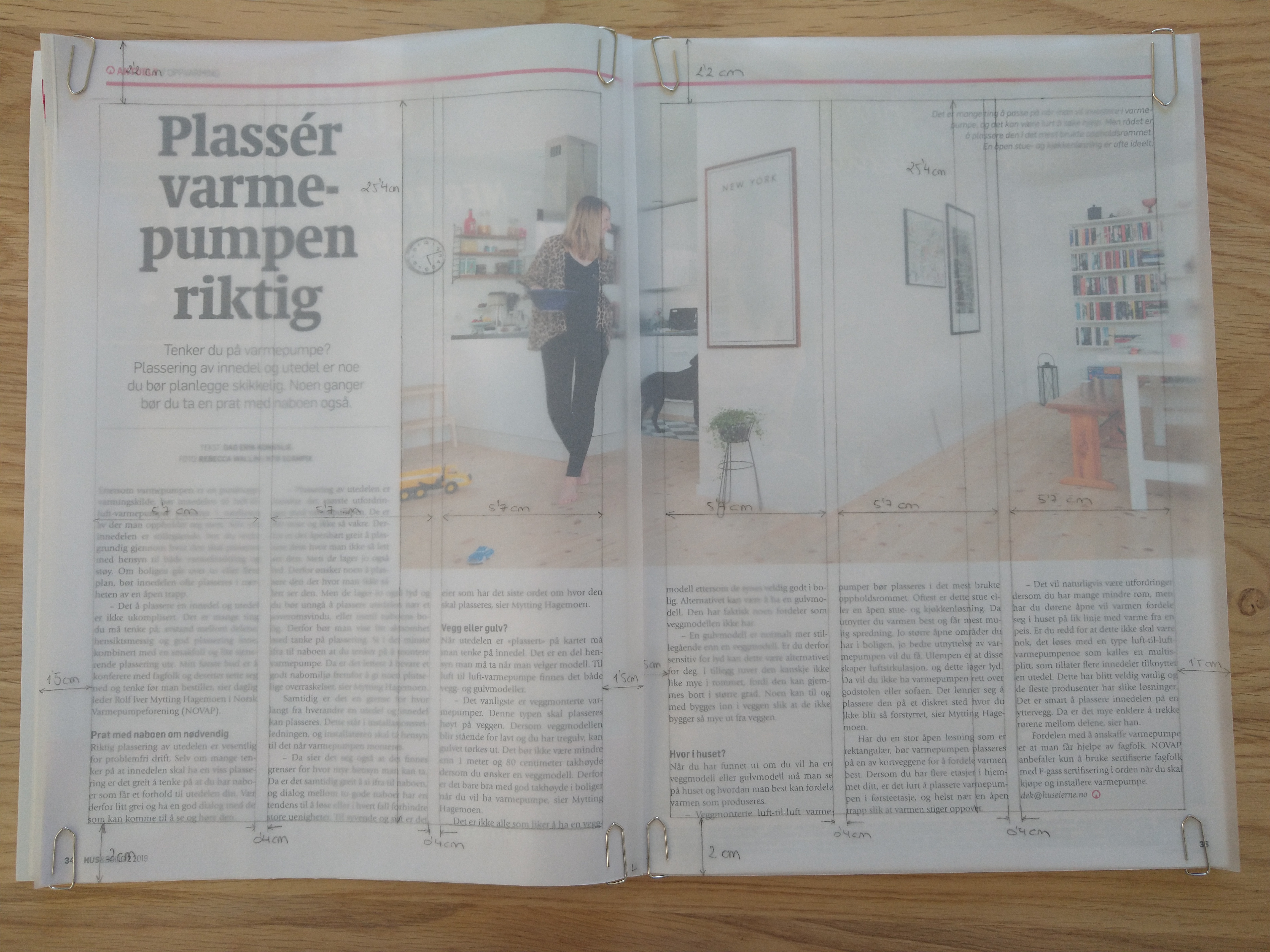
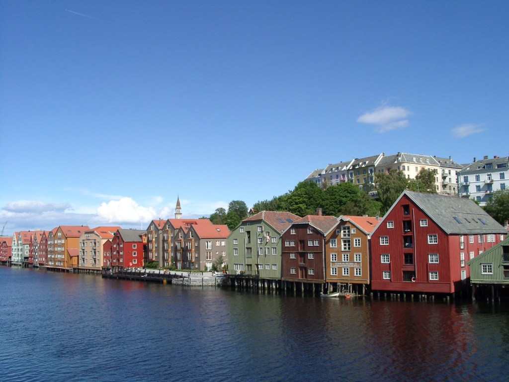
I decided to use the magazine Hus & Bolig. The three spreads I chose are based on a three-column grid, like most of the pages in the magazine. All the pages selected have a mid-range amount of text, which works well with this type of grid. All three spreads have large images/graphics; the first and the last one have an asymmetric distribution between picture and text, while the second one is symmetrically divided.
Column width: 5,7 cm Column hight: 25,4 cm Top margin: 2,2 cm Bottom margin: 2 cm Left margin: 1,5 cm Right margin: 1,5 cm Gutter: 0,4 cm
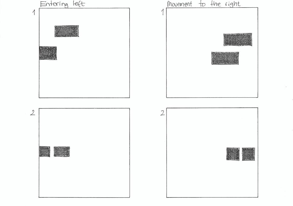
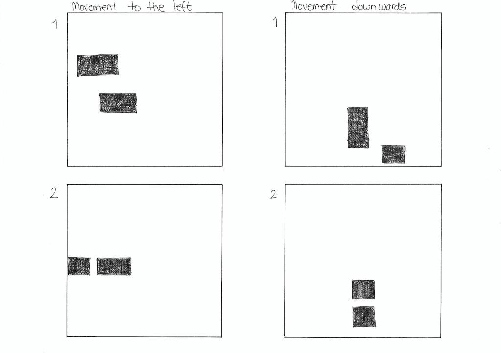
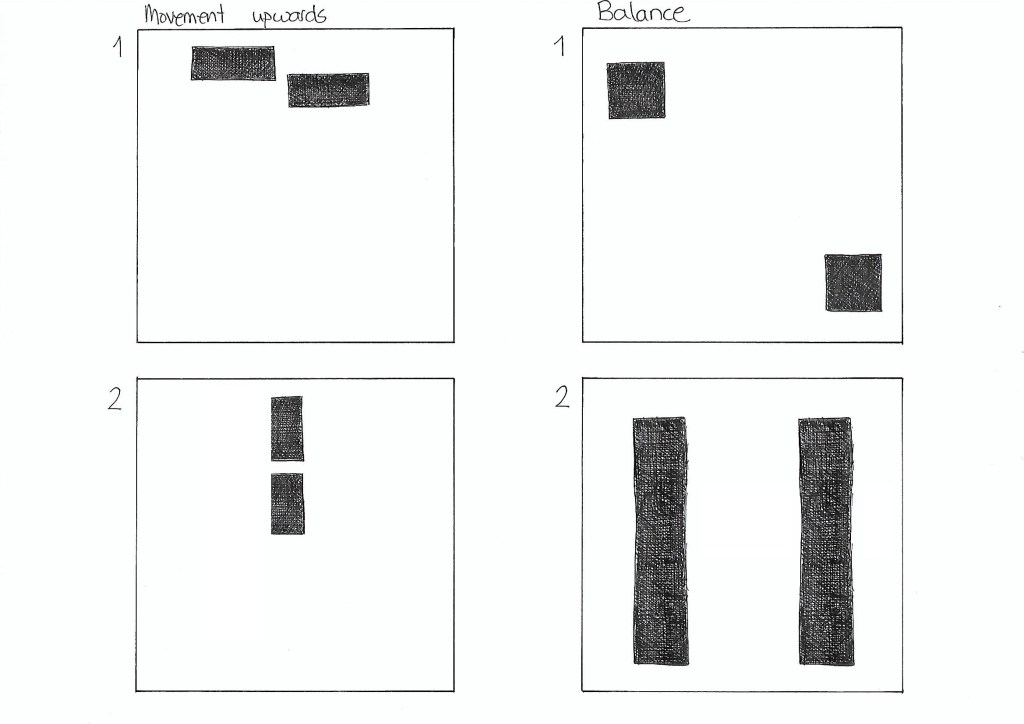
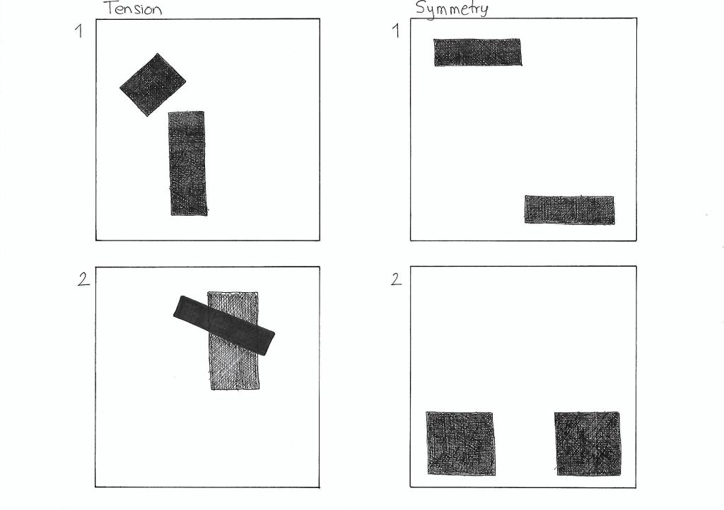
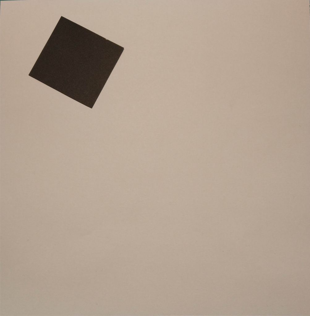
On five A4 landscape pages, I had to draw four equal squares in each. Then, I draw one or two squares or rectangles in each of the empty squares to achieve the following visual effects:
Entering left
Movement to the right
Movement to the left
Movement downwards
Movement upwards
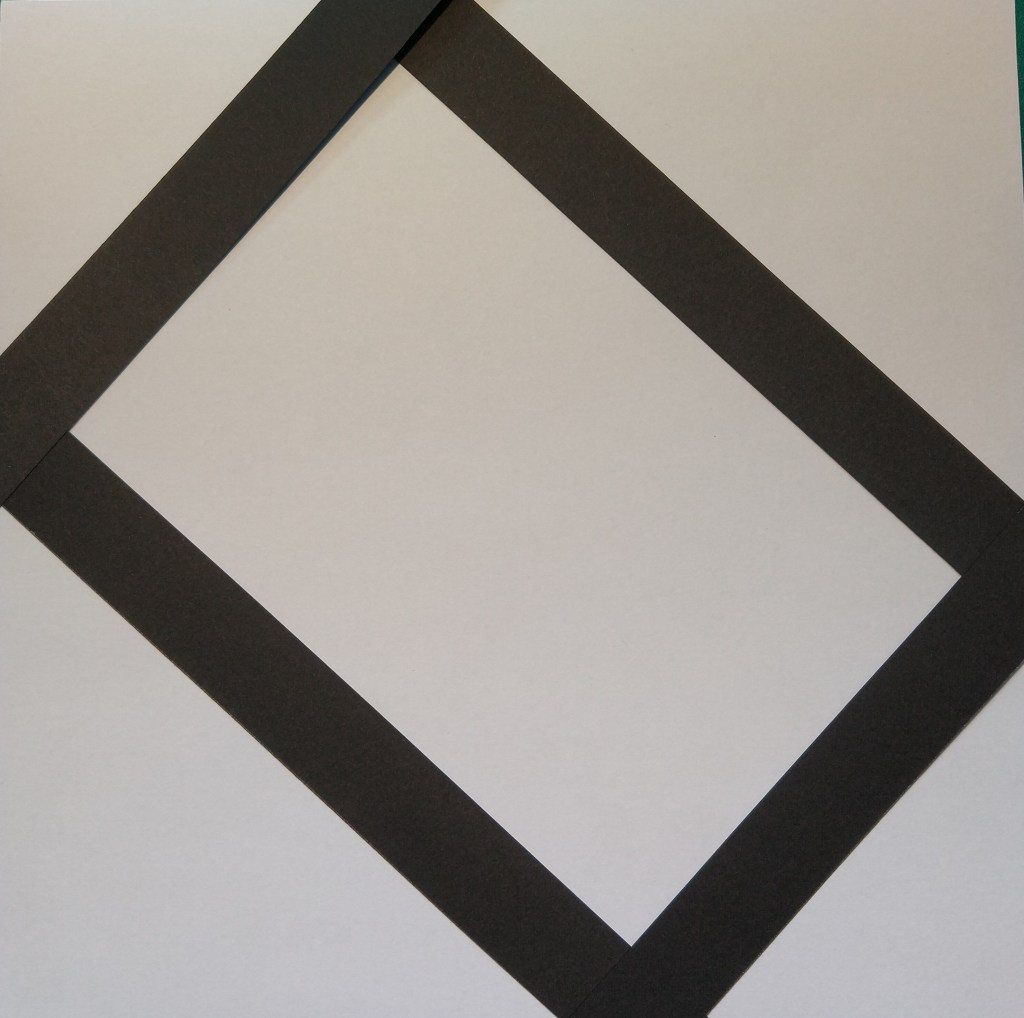
Balance
Tension
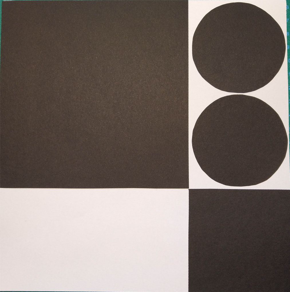
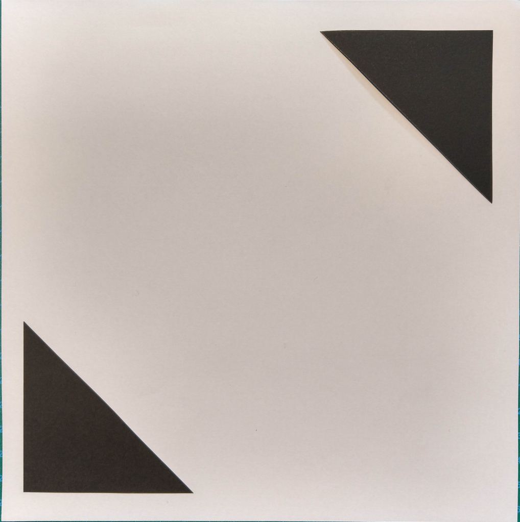
Symmetry/asymmetry
Entering left The rectangles placed close to the left end of the square gives the impression that they are entering the page on the left side. The fact that the rectangle closest to the edge is only partially shown helps enforce that effect.
Movement to the right Placing both pieces on the right side of the square gives the impression that they are moving to the right. It doesn’t affect if I use squares or rectangles.
Movement to the left In the same way, placing the squares or rectangles on the left side of the page suggests movement to the left.
Movement downwards In order to show the effect of movement downwards, I decided to place the squares and/or rectangles close to the bottom of the big square.
Movement upwards Placing two rectangles on the top of the square gives the illusion that they are moving upwards. It works if the blocks are in line or in parallel paths.
Balance Two squares with the same size placed in opposite corners of the page suggest balance. The same happens with two equally sized rectangles on each side of the square.
Tension In the first drawing, the small rectangle is place in such a manner that seems as it was about to fall, creating tension. In the second example, the contrast of shape, color and orientation, as well as the fact that one is place on top of the other also creates tension.
Symmetry Two equally large shapes mirrored to each other create symmetry.
Asymmetry The different sizes and shapes in the first example create asymmetry. In the second drawing, even though the squares are the same size, they are not mirrored to each other, which makes them asymmetric.
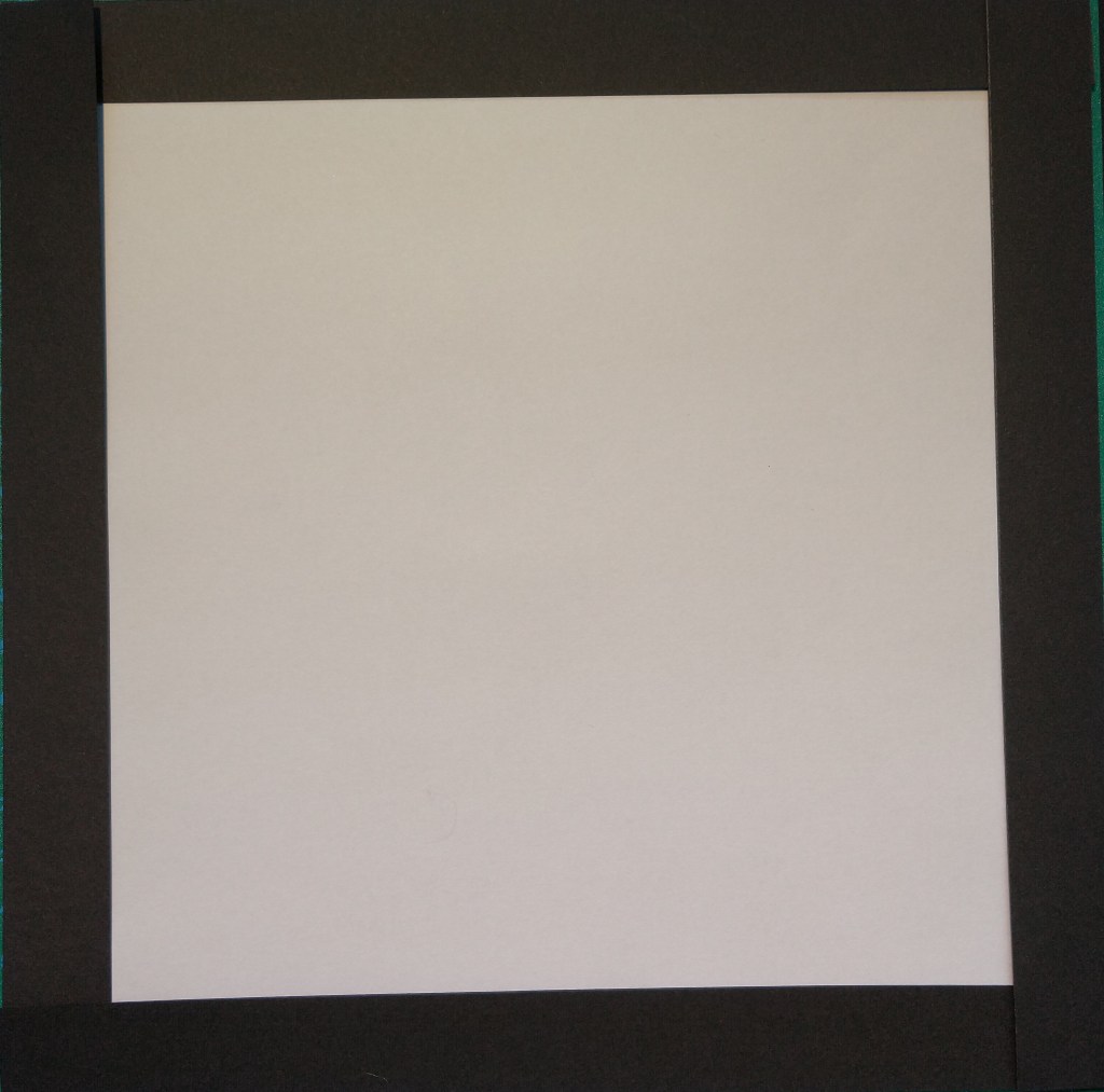
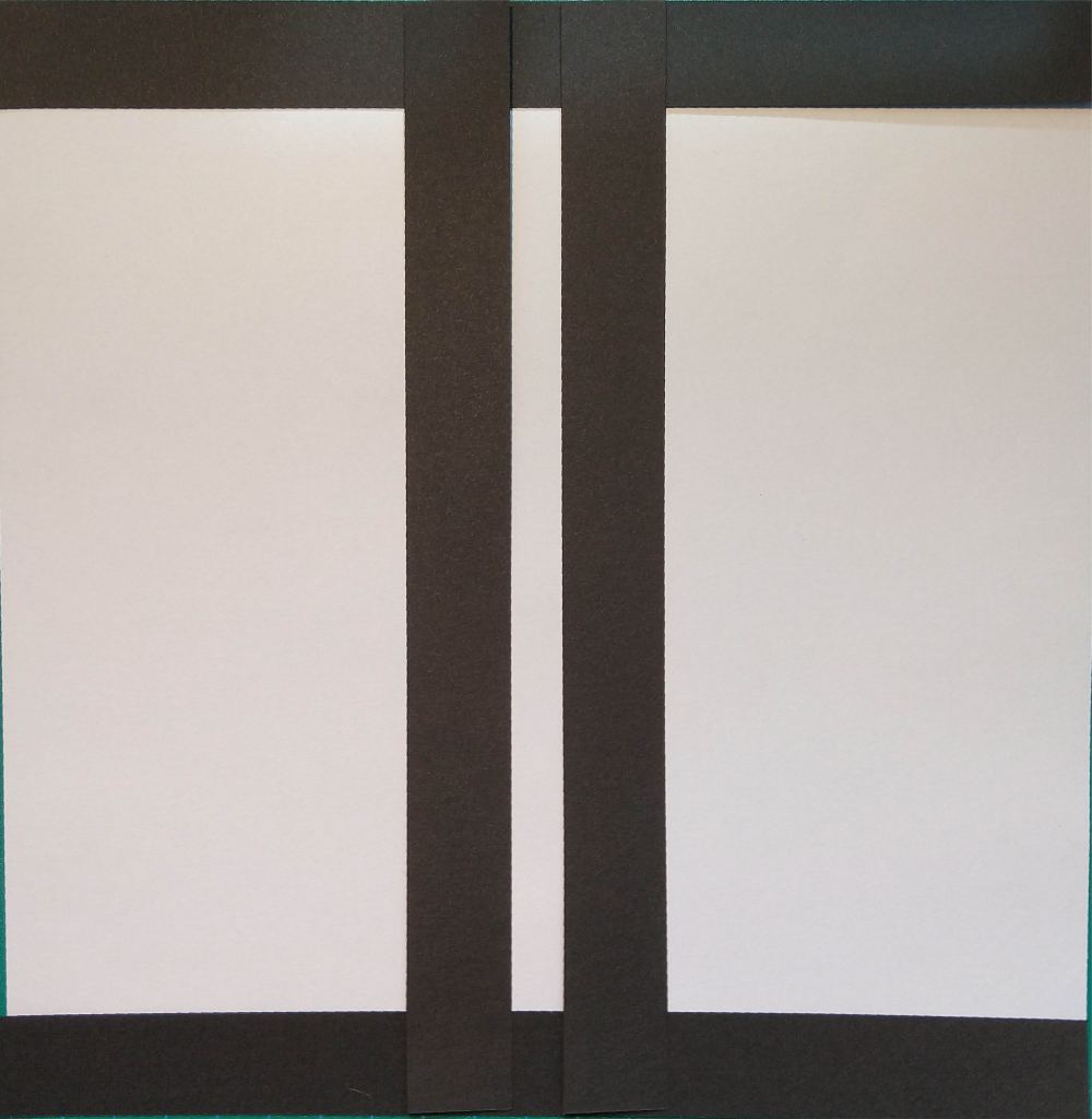
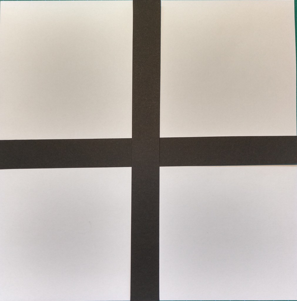
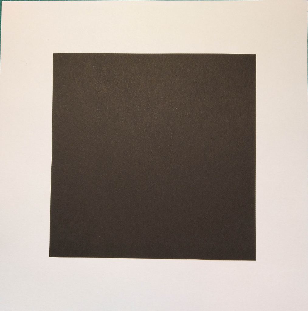
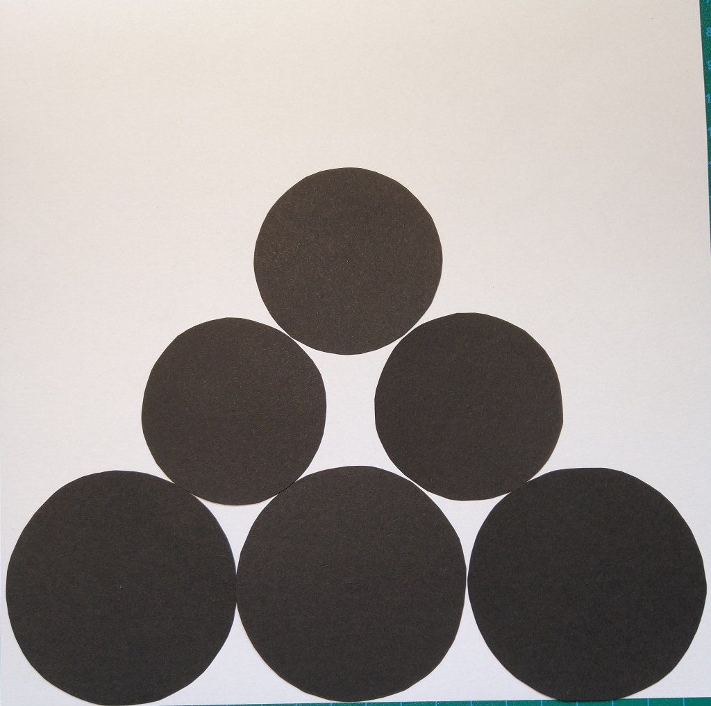
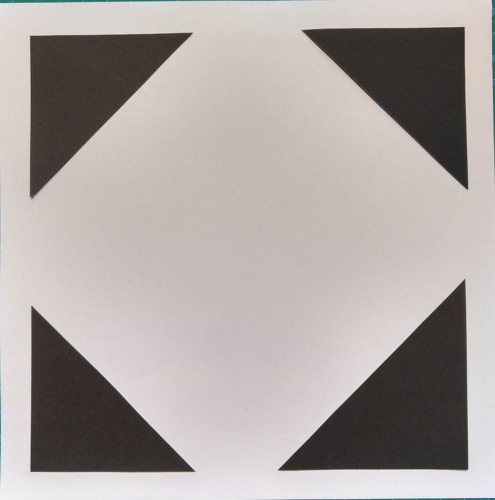
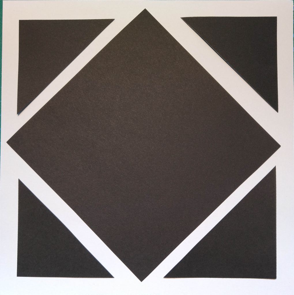
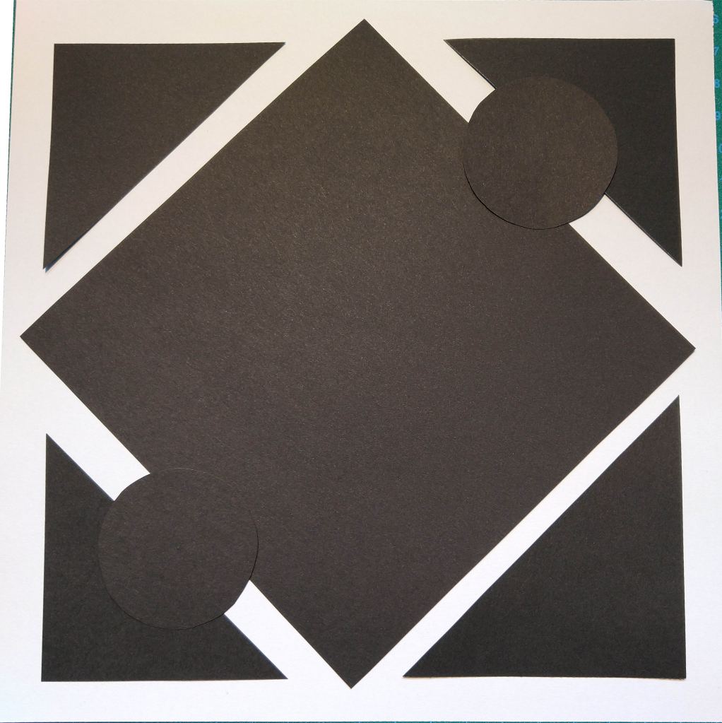
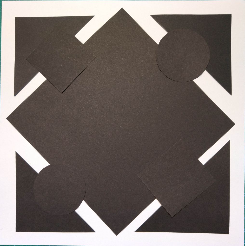
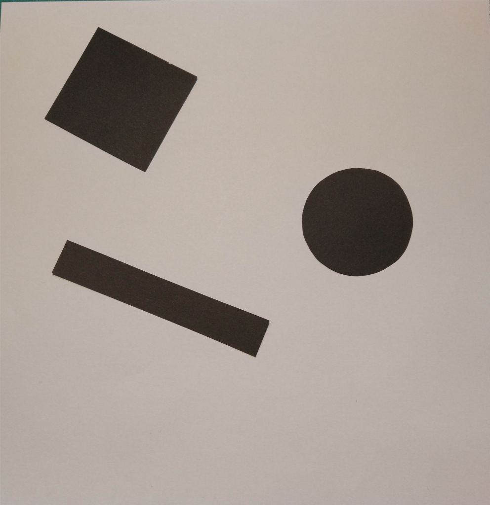
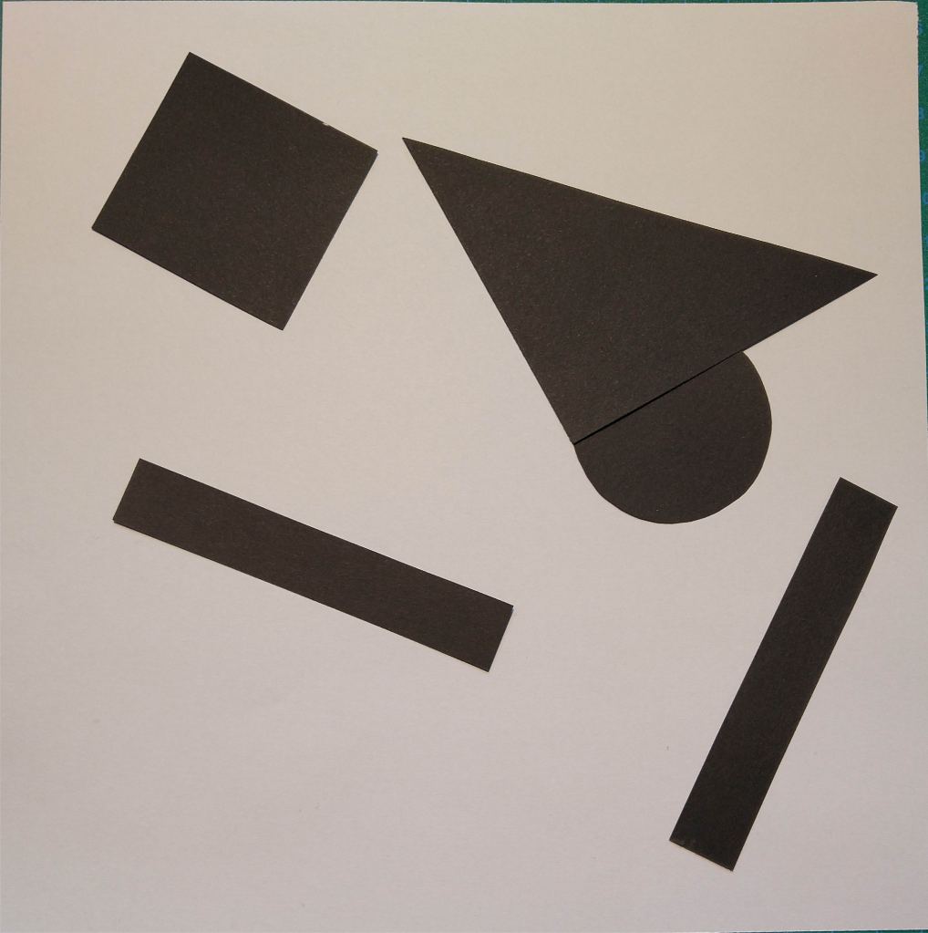
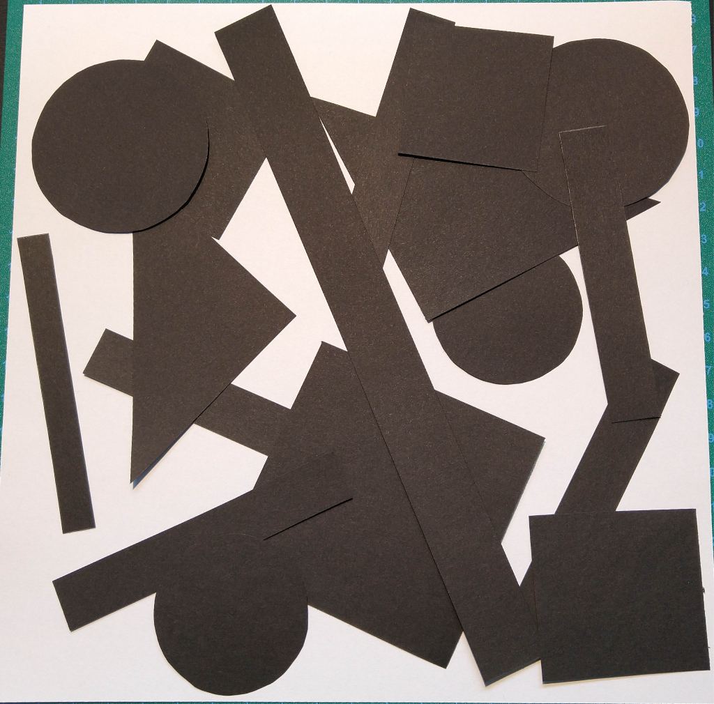
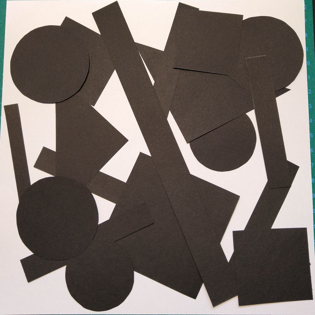
For this Learning Activity, I had to cut several shapes from black paper in a variety of sizes and place them into a square piece of white paper, one at a time, and move them around to try and find the point where the distinction between figure and ground becomes unclear.
As shown in the pictures above, it doesn’t matter whether the dominant space is black or white. In all of them, it’s easy to differentiate between figure and ground.
The placement of the shape within the space doesn’t seem to have an important role when it comes to separate the figure from the ground.
Order
Random
In the first of these two series, I decided to place the black shapes in an ordered manner. This way, I think the eye can always see what the figure is and what the ground. In the second one, however, I randomly placed the paper cuts. The look of the composition is disorganized and strange. At some point, around picture number six, the piece is too cluttered to distinguish a figure.
In conclusion, I don’t think the distinction between figure and ground is highly affected by the position of the shape, or if the white or black is the dominant part of the space. The most important is the way we place the different elements on the composition and their position respect to each other. We must include enough negative spaces between the positives for the eye to be able to differentiate the shapes and interpret the whole piece.
A – Infrared Receiver B – Shutter Release C – Exposure Compensation/Aperture Adjustment D – Info Button E – Movie Record Button F – AF-Assist Illuminator G – Live View Switch H – Mode Dial I – Flash Mode Button J – Function Button K – Lens Release Button
L – Infrared Receiver M – Menu N – Information Edit O – AutoExposure/AutoFocus Lock Button P – Command Dial Q – Playback Button R – Multi-Selector S – OK Button T – Playback Zoom In U – Delete Button V – Thumbnail/Playback Zoom Out
How to set the correct ISO
To adjust the ISO on my camera, I press the Information edit button, with the Multi-Selector I navigate to the ISO sensitivity settings and press OK. Once I have chosen the desired value, I press OK again to select it.
It is also possible to change the ISO on the fly by pressing and holding the Function button while turning the Command dial. The ISO value change will show on the viewfinder display.
The higher the ISO, the greater the amount of noise in the image. For that reason, it is advisable to use the lowest ISO possible in each situation.
How to change the aperture
When the camera is set to “Aperture Priority Mode”, I can change the aperture by turning the Command dial. If the camera is on “Manual Mode”, I need to press and hold the Aperture adjustment button while turning said dial.
How to change the shutter speed
Both in “Shutter Priority Mode” and “Manual Mode”, I can change the shutter speed on my camera by rotating the Command dial.
Photos
Part of the Learning activity was to take several photos a day applying manual settings and experimenting with different lighting, subjects or landscapes. These are the six pictures I chose from all the ones I took during the week.
ISO 200 Aperture 4.5 Shutter speed 1/1250
ISO 200 Aperture 4.5 Shutter speed 1/2000
ISO 100 Aperture 4.8 Shutter speed 1/125
ISO 200 Aperture 5.6 Shutter speed 1/80
ISO 800 Aperture 5.3 Shutter speed 1/2.5
ISO 400 Aperture 5.6 Shutter speed 1/1600
I learned a lot with this assignment, and I also realised how much more I still need to practice and experiment with the different setting of my camera to become a better photographer and take advantage of all the possibilities a DSLR offers.
Pick three events in the timeline from this week’s lesson History of Photography: An Introduction, and find photographs of the event on the Internet or in the library and write a paragraph explaining the event in more detail. Include your photographs in the description.
The oldest surviving camera photograph
View from the Window at Le Gras is a heliographic image and the oldest surviving camera photograph. It was created by French inventor Nicéphore Niépce in 1826 or 1827 at Saint-Loup-de-Varennes, France, and shows parts of the buildings and surrounding countryside of his estate, Le Gras, as seen from a high window. Niépce captured the scene with a camera obscura focused onto a pewter plate thinly coated with Bitumen of Judea, a naturally occurring asphalt. The bitumen hardened in the brightly lit areas, but in the dimly lit areas it remained soluble and could be washed away with a mixture of oil of lavender and white petroleum. A very long exposure in the camera was required, traditionally said to be eight hours, but now believed to be several days.
View from the Window at Le Gras, 1826–1827 (manually enhanced version)
Close up of the original plate
Introduction of Daguerreotype
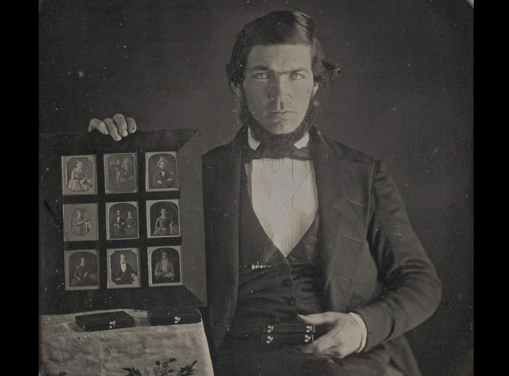
In 1839, Louis Jacques Mandé Daguerre publicly introduces his daguerreotype process, which produces highly detailed permanent photographs on silver-plated sheets of copper. At first, it requires several minutes of exposure in the camera, but later improvements reduce the exposure time to a few seconds. The daguerreotype was the first commercially successful photographic process in the history of photography. A great number of daguerreotypes, especially portraits, were made in the mid-19th century; the technique was supplanted by the wet collodion process.
Still life with plaster casts, made by Daguerre in 1837, the earliest reliably dated daguerreotype.
Daguerreotype camera built by La Maison Susse Frères in 1839
A formally dressed man displays nine different daguerreotypes in a display frame, one of the first known photographic advertisements, made in 1845
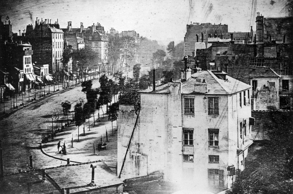
Boulevard du Temple, Paris, a street scene captured in a Daguerreotype in 1838 or 1839. Believed to be the earliest photograph showing a living person.
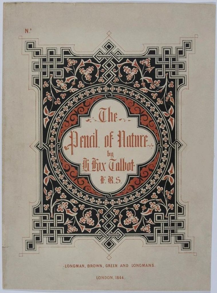
First photographically illustrated book to be commercially published
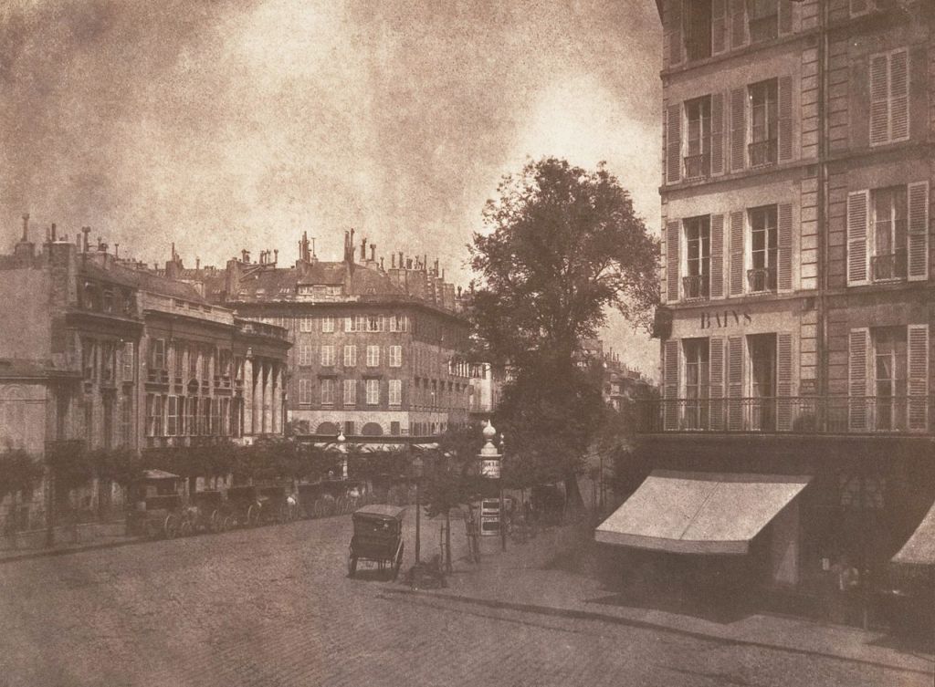
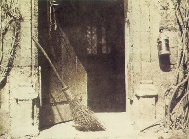
The Pencil of Nature (1844–46), written by William Henry Fox, was the first book with photographic illustrations. The book detailed Talbot’s development of the calotype process and included 24 calotype prints, each one pasted in by hand, illustrating some of the possible applications of the new technology. They include a variety of architectural studies, scenes, still-lifes, and closeups, as well as facsimiles of prints, sketches, and text. Due to the long exposure times involved, however, Talbot included only one portrait, The Ladder. Though he was no artist, Talbot also attempted to illustrate how photography could become a new form of art with images like The Open Door.
Cover of The Pencil of Nature, 1844
View of the Boulevards at Paris
The Open Door
The Ladder
Question 2
Throughout this lesson you’ve learnt about the various techniques used and inventors that contributed to the art form that is Photography. Choose only one, do some additional research and in your own words write a report on why you think the chosen technique contributed to what we are able to do today through photography.
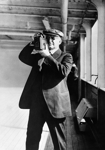
I grew up using a Kodak roll film camera. I remember the excitement of taking the roll to the shop to be developed and, a few days later, open the envelop and see all those pictures I took weeks (or months) prior. I was surprised to learn in this week’s lesson that this was already possible a century before, thanks to George Eastman’s invention of the roll film and the first Kodak camera.
George Eastman takes pictures with his Kodak camera
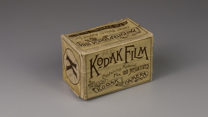
Before that, photography was only available for the few who could afford it. The cameras and gear at the time were large, heavy and cumbersome, and the wet place processes used back then required the photographer to do the development. This added to the time, expense, and skill level needed to make a photograph. It was 1888 when the American entrepreneur invented a game-changing dry and flexible photographic film that came in a roll. Besides, the film was designed for use in Eastman’s newly designed, user-friendly Kodak cameras. This innovative camera and film combination represents a turning point in photography, when the industry began shifting from expensive, time-consuming processes enjoyed by the few, to cheaper and easier snapshots that can be done by the many.
Kodak roll film
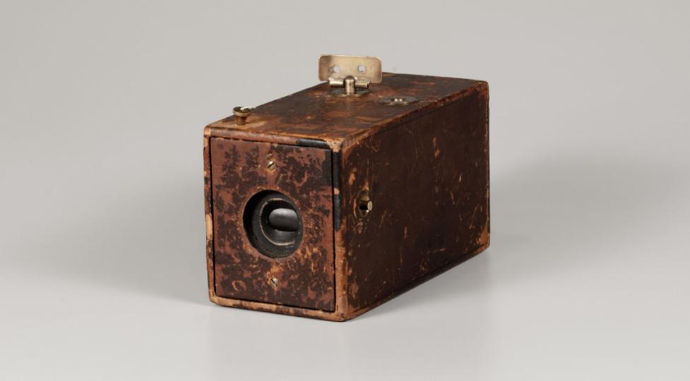
Kodak Camera, 1888
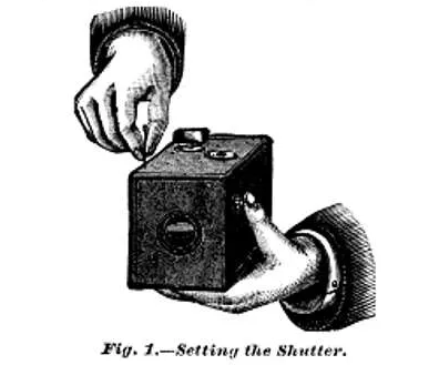
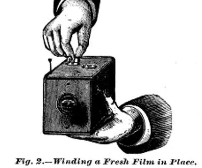
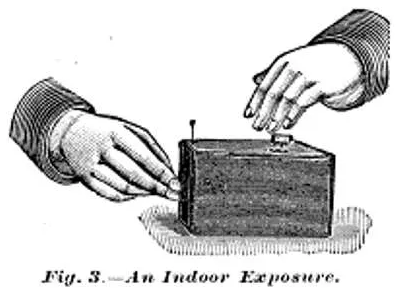
The Kodak camera was a box-style camera requiring no adjustments or prior photographic knowledge. To use the camera, the photographer simply armed the shutter by pulling up on the string (located on the front right of the camera), pointed the camera at the subject, and then pressed the shutter release. After taking a photograph, a key on top of the camera was used to wind the film onto the next frame. There is no viewfinder on the camera; instead, two V-shaped lines on the top of the camera leather are intended to aid aiming the camera at the subject. These steps were clearly explained in the camera’s instruction manual and were used to promote the ease of the camera along with the slogan, “You press the button, we do the rest”.
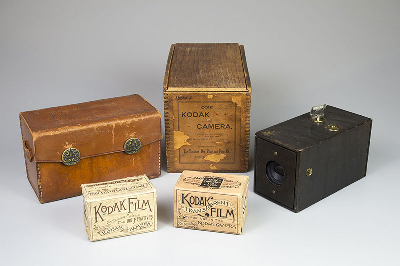
For $25 at the time (around $625 in today’s money), anyone could purchase the device, preloaded with enough film for 100 pictures. After finishing the roll, the camera could be sent to the Kodak factory for developing and printing at a cost of $10. The camera, loaded with a fresh roll of film, was returned with the negatives and mounted prints. Although the price was still high, the Kodak camera was accessible for far more people than before. Amateur photography grew significantly, which lead to an enormous demand for new rollable film.
Two rolls of film with a 1888 Kodak Camera, leather case and wooden box
It is difficult to imagine how photography would be today without the invention of the roll film or the Kodak camera at the end of the 19th century. Even though digital photography is the most popular choice nowadays, it is obvious the essential role film photography played in the development of modern photography. Besides that, and thanks to portable cameras such as the one created by George Eastman, we were able to document important events in history in a much easier and cheaper way than ever before.
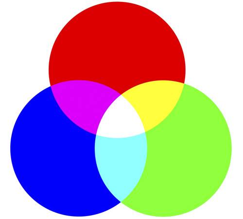
RGB stands for red, green and blue. It’s the colour system used by monitors, digital cameras and scanners. In these devices, the colour is created by the effect of light moving directly into the eye, i.e, the more light is added, the lighter the result gets. The brightness of an RGB image is messured from 0-255.
CMYK stands for cyan, magenta, yellow and key (black). It’s the colour system used by printers. In a printer, the colour is created by mixing ink; the more colour (ink) is added, the darker the result gets. The brightness of an CMYK images is messured in ink percentage on a scale from 0-100.
COLOUR SCHEMES
I created four colour schemes making use of the tool Adobe Color. Here are my results.
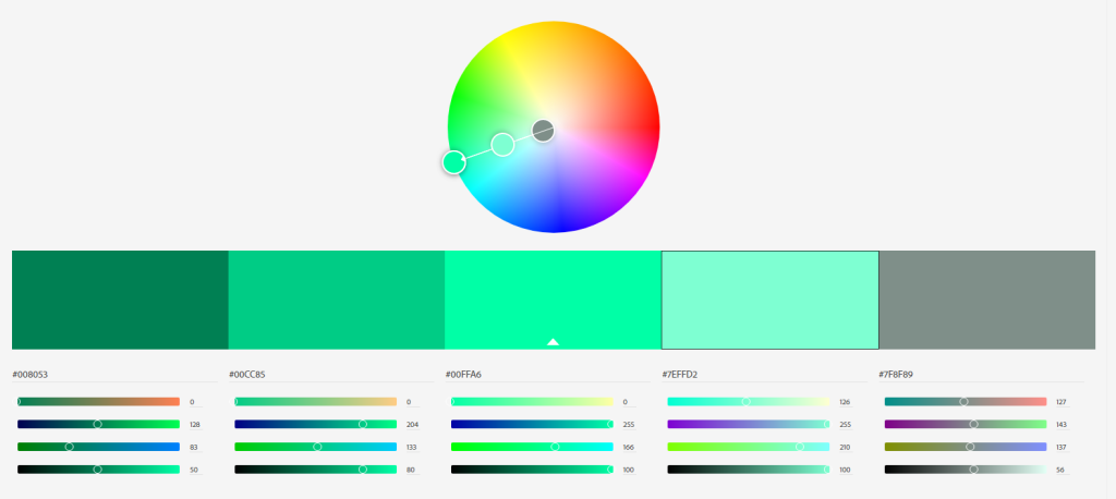
Monochromatic
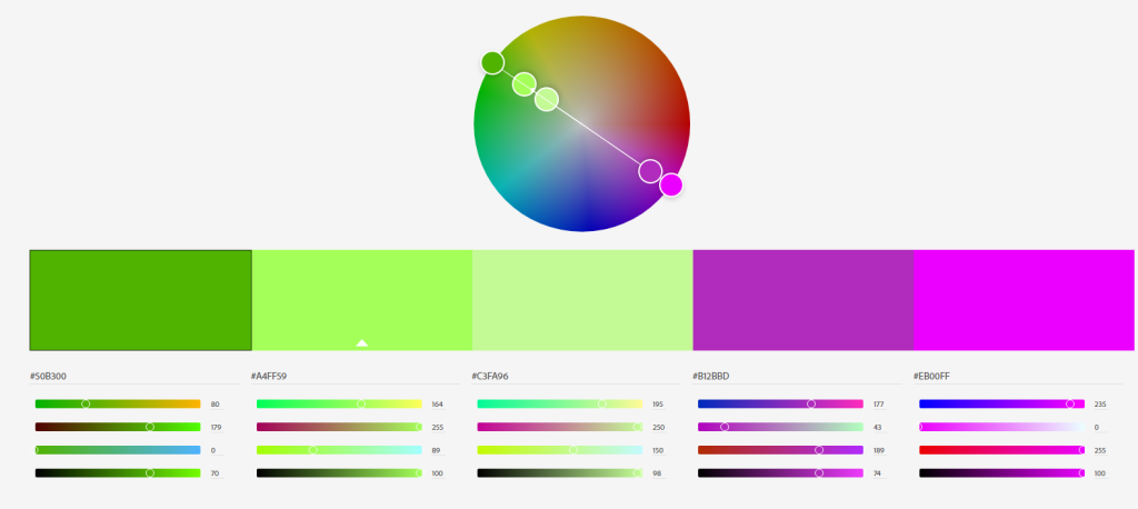
Complementary
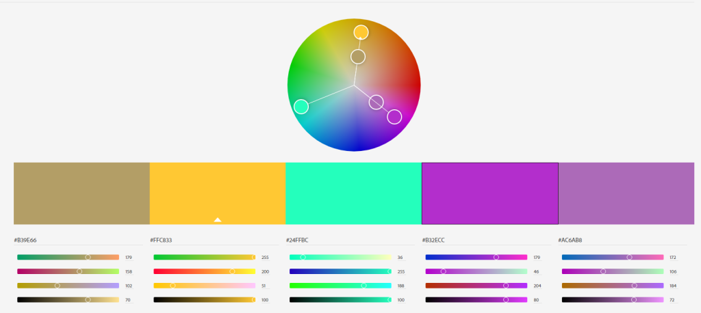
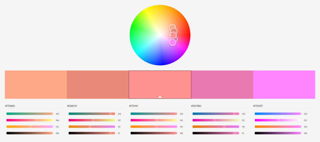
TriadicAnalogous
PHOTO COLOUR EFFECTS
For this part I had to use a colour photo and create different colour effects using Photoshop.
Original
Fluorescent duotone
Monochrome look
Split toning
Sepia (colour effect of my choice)
BOOK COVER
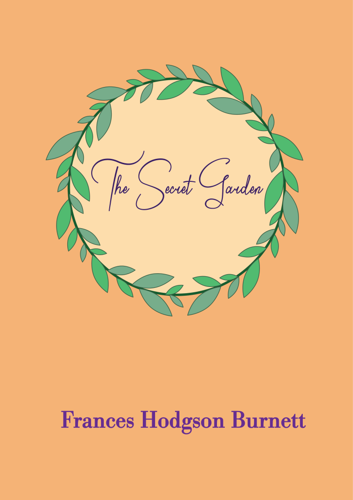
For this last part of the assignment I had to design a book cover for one of the following titles: – “Rosemary’s Baby” by Ira Levin – “Animal Farm” by George Orwell – “The Secret Garden” by Frances Hodgson Burnett
I must make use of colour to express the desired meaning, and the cover should show the title and the author’s name.
My choice was “The Secret Garden” and I used secondary colours to express naivety, honesty and harmony.
Here I show the last version of the Food & Malt logo for the Mandatory Assignment 02. I decided to go for a black and white style since I think it makes for a bolder, more hipster design, which describes better the company’s character.
I have also included the brand style guide I made as part of the report, where logo variations are displayed, as well as the colors and fonts used. It was the first time I ever made one guide like that, and I find it very useful to express the whole idea behind a design.
Overall, this has been an exciting and fun process, and I have learned a lot. I look forward to seeing the next challenges this program brings!
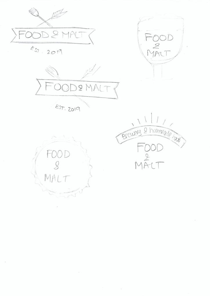
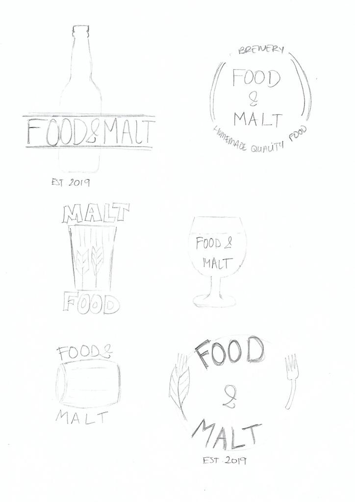
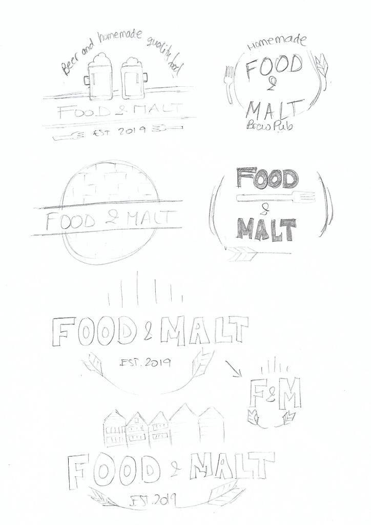
As we learned in week 3, sketching is the starting point of the idea development process. It’s crucial to put your ideas on paper before trying to use a computer drawing program. For me it’s been easier to draw than I thought it would be, I enjoy the process, and I come up with more ideas while sketching them because I can “see” them, not only on my mind. It is a good practice to sketch often to get better at it, so the process becomes more natural with time.
For the Mandatory Assignment 2, the brief was to design a logo for a company named “Food & Malt”. They will serve homemade good quality food with a great selection of beers to complement each meal. The target audience is young urban individuals, 18 to 35-year-old, interested in culture, food, design, trends and the night scene.
After doing some research and a brainstorming session where I wrote down all the ideas I could think of, I started to draw the ones that I thought made more sense for the briefing.
In this Learning Activity, I had to create three A4 compositions showcasing three chosen words. The requirement was to use only one typeface per composition and only black and white. I experimented with the size, letter spacing, spacing, placement, etc.
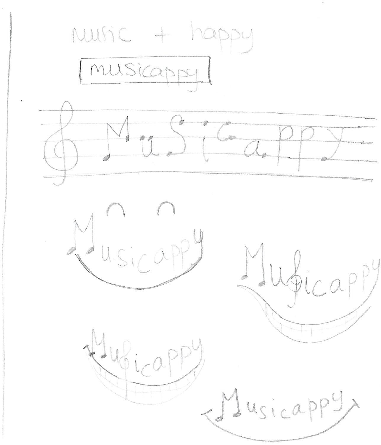
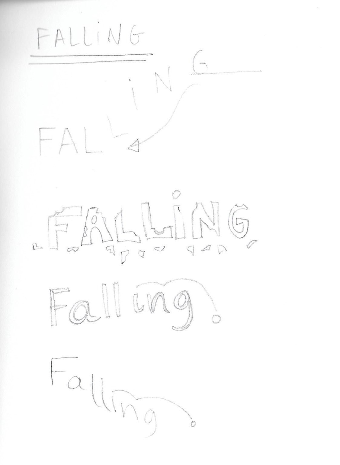
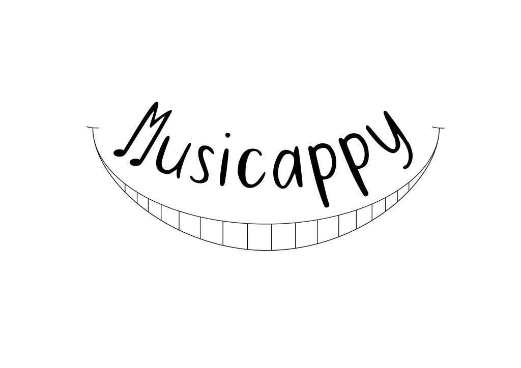
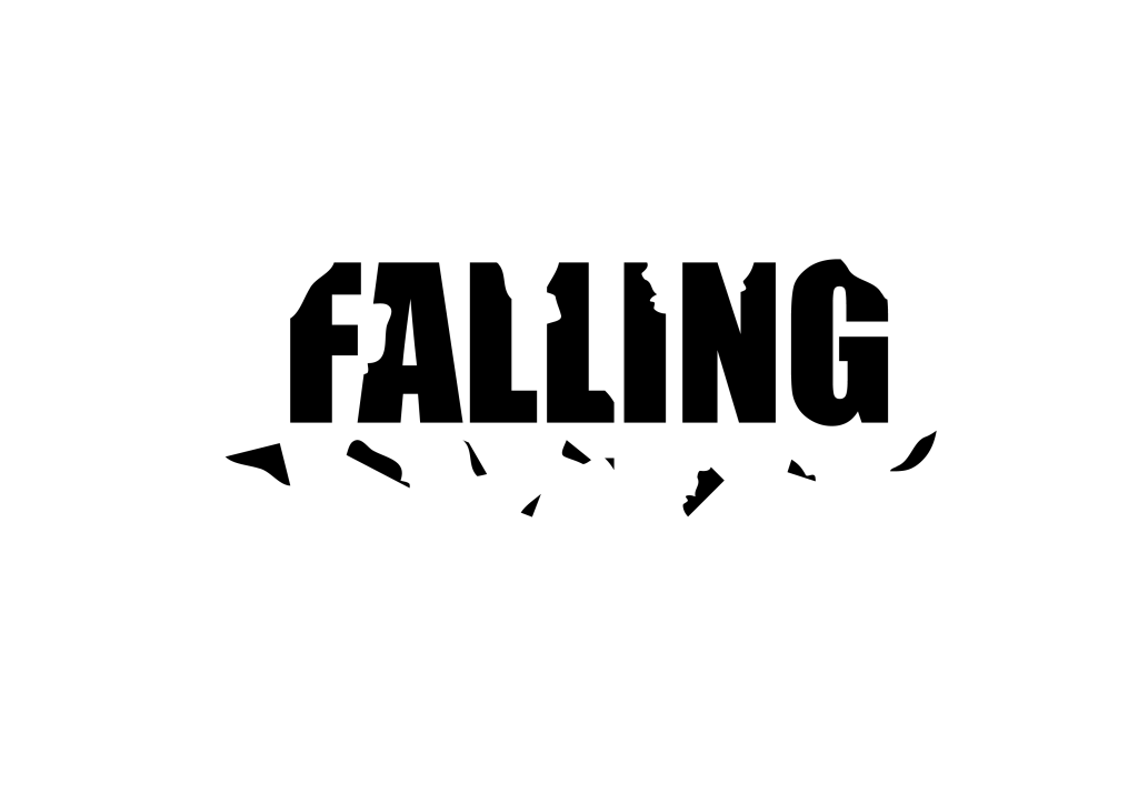
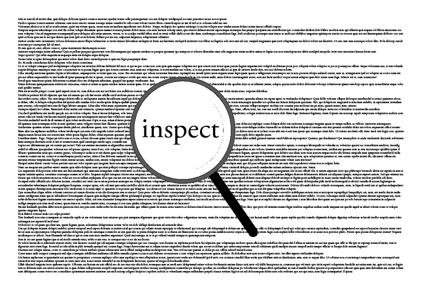
The first word is one I created and has no dictionary definition but has a meaning for me. The term is musicappy: feeling of happiness when one listens to music. The other two words I picked from a given list and are falling and inspect.
I first sketched several ideas for each of these words:
When I was happy with these ideas, I created the following compositions using a combination of InDesign and Illustrator.
For musicappy I chose the sans-serif facetype Peaches For Breakfast that I downloaded from 1001fonts.com. I think the letters are thin enough and have a casual and “happy” feeling, which goes well with the meaning of the word. The text is curved and sits over the drawing of a smile. Lastly, I added a couple of small black ellipses at the end of the letter M, as if they were notes.
With falling I went for a bold type and chose Impact Regular. I used only uppercase letters to make the word very solid and thick. Then I cut pieces of the letters and placed them under the word as if they were falling out.
The font used for inspect is Adobe Garamond Pro Regular, both on the background text and the magnifying glass. The idea was to use an old-style serif face like it would be used in a book.