
Week 28
Develop a name for a dog food product. Design a logo for this product, using full colour. The logo must contain a main visual and typography. (Use the “People Saving Pets” logo as a guide – this does not mean your design should be the same, it is simply an example.) Follow each of the fundamental steps outlined above, in that sequence and take note of what needs to be handed in as you progress through these steps:
- Exploration – Use sketching techniques to draw thumbnails and hand in your thumbnails as scanned PDFs.
- Focus – Highlight three of the thumbnail ideas that you consider the best options and state why. Hand in an A4 with visuals of the three chosen thumbnails; include reasons for choosing each of these three options.
- Construction – Use sketching techniques and redraw ONE of your chosen concepts until you’ve reached a conclusion on a successful logo. Hand in your drawings as scanned PDFs.
- Testing – Experiment more with your favourite options from Step 3 and ask the opinion of a few people. Hand in examples of the logos shown to people and write their feedback or opinion on each.
- Refinement – Choose your final design and execute it in Adobe Illustrator, along with the name of the product. Hand in your final logo as an A4 PDF.
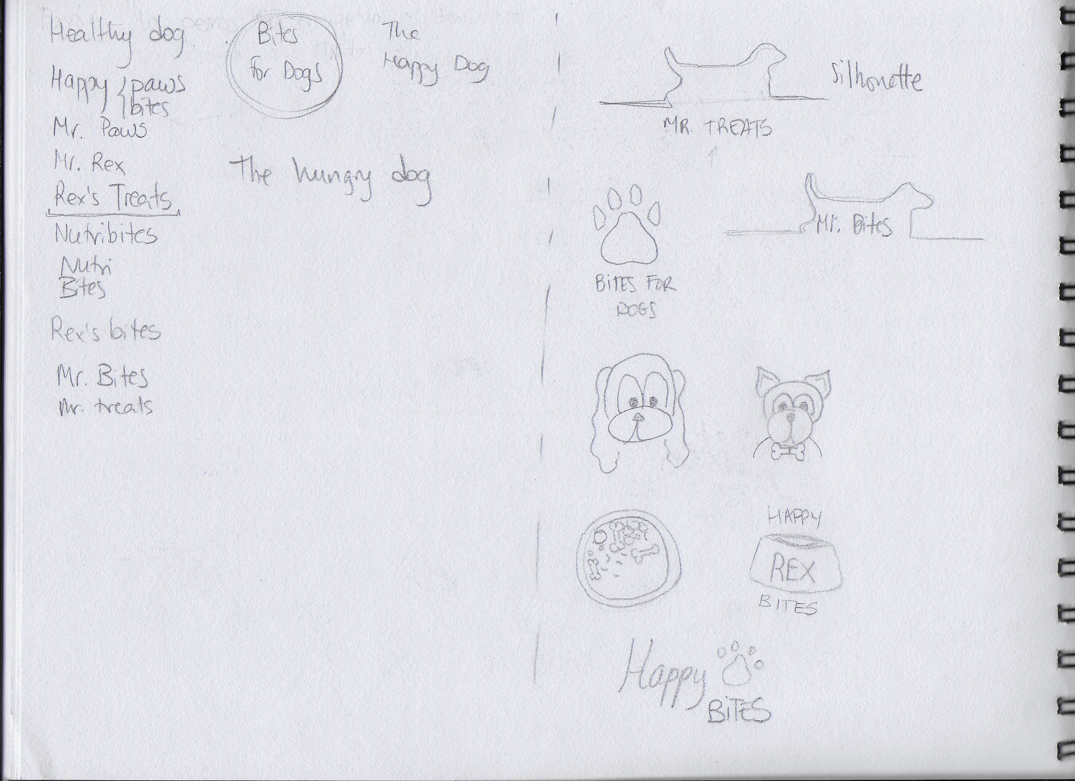
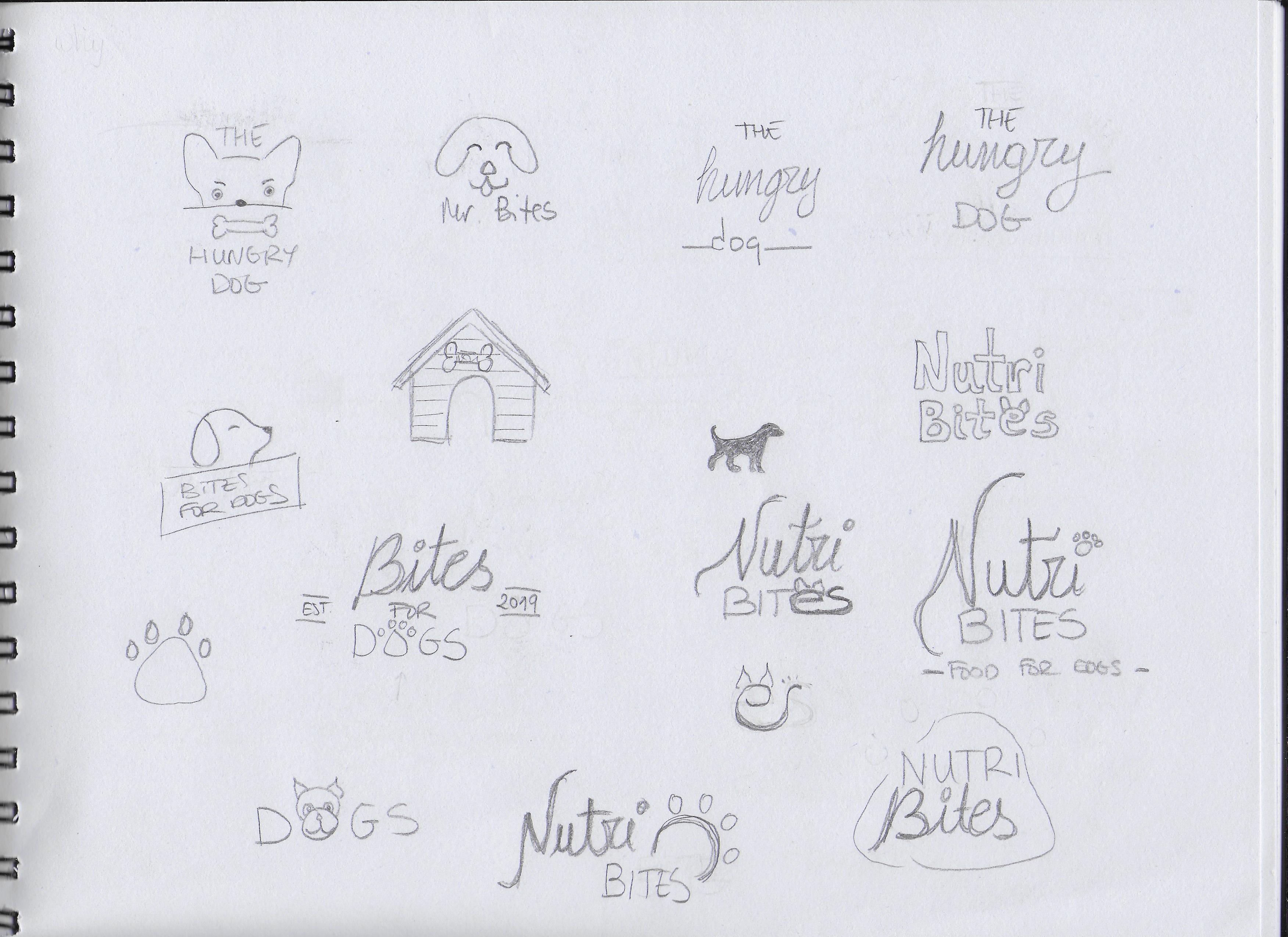
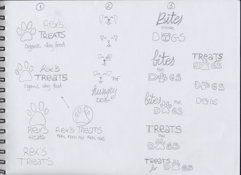
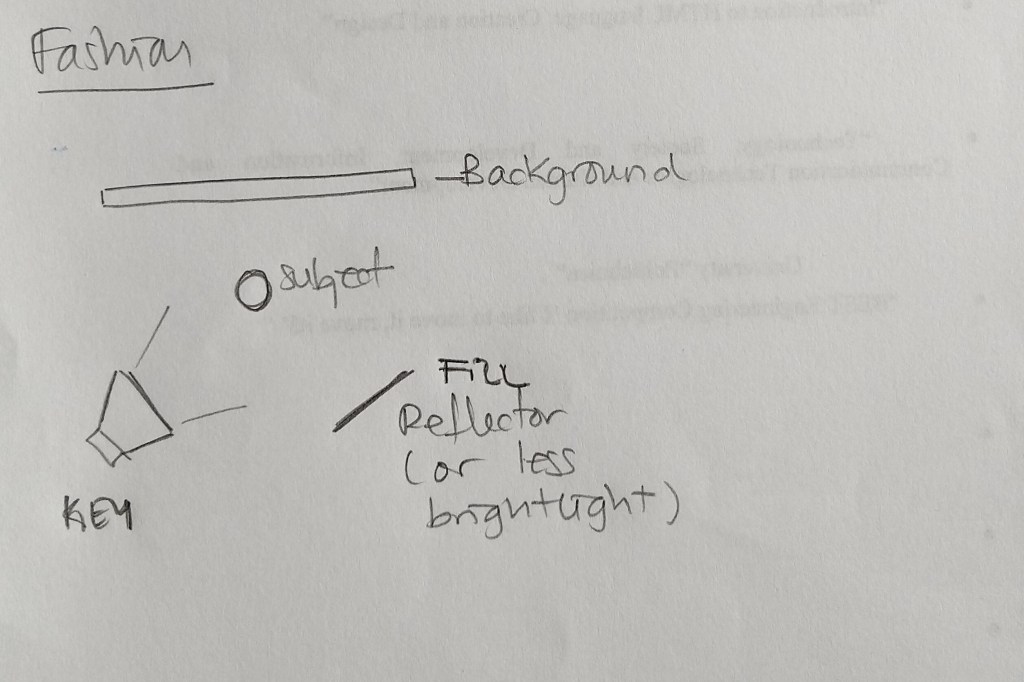
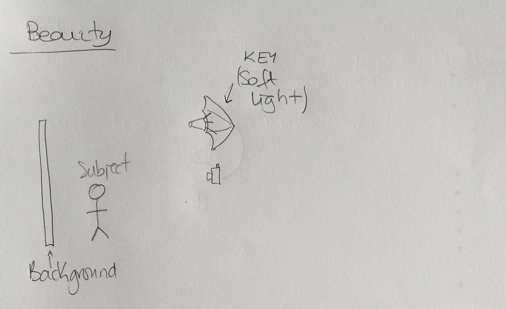
EXPLORATION
First of all, I spent some time brainstorming and deciding how I wanted my brand to look. I also did some research and looked at examples of existing brands, packages and logos. After that, I began to sketch all the ideas that came to my mind. I also played with a few different names. Below are some of my first sketches.
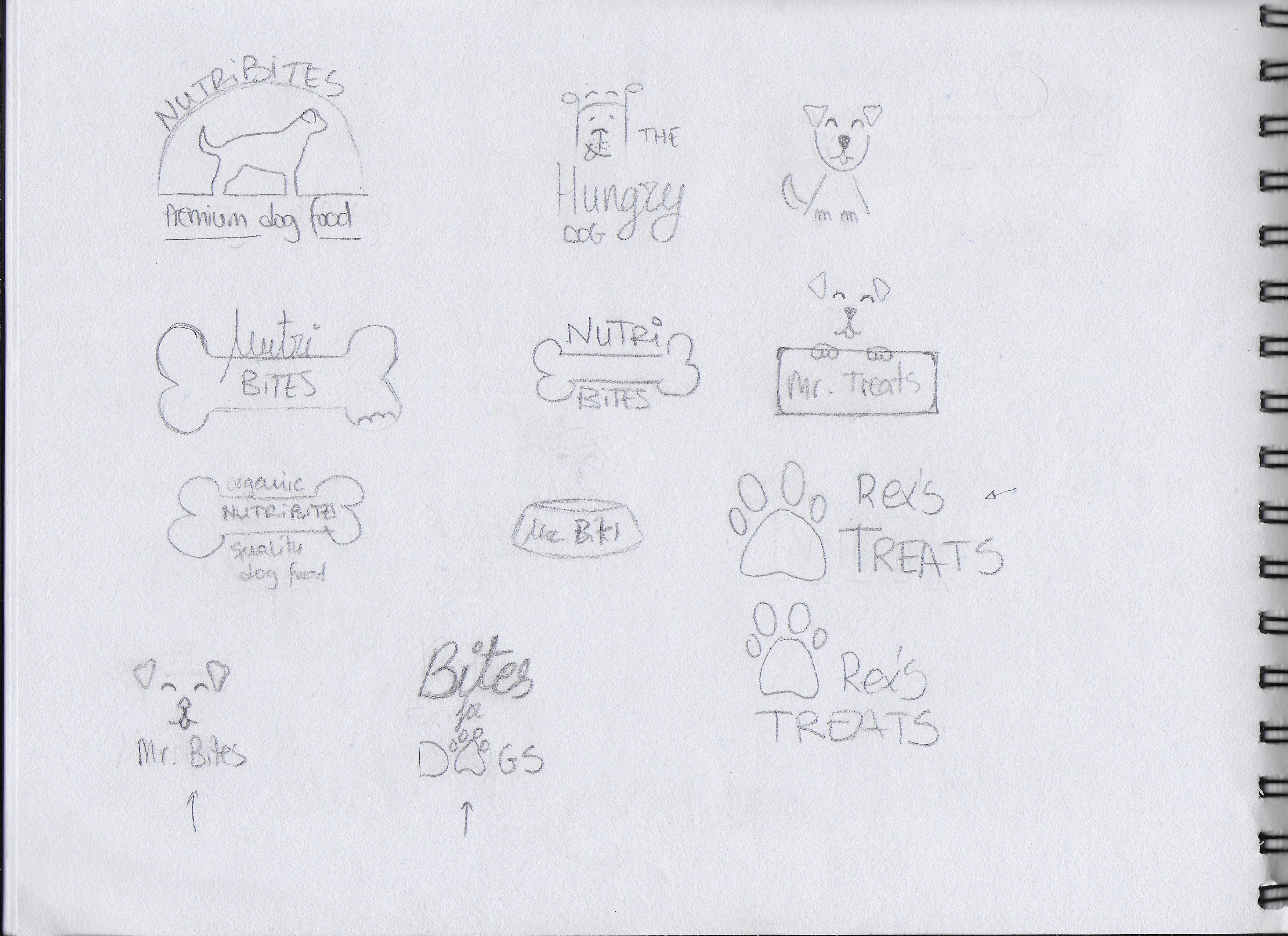
FOCUS
The following are the three options I picked of them all:
I picked this option because I liked the idea of having an icon that could be used with or without the brand name, depending on where the logo is going to be placed. I also liked the clear and readable text.
I chose this one for its simplicity. I thought it could work to have only a few lines representing a dog’s face.
This is a slightly more elegant option due to the script font used for “Bites”. I used the paw print as well, but I integrated it into the word “DOGS”.
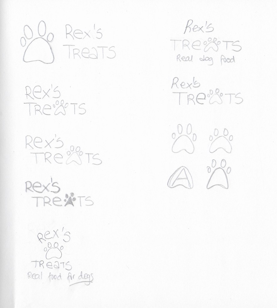
CONSTRUCTION
I picked the first logo idea from the previous step and worked on it further, although it did not end up being the final choice.
TESTING
I experimented more with my three picks on paper. I decided to also do some digital sketches in Adobe Illustrator so it would be easier to show the logos and get feedback.
1
2
3
The most popular logo was number 3. I received the feedback that logo number 1 could work for any dog food while number 3 gives the feel that it is more quality food. Some thought number 2 was a bit childish looking.
REFINEMENT
I finally chose logo number 3, because it has a slightly more serious look than the other two. I want my brand to be a bit playful but also to show that it offers quality products. I worked a bit more with it in Illustrator and tried different colours to see how it would look with different backgrounds.
Sources:
- Photo by Ken Reid on Unsplash
- Photo by Oscar Sutton on Unsplash


