The goal for this Learning Activity was to recreate the Unilever logo using one of the Gestalt principles.
The original logo is a combination of a symbol and a wordmark with the name of the brand. It has the shape of the letter U -which stands for Unilever- made up of different icons. Even though there are many shapes, the design looks neat and straightforward.
The Gestalt principle used in this design is proximity: several objects or elements that are close in proximity to each other (icons) are seen as a group (the letter U).
I started the process by researching the company and the meaning behind their logo. Unilever makes some of the best-known brands in the world that produce cleaning products, food and refreshments, and products for personal care and beauty. Each of the 25 icons shaping the big U represents an aspect of the business; all of them have a meaning. I looked closely at the little symbols and realised that many are related to nature, science and health.
After that, I began sketching everything that came to mind, using different Gestalt principles. Here are my first ideas:
My three favourite versions are the following, using the principles of closure, continuation and figure/ground:
Closure
Continuation
Figure/ground
Finally, I picked the one where I applied figure/ground to create it in a vector format. The reason why I chose this one is that, in my opinion, is the cleanest design. Besides, it represents a drop of water, which is in agreement with the nature theme I noticed in some of the icons from the original logo. Thanks to the figure/ground principle, the eye either sees the droplet or the shape of the letter U.
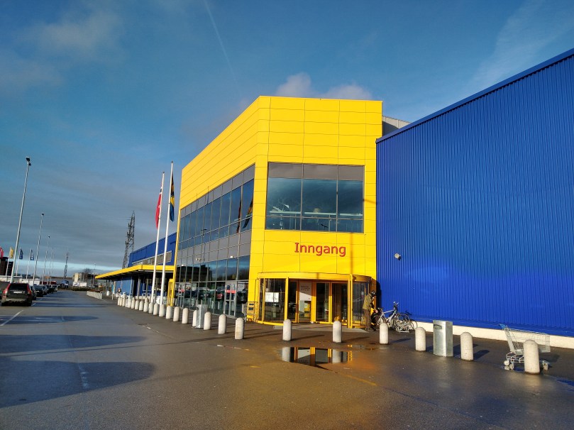
For this Learning Activity, I had to visit a well-known store and evaluate how they remain true to their brand identity or how they do not. I chose to go to IKEA.
Logo
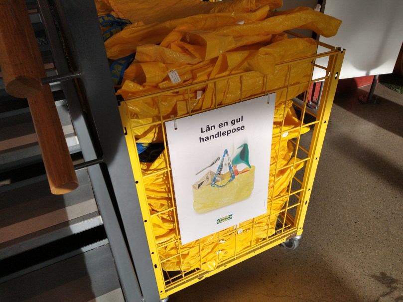
Ikea’s logo is a wordmark. It uses a thick font to display the name of the brand in blue and yellow, like the flag of Sweden, home to Ikea. The same colors are found all over their stores, from the building itself to the bags, shopping baskets, posters, and staff uniforms.
Their brand ideal
The IKEA vision is “to create a better everyday life for the many people”, and they achieve that by offering a wide range of well-designed, functional home furnishing products at prices so low that as many people as possible will be able to afford them.
How they remain true to their brand ideal within their shops
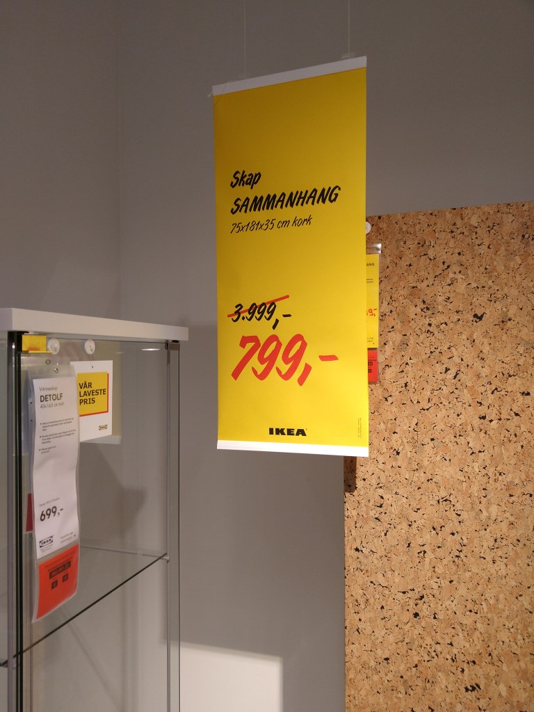
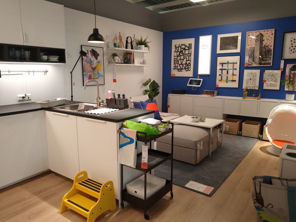
In their shops, Ikea shows a wide variety of styles and functional solutions at low prices. They recreate various types of houses in many sizes to make it easier for the customer to find a solution for their own home. Their furniture is practical, customisable and easy to fit in different spaces. There are plenty of posters showing their low prices and offers all around the shop, and even a combined price for entire rooms in the house. Everything at Ikea shows its brand ideal.
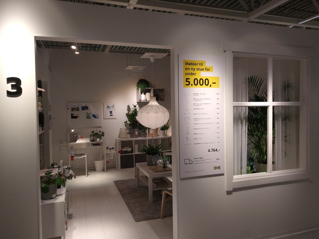
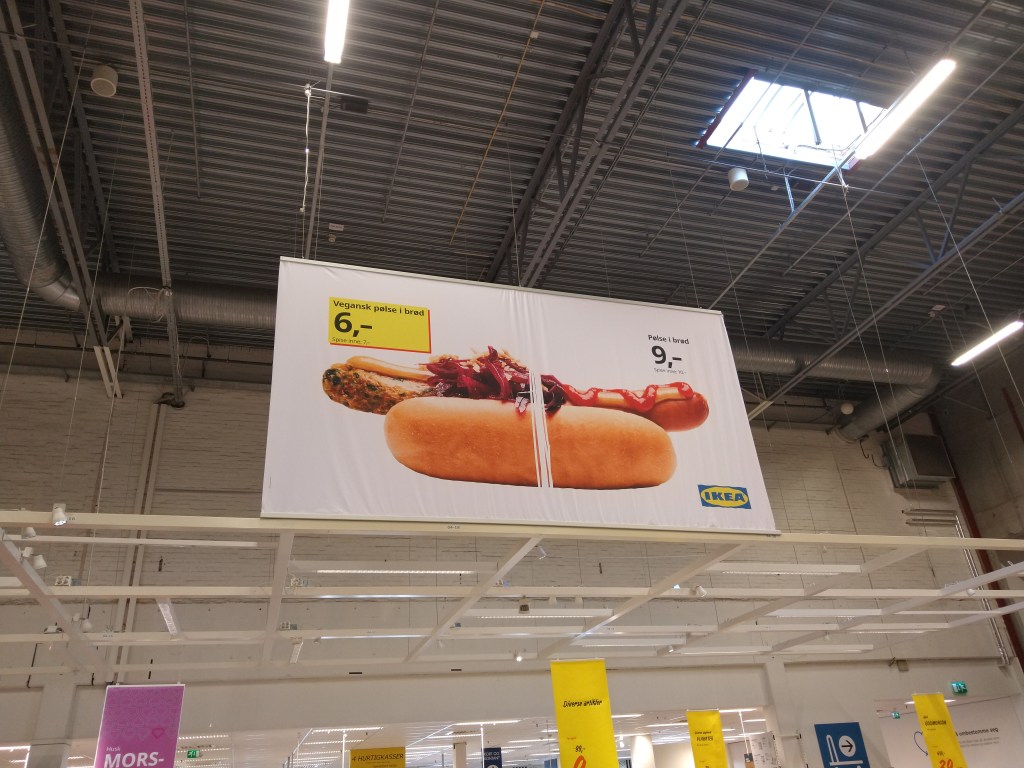
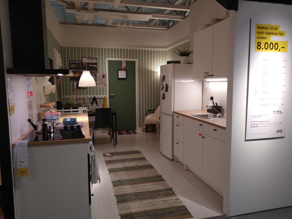
Furniture for a new living room for under 5.000,-NOK
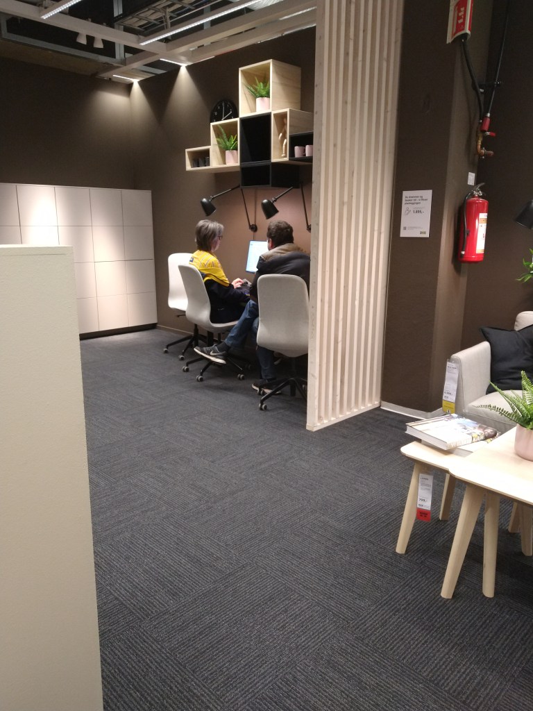
The customer experience according to the brand ideal
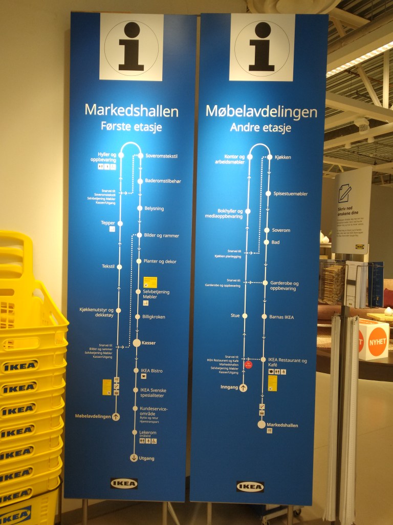
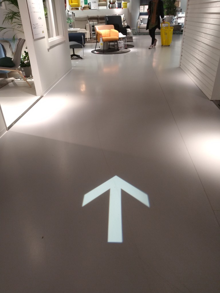
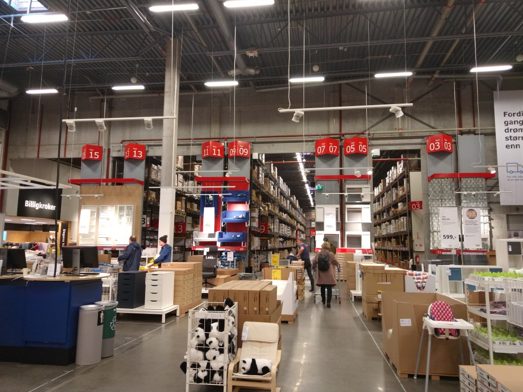
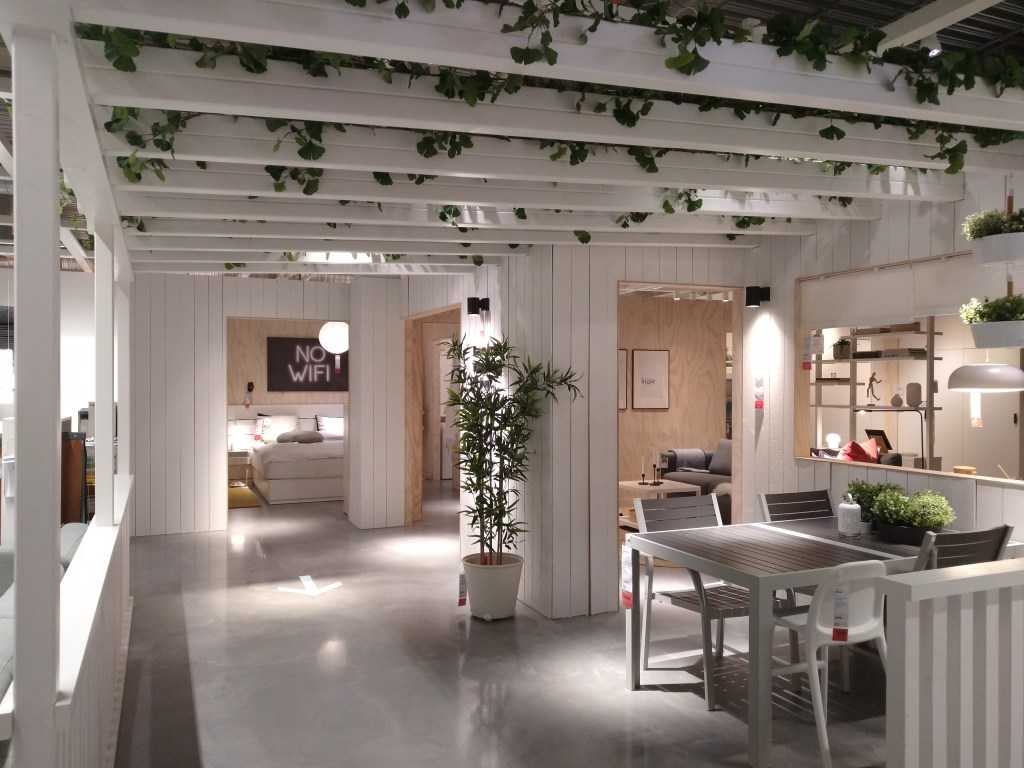
Ikea makes it very easy to navigate their stores due to the way they are divided and distributed. There are three main sections: a showroom, where you can see a wide variety of their furniture; a market hall with textiles, accessories, lighting and decoration items; and a self-serve furniture area. The store is designed to follow a path that takes you through all the departments; signs on the floor show you the direction.
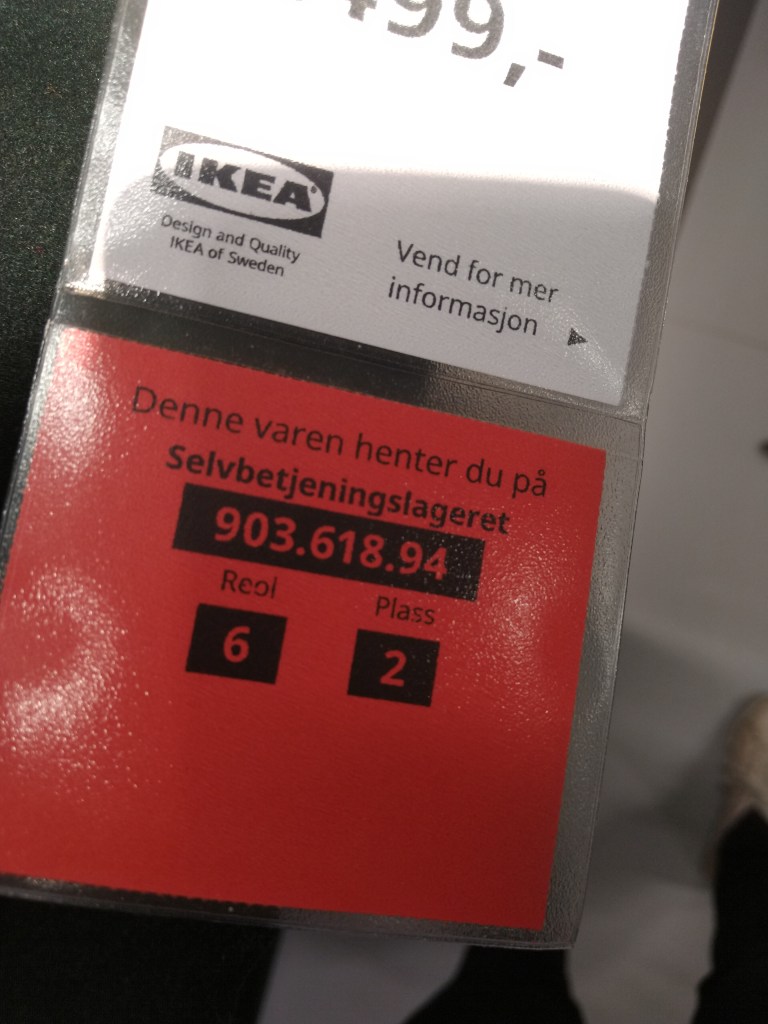
At the entrance, there is a big map of the building with all the store departments so you can find your way around quickly, including shortcuts. Throughout the store, customers can find little stands where they can take a paper measuring tape, pencils and a printed version of the floor plan that can also be used as a shopping list. Each item on the shop is marked with a number that indicates the location where you can find it at the self-serve furniture area.
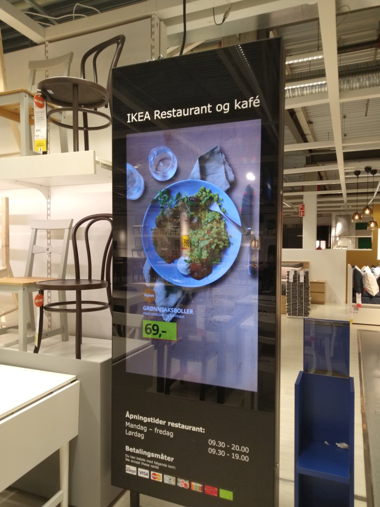
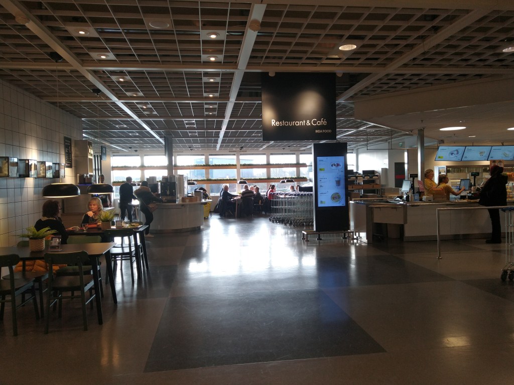
Another essential part of the experience as a customer is Ikea’s restaurant and cafe, where they serve varied quality foods at low prices.
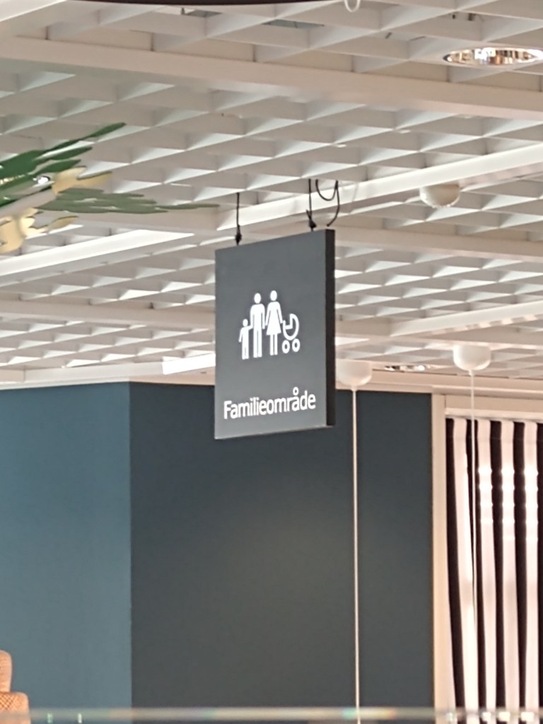
Also, Ikea is very family-friendly; they have a playground for kids, special menus and toys in the restaurant, and toilets and sinks adapted for them.
Playground
Family area
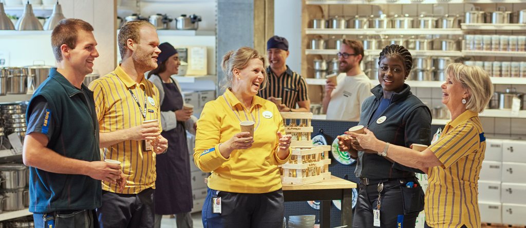
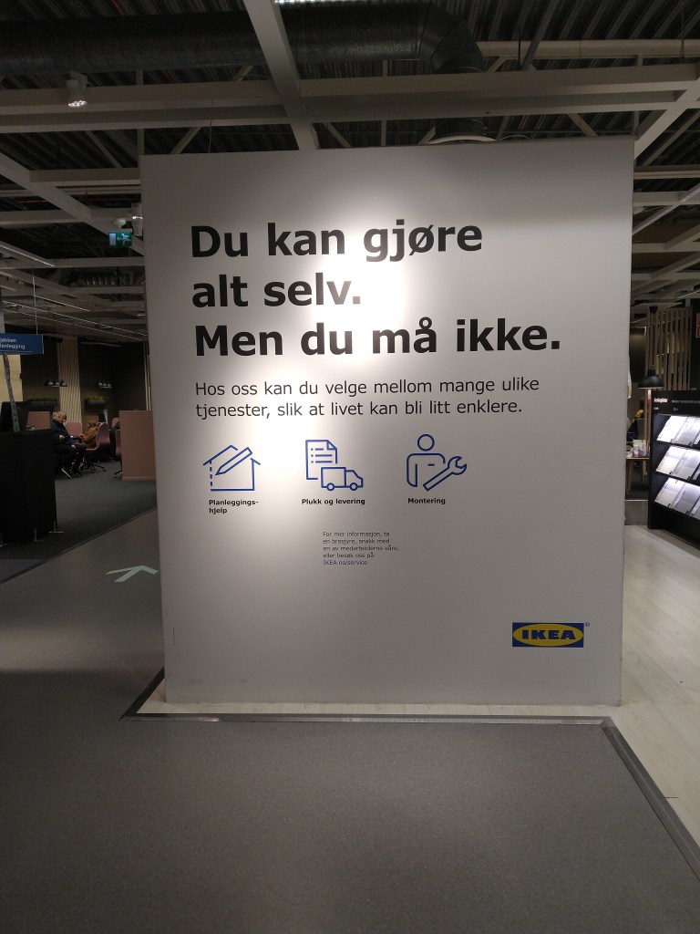
It’s quite easy to shop at Ikea, which agrees with their brand ideal, but in case you need assistance, their staff can guide you and even help you design your kitchen or wardrobe.
You can do it all yourself. But you don’t have to.
The visual display of products according to the brand ideal
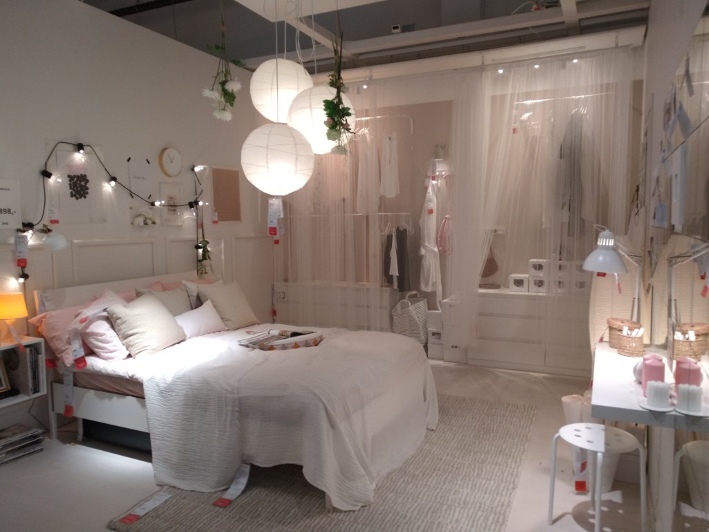
As mentioned before, one of Ikea’s sections is a showroom, where they recreate rooms and houses using their furniture and accessories. They design it to look like a real home, and everything they display is on sale at the store. If you like what you see, you only have to write down the number and pick it up before check-out.
All in all, Ikea wants to make a better and easier everyday life, not only at home but also while shopping at their stores.
1 – Look at the following logos and explain in your own words what you consider their positioning to be (do this for each one).
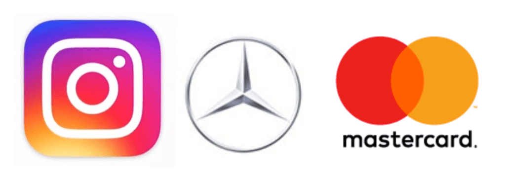
Instagram The Instagram logo is a symbol. It has the shape of a simple camera, which quickly gives the idea that it’s an app for photos and videos. The bright fun colours used indicate it’s directed to young people. It’s an easily recognizable symbol.
Mercedes Benz This logo is also a symbol. It’s a classy design using different shades of grey, which, in my opinion, makes the logo timeless and elegant. It reminds me of a steering wheel. All that makes me think that their cars are robust, classic and safe, possibly aimed at middle-aged people.
Mastercard In this case, the logo combines a symbol and a wordmark. It is a very recognisable logo, even when displayed without the name of the company. The two overlapping circles can be interpreted as a connection, which makes sense with what Mastercard does. It is a simple and timeless design that works.
2 – Let’s work backwards! Look at the logo on the Apple iPhone and, by doing your own research, investigate the history of the product and the company that manufactures it. Give an outline, in your own words, of what you consider the following to be:
Describe the iPhone’s brand identity – exactly as you see it
What do you think its positioning is currently?
What do you think the strategy for this specific product was?
What research do you think was done on this by the company who made it?
Before the first iPhone was released, cell phones were based more on fashion and brand rather than technological innovation. From the beginning, iPhone has always sought to push its phone to the limits of what is technologically capable. They simplified their product line and offered just one model a year while making it an expensive, high-end product. For me, iPhone means exclusivity, innovation and good quality.
More than a decade after the first iPhone, the company continues to deliver innovative, robust and modern versions of the smartphone. It has a high price tag, which still makes it exclusive and gives you the feeling that you are purchasing a solid and reliable device.
In my opinion, part of the reason why this product is so popular is that it focuses on technology, and offers a new experience for the customer. Apple also uses smart advertising campaigns and builds momentum before release day, when you can find people waiting in line all over the world -even for days!- to be one of the first ones to buy the new iPhone. As I see it, the brand creates a sense of belonging, so once you are a customer, you most likely will continue to be.
Before the iPhone era, Apple’s iPod was very popular, but they realised that people were carrying both their phone and their iPod, and that was a problem that would lead to the iPod becoming obsolete. They decided to develop a phone which would also work as an iPod. Apple probably studied how people used their cell phones and for what purpose. They anticipated their needs and created a product that changed the way we understood smartphones, merging an iPod, cell phone and internet browser that worked as efficiently as it would on a desktop.
3 – Now take the same product as in question 2 and explain, in your own words, how the visual element (in this case, the logo) fits in with the brand identity.
The logo on the back of the iPhone is the Apple logo, which is very well known and recognised worldwide. The design of Apple devices -including the iPhone- is clean, simple and elegant. The logo fits this description very well, especially since it changed to a monochromatic figure using black, silver or white colours to represent the famous apple.
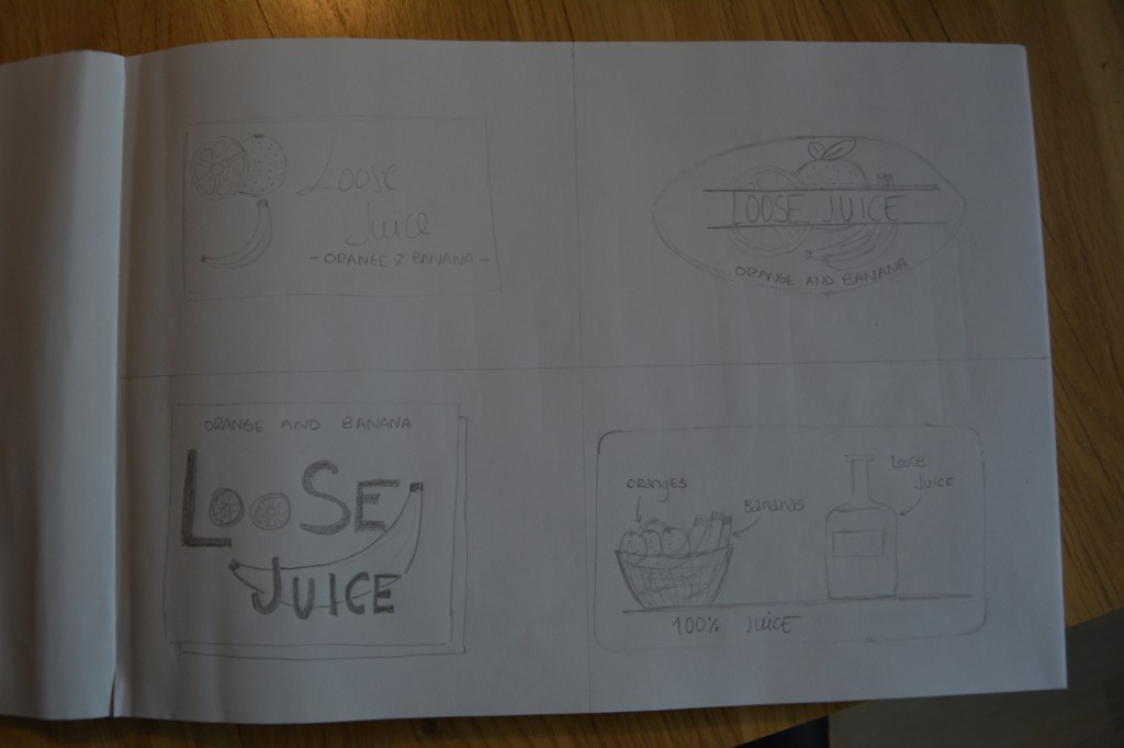
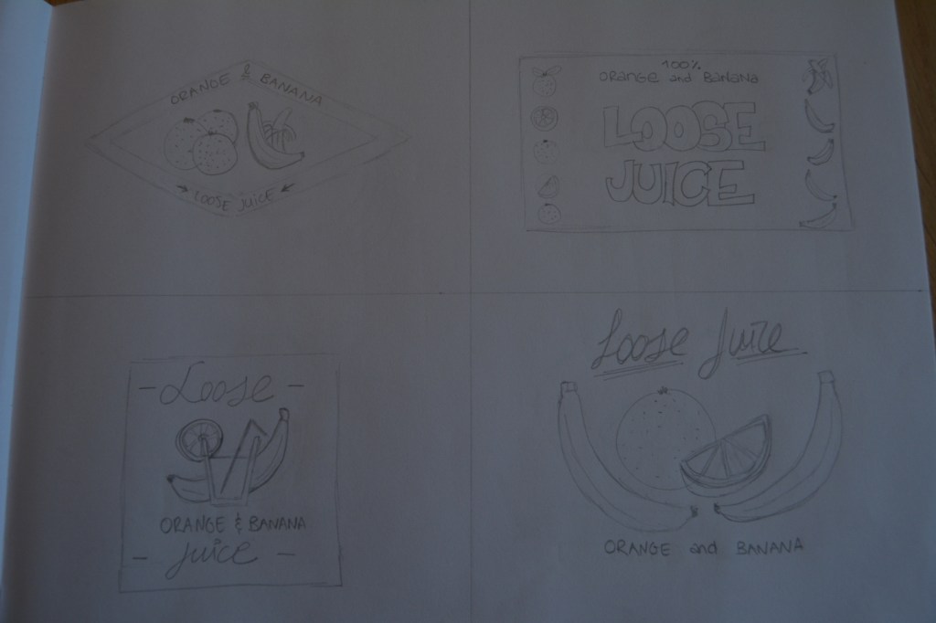
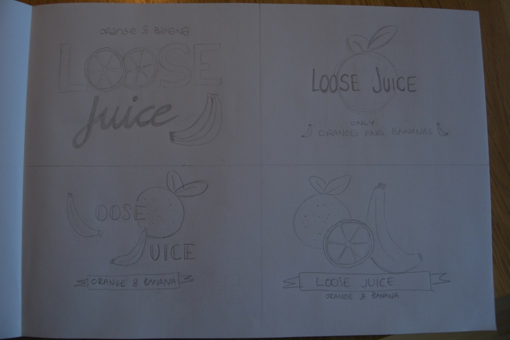
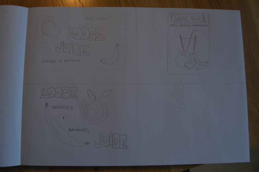
For this week’s Learning Activity I had to make an illustration for fruit juice packaging. The flavour is orange and banana, and the name of the product is Loose Juice.
Firstly, I draw 15 sketches of the label. All of them include the fruit, the name of the flavour and the name of the product. It was an interesting process. In the beginning, I thought I wouldn’t be able to come up with 15 different ideas, but after a while, it was exciting to see how easily new concepts came to my mind. This assignment made me realise how essential sketching is for a designer. It’s a good practice that I will try to incorporate into my routine. These are my sketches:
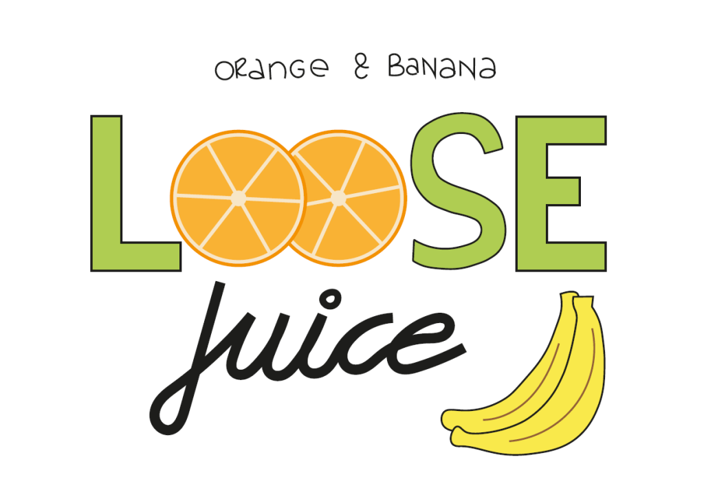
Then, I picked the design I liked the most and drew the label using Adobe Illustrator. This is the final result:
Label illustration
This is the first time I use Adobe Illustrator, and it took me a while to be able to make the drawing. At the same, the task was easy enough to allow me to experiment and try the different tools I learned in the tutorials during the last couple of weeks. It didn’t become frustrating or too difficult; it was actually a fun challenge!
You are given a teaspoon as an object. Now apply each one of the SCAMPER techniques to it and give a brief explanation of what new product comes of this and how it can be marketed.
S – Substitute The first thing I thought of was to substitute the material or the color of the spoon, but then I thought it’d be better to replace the handle by a straw. This way, you can add sugar or other condiments to your drink, mix it and drink it, all with one item. It could be of interest for cafes and restaurants.
C – Combine I thought of combining the spoon with a fork at the other end of the handle. It could be marketed to people that take their lunch to school or work. It’s also useful when traveling or going out in nature. No more single-use plastic cutlery.
A – Adapt Making the spoon foldable makes it easier to carry it with you. If we combine this option with the previous one – spoon + fork – it’s an even better solution for portable cutlery.
M – Modify I modified one side of the bowl of the spoon to give it the shape of a serrated knife. It would be useful for eating certain fruits, like kiwi, without the need to peel it. It could be sold at any store where silverware is sold, or next to the fruit section at the supermarket.
P – Put to other uses Another use I came up with for any metal teaspoon is to roll up metal tubes in the kitchen, like those for mayonnaise or cream cheese.
E – Eliminate If we eliminate the bowl of the spoon, we are left with a stick to mix drinks. The advantage is that it takes less space to store than a regular teaspoon. It could be marketed to students or people who live in small apartments and need to save space. It’d probably be interesting for cafes and restaurants as well.
R – Reverse or rearrange it By linking the handle of the spoon to both sides of the bowl, we could use a simple spoon as a bracelet. It could be aimed at coffee/tea lovers and sold at cafes, for example.
Rice packaging
You have to design packaging for rice. The packaging has to be different from what is out there in the market. Apply each one of the SCAMPER techniques and do a write‑up on your findings. Then choose the option that you think would work best and do a sketch of what the packaging would look like.
S – Substitute The most obvious substitution would be to find a new material for the packaging. For example, glass, metal, fabric or even leaves (which would make it biodegradable and more eco-friendly).
C – Combine It would be easy to combine the rice with salt, spices and dried herbs to make the preparation easier as it eliminates the need to add them afterward.
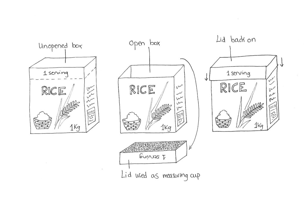
A – Adapt I usually cook too much or too little rice as I find it difficult to calculate the portions. One way to avoid this problem is to adapt the packaging to include a measuring cup. The top part of the cardboard box would detach from the rest of the box and could be used as a measuring tool. It would also work as a lid while storing the leftover uncooked rice.
M – Modify The package could be modified so it includes a dispenser that would release one serving of uncooked rice every time you push it. This would be useful in the same way as the option above.
P – Put to other uses The box could be made in such a way that it could be reused once the rice is finished. One application could be to store different products around the house or even to use as blocks for kids to play with.
E – Eliminate What if we eliminate the packaging altogether? We would be left with only rice, and the customers would need to buy it in bulk and bring their own container from home.
R – Reverse or rearrange it Usually, the rice packages are opened near the top. We could rearrange it and have the box open at the bottom part. If we combine this solution with the dispenser explained in the Modify section, we have a better solution.
Some of the ideas presented in this exercise already exist on the market. Adding a rice dispenser to the packaging would probably result in a price increase. The option of using part of the packaging as a measuring tool gives you the same results; however, it would be cheaper. For that reason is the design I picked. Here is the sketch.
Use the Internet to research the history of the fast food chain McDonald’s and explain which parts of the SCAMPER model are evident in its development onto its current success.
Alex Osborn, a pioneer teacher of creativity, first identified the nine principle ways of manipulating a subject. Bob Eberle later arranged them into the SCAMPER method:
Substitute something Combine it with something else Adapt something to it Modify or Magnify it Put to other uses Eliminate something Reverse or Rearrange it
Substitute something
French fries and milkshakes replaced potato chips and pie in 1949.
Combine it with something else
The Happy Meal, a menu for children, was introduced in 1979. It combined a meal and a toy.
Adapt something to it
The company has adapted to the customers’ and society’s wishes and needs over the years.
For example, in the first Macdonald’s restaurants in the ’50s, ketchup was reserved for hamburgers and cheeseburgers. French fries were meant to be eaten alone, but Macdonald’s customers frequently asked for the sauce for their fries. The firm ended up creating “The Dunk Cup”, a small cup containing ketchup to serve with the food when requested.
In Arab countries, the restaurant chain introduced halal menus, which complied with Islamic laws for food preparation. In the same way, McDonald’s offers Big Mac made with lamb instead of beef in India.
In order to offer a healthier meal option, salads were added to the menu.
In 2018 McDonald’s announced that plastic drinking straws would be banned in the UK and Ireland restaurants.
Early on, McDonald’s defined the quality, service and cleanliness guidelines that all franchisees continue to follow to this day.
Modify it
In 1948 the restaurant’s name was changed from “McDonald’s Bar-B-Que” to simply “McDonald’s”.
Shortly after, the architecture of the building was modified as well – The “Red and White” design and the “Golden Arches” where introduced.
Magnify it
Even though the menu initially was reduced to a few items, new ones have been added during the years, such as chicken nuggets, breakfast options or ice cream.
The chain has grown from only one restaurant in San Bernardino, California, to over 36.000 worldwide.
Put to other uses
The Ronald McDonald House Charities is an independent non-profit organization whose stated mission is to create, find, and support programs that directly improve the health and well-being of children. The first house was opened in 1974 as a way to give “something back into the community where you do business”.
Eliminate
Besides changing their name, one of the most significant early changes in the company was to reduce the menu from 25 items, mostly barbeque, to a simple one of only 9.
Rearrange it
In 1948, the McDonald’s brothers rearranged their kitchen and set it up like an assembly line to ensure maximum efficiency.
During week 2 of GRA1, we are working with idea development. The Learning Activity this week has 3 parts. In this post, I cover the first part: creatively solve 4 given riddles.
1- A man is replacing a wheel on his car, when he accidentally drops the four nuts used to hold the wheel on the car. They fall into a deep drain, irretrievably lost. A passing girl offers him a solution that enables him to drive home. What is it?
I have to admit this first puzzle was the hardest for me to solve. I could not see an immediate solution to it, so I began to brainstorm and wrote down all I could think of:
The girl lends him a car or wheel – but she is a girl, not a woman and it’s unlikely that she would have a car
She gets him a lift – then he wouldn’t be driving
She gives him the nuts from another car – again, unlikely she happens to have some spare nuts on her pocket
He borrows her bike to go and get help/new nuts – then he wouldn’t be driving
She gives him the idea to use a thread and a magnet to get the nuts out of the drain – but the riddle states the nuts are “irretrievably lost”
None of these solutions felt right or good enough, and suddenly it hit me: she suggests him to take one nut from each wheel and fasten the fourth wheel with them. This way, he can drive home and find new nuts later.
2- Two Russians walk down a street in Moscow. One Russian is the father of the other Russian’s son. How are they related?
These people are not necessarily related, but they both have a son together (either biological or adopted).
3- What occurs once in June, once in July and twice in August?
The letter “U”.
4- Six drinking glasses stand in a row, with the first three full of water and the next three empty. By handling and moving only one glass at a time, how can you arrange the six glasses so that no full glass stands next to another full glass, and no empty glass stands next to another empty glass? What is the minimum number of moves to solve this puzzle?
The minimum number of moves is one: pour the water from glass number 2 into glass number 5.
Learning how to use Moodle -our online campus- has been more challenging than I anticipated. Although I had used other studying online platforms and even forums before, it wasn’t very easy to navigate Moodle and find what I needed at first.
Fortunately, it got easier the more I used it, and I feel more confident finding my way around now.
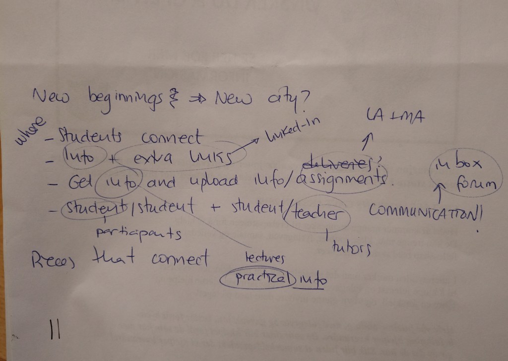
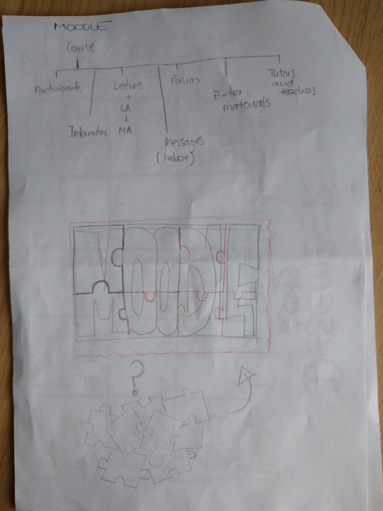
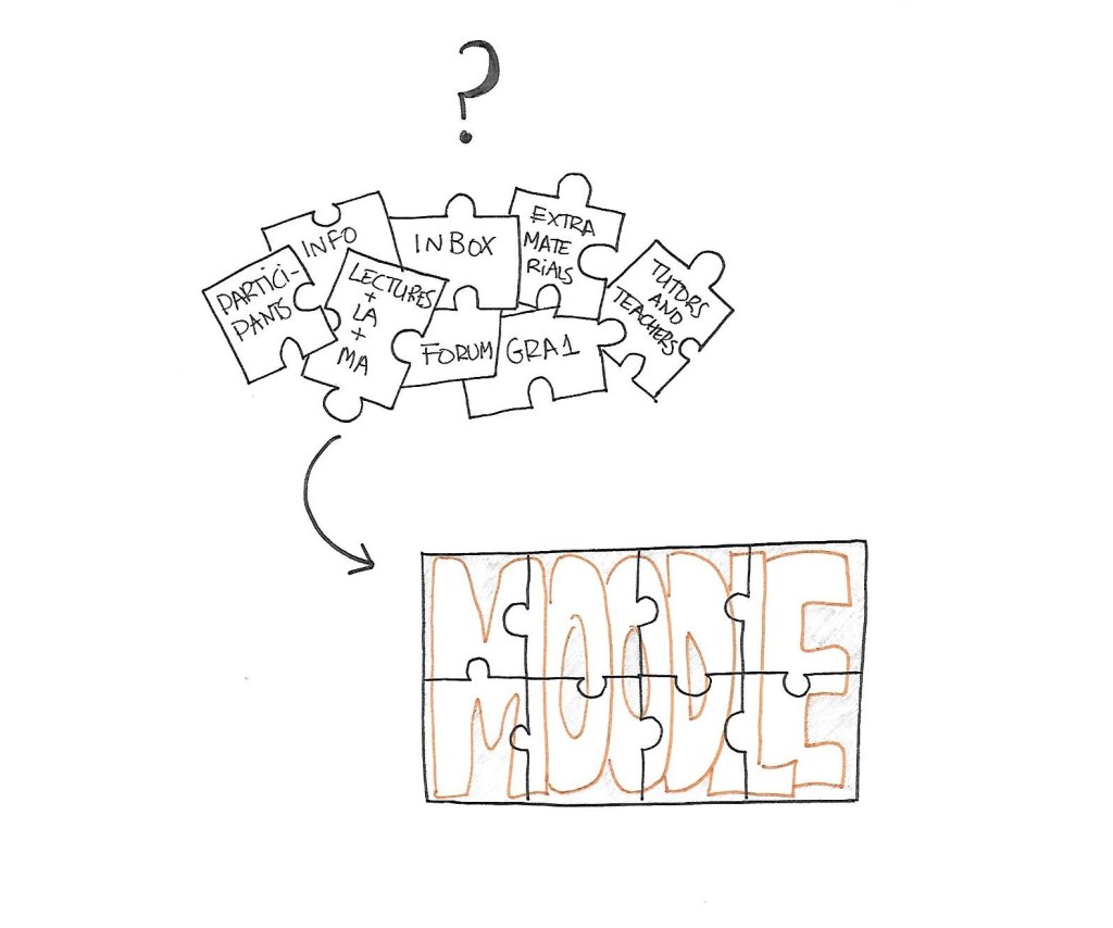
I started brainstorming and saw the different parts of Moodle. In my view, the platform can be divided into these 8 parts:
GRA1 – the course itself
Participants – students
Lectures + LA + MA – Weekly lessons, learning activities and mandatory assignments
Inbox – messages with other students and teachers/tutors
Forum – for communication and project submissions
Extra materials – such as LinkedIn learning platform and Dawsonera.
Info – practical information, guidelines, semester plans…
Tutors and teachers
In a way, it reminded me of a puzzle: you have a pile of pieces that are not connected, and you have no idea how to put them together. After a while, you start studying their shape and how they can fit together, trying to pair them until they perfectly match. Once you have organized all the pieces, you can see the whole picture.
My name is Mónica, and I live in Stavanger with my husband and our two three children. I come from Spain but have been living in the Nordic countries for over a decade now. First, Denmark, then Iceland, and now Norway.
I studied Telecommunication Engineering in my home country, but it was never my passion. I have worked in IT, as a tour guide, travel agent and even as a Spanish teacher, and although I enjoyed it, there was always something missing.
I have been interested in creative activities since I can remember, and now I know I should have studied something related to that. Well, I have known for a while, but for one reason or another, it was never the “right moment”. So I decided to stop making excuses and go for it, and here I am, back at school 10 years later and excited to learn as much as possible.
In my free time, I like to knit, to read and to make different crafts with my kids. I recently discovered doodling, lettering and watercolors, and I am having fun with it, even if I am a beginner. As I once read, “one learns to dance by dancing”. Let’s dance!
Mónica
Part of this assignment was to include a non-photograph self-portrait. I decided to make a drawing. There is a woman in the center representing me and several other doodles around indicating things I like and enjoy, or that define me in some way.